
10 Principals of Typography for UI Design

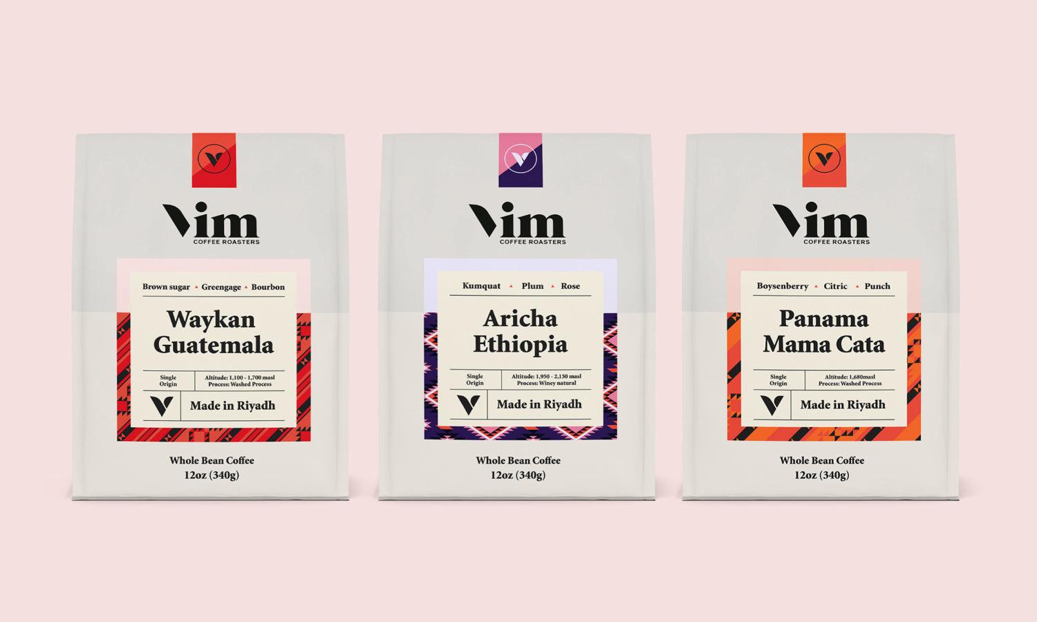
Source: Anagrama Studio, Lumio, Behance, https://www.behance.net/gallery/114545459/Lumio
Typography is a fundamental element of user interface (UI) design, bridging the gap between aesthetic appeal and functional clarity. Effective typography enhances the user experience, guiding users effortlessly through a digital landscape. As UI designers, understanding the principals of typography is crucial for creating interfaces that are not only visually engaging but also optimally functional.
This article delves into the core principals of typography tailored specifically for UI design. From selecting the right typefaces to adjusting layout and scale, each principle is designed to improve readability, enhance aesthetic harmony, and support the overall usability of the digital products. Whether you are refining an existing interface or building a new one from scratch, these insights will equip you with the tools to make typographic choices that resonate with users and reinforce the objectives of your UI design.
Stay tuned as we explore these ten fundamental principals of typography that every UI designer should master to craft compelling and user-friendly digital experiences.
Understanding Typography Fundamentals
Typography in UI design is not just about making things look attractive; it's about optimizing readability and enhancing user experience. Fundamental to this is understanding the principals of typography, which includes recognizing the role of typefaces, fonts, and text arrangement. Typefaces or font families come in various styles and carry different weights, each contributing distinctively to UI aesthetics and functionality. For instance, serif fonts often convey formality and tradition, while sans-serif fonts are seen as modern and approachable.
Another critical aspect is font size and text alignment. These elements must be managed skillfully to ensure that the UI is accessible and legible across various devices and resolutions. Text alignment, whether left, right, centered, or justified, plays a pivotal role in the visual balance and order of content within an interface.
Furthermore, understanding the importance of line spacing, letter spacing, and word spacing is crucial. These spacing variables affect the readability of text blocks, influencing how quickly and comfortably users can absorb information. Proper use of typography principals not only guides a user’s eye across a digital product but also creates a rhythm and mood that enhances the overall user interaction with the UI design.
Choosing the Right Typeface
Selecting the appropriate typeface is paramount in establishing an effective UI design. The right typeface should align with the brand’s personality and the functional needs of the application. It's not merely about aesthetics but about creating the correct tone and ensuring readability.
When choosing a typeface, consider the context of your user interface. For content-heavy interfaces like editorial websites, choose typefaces that excel in readability for longer reads. For apps with more visual elements and minimal text, your typeface should complement other design elements without overwhelming them.
The decision between serif and sans-serif fonts can impact user perception. Serif fonts are typically used for more traditional or formal applications, while sans-serif fonts are considered more modern and are generally easier on the eyes for digital screens.
Additionally, it is important to test typefaces in various environments to ensure they perform well across different screen sizes and resolutions. This includes checking for scalability and legibility to prevent user strain and enhance interface usability.
Finally, consider the licensing requirements for any typeface you plan to use to avoid legal issues and ensure compatibility with different platforms.
Legibility Versus Readability
In the realm of UI design, mastering the principals of typography involves understanding the distinction between legibility and readability, which are critical for enhancing user interaction. Legibility refers to how easily individual characters can be distinguished from each other. It is influenced by the design of the typeface itself, including factors such as character shape, size, and spacing. A typeface with clear, distinct characters increases legibility and is crucial for user interfaces where quick information recognition is necessary.
Readability, on the other hand, pertains to how easily blocks of text can be read and understood. It is affected by how text is arranged in a layout, including line length, line spacing, and overall text organization. Good readability means that the user can effortlessly scan the text, understand the message, and proceed without confusion. This is particularly important in UI design, where information presentation can significantly impact user satisfaction and efficiency.
Both legibility and readability are foundational to creating effective user interfaces. Designers must carefully select typefaces and design layouts that support both principles to ensure that users can not only recognize text at a glance but also digest larger blocks of information without strain.

Source: Ekaterina Grigoryeva, Web Design for Trade Capital Industrial, Behance, https://www.behance.net/gallery/108501239/Web-design-for-Trade-Capital-Industrial
The Role of Font Size and Scaling
Font size and scaling are pivotal in typography for UI design, ensuring text is accessible and legible across various devices and screen sizes. Effective use of font size not only influences how information is perceived but also how it is accessed by users with varying visual abilities. A principal rule in UI design is to maintain a font size that is easily readable on small and large screens alike.
Scaling, or responsive typography, refers to the adjustment of text size based on the device's display characteristics. This practice is essential for maintaining legibility and readability as users switch between devices such as smartphones, tablets, and desktop computers. For example, text that is comfortable to read on a desktop may be too small on a mobile device unless appropriately scaled.
To implement effective scaling, UI designers use relative units like percentages or viewport widths instead of fixed units like pixels. This approach allows text to grow or shrink dynamically in response to the screen size, improving the overall readability and enhancing user engagement.
Additionally, considerations for font size and scaling also involve adhering to accessibility standards, ensuring that text remains functional for users with disabilities.
Responsive Typography
Responsive typography is a core principal in UI design, ensuring that text is both legible and aesthetically pleasing across all device types and screen sizes. This approach involves dynamically adjusting type settings such as font size, line height, and letter spacing based on the user's screen. The aim is to maintain optimal readability and enhance the user experience, regardless of how they access the UI.
In practice, responsive typography uses relative units like viewport width (vw), viewport height (vh), and ems, which scale text proportionally to the screen size. For example, using vw for font sizes allows text to grow or shrink fluidly as the screen width changes, which is crucial for maintaining legibility on mobile devices.
CSS media queries play a significant role in implementing responsive typography. They enable designers to apply different typographic styles at specific breakpoints. This means that a UI can present larger, more prominent headings on desktops while adapting to smaller, more space-efficient versions on mobile devices without sacrificing user experience.
The effective use of responsive typography not only improves the visual harmony of the UI but also supports usability. It ensures that all users, regardless of device, receive a consistent and accessible experience, which is fundamental in today's multi-device world.
Hierarchy and Scale
Hierarchy and scale are vital principals in typography for UI design, guiding users through the digital space with visual cues that indicate the importance and relevance of information. Effective use of typographic hierarchy can significantly enhance user engagement and content comprehensibility by organizing text in a clear and structured manner.
Typographic hierarchy involves the strategic use of varying font sizes, weights, and styles to differentiate levels of information importance. For example, headlines might be set in a bold, large font to capture attention, while body text is presented in a smaller, lighter font to facilitate easy reading. This visual differentiation helps users navigate content more efficiently, understanding quickly which elements are headlines, subheadings, or general body text.
Scale, on the other hand, refers to the relative size of text to other elements within the UI. It plays a crucial role in creating visual interest and focus. By scaling text appropriately, designers can draw attention to key information or actions, encouraging user interaction. Additionally, the thoughtful scaling of typographic elements can help balance design aesthetics, ensuring that the interface feels harmonious and cohesive. Incorporating hierarchy and scale effectively requires a deep understanding of how users consume digital content.
Color and Contrast in Typography
Color and contrast are essential principals in typography for UI design, playing a crucial role in enhancing readability and drawing user attention. Effective use of color can convey mood and emphasize important information, while contrast determines the visibility of text against its background, which is pivotal for readability.
In UI design, high contrast between text and its background is generally recommended to ensure that content is accessible to all users, including those with visual impairments. For instance, black text on a white background offers the highest level of contrast, making it widely preferred for body text. However, designers can use subtle color variations for less critical text to reduce visual fatigue and enhance aesthetic appeal.
Choosing the right color palette is also vital. Colors should align with the brand’s identity and the emotional tone of the content. Warmer colors can invoke passion and urgency, while cooler tones tend to be calming and professional.
It’s important to test typography in various lighting conditions and on different devices to ensure consistency in readability. Tools like color contrast analyzers can help designers adhere to accessibility standards, ensuring that text is perceivable by everyone.

Source: Adoratio Studio, Awwards Conference 2020, Behance, https://www.behance.net/gallery/108886915/Awwards-Conference-2020
Whitespace and Layout
Whitespace, often referred to as negative space, is a powerful tool in typography and UI design. It refers to the areas of a layout left unmarked by text or graphics. Proper use of whitespace can significantly improve the readability of text and the clarity of information, making it a critical principal in UI design.
In typography, whitespace isn't just empty space; it's a key element of design aesthetics and functionality. It helps to separate different UI elements, groups related items, and creates a visual flow in content, guiding users through the interface naturally and effortlessly. Effective layout uses whitespace to balance design elements, harmonizing visuals and text, and preventing the UI from appearing cluttered.
For example, increasing the padding around text not only enhances legibility but also makes the content more appealing. Similarly, adequate line spacing can improve the readability of long text passages by preventing text from blending together, which is especially important in digital interfaces where eye strain is a concern.
Additionally, mastering layout involves organizing content in a way that aligns with user expectations. Aligning text logically and consistently ensures that the UI is intuitive and easy to navigate.
Optimizing Text for User Interaction
Optimizing text for user interaction is a critical principal of typography in UI design. It involves designing textual elements so they are not only readable and visually appealing but also function effectively as tools of user engagement. This includes actionable items such as buttons, links, and CTAs (calls to action), which are essential in navigating and interacting with the interface.
The choice of typeface, size, color, and weight plays a significant role in making these textual elements intuitive and noticeable. For instance, buttons with bold, contrasting text are more likely to catch the user’s eye and prompt action. Similarly, hyperlink differentiation is typically achieved through color changes, underlining, or font weight adjustments to signify clickable content distinct from regular text.
It is also important to maintain a clear distinction between interactive and non-interactive text. This can be managed through consistent styling choices that help users learn and predict how to navigate your UI effectively. Additionally, ensuring that text elements are sized appropriately for touch interactions on mobile devices enhances usability, making UIs more accessible and user-friendly.
Microtypography in UI Design
Microtypography is an essential aspect of typography that focuses on the details of letter and text presentation, influencing both the legibility and aesthetics of the user interface. This principal of typography in UI design deals with the fine adjustments of spacing, such as kerning, tracking, and leading, which can greatly enhance text readability and visual comfort.
Kerning adjusts the space between individual letter pairs to create a uniform appearance, which prevents awkward gaps that can distract from reading. Tracking involves adjusting the spacing across larger blocks of text to affect density and text readability, useful in both headers and body text. Leading, or line spacing, affects how text is spaced vertically, which can impact the readability and overall look of paragraphs.
Microtypography also includes the use of ligatures, special characters that enhance the readability and appearance of certain letter pairs or combinations. These subtle enhancements are particularly important in UI design, where every detail can contribute to a seamless and engaging user experience.
Attention to microtypographic details ensures that the UI feels thoughtfully designed and easy to interact with. It also helps in establishing a visual hierarchy and can guide the user's eye through the content effectively.
Conclusion
Mastering the principals of typography in UI design is essential for creating engaging and functional user interfaces. By understanding and applying the core principles such as legibility, hierarchy, responsiveness, and microtypography, designers can significantly enhance user experience. Effective typography not only guides users through the interface with ease but also establishes a visual harmony that reflects the brand’s identity. As UI design continues to evolve, staying informed and adept in these typography principals will remain crucial for designers aiming to deliver innovative and user-centric digital solutions. Embrace these fundamentals to craft visually appealing and highly functional UIs.
Let Us Know What You Think!
Every information you read here are written and curated by Kreafolk's team, carefully pieced together with our creative community in mind. Did you enjoy our contents? Leave a comment below and share your thoughts. Cheers to more creative articles and inspirations!
Related Articles


%20design,%20bridging%20the%20gap%20between%20aesthetic%20appea...)


Leave a Comment