
10 Tips to Create A User Friend Website Layout Design

A user-friendly website layout design is crucial not only for providing a positive experience but also for retaining visitors and converting them into loyal customers. Whether you're a small business owner, a freelancer, or a large corporation, the way your website navigates and feels to the user can significantly impact your success online.
Creating an effective website layout design involves more than just aesthetics. It requires a deep understanding of user behavior, a strategic structuring of information, and an interface that enhances accessibility. From ensuring the design is responsive across all devices to implementing an intuitive navigation system, every element must be optimized for user engagement and satisfaction.
This guide will explore ten essential tips to help you create a website layout design that is not only visually appealing but also highly functional. By focusing on simplicity, usability, and modern design principles, you can develop a website that meets the needs of your audience while providing them with a seamless browsing experience.
Keep It Simple and Clean
In the realm of website layout design, simplicity reigns supreme. A clean and uncluttered design not only enhances the aesthetics of your site but also improves its usability and functionality. When users land on a website, they prefer an experience that allows them to navigate effortlessly and find information quickly. This means minimizing distractions and focusing on the essentials that deliver value to your audience.
To achieve a simple and clean website layout, start by using a neutral color palette that promotes clarity and does not overwhelm the senses. Limit the number of fonts to two or three to maintain typographic consistency and readability. Additionally, consider the strategic use of white space, which can help to break up content, making it easier to digest. This spacing is not just visual; it contributes to logical navigation and prioritizes content by drawing attention to the most important information.
Streamline your content and visuals to ensure that each element serves a purpose and supports user tasks. Avoid unnecessary decorations or elements that do not enhance user interactions. A clean design is not about the absence of color or detail, but rather about the careful selection of what to include to create a tranquil and effective user experience. Embracing minimalism in your website layout design can lead to a more focused and productive user journey.
Optimize for Usability
Optimizing a website layout design for usability means ensuring that the site is intuitive, efficient, and accommodating to users' needs. An effective website layout allows users to navigate the site with ease, finding information without frustration or confusion. This involves thoughtful placement of elements, consistent navigation cues, and interactive features that are responsive and accessible.
Start by organizing content in a logical flow that mirrors natural user behavior. Menus and navigation bars should be straightforward and prominently placed, typically at the top or side of the page, to help users orient themselves on your site. The search function should be easy to find and use, as it’s essential for users who want to quickly locate specific content.
Responsive design is non-negotiable in today's multi-device world. Ensure that your website layout works seamlessly across all devices, adjusting to different screen sizes and orientations without losing functionality. This adaptation not only improves usability but also caters to the growing number of users who access the internet on mobile devices.
To further enhance usability, consider the accessibility of your website. Use high-contrast colors for better visibility and alt text for images to support screen readers. Interactive elements should be large enough to click and spaced adequately to prevent errors. Regular testing with real users will provide valuable insights into how your website performs in real-world scenarios, allowing you to make continuous improvements.
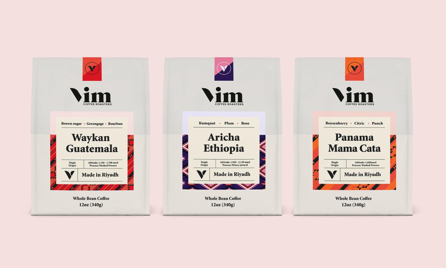
Implement a Visual Hierarchy
Creating a visual hierarchy within your website layout design is essential for guiding users through your content effectively. This strategic arrangement of visual elements according to their importance ensures that visitors naturally gravitate towards the most critical information first. By employing a visual hierarchy, you can control the order in which the human eye perceives what it sees.
To implement a visual hierarchy, start by defining the primary goal of your website. What do you want users to notice and do first? Use size, color, and contrast to make the most important elements stand out. For example, larger elements are noticed first, and bold colors can draw attention more than muted tones. Similarly, high-contrast elements against their backgrounds are more likely to catch the eye than those with low contrast.
Typography plays a crucial role in visual hierarchy. Differentiate clearly between headings, subheadings, and body text using varying font sizes, weights, and styles. This not only improves readability but also helps organize information into digestible chunks.
Spacing and alignment are also vital; they help create order and group related items. Properly spaced and aligned content appears more organized and reduces cognitive load, making the website easier to navigate.

Source: Creative Mints, Website Design / 3D & 2D Edition, Behance, https://www.behance.net/gallery/102374705/Website-design-3D-2D-Edition
Ensure Responsive Design
Ensuring responsive design in your website layout is crucial in today's diverse device landscape. A responsive website automatically adjusts to fit the screen size and resolution of the device it is being viewed on. This adaptability improves user experience, boosts engagement, and increases the likelihood of return visits.
Responsive design involves a flexible grid layout where all the elements scale according to the screen size. This flexibility means your website maintains usability and functionality, whether accessed through a desktop, a tablet, or a smartphone. Use CSS media queries to apply different stylings for different devices, ensuring that your website looks great and works well on any screen.
Images and multimedia content also need to be responsive. They should resize correctly and load efficiently to ensure they don't slow down your website on smaller devices. Moreover, consider the touch interface of smartphones and tablets by designing easy-to-tap buttons and links with sufficient spacing around them to prevent accidental clicks.
Implementing a responsive design not only enhances the user experience but also improves your website’s SEO performance, as search engines favor websites that cater to mobile users. With a significant number of users accessing websites via mobile devices, responsive design is not just advisable; it’s imperative for modern web success.
Make Navigation Effortless
Effortless navigation is a cornerstone of effective website layout design. A well-designed navigation system acts as a roadmap for your visitors, guiding them through your site’s content smoothly and intuitively. The goal is to allow users to find the information they need quickly, without confusion or delay, which enhances user satisfaction and increases the likelihood of a return visit.
To achieve this, start by organizing your navigation menu logically. Group related information together under broad categories that are easily understandable. Keep menu items to a minimum to avoid overwhelming your users. A rule of thumb is to have no more than seven main items in your navigation bar; this helps maintain clarity and focus.
Dropdown menus can be useful for accommodating additional sub-items without cluttering the main navigation bar. However, ensure these are clearly labeled and easy to interact with, especially on mobile devices where precise tapping can be challenging. Use standard icons, such as a magnifying glass for search or a house for the home page, to improve recognition and speed up navigation.
Consistency is also key in navigation design. Keep your navigation style and placement consistent across all pages. This predictability allows users to rely on muscle memory, making navigation feel more natural and effortless.
Use Grid-Based Layouts
Utilizing grid-based layouts is a fundamental principle in website layout design, promoting an organized appearance and helping to maintain visual balance across the webpage. Grids provide a framework that structures your content clearly, making it easier for users to navigate and digest information. This structured approach is not only beneficial for aesthetics but also enhances functionality and usability.
A grid system divides a page into a series of rows and columns, creating a series of cells where content can be placed. This modular system allows designers to arrange elements in a clean, aligned, and orderly manner, ensuring that the website looks organized on any device. It also makes responsive design more manageable because the grid adjusts to different screen sizes, maintaining the integrity of the visual layout.
When implementing a grid-based design, consider the most important elements of your content and place them in positions within the grid that enhance visibility. For instance, placing key information in the top left cell where users typically start reading can capture attention quickly.
The flexibility of grid-based layouts also allows for creative design solutions. While the grid provides a guideline, elements do not have to fill every cell completely; they can span multiple cells or fit into smaller parts of a cell, allowing for dynamic compositions and visual interest.
Incorporating a grid helps ensure consistency throughout the pages of your website. This consistency can significantly improve the user experience by providing a predictable and easy-to-follow structure. As users become accustomed to the layout, their ability to find information quickly and easily will improve, making your website more effective and engaging.
Choose the Right Color Scheme
Selecting the right color scheme is crucial in creating an effective website layout design. Colors not only enhance the aesthetic appeal of a site but also influence user emotions and behaviors. A well-chosen palette can effectively communicate your brand's message and increase user engagement.
When choosing colors for your website, consider the psychological impact of different hues. For instance, blue evokes trust and reliability, making it popular among financial institutions, while green is often associated with health and tranquility, suitable for wellness brands. Understand the associations of colors and use them strategically to align with your brand identity.
It's also important to ensure sufficient contrast between the background and text for readability. High contrast, such as black text on a white background, can make your content more accessible to a wider audience, including those with visual impairments.
Stick to a palette of three to five colors to maintain visual coherence. Your primary color should dominate, supported by secondary colors that complement or contrast effectively, creating balance and variety. Use an accent color for calls to action to draw attention without overwhelming the overall design.
Consistency in color usage across all pages solidifies your brand's identity and contributes to a cohesive user experience. Test different palettes to see how they influence user interaction and conversion rates, and adjust your choices based on these insights.

Source: Creative Mints, Website Design / 3D & 2D Edition, Behance, https://www.behance.net/gallery/102374705/Website-design-3D-2D-Edition
Incorporate Effective CTAs
Incorporating effective calls to action (CTAs) is a pivotal element in website layout design, crucial for guiding users towards desired interactions, whether it’s making a purchase, signing up for a newsletter, or contacting customer service. A well-crafted CTA button can significantly increase conversion rates by clearly stating what actions users should take next.
To design effective CTAs, start by making them stand out from the rest of your website content. Use a color that contrasts with your site's color scheme to grab attention. However, ensure that this does not clash with your overall design. The size and shape of the CTA should also be large enough to notice but balanced within the layout, maintaining design harmony.
Position your CTAs strategically within the user’s workflow. Place them in locations where users are most likely to make decisions, such as at the end of a persuasive piece of content or near product details. This positioning makes it convenient for users to take action without searching around.
The language you use in your CTAs is equally important. Action-oriented verbs like "Buy," "Register," "Call," or "Download" communicate immediacy and clarity, telling users exactly what they will get. Be concise but specific to reduce uncertainty for the user.
Finally, consider the user journey on your site. Multiple CTAs may be necessary for different stages of interaction, but they should all lead to a coherent end goal that benefits the user and meets your business objectives. Regular testing and refinement of CTA placement, size, color, and wording can lead to better user engagement and increased conversions.
Speed Up Your Site
In the realm of website layout design, site speed is a pivotal factor that impacts user experience and engagement. A swift-loading site retains users, boosts engagement, and supports SEO efforts by meeting search engine standards for speed. Enhancing your website's speed is therefore crucial for maintaining competitive edge and user satisfaction.
Start by optimizing all visual content. Compress images and videos without sacrificing quality to decrease load times. Consider using modern formats like WebP for images, which provide superior compression and quality characteristics compared to traditional formats like JPEG.
Minimize the use of heavy JavaScript and CSS files. Where possible, merge multiple scripts into one and similarly consolidate CSS files to reduce the number of HTTP requests your site makes. Employ minification tools to strip unnecessary characters from your scripts and style sheets to further speed up loading.
Leveraging browser caching can significantly enhance site speed by storing elements of your site locally in the user's browser upon the first visit, thus reducing loading times on subsequent visits.
Content Delivery Networks (CDNs) are also invaluable for improving website speed, especially for global audiences. CDNs distribute your content across multiple geographically dispersed servers, minimizing the latency that comes with fetching data from a single location.
Test Your Design
Testing your website layout design is essential to ensure it effectively meets user needs and achieves your business objectives. Regularly testing and refining your design based on user feedback and behavior helps improve usability, increase user satisfaction, and drive conversions.
Start with usability testing, which involves observing real users as they interact with your website. This direct feedback can uncover usability issues that you might not have anticipated. Techniques such as task analysis, where users are asked to complete specific tasks, can be particularly revealing.
A/B testing is another critical method for optimizing your website layout design. By presenting two variations of a page to different segments of users, you can compare which version performs better in terms of user engagement and conversion rates. This type of testing is invaluable for making data-driven decisions about design changes.
Accessibility should also be a priority in your testing regimen. Ensure that your website is navigable and understandable by all users, including those with disabilities. Tools like the Web Accessibility Evaluation Tool (WAVE) can help identify and rectify accessibility issues in your design.
Finally, implement analytics to continuously monitor how users interact with your site. Metrics such as bounce rate, average time on page, and conversion rates are vital for assessing the effectiveness of your design and identifying areas for improvement.
Conclusion
Mastering the art of website layout design is crucial for creating engaging and effective online spaces. By implementing the tips discussed—from keeping your design simple and clean to testing and refining your layout based on user feedback—you can significantly enhance the usability and aesthetic appeal of your site. Whether you're looking to improve navigation, optimize responsiveness, or ensure fast load times, each element plays a vital role in the overall user experience. Embrace these principles to build a website that not only looks great but also performs well, meeting the needs of your audience and achieving your digital goals.
Let Us Know What You Think!
Every information you read here are written and curated by Kreafolk's team, carefully pieced together with our creative community in mind. Did you enjoy our contents? Leave a comment below and share your thoughts. Cheers to more creative articles and inspirations!
Related Articles


Leave a Comment