Ralph Lauren Logo Design: History & Evolution

Image Source: https://www.ralphlauren.com/ | Image Courtesy: Ralph Lauren
I'm excited to dive into this iconic brand's visual journey! When you talk about timeless and elegant branding, the Ralph Lauren logo design almost immediately pops up in any designer's mind. This emblem—a simple yet sophisticated polo player on horseback—has become an indelible symbol of luxury, sportiness, and American elegance. But have you ever stopped to ponder its origins and evolution? Understanding the Ralph Lauren logo design can offer valuable insights into the power of effective branding and graphic design.
Created in the late 1960s, the Ralph Lauren brand and its iconic logo have stood the test of time, adapting subtly to the ever-changing fashion landscape while retaining its core identity. This article aims to unravel the fascinating history and evolution of this iconic emblem, which has not just captivated fashionistas but also struck a chord in the hearts of graphic designers around the globe. So saddle up, as we explore the techniques, the iterations, and the vision that went into shaping the Ralph Lauren logo design. Whether you're a seasoned professional or a newbie graphic designer, there’s a lesson or two to pick up from this all-American symbol of style and sophistication.
Ralph Lauren Logo Design History
1974 - Present
In the ever-changing world of fashion, where logos often undergo tweaks and overhauls, the Ralph Lauren logo design is a testament to the timeless power of simplicity and directness. Unveiled in 1974, this iconic emblem has remained virtually unchanged, and why should it? Its success lies in its straightforwardness—a Polo player in full swing, seated on a galloping horse. It conveys luxury, athleticism, and timeless American style, all in one fell swoop.
For those of you who revel in the technicalities like I do, you’d appreciate that the Ralph Lauren logo design doesn’t need gradients, shadows, or any other modern gimmicks to make it stand out. Crafted in a monochrome palette, it exudes a timeless aesthetic. The silhouette is clean-cut, letting the brand speak through a single, unified image. Simplicity is key here, but achieving this kind of "effortless" design is anything but simple. The challenge lies in achieving enough detail to tell a story, yet not so much that the image becomes cluttered or hard to replicate across various mediums—a balance that the Ralph Lauren logo design nails perfectly.
In our field, we often hear that a great logo should adapt and evolve over time. But the Ralph Lauren case argues for the merits of consistency. For almost five decades, this emblem has graced everything from polo shirts to perfumes, bedding to luxury cars. It has managed to extend its reach far beyond its original target audience, infiltrating mainstream culture and different market sectors. This serves as a striking example for graphic designers on the impact a well-thought-out logo can have. When you're working on a branding project, the Ralph Lauren logo design is a prime example that sometimes "if it ain't broke, don't fix it" holds true.
The consistent use of the logo has fostered a strong brand identity that people around the world instantly recognize. If you’re working on branding projects, especially for lifestyle or luxury brands, there are pages you could take out of Ralph Lauren's book. One key takeaway is that every element of the logo serves a purpose. There’s no filler; everything from the polo mallet to the posture of the horse contributes to the story that the brand wants to tell. It communicates an aspiration, a lifestyle, and an aesthetic.
Another important facet is that the logo has been applied consistently across a wide range of applications. From massive billboards to tiny labels, it never loses its essence or readability. This is a critical factor for us graphic designers to consider: scalability. A logo must be flexible enough to work in a variety of formats and sizes, and this one's proven it can do just that.
So, for anyone in the graphic design industry, the Ralph Lauren logo design serves as a masterclass in visual storytelling and brand longevity. It offers valuable lessons in simplicity, adaptability, and consistency—qualities that are pivotal in creating an iconic logo. If you’ve ever been caught in the whirlpool of changing design trends and client demands, take a breather and think about this emblem. Sometimes, sticking to the basics can result in a design that not only transcends time but also effortlessly strides across diverse platforms and audiences.
And there you have it! Nearly five decades and counting, the Ralph Lauren logo design remains as poignant and effective as ever, providing timeless lessons for graphic designers of all levels.

Image Courtesy: Ralph Lauren
Analysis: Ralph Lauren Logo Design Evolution
Now that we've dived deep into the history of the Ralph Lauren logo design, it's time to get into the nitty-gritty. Let's dissect this timeless emblem by looking at its subtle evolution over the years and what it means for us in the graphic design realm. Trust me, there's more than meets the eye, and you're gonna want to take some notes. So, grab your designer notepads (or, fine, open a new Google Doc), and let's jump into it.
Simplicity is Timeless
Though the Ralph Lauren logo design has seen slight refinements over the years, its core elements—namely the polo player and horse—have remained consistent. This teaches us that a simple, clean-cut design has a timeless quality. It eliminates the need for dramatic shifts, ensuring the logo stays relevant without losing its classic appeal.
Subtle Tweaks, Big Impact
Even an iconic logo may undergo small adjustments for technical reasons, like improved visibility or printing techniques. In Ralph Lauren's case, minor tweaks have been made to streamline the design, but they've been so subtle that the logo retains its original look and feel. As designers, we should recognize the value of subtle modifications that serve a functional purpose.
Consistency is Key
The Ralph Lauren brand has experimented with colors and backgrounds in its various product lines, but the core logo has stayed the same. This commitment to consistency strengthens brand identity, a lesson that's gold for graphic designers.
Adaptability Across Mediums
One of the signs of an effective logo is its ability to adapt across different mediums and platforms without losing its essence. Whether embroidered on a shirt, embossed on leather, or showcased in digital media, the Ralph Lauren logo design demonstrates exceptional adaptability. For us designers, that's a clear reminder of how crucial scalability and adaptability are in our work.
Communicating Brand Values
Perhaps one of the most crucial aspects is that the logo effectively communicates the brand's values of luxury, sportiness, and American elegance. A well-designed logo should be an extension of the brand's ethos, and Ralph Lauren hits this point home. As graphic designers, we should strive to encapsulate a brand’s values in its visual identity.
The Ralph Lauren logo design is more than just a style icon; it's a masterclass in branding and design fundamentals. With its commitment to simplicity, subtle evolution, and unshakeable consistency, it offers invaluable lessons for graphic designers of all stripes. So the next time you find yourself stuck in a design conundrum, think of this emblem and the timeless principles it embodies. You might just find the inspiration you need.
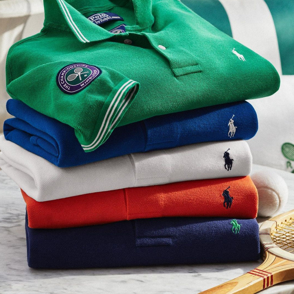
Image Source: https://www.instagram.com/poloralphlauren/ | Image Courtesy: Ralph Lauren
The Philosophy & Meaning Behind Ralph Lauren Logo Design
If you've been following our deep-dive into the Ralph Lauren logo design, you're in for a treat. In this section, we're going to go a step further by exploring the philosophy and meaning that anchor this iconic emblem. Because let's be honest, a logo isn't just a pretty picture—it's a brand's visual thesis statement. Ready to decode the message hidden in plain sight? Let's get into it!
Luxury & Aspiration
The Ralph Lauren logo design speaks volumes without uttering a word. The polo player in action symbolizes not just sportiness, but a certain level of affluence and luxury. The image takes us to polo matches frequented by the elite, communicating the aspirational lifestyle that the brand represents. As designers, we're reminded that the power of suggestion can work wonders for a brand’s identity.
Timeless American Style
The man on the horseback isn’t just any athlete; he's a polo player—an iconic symbol of American style. This is more than mere coincidence; it's a calculated design choice that speaks to Ralph Lauren’s American roots. For us designers, the lesson is to consider cultural elements that can root a brand in its origins, adding layers of depth and meaning to a logo.
Sporty yet Sophisticated
The polo player and horse conjure images of athleticism, but they do it in a way that oozes sophistication. This dual imagery serves as a brilliant reminder for graphic designers: a well-thought-out design can encapsulate more than one facet of a brand’s identity.
Subtlety & Understatement
While some logos scream for attention with flashy colors and intricate designs, the Ralph Lauren logo design whispers. Its monochrome palette and straightforward silhouette tell us that sometimes less is more, especially if the brand itself has a story rich enough to fill in the gaps. The takeaway here? Don’t underestimate the impact of understatement and subtlety.
Versatility
The logo’s design is versatile enough to appear on a wide range of products—from high-end fashion collections to home goods. This teaches us designers the importance of creating flexible designs that can span different product categories without losing brand coherence.
The Ralph Lauren logo design is a symbol loaded with meaning, serving as a masterful execution of branding philosophy. It's a multifaceted emblem that communicates luxury, American tradition, sportiness, and elegance—all without being overt or flashy. For graphic designers looking to imbue deeper meaning into their work, this logo serves as a classic example to learn from. So, the next time you’re sketching out ideas for a brand that needs to communicate complex ideas simply, think of the polo player and his horse—sometimes the simplest designs speak the loudest.

Image Source: https://www.instagram.com/poloralphlauren/ | Image Courtesy: Ralph Lauren
What Can We Learn from Ralph Lauren Logo Design
Welcome back to our exploration of the iconic Ralph Lauren logo design! We've looked at its history, analyzed its evolution, and even delved into the philosophy behind it. But now, it's time for the grand finale: what can we, as graphic designers, actually learn from this enduring emblem? Whether you're a seasoned vet or a newbie dipping your toes into the design pool, Ralph Lauren's iconic logo has some key takeaways for all of us. Buckle up, because these insights are gold.
Less is More
The Ralph Lauren logo design is a masterclass in minimalism. With just a simple silhouette of a polo player on horseback, it conveys luxury, elegance, and sportiness. No frills, no fuss—just a straightforward image that’s easily recognizable. The lesson? Don’t clutter your design with unnecessary elements. Make each line and curve count.
Storytelling Through Symbols
Each element of the Ralph Lauren logo design is a storytelling vehicle—from the sport of polo representing an aspirational lifestyle, to the American roots showcased by the choice of sport. For us designers, this underscores the importance of symbolism in logo design. Every icon, color, and font should work in tandem to tell a compelling story that aligns with the brand's values.
Consistency is Branding 101
We can't stress enough how the Ralph Lauren logo has remained largely consistent since its inception in 1974. It's become the visual shorthand for the brand, instantly recognizable worldwide. Takeaway? Consistency helps in building brand recognition and loyalty. Don't keep changing things up unless it's absolutely necessary for rebranding or evolving business needs.
Adaptability is King
As much as consistency is vital, so is adaptability. The Ralph Lauren logo design works equally well on a perfume bottle as it does on a billboard. This kind of scalability is a crucial trait that every logo should possess. The lesson here? Make sure your design is flexible enough to work across a variety of media and sizes.
Emotional Resonance Matters
Last but certainly not least, a great logo resonates emotionally with its audience. Ralph Lauren's logo isn’t just a symbol; it's a lifestyle aspiration for many. When designing, think about the emotional hook of your logo. What feelings or desires does it evoke? A strong emotional connection can set a logo apart in a crowded marketplace.
The Ralph Lauren logo design is a blueprint for effective branding: simple yet meaningful, consistent yet adaptable, and emotionally resonant. If you're looking for a crash course in logo design excellence, you could do far worse than studying this timeless emblem. Keep these principles in mind, and you're already on your way to designing the next iconic logo. Happy designing!
Conclusion
Alright, we've journeyed through the history, evolution, philosophy, and even dissected the design lessons packed into the iconic Ralph Lauren logo design. Whether you're a seasoned pro or just getting your feet wet in the design world, this emblem stands as a timeless textbook example. It's minimal yet powerful, consistent but adaptable, and above all, it knows how to tell its brand story. So, the next time you're in a creative rut or just need some design inspiration, think of that polo player riding high—sometimes the best lessons come from designs that have stood the test of time.
Let Us Know What You Think!
These fantastic logo design articles are written and curated by Kreafolk's team. We hope you enjoy our information and remember to leave us a comment below. Cheers!




Leave a Comment