Versace Logo Design: History & Evolution
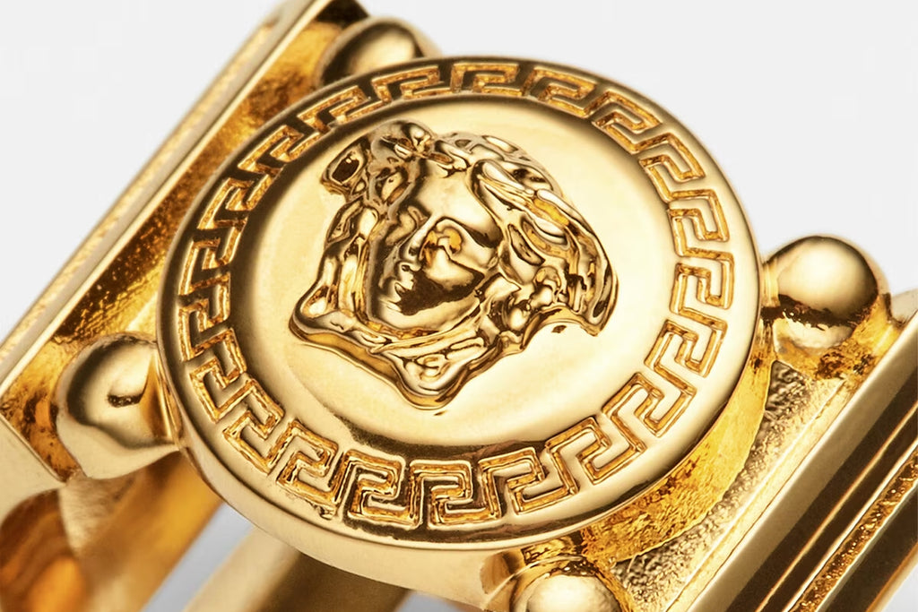
Image Source: https://www.versace.com/ | Image Courtesy: Versace
When diving into the world of iconic brand symbols, the Versace logo design undeniably stands tall among the greats. An emblem that effortlessly blends luxury with classical mythology, the Versace brand has managed to remain both timeless and ever-evolving. If you're a graphic designer, you've undoubtedly marvelled at the intricacy and storytelling embedded in this design.
The famous Medusa head, which is central to the logo, isn’t just a flashy emblem; it's steeped in history, representing both the brand's roots and its aspirations. Whether you're curious about its origin or how it has transformed over the years, this exploration into the Versace logo design promises a blend of history, artistry, and the genius of branding. So, fellow designers, buckle up and let's embark on this journey, unraveling the layers behind one of fashion’s most recognized and beloved symbols.
Versace Logo Design History
1980 - 1990
Ah, the 80s—a decade bursting with unique design aesthetics and a time when the Versace brand was truly coming into its own. To really understand the Versace logo design during this era, we must first transport ourselves back to the heart of this dynamic decade, a time of boldness, transformation, and undeniable style. So, let's hit rewind and delve into the Versace design language of the 1980s.
When Gianni Versace first stepped onto the scene, he didn't just bring innovative fashion designs; he also introduced a distinct branding vision. In the early days, the very first Versace logo took a departure from the more complex symbols we might associate with the brand today. Rather, it was an exercise in simplicity and legibility. The legendary designer opted for a custom monochrome inscription, utilizing a narrowed sans-serif typeface. It emphasized both "Gianni" and "Versace", with the two name segments drawn so closely together they were nearly inseparable, symbolizing the intimate connection between the designer and his budding brand.
To the discerning eye of a graphic designer, especially those with a passion for typography, you'd notice the uncanny resemblance of this typeface to the Sophi Sophi Regular font. This font choice, with its sleek and modern design, resonated deeply with the emerging trends of the 80s—both in fashion and graphic design. The sans-serif selection suggested a forward-thinking, contemporary appeal, ensuring that the Versace brand would be synonymous with modern luxury.
However, while this Versace logo design might seem minimalistic compared to later iterations, it wasn't devoid of character. The closeness of the name segments, the carefully chosen typeface, and the monochromatic palette all worked together to create an emblem that was immediately identifiable. It subtly whispered sophistication, setting the stage for the more intricate designs that were soon to follow in subsequent years.
In the 1980s, the Versace logo design didn’t just represent a brand—it encapsulated an entire movement. Gianni Versace was more than a designer; he was a trendsetter, pushing boundaries in the fashion realm. And this earlier logo version, with its modern typeface and unmistakable style, was a testament to his vision. It was a beacon for things to come, promising innovation and luxury, two principles at the heart of the Versace ethos.
In the world of graphic design, where change is the only constant, it's fascinating to trace back the roots of iconic emblems like the Versace logo. Understanding its evolution during the 80s offers us a unique glimpse into the brand’s foundational values, a legacy that still resonates with designers and fashion enthusiasts alike today.

Image Courtesy: Versace
1990 - 1997
Stepping into the 90s, the world of fashion experienced a paradigm shift. As aesthetics evolved and brands redefined their identities, so too did the Versace logo design. It was an era marked by bold choices, sleek silhouettes, and a move towards more pronounced branding. If the 80s was about setting the stage, the 90s for Versace was about making a statement.
In 1990, the Versace brand underwent a transformative redesign. While the ethos remained rooted in luxury and distinctiveness, the logo saw an overhaul that embraced the essence of the decade. Gone was the earlier monochrome inscription, making way for a bolder, smoother iteration. The new design featured a capitalized inscription, a definitive nod to the brand's growing confidence and prominence in the fashion industry. Crafted in a bold sans-serif typeface, reminiscent of Radiant RR Bold, the logo commanded attention. Each letter, slightly narrowed yet distinctly solid, resonated with purpose, mirroring the brand's dedication to impeccable craftsmanship.
For graphic designers and typography enthusiasts, this version of the Versace logo design is a masterclass in adaptability. The "Gianni Versace" lettering, while undeniably bolder, maintained a fluid versatility. Depending on the brand's requirements, the inscription could be presented seamlessly in one line or split across two levels. This flexibility ensured that the logo remained relevant across diverse platforms, be it fashion labels, print advertisements, or storefronts. Moreover, this adaptability, while seemingly a simple design choice, speaks volumes about the brand's foresight into the evolving world of marketing and branding during the 90s.
The transition from the 80s to the 90s in the Versace logo design narrative reflects more than just a change in typography. It mirrors the brand's journey from a promising fashion house to an industry titan. This era's logo is not just a representation of the brand; it's a testament to Gianni Versace's vision of building a legacy that seamlessly blends tradition with innovation.
To sum it up, the Versace logo design from 1990 to 1997 is a celebration of the brand's evolution. A shift from subtlety to boldness, from foundational beginnings to undeniable global recognition. It’s a gentle reminder for all graphic designers that while logos are visual symbols, they are, more importantly, stories - tales of dreams, growth, and unwavering passion. And in the case of Versace during these years, it's a tale of mastering the delicate dance between heritage and reinvention.

Image Courtesy: Versace
1993 - 1997
Ah, the mid-90s—a transformative period in design history and an especially pivotal era for the Versace brand. To any graphic designer familiar with luxury brand logos, the mention of "Versace" instantly conjures the iconic Medusa emblem. However, this wasn't always the case. Let’s journey back to 1993 when Versace's visual identity underwent a legendary transformation.
1993 was a landmark year in the Versace logo design story. While the earlier years were characterized by typography and sleek inscriptions, this year heralded the introduction of an emblem that would become synonymous with the brand—the Medusa. Drawing deep from Greek mythology, the monochrome, contoured image of this captivating creature debuted, encapsulating the allure, luxury, and mystique of the Versace brand. This emblem wasn't just any representation; it was encased within a wide, rounded frame, embellished with a traditional Greek geometric ornament, echoing the brand’s Mediterranean heritage and affinity for classical motifs.
This period saw the Versace logo design in primarily a monochrome color palette, fitting for a symbol as powerful as Medusa. Yet, the brand's penchant for opulence also ushered in iterations of the emblem in gold and black, an undeniably regal combination that screamed luxury. Whether it was embossed on leather goods, embroidered onto apparel, or elegantly printed on their fashion line, this logo variation shone in all its glory.
Interestingly, while the Medusa emblem could stand alone as a testament to Versace’s identity, it was also seen accompanied by the logotype introduced the same year. This typeface, a nod to the 1993 design, was a masterful blend of the brand's evolving aesthetic, ensuring the Versace name remained imprinted in the minds of its admirers.
For graphic designers, the introduction of the Medusa emblem during this period is a lesson in brand storytelling. The emblem is not merely an artistic choice; it's a narrative, intertwining the brand's ethos with a mythological tale. The Medusa, with her enthralling gaze, was said to make anyone who looked at her turn to stone. Similarly, Versace aimed to captivate its audience, making them enamored with the brand’s allure.
To sum it up, the Versace logo design from 1993 to 1997 is a testament to the brand's ability to evolve while staying true to its roots. By integrating classical mythology with contemporary design elements, Versace reminded the world that true luxury lies in the blend of storytelling, heritage, and impeccable design. It's a legacy that continues to inspire graphic designers and fashion aficionados alike.
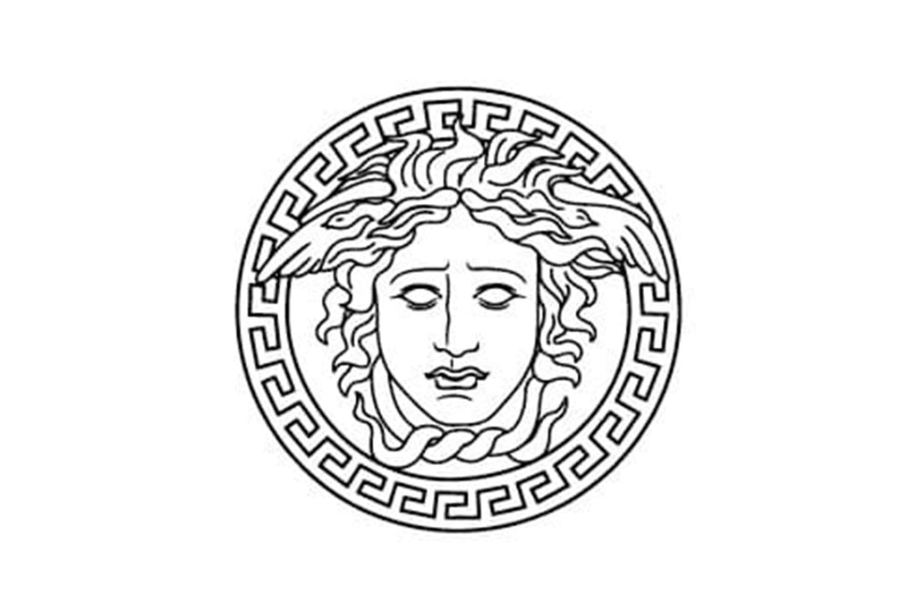
Image Courtesy: Versace
1997 - 2008
The late 90s to early 2000s marked an emotionally charged period for Versace. The untimely and tragic demise of its founder, Gianni Versace, in 1997, reverberated across the fashion industry, leaving a void that seemed impossible to fill. In the wake of this loss, the Versace brand, synonymous with Gianni’s genius, underwent an evolution in its identity. As we delve deeper into this era of the Versace logo design, we see a reflection of the brand's resilience and commitment to its legacy.
Post-1997, a significant shift occurred. The brand's name transitioned from "Gianni Versace" to just "Versace". This change, more than just being symbolic, was reflected in the brand's visual identity. The Medusa emblem, which had become iconic by this time, saw a reimagining. No longer was it the fierce gaze from before; instead, the face of the Medusa morphed into a more tender and feminine visage. This change can be interpreted in many ways. Some might see it as a nod to the brand’s softer, more elegant direction. Others could view it as a symbol of respect and tribute to Gianni’s memory, embodying a gentle strength in the face of adversity.
Beneath this evolved Medusa emblem, the wordmark underwent its own transformation. Now presented in all capitals, the "VERSACE" inscription arched gracefully beneath the Medusa, exuding a sense of pride and reverence. The choice to have the wordmark in all capitals is particularly compelling. While the Medusa became more delicate, the wordmark's typography became robust and linear. The contours of the letters were straight and strong, balancing the emblem's softness. It showcased a brand that was both vulnerable in its loss yet unyielding in its resolve to march forward.
For graphic designers examining the Versace logo design from 1997 to 2008, there's a profound lesson in storytelling. Logos aren't just about aesthetics; they capture emotions, histories, and transitions. The alterations made during this period speak of a brand honoring its past, embracing its present, and forging ahead into its future.
In wrapping up this chapter, the Versace logo from this era stands as a poignant reminder of the brand's journey through grief, resilience, and evolution. While change is an intrinsic part of design, the reasons behind those changes, especially in instances as profound as this, resonate deeply, offering insights and inspirations to designers and brand enthusiasts alike.

Image Courtesy: Versace
2008 - Present
The ever-evolving world of fashion is a testament to the adage, "Change is the only constant." Brands, in their pursuit of staying relevant and resonant, often transition through different visual identities, mirroring their growth, shifts in direction, or changing aesthetics. Versace, with its rich design history, is no exception. As we steer into the period from 2008 to the present, the Versace logo design presents an exciting blend of the classic and the contemporary, marking yet another pivotal chapter in the brand's storied journey.
In 2008, the logo underwent another refinement, a clear indication of Versace's adaptability. The Medusa emblem, a long-standing symbol of the brand’s allure and mystique, remained prominent. However, the wordmark saw significant changes. Enlarged and given its space to breathe, "VERSACE" was now placed horizontally right beneath the emblem, creating a balanced visual hierarchy. This straightforward positioning gave the brand name increased prominence, ensuring that while the Medusa captivated, the Versace name commanded equal attention.
Presently, Versace offers a dual take on its logo, catering to diverse branding needs and aesthetic preferences. One version is ornate, lavish in its detailing, echoing the brand's penchant for luxury and extravagance. It's replete with accents, showcasing the brand's commitment to meticulous craftsmanship and design. This variant speaks volumes to the audience familiar with Versace's legacy of opulence.
Conversely, the second badge is a testament to modern minimalism. It features the Medusa's head, but with restraint. Stripped of excessive detailing, the design focuses on essential touches and lines. This streamlined approach aligns with contemporary design sensibilities, resonating with a newer audience while retaining the essence of the brand's core identity.
For graphic designers and brand enthusiasts, this dual approach to the Versace logo design offers rich insights. It underscores the importance of versatility in branding. By having two distinct versions, Versace ensures it can seamlessly navigate diverse platforms and contexts, from high-end print campaigns to digital interfaces, without compromising its brand essence.
To sum up the journey from 2008 to the present, Versace's logo evolution is a masterclass in balancing heritage with innovation. The brand, while deeply rooted in its iconic past, showcases an agility to embrace the new. It's a reminder that in the world of design, reverence for tradition and openness to change aren't mutually exclusive; they can coexist, and in the case of the Versace logo design, thrive beautifully together.
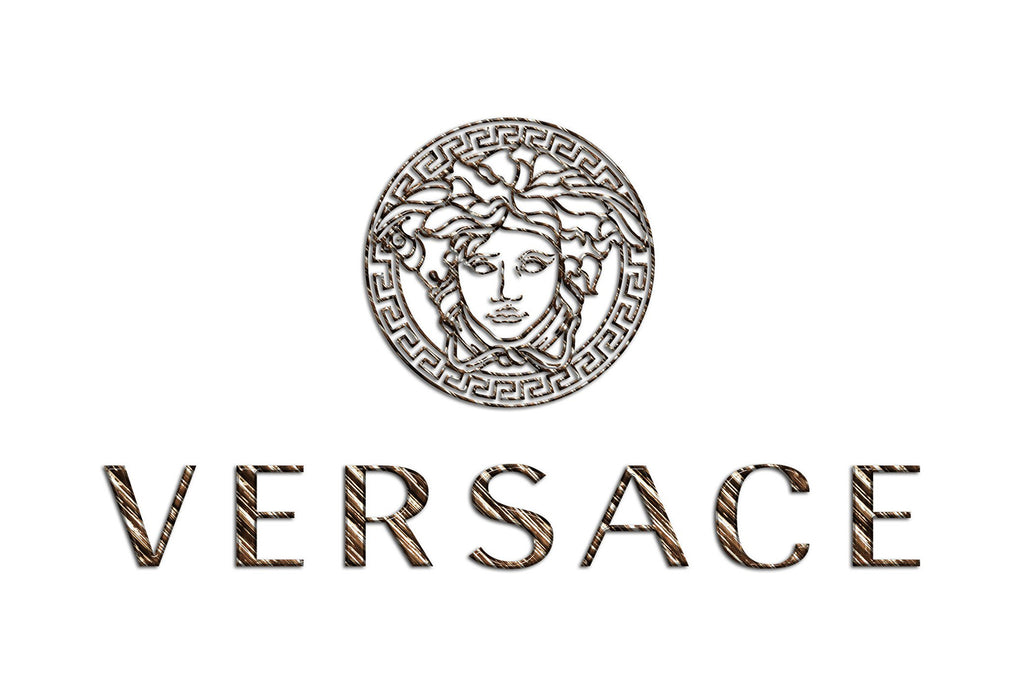
Image Courtesy: Versace
Analysis: Versace Logo Design Evolution
Logos, like living entities, have lifecycles. They're born, they mature, and they evolve, mirroring the brand's journey and the shifting sands of time. Versace, a titan in the fashion industry, offers a rich tapestry of design evolution that's as enthralling as its haute couture collections. For graphic designers, analyzing the Versace logo design across decades offers a masterclass in branding, storytelling, and adapting to the zeitgeist. Let's dive into five pivotal points that chart the logo's metamorphosis.
Less is More
The nascent stages of the Versace brand were marked by simplicity. The initial logo, primarily typographic, exuded understated elegance. Using a typeface reminiscent of the Sophi Sophi Regular font, the logo then embodied minimalism, emphasizing the brand name without any additional frills.
The Iconic Medusa
The 90s were transformative for Versace, especially with the introduction of the Medusa emblem in 1993. Drawing from Greek mythology, this emblem underscored Versace's allure and luxury. More than just a logo, the Medusa became a narrative, intertwining Versace's ethos with age-old tales of enchantment.
Tribute & Transition
Gianni Versace's untimely passing in 1997 deeply impacted the brand. The logo mirrored this emotional phase, evolving to portray a softer, more tender Medusa. Simultaneously, the typography became more assertive, showcasing a brand resilient in its grief and robust in its vision.
Modern Minimalism vs. Ornate Opulence
The 2008 refinement marked a dual approach in the Versace logo design. While one variant reveled in detailed luxury, the other embraced contemporary minimalism. This duality allowed Versace to cater to diverse branding needs, striking a chord with both traditionalists and modernists.
Versatility in Application
Today’s Versace ensures its logo remains versatile. The two distinct designs, ornate and minimalist, enable the brand to navigate seamlessly across platforms, from opulent print ads to sleek digital interfaces. This versatility underscores a brand that's both rooted in tradition and agile in its modern adaptations.
The Versace logo design evolution isn't just about changing aesthetics; it's a chronicle of a brand's journey through triumphs, tragedies, and transformations. Every twist and turn in its design path offers insights, making it a fascinating study for graphic designers and branding aficionados. As Versace continues to evolve, its logo stands as a beacon of design excellence, marrying the past's grandeur with the present's innovations.

Image Source: https://www.versace.com/ | Image Courtesy: Versace
The Philosophy & Meaning Behind Versace Logo Design
At the intersection of high fashion and iconic branding lies the emblematic world of Versace. The house of Versace isn't merely synonymous with opulence and luxury; it also boasts one of the most recognized logos in the fashion domain. As we pull back the curtain on the Versace logo design, a rich tapestry of symbolism, intention, and design prowess unravels. Delving deeper into its core reveals not just a logo, but a philosophy and a story waiting to be told. Let's decode the layers of meaning embedded within.
Medusa
Central to the Versace logo design is the captivating figure of Medusa. Drawn from Greek mythology, Medusa represents a mesmerizing beauty that leaves onlookers spellbound, almost turning them to stone with her gaze. This choice isn't mere aesthetics. It speaks to the brand's intention: to create fashion pieces so stunning, they leave the world enchanted and captivated.
Circular Design
The rounded emblem that houses Medusa is more than a design choice. Circles often symbolize eternity, wholeness, and timelessness. By encasing Medusa within a circle, Versace reinforces its commitment to everlasting elegance and the enduring allure of its designs.
Geometric Ornaments
Versace often surrounds its Medusa emblem with classic Greek geometric patterns. This design choice pays homage to the brand’s roots and Gianni Versace's love for historical art and architecture. It's a nod to the brand’s lineage and its deep connections to artistic grandeur.
Bold Typography
The Versace typography, especially in its latter versions, is bold, assertive, and dominant. This choice speaks to Versace’s standing in the fashion world. It's not just a label; it's an authority, a trendsetter, and a benchmark in haute couture.
Dual Approaches
choice to have both ornate and minimalist logo versions showcases its ability to bridge different eras. It respects its rich past, laden with intricate details, while simultaneously embracing the future's minimalist leanings. This duality is a testament to Versace's ability to evolve while staying true to its core.
The Versace logo design is more than just a brand identifier; it's a canvas that portrays the brand's ethos, ambitions, and legacy. Every element, from Medusa's gaze to the choice of typography, carries weight and intention. For graphic designers, it stands as a testament to the power of design in communicating a brand's essence, making the Versace emblem not just iconic in fashion, but also in the world of design.

Image Source: https://www.versace.com/ | Image Courtesy: Versace
What Can We Learn from Versace Logo Design
Whenever we talk about iconic brands that seamlessly merge luxury, history, and design, Versace inevitably dominates the conversation. The brand doesn’t just stop at crafting impeccable fashion pieces; its foray into design, especially the Versace logo design, offers invaluable lessons for graphic designers. Whether you're a seasoned professional or a budding designer, there's a well of inspiration and insight to be drawn from the brand's visual journey. Let's unpack some of these lessons.
Consistency Cultivates Brand Recognition
Over the decades, while the Versace logo design saw refinements, the core – the Medusa emblem – remained consistent. This consistency ensures that regardless of minor tweaks, the brand remains instantly recognizable. Lesson? Even as designs evolve, retaining a consistent core element can solidify brand recall.
Symbolism Deepens Connection
The choice of Medusa isn’t arbitrary. It's laden with symbolism, drawing parallels between the brand's offerings and Medusa's mesmerizing allure. As designers, weaving in symbolism can turn a logo from mere visuals to a narrative, deepening the emotional connection with the audience.
Versatility is Golden
Versace’s dual approach to its logo – ornate and minimalist – underscores the importance of versatility in design. With the digital age seeing brands sprawled across diverse platforms, having a logo that's adaptable is crucial. A design that looks equally compelling on a billboard, a website, or a business card is a true winner.
Respect for Heritage Enhances Authenticity
The Greek patterns encircling Medusa, the choice of bold typography reminiscent of historical fonts – all show reverence for the brand's heritage. For designers, integrating elements that nod to a brand's roots can add layers of authenticity and depth to the design.
Evolution is Inevitable and Necessary
While consistency is vital, so is evolution. The shifts in the Versace logo design, from its typography to the Medusa portrayal, show that brands must evolve to stay relevant. Design isn't static; it must adapt, mirroring the brand's growth and the changing zeitgeist.
The Versace logo design is more than just a lesson in aesthetics; it's a masterclass in branding strategy, storytelling, and adaptability. As graphic designers, delving into such iconic designs not only offers inspiration but also tangible insights to refine our craft. Every curve, contour, and color choice in the Versace emblem whispers a design secret, waiting to be decoded and embraced.
Conclusion
In the vast landscape of branding, the Versace logo design stands as a beacon of excellence, effortlessly merging history, luxury, and strategic design. For graphic designers, it offers a rich tapestry of lessons — from consistency and adaptability to the power of symbolism. As we navigate the evolving design realm, iconic symbols like Versace's emblem serve as both inspiration and a testament to the timeless impact of well-crafted visuals. Let's continue to draw from such masterpieces, elevating our work and celebrating design's transformative magic.
Let Us Know What You Think!
These fantastic logo design articles are written and curated by Kreafolk's team. We hope you enjoy our information and remember to leave us a comment below. Cheers!




Leave a Comment