Burberry Logo Design: History & Evolution

Image Courtesy of Burberry
The story of Burberry logo design is a fascinating journey through British heritage, luxury fashion, and modern minimalism. For over a century, Burberry has remained one of the most recognizable names in the industry, and its visual identity has played a crucial role in shaping that reputation. From the iconic Equestrian Knight emblem to the sleek contemporary wordmarks seen today, each redesign reflects the brand’s evolving vision while honoring its rich past.
Burberry was founded in 1856, and its logo design has consistently mirrored the house’s commitment to craftsmanship, innovation, and timeless style. The early emblems emphasized tradition and aristocratic elegance, while later updates embraced simplicity and global appeal. Every shift in typography, symbol, and structure tells a story about changing fashion eras and branding strategies.
In this article, we will explore the complete history and evolution of Burberry logo design, highlighting key transformations and the creative decisions behind them. Whether you are a designer, fashion enthusiast, or branding expert, this deep dive into Burberry’s visual identity reveals how a logo can define a legacy.
Burberry Logo Design History
1901 - 1968
The early years of the 20th century marked the beginning of a significant era for the Burberry brand, and the Burberry logo design played a key role in defining its identity. Introduced in 1901, the very first logo for the fashion label was both bold and symbolic, setting the tone for the brand's luxurious image.
Dominating the logo was a vibrant red emblem depicting an equestrian with a pike and shield. This choice wasn't arbitrary; the equestrian figure symbolized power and nobility, a perfect representation of Burberry's sophisticated appeal. The pike, adorned with a weaving flag, bore the Latin word "Prorsum" (meaning "forward") and an ornate letter “B”. This unique combination added an air of authenticity and tradition to the Burberry logo design.
The detailed portrayal of the emblem was indeed the focal point of the logo, but the wordmark underneath was equally impressive. Executed in all capitals in a bold serif typeface, it looked solid and powerful, encapsulating the brand's commitment to quality and strength.
The letter “B” drawn on the shield not only added to the aesthetic appeal of the emblem but also served as an unmistakable representation of the brand itself. Along with the inclusion of "Prorsum," it accentuated the distinctiveness of the Burberry logo design.
Over the decades, this original design stood as a testament to Burberry's heritage and class. While the fashion world evolved and changed around it, the 1901 Burberry logo remained untouched, its red hue and equestrian imagery exuding a sense of timeless elegance.
But logos, like fashion, often change with the times, and the Burberry logo design was no exception. While it retained its fundamental identity, the years leading up to 1968 saw subtle refinements and alterations, keeping the design in line with contemporary tastes without losing its core essence.
The Burberry logo design from 1901 to 1968 is not just a visual symbol; it's a rich narrative of a brand that knew how to intertwine elegance, heritage, and quality in one unique emblem. Through its detailed equestrian imagery and solid wordmark, this logo successfully encapsulated what Burberry stood for during this pivotal period. It laid the groundwork for the future, sowing the seeds for the evolution that would continue in the years to come, and remains an essential part of the history of Burberry logo design.
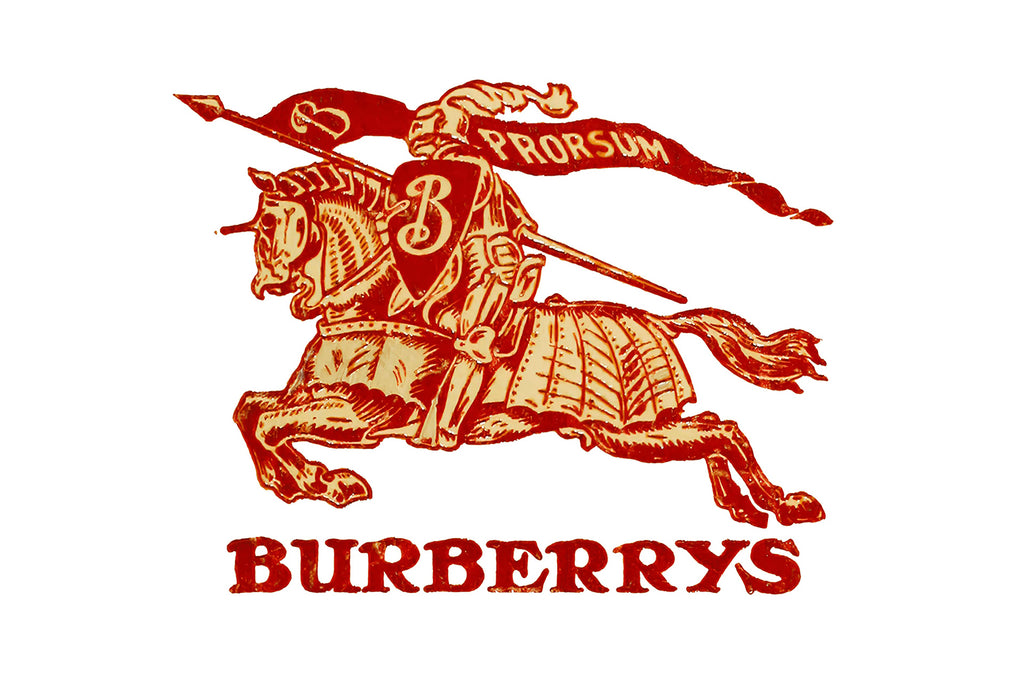
Image Courtesy of Burberry
1968 - 1999
The evolution of the Burberry logo design took a significant turn in 1968, reflecting a shift in focus and a modernized approach to brand identity. During this era, the wordmark transitioned to become the star of the logo, signaling a departure from the emblem-centric design of the past.
The emblem, once rich and detailed, was transformed into a black solid silhouette. Gone were the intricate features of the equestrian with a pike and shield; the emblem was now smaller and abstract, without any details and letters. This reduction in complexity was a deliberate move, aiming to distill the essence of the brand into a more streamlined and contemporary form.
While the emblem was simplified, the wordmark underwent a transformation of its own. The lettering was now presented in title case, bringing a softer and more refined touch to the Burberry logo design. A delicate "Of London" tagline was added in all-caps, written in the same serif typeface as the main inscription. This subtle addition not only emphasized the brand's British heritage but also infused a sense of cosmopolitan sophistication into the design.
The transformation of the logo during this period was more than just an aesthetic choice. It was a reflection of the company's growing influence and its alignment with the values of style, elegance, history, and legacy. The redesign showcased Burberry's metamorphosis into a fashion powerhouse, one that had matured and evolved to meet the tastes and demands of a changing world.
What made the 1968 Burberry logo design so iconic was its balance between tradition and modernity. It retained enough of its original character to honor its rich history while embracing contemporary design principles to project an image of timeless elegance. The abstraction of the emblem and the finesse of the wordmark worked in harmony to create a visual identity that resonated with a global audience.
This logo remained consistent through the following decades, becoming a symbol of the brand's unwavering commitment to quality and innovation. The new Burberry logo design was not just a marketing tool; it was a statement of intent, representing an influential company that understood its roots and was unafraid to adapt and evolve.
The Burberry logo design from 1968 to 1999 marked a critical phase in the brand's journey, shaping its identity in the modern fashion landscape. It stands as an inspiring lesson in branding, demonstrating how a logo can transform to reflect changing times while staying true to its core values. This period in the Burberry logo design history is a testament to the brand's ability to innovate without losing sight of its heritage, a quality that continues to define Burberry to this day.

Image Courtesy of Burberry
1999 - 2018
As we approach the close of the 20th century, the Burberry logo design underwent another notable transformation, marking a new era of refinement and elegance. The 1999 redesign balanced the elements of the logo in a way that spoke to both its history and its modern sensibilities.
The emblem, once diminished, was enlarged, and the rider returned with white contours, breathing life back into the symbol that had once defined the brand. This restoration of the emblem's prominence was a thoughtful nod to the past, blending tradition with modernity in a way that only Burberry could master.
The wordmark, although made slightly smaller, was anything but diminished. Now presented in all capitals of an elegant serif typeface very similar to the fonts in the Bodoni Family, the inscription displayed sleek sophisticated lines and thin serifs. This change gave the Burberry logo design a fresh, stylish appeal while preserving its strong, confident character.
Subtle yet significant adjustments were made to the tagline as well. The "Of" part was gracefully removed, leaving only the word "London" in capital letters. Executed in the same font as the main wordmark, but in a smaller size and with thinner lines, this minimalist approach perfectly complemented the overall design.
The 1999 Burberry logo design was more than a simple aesthetic update; it was a harmonization, a carefully considered reimagination that encapsulated the best of what Burberry had become. It looked professional and classy, representing the brand's expertise in fashion and design, along with a huge reservoir of experience.
This era of the Burberry logo design stood as a symbol of the brand's relentless pursuit of excellence, mirroring its growing influence and prestige in the global fashion industry. The logo’s blend of traditional imagery with contemporary typography provided a visual manifestation of Burberry's commitment to innovation, quality, and elegance.
In the context of the evolving landscape of fashion, the 1999 redesign of the Burberry logo served as a testament to the brand's ability to adapt, innovate, and lead. It struck a delicate balance between honoring its storied history and embracing a future filled with possibilities.
The Burberry logo design from 1999 to 2018 reflects a brand that knows its roots but is unafraid to evolve. This period in the logo's history is not just a chapter in a design textbook; it's a story of how attention to detail, respect for tradition, and a passion for innovation can create a visual identity that's as timeless as it is contemporary. It continues to be a source of inspiration for designers and brand enthusiasts alike, highlighting the enduring power of intelligent and intuitive design in the ever-changing world of fashion.

Image Courtesy of Burberry
2018 - 2023
The story of the Burberry logo design took a bold and decisive turn in 2018, heralding a new era for the iconic brand. With this redesign, Burberry embraced a modern and youthful approach to design, emphasizing the progressive and energetic character that the brand sought to project.
This latest iteration of the Burberry logo design is a striking departure from its predecessors. The knight, a long-standing symbol of the brand's heritage, was removed from the official logo. This significant change signaled a willingness to evolve and adapt, reflecting a brand not only ready to follow current new trends but ambitious enough to create them.
However, the knight's absence from the official logo doesn't mean it has been completely forsaken. It continues to grace the tags and packaging of the brand, as well as patterns on the branded clothing and accessories. By retaining this connection to its past, Burberry skillfully pays homage to its history while emphasizing its commitment to innovation.
The wordmark itself underwent a transformation, adopting a cleaner, more minimalistic aesthetic. Usually used on its own, the wordmark occasionally is accompanied by a "London England" tagline, written in all capitals. This choice of typography imparts a sense of freshness and modernity to the Burberry logo design, while the tagline subtly underscores the brand's deep connection to its British roots.
What sets the 2018 Burberry logo design apart is its ability to balance tradition and innovation. By selectively retaining elements from its past and combining them with new design principles, Burberry created a visual identity that resonates with both long-time admirers and a new generation of followers.
This iteration of the Burberry logo design represents more than just a stylistic choice; it is a statement of intent. It reflects a brand that is confident and forward-looking, unafraid to reinvent itself while remaining true to its core values. The modern simplicity of the wordmark and the innovative use of traditional elements demonstrate Burberry's expertise in fashion and design, as well as its vast experience.
The Burberry logo design from 2018 to 2023 symbolizes a dynamic and evolving brand that understands the pulse of contemporary fashion. It's an inspiring example of how a brand can transform itself without losing its essence, perfectly capturing the zeitgeist of the times while paying respect to its storied past. The story of the Burberry logo design is a continuous journey of innovation, creativity, and adaptability, and this latest chapter is a vivid reminder that the ability to evolve is at the heart of enduring success in the ever-changing world of fashion.

Image Courtesy of Burberry
2023 - Present
With the arrival of 2023, the Burberry logo design once again transformed, dramatically reshaping the iconic brand's visual identity. This redesign has ushered in a new era for Burberry, infusing the logo with a sense of vivacity, elegance, and nostalgia.
The new typeface introduced in the 2023 Burberry logo design is a complete departure from its predecessors. Gone is the minimalist approach of recent years; in its place, a fancy and elegant font takes center stage. With shots and playful serifs on the end of slightly flared bold bars, this typeface has a charisma all its own.
Set in plain black, the refined uppercase inscription now exudes a more feminine and lively vibe. The characters seem poised to start dancing above the line, each letter brimming with a unique personality. This fresh approach to the Burberry logo design has breathed new life into the brand, resonating with a sense of joy and sophistication.
The new font's style finds a delightful middle ground between Moonllys Regular and Valeson Condensed Regular. This choice carries a hint of nostalgia, allowing the logo to simultaneously embrace modernity and pay homage to timeless elegance.
What's truly captivating about the 2023 Burberry logo design is how it masterfully balances the various elements of style, mood, and tradition. The playful and lively characters connect with a contemporary audience, while the nostalgic undertones reach back to the brand's rich heritage. This synthesis creates a logo that is not only visually appealing but also emotionally resonant.
This latest redesign is more than just a change of font; it's a bold declaration of the brand's evolving identity. By embracing a design that is both fresh and reminiscent of classic elegance, Burberry signals its commitment to remaining at the forefront of fashion, setting trends, and honoring its legacy.
In the ever-evolving world of fashion, the Burberry logo design continues to be a beacon of innovation and creativity. The 2023 transformation reflects a brand that knows itself, is unafraid to take risks, and is dedicated to surprising and delighting its audience.
The Burberry logo design of 2023 to the present offers a vibrant and inspired glimpse into the future of a brand that has consistently been a trendsetter. With its dance-like letters, nostalgic flair, and lively spirit, it's a logo that speaks not just to the eyes but to the heart. As we look forward to what the future holds for Burberry, the current logo stands as a beautiful testament to a brand that continues to evolve, inspire and lead the way in the fashion world. It's a story of transformation that captures the essence of Burberry's relentless pursuit of excellence in design, and it's a story that is far from over.

Image Courtesy of Burberry
What Does The Burberry Logo Symbolize?
The story behind Burberry logo design is far more than a simple fashion statement. It is a carefully crafted visual identity that reflects British heritage, innovation, and timeless sophistication. When you look at the Burberry logo, you are not just seeing typography or an emblem—you are witnessing more than a century of luxury storytelling packed into a single mark.
The most historic symbol in Burberry logo design is the Equestrian Knight. Introduced in 1901, the knight rides confidently forward while holding a banner inscribed with the word “Prorsum,” which means “forward” in Latin. This detail alone reveals the brand’s philosophy: progress with honor. The armored knight represents strength, protection, and resilience—qualities that originally connected to Burberry’s functional outerwear and innovative fabrics like gabardine.
Beyond strength, the knight also symbolizes prestige. Equestrian imagery has long been associated with British aristocracy and tradition. By incorporating this emblem, Burberry logo design positioned the brand as both refined and authoritative. It quietly communicates craftsmanship, heritage, and a deep connection to British culture.
Fast forward to the modern era, and Burberry logo design took a bold minimalist turn. The detailed knight was simplified, and the focus shifted toward a clean, uppercase serif wordmark. At first glance, it may seem understated, but that simplicity speaks volumes. The sharp yet elegant letterforms convey confidence, luxury, and global relevance. In fashion, minimalism often signals maturity and power—and Burberry embraced that philosophy fully.
Typography in Burberry logo design plays a major symbolic role. The evenly spaced capital letters project clarity and authority. There is no clutter, no distraction—just the name. This reflects a brand that no longer needs excessive ornamentation to prove its value. The logo says, “We know who we are.”
Another symbolic layer in Burberry logo design is balance. Throughout its evolution, the brand has carefully walked the line between tradition and modernity. The reintroduction of the Equestrian Knight in recent branding updates shows that Burberry understands the emotional power of its heritage. By blending archival elements with contemporary styling, the logo becomes a bridge between generations of fashion lovers.
Color also contributes to meaning. While the logo often appears in black and white for a polished look, Burberry’s visual identity frequently connects with its iconic beige, red, black, and white check pattern. This association reinforces authenticity and instant recognition, even when the logo stands alone.
Ultimately, Burberry logo design symbolizes forward movement rooted in tradition. It represents innovation without abandoning heritage, confidence without excess, and luxury without shouting. Whether displayed on a runway, a trench coat, or a digital campaign, the Burberry logo carries a message of timeless British elegance with a modern edge.
That is the magic of Burberry logo design—it is not just a symbol. It is a legacy in motion.
What Is The Equestrian Knight In Burberry Logo Design?
If Burberry logo design were a movie, the Equestrian Knight would be the leading character. Introduced in 1901, this iconic emblem features a fully armored knight riding a horse while carrying a flag marked with the word “Prorsum,” meaning “forward” in Latin. From the very beginning, the knight was more than decorative artwork. It was a bold declaration of identity, purpose, and British pride.
The Equestrian Knight in Burberry logo design symbolizes strength, honor, and progress. At the time of its creation, Burberry was already known for innovation, particularly the invention of gabardine fabric. The knight visually reinforced the brand’s reputation for durability and protection. Just as armor shields a warrior, Burberry’s outerwear was designed to protect explorers, soldiers, and adventurers from harsh weather conditions.
But there is also a deeper layer of symbolism woven into this emblem. Equestrian imagery has long been associated with nobility and heritage in British culture. By choosing a knight on horseback, Burberry logo design subtly aligned the brand with aristocratic elegance and tradition. It communicated quality without needing explanation. The image spoke for itself.
The banner reading “Prorsum” adds even more meaning. This small yet powerful detail expresses forward movement and innovation. It reflects Burberry’s mindset: always progressing, always evolving. Even as fashion trends changed over decades, the knight remained a reminder that Burberry respects its past while confidently moving into the future.
Visually, the Equestrian Knight in Burberry logo design is intricate and detailed. The flowing lines of the horse, the structured armor, and the waving flag create a sense of motion and authority. It is dynamic, not static. That energy mirrors the spirit of the brand itself—luxurious yet practical, traditional yet forward-thinking.
In recent years, Burberry logo design shifted toward minimalist typography, temporarily placing the knight in the background. However, the emblem was never truly forgotten. Its return in updated branding demonstrates how powerful heritage symbols can be. By reintroducing the Equestrian Knight, Burberry reaffirmed its roots and strengthened its storytelling.
The beauty of the Equestrian Knight lies in its versatility. It works equally well embossed on leather goods, embroidered on garments, or displayed in digital campaigns. Whether detailed or simplified, the symbol retains its authority and elegance. Few fashion emblems carry such historical weight while still feeling relevant.
Ultimately, the Equestrian Knight in Burberry logo design is a visual representation of the brand’s DNA. It captures protection, prestige, and progress in a single mark. It reminds audiences that Burberry is not just a fashion label—it is a legacy built on craftsmanship and courage.
That knight is not just riding forward. It is carrying over a century of design excellence with it.
Who Designed The Modern Burberry Logo?
The modern Burberry logo design did not happen by accident. It was the result of a bold creative decision made during a transformative period for the British fashion house. In 2018, Burberry introduced a refreshed visual identity under the creative direction of Riccardo Tisci, who had just joined the brand as Chief Creative Officer. To bring this new vision to life, Tisci collaborated with renowned British graphic designer Peter Saville, a legend in the world of typography and branding.
This partnership marked a significant turning point in Burberry logo design. Saville is widely known for his minimalist and modernist approach, and that influence became immediately visible in the updated logo. The historic serif lettering was replaced with a clean, bold sans-serif wordmark displayed in all capital letters. The result was sharp, confident, and unapologetically contemporary.
The goal behind this modern Burberry logo design was clarity and global impact. In today’s digital world, logos must function seamlessly across websites, social media, packaging, and storefronts. The simplified typography ensured that the Burberry name would remain strong and legible at every scale. It was less about ornamentation and more about authority.
Peter Saville’s design philosophy played a major role in shaping this identity. Known for stripping visuals down to their essential elements, he helped transform Burberry logo design into something sleek and versatile. The spacing between the letters, the balanced proportions, and the refined structure all contribute to a sense of luxury through simplicity. It is proof that sometimes less truly is more.
Interestingly, the redesign also included a new monogram featuring the intertwined letters “T” and “B,” representing founder Thomas Burberry. This addition further modernized Burberry logo design while reconnecting the brand to its origins. The monogram introduced a fresh visual layer that could be used in patterns, prints, and digital branding.
The decision to modernize the logo sparked conversation in the fashion world. Some admired the bold minimalism, while others missed the traditional serif style and the historic Equestrian Knight emblem. However, that reaction only highlighted how emotionally powerful Burberry logo design truly is. When a logo carries more than a century of heritage, every update feels significant.
In recent updates, Burberry has reintroduced elements of its heritage, including the Equestrian Knight, showing that logo design is never static. It evolves with leadership, cultural shifts, and creative direction. The collaboration between Riccardo Tisci and Peter Saville demonstrates how design can reflect a brand’s new chapter while still respecting its legacy.
Ultimately, the modern Burberry logo design is the result of visionary leadership and world-class graphic expertise. It represents a moment when tradition met contemporary design thinking. And like all great fashion statements, it continues to evolve while keeping the Burberry name at the center of global luxury.
Conclusion
Burberry logo design is a powerful example of how heritage and modern style can coexist in perfect balance. From the iconic Equestrian Knight to the refined contemporary wordmark, Burberry has continuously evolved while protecting its British identity. Each redesign reflects changing creative leadership, cultural shifts, and the brand’s commitment to innovation. As a visual symbol, the Burberry logo represents strength, elegance, and forward movement. Its ability to adapt without losing authenticity proves why Burberry remains one of the most respected names in fashion and logo design history.
Let Us Know What You Think!
Every information you read here are written and curated by Kreafolk's team, carefully pieced together with our creative community in mind. Did you enjoy our contents? Leave a comment below and share your thoughts. Cheers to more creative articles and inspirations!





Leave a Comment