Yves Saint Laurent Logo Design: History & Evolution

Image Courtesy: Yves Saint Laurent
From its humble beginnings to the globally recognized emblem it is today, the Yves Saint Laurent logo design stands as an iconic testament to the brand’s legacy in the fashion industry. Emblematic of luxury, innovation, and impeccable craftsmanship, this logo has witnessed an intriguing evolution that mirrors the brand's journey over the decades.
Much like the haute couture collections that have sashayed down the runways, the Yves Saint Laurent logo design has its own story to tell, weaving through the annals of fashion history. In this article, we'll delve deep into the origins, inspirations, and the transformative journey of this legendary emblem. Whether you're a design enthusiast or a fashion aficionado, this exploration promises a unique perspective into the confluence of branding and high fashion. Join us, as we trace the indelible mark of Yves Saint Laurent in the tapestry of design evolution.
Yves Saint Laurent Logo Design History
1962 - 2012
In the rich tapestry of fashion's ever-evolving landscape, certain symbols remain timelessly evocative, and the Yves Saint Laurent logo design that graced the industry from 1962 to 2012 stands as a paragon among them. Characterized by its refined simplicity and a touch of opulence, this emblem succinctly encapsulated the spirit of Yves Saint Laurent's sartorial elegance.
At its inception, the original logo featured a captivating monochrome composition. Distinctly, it married a wordmark with an emblem, thoughtfully crafted from the three letters representing the essence of the designer's identity: YSL. This emblem, now one of the most recognizable fashion symbols globally, showcases intertwined capital letters. Crafted with bolder lines than the main wordmark, the emblem radiates luxury and finesse.
The wordmark's typography is a testament to meticulous design sensibilities. While the uppercase letters initiate each segment of the designer's name, there's a pronounced emphasis on the initials, with each of them being slightly enlarged. The typeface employed for the Yves Saint Laurent visual identity is reminiscent of the 'New Yorker' but with a contemporary twist. Its lines have been modernized and elongated, exuding a sense of fluidity. Furthermore, the proximity of the three distinct name segments — Yves, Saint, and Laurent — offers a sense of cohesion, underscored by an intentional absence of separators.
But perhaps the most enduring feature of the Yves Saint Laurent logo design during this fifty-year span is its masterful color play. The emblematic monochrome palette underscores the brand's ethos: timeless elegance. However, the brand occasionally dabbled in gold for the letters and emblem, a nod to the opulence the name Yves Saint Laurent often evokes. Yet, it's the classic black-and-white combination that the world predominantly associates with the brand, epitomizing a harmonious blend of modernity and timelessness.
In summarizing these five decades, it's evident that the Yves Saint Laurent logo design is more than just branding. It's a symbol, a story, and a reflection of a legacy that reverberates through the corridors of fashion history. Embracing both modernity and tradition, it is a beacon of luxury and a testament to the designer's enduring impact on the world of haute couture.
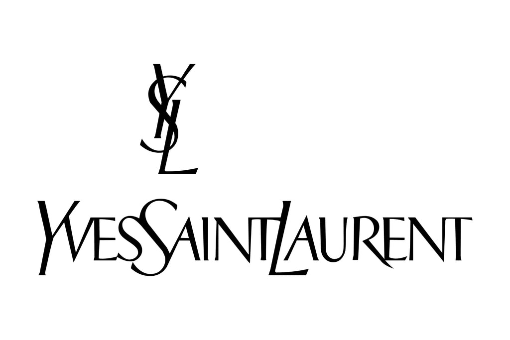
Image Courtesy: Yves Saint Laurent
2012 - Present
The realm of fashion is an ever-changing canvas, and the evolution of the Yves Saint Laurent logo design from 2012 onward exemplifies this transformative journey. This period marked a significant shift for the renowned fashion house, not just in aesthetics, but also in nomenclature. The name transitioned from the grandeur of 'Yves Saint Laurent' to the succinct 'Saint Laurent', and this rebranding was accompanied by a new visual representation befitting the new era.
The refreshed Yves Saint Laurent logo design, centered around the 'Saint Laurent' moniker, strikes a harmonious balance between bold modernity and nuanced elegance. At its core, the logo boasts the brand name written in bold sans-serif letters, a stark departure from the intertwined YSL that had once been synonymous with the brand. This new typography choice, derived from the Neue Helvetica font family, is notable for its enlarged and immaculate lettering, exuding clarity and precision.
Beneath this bold statement lies the word 'Paris' – a nod to the brand's origins and its everlasting connection to the heart of fashion. This subtle addition, though understated, brings a rich layer of sophistication to the design. Executed in uppercase, the typeface chosen for 'Paris' bears resemblance to the Copperplate Gothic Std Bold. The decision to place its letters at a distance from each other introduces an element of airiness, allowing the logo to breathe and conveying a sense of expansiveness. This strategic spacing, combined with the juxtaposition of a modern serif font, infuses the logo with a lightness that complements the assertive nature of the brand name.
This redesign serves as a testament to the brand's adaptability, reflecting the dynamic nature of the fashion world while staying true to its roots. By integrating elements of both modernity and timeless elegance, the Yves Saint Laurent logo design, from 2012 to the present, symbolizes the brand's forward-looking vision and its unwavering commitment to its storied legacy.
The reimagined logo doesn't merely represent a name change but captures the brand's evolution. The decisions in typography and layout speak volumes of the maison's dedication to evolving with the times, while still paying homage to its Parisian heritage. Through this evolution, the Yves Saint Laurent logo design remains an emblem of luxury, reflecting the brand's past, present, and promising future in the tapestry of high fashion.
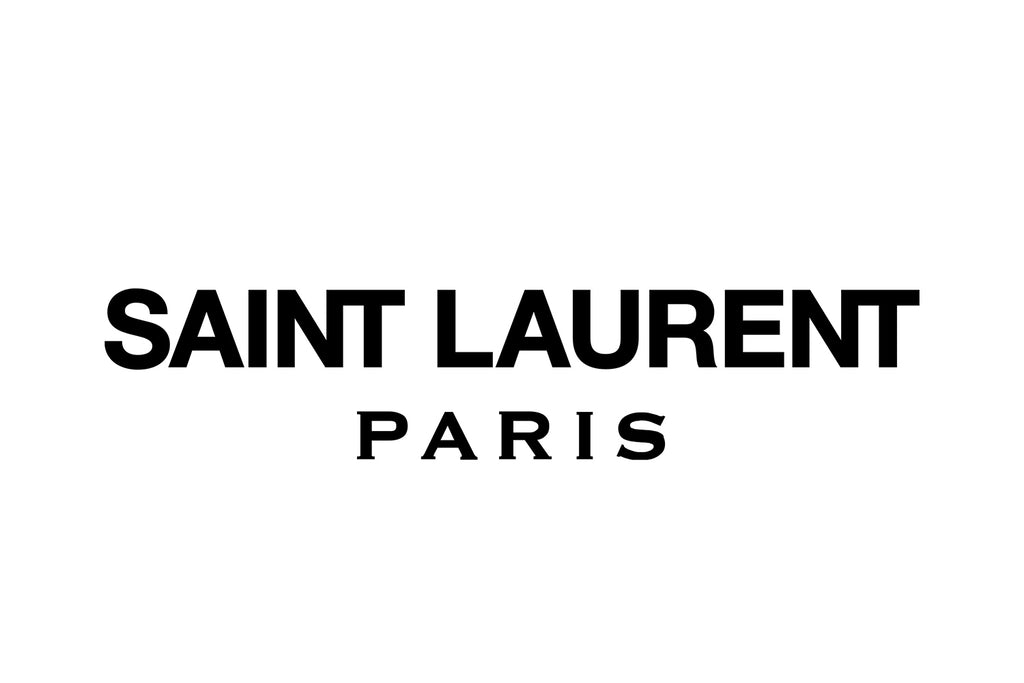
Image Courtesy: Yves Saint Laurent
Analysis: Yves Saint Laurent Logo Design Evolution
In the vast galaxy of fashion branding, few emblems shimmer as brightly or with as much longevity as the Yves Saint Laurent logo design. Its evocative journey, spanning over several decades, provides an insightful case study into the symbiotic relationship between brand identity and evolving aesthetics in the fashion realm. To fully appreciate the transformative nature of the Yves Saint Laurent brand, it's crucial to dissect the design elements and choices made across its logo's storied lifespan. Here, we provide a comprehensive analysis of its evolution, spotlighting five pivotal aspects:
Monochromatic Mastery
For five decades, the iconic YSL emblem embraced a monochromatic palette. This decision underscored the brand's ethos of timeless elegance. Whether rendered in classic black-and-white or the occasional opulent gold, this tonal choice exuded luxury, class, and universality, making it immediately identifiable and accessible to a global audience.
Interlocking Emblem
A symbol that would become synonymous with luxury fashion, the intertwined YSL emblem held its own as a standalone design marvel. It encapsulated the brand's essence and showcased the designer's initials in a memorable, cohesive, and chic design. This emblem's simplicity allowed for versatile usage across various brand materials, from clothing tags to storefronts.
Shift in Typeface
The rebranding in 2012 marked a notable typographical shift. The transition from the interlaced YSL to the bold Neue Helvetica for 'Saint Laurent' signified a modern, assertive direction. In contrast, the addition of 'Paris' in a spaced-out Copperplate Gothic Std Bold typeface introduced a touch of vintage sophistication, bridging past legacies with a contemporary vision.
Name Simplification & Brand Focus
The decision to shorten the brand name to 'Saint Laurent' was more than just a cosmetic change. It reflected a renewed focus on the brand's core identity, emphasizing the weight and recognition of 'Saint Laurent' in the global fashion lexicon. This streamlining allowed for a cleaner, more modern aesthetic in its branding materials.
Balancing Tradition with Modernity
The Yves Saint Laurent logo design journey aptly demonstrates the brand's ability to remain rooted in tradition while embracing contemporary trends. Each design iteration, while distinct in its elements, always resonated with the brand's core ethos of luxury, elegance, and Parisian chic.
The Yves Saint Laurent logo design evolution is emblematic of a brand's journey through the fluctuating tides of fashion, consistently staying ahead while honoring its illustrious past. The logo, in all its forms, serves as a beacon, guiding fashion enthusiasts through a rich tapestry of style, innovation, and timeless elegance.
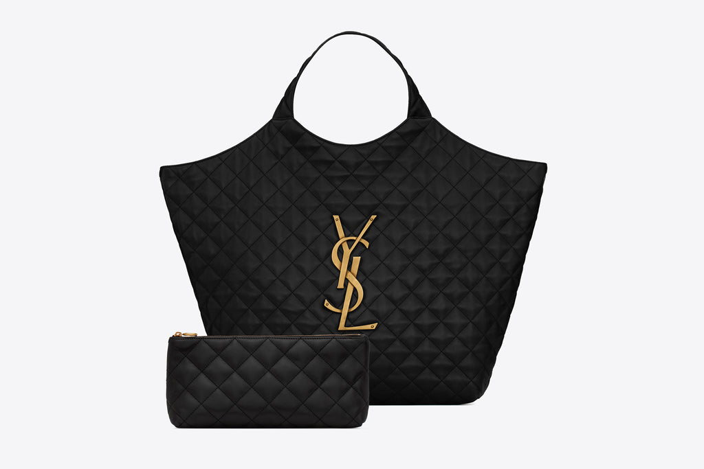
Image Source: https://www.ysl.com/ | Image Courtesy: Yves Saint Laurent
The Philosophy & Meaning Behind Yves Saint Laurent Logo Design
In the intricate tapestry of fashion branding, certain emblems stand out, not just for their visual allure but for the depth of meaning they encapsulate. The Yves Saint Laurent logo design is one such emblem, echoing profound philosophies and underlying principles that have defined the brand's legacy. As we venture into the nuances of this iconic insignia, it's vital to understand the layers of intention and symbolism that it holds. Here's a deep dive into the philosophy and meaning behind the Yves Saint Laurent logo design:
Elegance in Minimalism
Central to the Yves Saint Laurent logo design is a philosophy of minimalistic elegance. By opting for sleek lines and a restrained monochromatic palette, the design emphasizes that true sophistication often lies in simplicity. This minimalistic approach not only ensures timeless appeal but also conveys an aura of understated luxury.
Legacy Embodied
The intertwined YSL letters are more than just an abbreviation; they are a tribute to the founder's legacy. The intertwining suggests unity, continuity, and an unbroken commitment to the brand's foundational principles, illustrating the brand's journey from Yves Saint Laurent's personal vision to an enduring global legacy.
Parisian Heritage
With its reference to 'Paris', the logo doesn't just denote a place of origin but symbolizes a deep-seated cultural ethos. Paris, known for its rich history in haute couture, underscores the brand's commitment to refined craftsmanship and luxury. It's a nod to its roots, a beacon of sophistication, and a world-renowned fashion hub.
Evolution with Integrity
As the brand has evolved, so has its logo. But what's remarkable about the Yves Saint Laurent logo design is its ability to embrace change while retaining its core identity. Each iteration, while reflecting contemporary trends, stays true to the brand's essence, teaching us the importance of evolving without losing one's identity.
Universality in Design
The beauty of the Yves Saint Laurent logo design lies in its universal appeal. Without leaning into transient trends, it resonates with diverse audiences, exemplifying how design, when rooted in strong philosophy, can transcend borders and cultures.
The Yves Saint Laurent logo design is not just a visual identifier but a rich tapestry of stories, values, and philosophies. It offers insights into the brand's soul, capturing its journey, legacy, and vision, all elegantly encapsulated in a design that has become synonymous with luxury and sophistication.

Image Source: https://www.ysl.com/ | Image Courtesy: Yves Saint Laurent
What Can We Learn from Yves Saint Laurent Logo Design
Branding, as exemplified by the greats of the fashion industry, transcends mere aesthetics. It encapsulates a brand's ethos, its journey, and its vision for the future. The Yves Saint Laurent logo design, in its elegance and consistency, offers invaluable lessons for designers and brands alike. With every curve, hue, and typeface choice, it tells a tale of intentionality and brand coherence. As we unravel the intricacies of the Yves Saint Laurent logo design, here are five key takeaways that can guide and inspire:
Consistency is Key
Throughout its existence, the Yves Saint Laurent logo design has maintained a clear and consistent visual identity. Whether through its color palette or its foundational elements, this consistency reinforces brand recognition and builds trust with consumers. Even as design elements evolved, the essence remained unaltered, teaching us the importance of a steadfast brand image in an ever-changing marketplace.
Less is Often More
One of the hallmarks of the Yves Saint Laurent logo design is its simplicity. The brand eschews overly ornate elements in favor of minimalistic elegance. This streamlined approach not only ensures timeless appeal but also enhances versatility across various mediums, from product tags to expansive billboards.
Rootedness and Evolution Can Coexist
The brand's recent inclusion of 'Paris' in its logo, juxtaposed with its modern typography, showcases a blend of honoring origins while embracing evolution. This duality is a powerful reminder that while brands should evolve with the times, they should also celebrate and remain rooted in their foundational ethos.
Symbolism Enhances Connection
The interlocking YSL, more than a mere monogram, symbolizes interconnectedness and unity. Such emblematic design choices, laden with meaning, forge a deeper emotional connection with the audience. They transform a logo from being a mere visual identifier to a symbol that resonates with a brand's core values.
Adaptability is Vital
While the core elements of the Yves Saint Laurent logo design have remained, its adaptability to different contexts – be it varying color schemes like gold for a touch of opulence or layout changes – ensures the brand remains relevant and fresh. This teaches us the importance of flexibility in design, allowing for shifts that reflect current aesthetics while staying true to brand identity.
The Yves Saint Laurent logo design serves as a masterclass in brand identity, showing us the power of consistency, simplicity, and meaningful design. Through its storied journey, it imparts lessons of intentionality and adaptability, urging designers to craft logos that not only identify but also narrate a brand's rich tapestry.
Conclusion
In the ever-evolving landscape of fashion branding, the Yves Saint Laurent logo design stands as a testament to timeless elegance and intentional adaptability. Its consistent evolution, while staying rooted in core principles, offers invaluable insights into the art of brand identity. As we reflect on the intricacies and lessons encapsulated within its design, one truth emerges clearly: a logo, beyond aesthetics, is a powerful narrative tool. The Yves Saint Laurent logo design beautifully captures this ethos, serving as both an inspiration and a benchmark in the world of branding.
Let Us Know What You Think!
These fantastic logo design articles are written and curated by Kreafolk's team. We hope you enjoy our information and remember to leave us a comment below. Cheers!





Leave a Comment