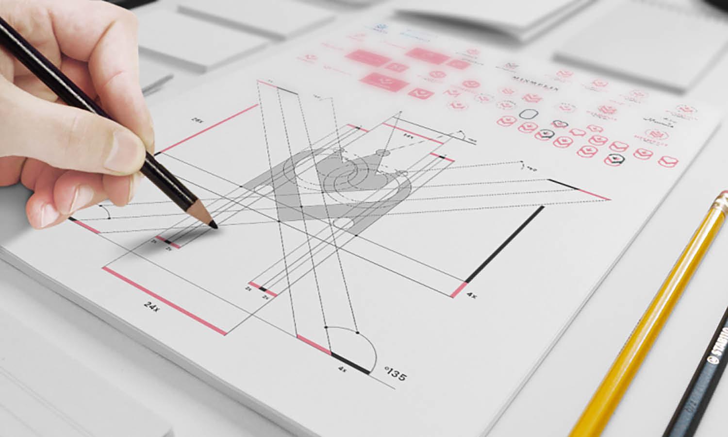
10 Main Principles Of Good Design For Humans

Source: CHANCE, Douma, Behance, https://www.behance.net/gallery/99554283/Duoma
In design, understanding and implementing core principles that cater to human needs is fundamental. Good design transcends mere aesthetics; it is about creating solutions that enhance human interaction and ensure usability. Whether it’s a digital interface, a physical product, or a service, the principles of good design serve as the compass that guides creators in developing user-centric innovations. This introduction explores the ten main principles that define good design, emphasizing their importance not just for functionality and aesthetics, but also for fostering meaningful connections between the design and its users.
By adhering to these principles, designers can ensure that their creations are not only visually appealing but also genuinely useful and accessible to a diverse range of individuals. Through this exploration, we aim to underline how these principles are integral to crafting designs that respect human psychology and physicality, ensuring that every interaction is intuitive, inclusive, and impactful.
Emphasize User Experience
User experience (UX) stands as a cornerstone in the principles of good design. It focuses on the satisfaction and ease with which a user can interact with a product, ensuring that every touchpoint is intuitive and enjoyable. By prioritizing UX, designers can create more than just functional items; they can create memorable, engaging experiences that resonate with users. This involves understanding the user's needs, preferences, and environments to tailor designs that not only solve problems but also enhance daily interactions. For instance, in digital design, this could mean simplifying navigation, speeding up load times, and making interfaces adaptable to various user scenarios.
In physical products, it encompasses ergonomic considerations and the sensory feedback that a product provides. Ultimately, emphasizing user experience in design is about respecting the user’s time and capability, ensuring the design facilitates a seamless integration into their lifestyle, making technology feel like a natural extension of their daily activities.
Maintain Simplicity
Simplicity in design is essential for usability and comprehension. It is about stripping away the unnecessary, leaving behind only what is essential to the functionality and aesthetic of the product. This principle challenges designers to think critically about each element, asking whether it serves a purpose. When designs are simple, they become timeless, transcending trends and reducing cognitive load for users. This approach not only improves user interaction but also aids in the product's longevity by focusing on core features that meet essential needs without overwhelming the user.
In practice, maintaining simplicity might mean using a minimal color palette, clean lines, or a clear hierarchy in visual layouts. For digital interfaces, it could involve reducing the number of steps to complete a task, or for physical products, focusing on form and function that clearly communicate how to use them. Simplicity ensures that the user’s journey through a design is straightforward and rewarding, enhancing overall user satisfaction and engagement.
Aesthetic Integrity
Aesthetic integrity is a pivotal principle of good design, especially when crafting solutions that appeal to humans on both functional and emotional levels. This principle does not imply that every design must adhere to conventional beauty, but rather that the design’s appearance and user interaction should align closely with its function. When a product’s design respects its purpose, the user experience is enhanced, creating a seamless integration of form and function.
Aesthetic integrity involves the careful selection of colors, typography, and layout that reflect the ethos and values of the brand while also catering to the usability and accessibility needs of the user base. It is about creating an intuitive and visually appealing interface that communicates purpose without sacrificing usability.

Source: Daps, Bowen | Skincare, Behance, https://www.behance.net/gallery/136175169/Bowen-Skincare
Be Inclusive
Inclusivity in design ensures that products and services cater to a diverse range of humans, irrespective of their age, gender, ethnicity, physical abilities, or socio-economic status. Being inclusive is one of the main principles of good design for humans as it emphasizes the importance of creating solutions that are usable by as many people as possible.
This approach involves considering various perspectives and needs during the design process to avoid unintentional exclusion. For instance, inclusive design accommodates those with disabilities by incorporating features such as readable fonts for the visually impaired, subtitles for the hearing impaired, and accessible physical design for those with mobility challenges. It also means considering cultural nuances that influence how different groups perceive and interact with designs.
Innovate Thoughtfully
Innovation in design must be thoughtful to truly resonate with and benefit humans. This principle of good design challenges designers to create novel solutions that address specific user needs and improve existing systems without causing unnecessary disruption. Thoughtful innovation involves understanding the deeper implications of design choices, focusing on sustainability, and predicting potential future needs. It's about asking the right questions: Does this innovation solve a real problem? Does it improve the user experience? Is it environmentally friendly? By considering these aspects, designers can ensure that their innovations are not just technologically advanced but also socially responsible and ethically sound.
This approach requires a balance between creativity and practicality, encouraging designers to think beyond the conventional and explore new possibilities that can have a lasting impact. Ultimately, thoughtful innovation is about enhancing the human aspect of design, ensuring that progress in design technology always translates into better living standards and enriched experiences for people.
Use Consistent Design Patterns
Consistency is key in achieving good design that resonates with humans. Using consistent design patterns across products and services ensures that users can quickly familiarize themselves with new interfaces, reducing the learning curve and enhancing the overall user experience. Consistency in design elements like typography, color schemes, and layout helps in building brand recognition and trust. It also reinforces usability by standardizing interactions and expectations for the users.
For instance, maintaining consistent navigation elements across a website or application allows users to move seamlessly between sections without confusion. This principle of design not only aids in the aesthetic cohesion of a project but also supports functional and cognitive aspects, making the design intuitive and predictable. By applying consistent design patterns, designers empower users, enabling them to feel competent and in control.
This reliability can significantly improve user satisfaction and loyalty, as it creates a safe and understandable environment for interaction. Ultimately, consistent design patterns are about creating harmony in the user's journey, ensuring that every interaction feels like a continuation rather than a challenge.
Create an Emotional Connection
Creating an emotional connection through design is a powerful principle that can transform ordinary experiences into memorable ones. Good design for humans should evoke positive emotions, making users feel valued, understood, and cared for. Emotional connection can be achieved by designing products that reflect the users' identity and values, or by creating experiences that spark joy, satisfaction, or relief.
This can involve using aesthetic elements like colors and images that elicit specific feelings, or it can be about crafting narratives within the design that users can relate to on a personal level. For example, incorporating elements of nostalgia in a design can evoke warmth and comfort, while sleek, modern designs may convey efficiency and professionalism. This connection is crucial not only for user engagement but also for building brand loyalty and advocacy.
Emotional design goes beyond functionality and usability; it speaks to the heart of the user, making the design meaningful and the experience enriching. When users form an emotional bond with a design, they are more likely to return to it and recommend it to others, proving that good design truly resonates on a human level.

Source: Anastasia Golovko, Healthy Habits - App Design, Dribbble, https://dribbble.com/shots/25494471-Healthy-Habits-App-Design
Prioritize Safety
Safety is a fundamental principle in good design, especially when it concerns human-centric products and services. Ensuring that a design poses no threat to its users involves a comprehensive understanding of physical, emotional, and digital security. Physically, products should be designed to prevent injuries and accidents, incorporating features such as non-toxic materials, ergonomic structures, and fail-safes that protect users under various conditions.
Emotionally, designs should promote psychological well-being, avoiding features that could cause undue stress or emotional harm. In the digital realm, prioritizing safety means securing users' data and providing robust protections against breaches and other cybersecurity threats. Designers must also consider accessibility and usability to ensure that safety measures are effective and do not inadvertently exclude any user group.
Align With the Brand's Identity
Aligning design with a brand’s identity is crucial for establishing a strong, cohesive image that resonates with consumers. This principle involves integrating the brand’s core values, mission, and personality into every design element, ensuring a unified presentation across all platforms. Whether it’s through the use of consistent color schemes, typography, or imagery, every design decision should reflect the brand’s unique voice and message. This consistency not only strengthens brand recognition but also builds trust and loyalty among customers. It creates a familiar and reliable experience that users can identify and connect with on multiple levels.
For example, a brand known for sustainability might incorporate green colors and natural imagery into its design, signaling its commitment to environmental issues. By maintaining a consistent brand identity, companies can differentiate themselves in a competitive market and foster a strong emotional connection with their audience, enhancing the overall impact of their marketing efforts.
Implement Feedback Mechanisms
Implementing feedback mechanisms is an integral principle of good design, as it allows designers to adapt and refine their work based on user interactions. Effective feedback systems gather insights directly from users, which can inform necessary adjustments to enhance usability and satisfaction. This might involve various methods such as surveys, user testing sessions, or digital analytics. By actively seeking and incorporating user feedback, designers can identify pain points and areas for improvement, ensuring the design evolves to meet changing needs and preferences.
For example, in digital product design, real-time feedback can be used to tweak interface elements for better user experience, or in service design, customer feedback can lead to enhanced service delivery processes. Overall, feedback mechanisms are essential for creating a dynamic, user-centered design process that continually strives to meet and exceed user expectations.
Conclusion
The principles of good design are fundamental in creating products that are both functional and pleasing, while deeply resonating with human needs. By adhering to these principles, designers not only enhance user interaction but also foster an environment of innovation and user-centered development. From emphasizing user experience to aligning with brand identity, and implementing feedback mechanisms, each principle contributes to a holistic design approach that prioritizes human factors. Embracing these principles ensures that design remains an influential tool in shaping how we interact with the world around us, making every design decision count in the pursuit of excellence.
Let Us Know What You Think!
Every information you read here are written and curated by Kreafolk's team, carefully pieced together with our creative community in mind. Did you enjoy our contents? Leave a comment below and share your thoughts. Cheers to more creative articles and inspirations!


Leave a Comment