Perfect Guide To Create A Good Pictorial Logo Design

Source: Roxana Niculescu, Palm, Dribbble, https://dribbble.com/shots/21316579-Palm
A strong logo is one of the most important elements of any brand identity. Among the many styles used in modern branding, pictorial logo design stands out as one of the most recognizable and visually powerful options. A pictorial logo design uses a simple graphic symbol or icon to represent a brand, making it easy for audiences to remember and quickly identify a company.
Well-known brands around the world rely on pictorial logo design to communicate their identity without needing many words. A carefully designed symbol can instantly express a brand’s personality, industry, and values. When done correctly, this type of logo becomes a visual shortcut that helps customers recognize a brand across websites, products, advertisements, and social media.
Creating an effective pictorial logo design requires more than simply choosing an attractive image. Designers must carefully consider elements such as symbolism, simplicity, color, and balance. The goal is to craft a visual mark that is unique, meaningful, and flexible enough to work across many different platforms and sizes.
In this guide, we will explore practical tips and essential design principles that help create a strong pictorial logo design. Whether you are a designer, business owner, or someone interested in branding, these insights will help you understand how to develop a symbol that represents your brand clearly and effectively.
Understanding What A Pictorial Logo Design Is
A pictorial logo design is a type of logo that uses a clear graphic symbol or icon to represent a brand. Instead of relying mainly on text, this style focuses on a visual image that audiences can easily recognize and remember. Many famous companies have successfully used pictorial logo design to create strong brand recognition around the world.
The main idea behind pictorial logo design is simplicity and visual storytelling. A single image can communicate a brand’s identity, industry, or message without needing many words. For example, a technology company may use a clean, modern icon, while a nature-related business might choose a leaf or mountain symbol. The goal is to create an image that instantly connects with the brand’s personality.
One of the strengths of pictorial logo design is its ability to cross language barriers. Because it relies on imagery rather than text, people from different cultures can still recognize and understand the symbol. This makes pictorial logos especially effective for brands that operate globally.
However, creating a successful pictorial logo design requires careful planning. Designers must choose symbols that are meaningful, unique, and easy to understand. The image should not be overly complex, as too many details can make the logo harder to recognize at smaller sizes.
When done correctly, a pictorial logo design becomes a powerful visual asset. It helps build brand familiarity, strengthens brand identity, and makes a company easier to recognize in crowded markets.
Choosing The Right Symbol For Your Brand Identity
Selecting the right symbol is one of the most important steps when creating a pictorial logo design. The symbol should represent the core idea of the brand while remaining simple, memorable, and visually appealing. A well-chosen symbol can communicate a brand’s message instantly, even before customers read the company name.
Before designing the icon, it is important to understand the brand’s personality, values, and target audience. A pictorial logo design should reflect what the brand stands for. For example, a fitness brand may use symbols related to strength or motion, while a travel company might use imagery connected to exploration or landscapes.
Clarity is essential when choosing a symbol for pictorial logo design. The icon should be easy to recognize at a glance. Overly complicated images can confuse viewers and reduce the effectiveness of the logo. Simple shapes and clear visual concepts often create stronger results.
Another key factor is uniqueness. The symbol used in pictorial logo design should stand out from competitors and avoid looking generic. Designers often combine creativity with research to ensure the chosen icon feels distinctive and memorable.
A carefully selected symbol forms the foundation of a strong pictorial logo design. When the image reflects the brand’s identity and communicates its message clearly, it helps build trust, recognition, and long-term brand value.
Keeping The Pictorial Logo Design Simple And Memorable
Simplicity is one of the most important principles when creating a successful pictorial logo design. A logo that is simple is easier to recognize, remember, and reproduce across different platforms. When a symbol contains too many details, it can become confusing and difficult to understand at a glance. The goal of pictorial logo design is to communicate a clear idea through a clean and focused visual symbol.
Many of the most recognizable brands rely on very simple pictorial logo design concepts. A single icon or minimal graphic element can leave a stronger impression than a complicated illustration. Simple logos are also easier for people to recall, which helps build long-term brand recognition.
Another advantage of simplicity in pictorial logo design is flexibility. A simple icon works well in various applications, including websites, product packaging, social media profiles, and mobile screens. When the design is clear and uncluttered, it remains effective even when scaled down to very small sizes.
Designers should focus on removing unnecessary elements and keeping only the most essential parts of the symbol. Clean lines, balanced shapes, and minimal details often produce stronger visual results. Every element in the pictorial logo design should serve a clear purpose and support the overall concept.
By prioritizing simplicity, designers can create a pictorial logo design that feels modern, professional, and timeless. A memorable symbol helps audiences quickly recognize the brand and strengthens the visual identity across different platforms.

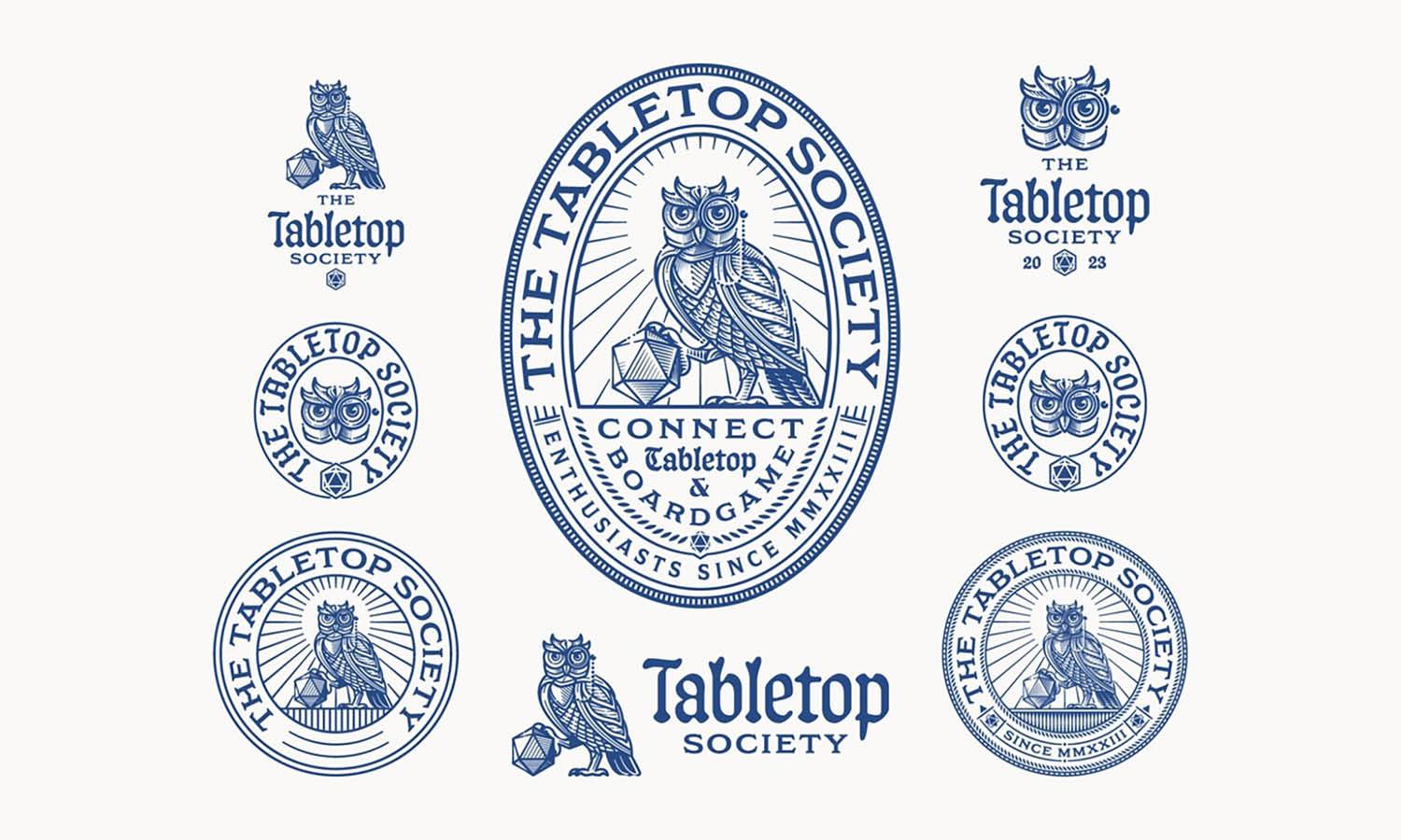
Source: VASK Studio, Voa Labs - Brand Identity, Dribbble, https://dribbble.com/shots/21465793-Voa-Labs-Brand-Identity
Using Shapes And Visual Balance Effectively
Shapes play a critical role in building a strong pictorial logo design. Every shape carries visual meaning and influences how people perceive a brand. Circles often represent unity and friendliness, squares suggest stability and reliability, while triangles can communicate energy and direction. Choosing the right shapes helps reinforce the message behind the logo.
When developing a pictorial logo design, designers should also pay close attention to visual balance. Balance ensures that the logo feels stable and visually pleasing. If one side of the logo appears heavier or more crowded than the other, the design may feel uncomfortable or unprofessional.
There are different ways to achieve balance in pictorial logo design. Symmetrical balance creates a formal and structured appearance, while asymmetrical balance can produce a more dynamic and modern look. Both approaches can work well depending on the brand’s identity and design goals.
Spacing and alignment also contribute to visual harmony. Proper spacing between elements prevents the logo from feeling cramped and allows the symbol to remain clear and readable. A well-balanced pictorial logo design guides the viewer’s eye smoothly across the design.
By carefully selecting shapes and maintaining visual balance, designers can create a pictorial logo design that feels professional, attractive, and easy to recognize. Thoughtful composition helps ensure the symbol communicates the brand message clearly and effectively.
Selecting Colors That Strengthen The Visual Message
Color is one of the most powerful elements in pictorial logo design. The colors chosen for a logo can influence how people feel about a brand and how easily they remember it. Because pictorial logo design often relies on a single symbol, color becomes an important tool for adding personality and meaning to the visual mark.
Different colors naturally communicate different emotions and ideas. For example, blue is often associated with trust and professionalism, while green may represent growth, nature, or sustainability. Red can express energy and excitement, and black often conveys elegance and sophistication. When designing a pictorial logo design, it is important to choose colors that reflect the brand’s identity and industry.
Limiting the number of colors can also strengthen the design. Too many colors may make the pictorial logo design look busy or difficult to reproduce. Many successful logos use only one or two primary colors to maintain clarity and consistency across various platforms.
Another important consideration is contrast. Strong contrast helps the symbol stand out and remain visible on different backgrounds. Designers often test the pictorial logo design in both color and monochrome to ensure it remains clear and recognizable.
By selecting thoughtful color combinations, designers can enhance the impact of pictorial logo design. The right colors help the symbol communicate the brand message clearly while making the logo more memorable and visually appealing.
Ensuring The Pictorial Logo Design Works At Any Size
A successful pictorial logo design must remain clear and recognizable at any size. Logos appear in many different places, including websites, social media icons, product packaging, advertisements, and mobile applications. Because of this, designers must ensure the pictorial logo design performs well whether it is displayed large on a billboard or small on a smartphone screen.
Scalability is one of the key principles in logo creation. A pictorial logo design that looks detailed and attractive at a large size may lose clarity when reduced. Small icons can easily become blurry or unreadable if the design contains too many intricate details.
To avoid this issue, designers often simplify the shapes and remove unnecessary elements. Clean lines, bold shapes, and clear silhouettes help the pictorial logo design remain recognizable even at smaller dimensions. A strong outline allows the symbol to maintain its identity regardless of scale.
Testing the logo at different sizes is an important part of the design process. Designers typically preview the pictorial logo design in various formats such as website icons, mobile app icons, and printed materials. This ensures the logo maintains visual consistency across multiple applications.
When scalability is carefully considered, a pictorial logo design becomes more versatile and practical. A logo that works well at any size strengthens brand recognition and ensures the symbol remains effective across both digital and physical media.
Making The Icon Unique And Easily Recognizable
Uniqueness is a key factor in building a successful pictorial logo design. A logo should stand out from competitors and create a lasting impression on viewers. When a symbol looks too generic or similar to other brands, it becomes harder for customers to remember the company behind it. A unique pictorial logo design helps establish a clear identity and makes the brand easier to recognize.
To create a distinctive symbol, designers often begin by researching the brand’s industry and competitors. Understanding common visual trends can help identify opportunities to design something different. The goal of pictorial logo design is not just to create a beautiful image, but to develop a symbol that feels original and meaningful.
Creative thinking plays a major role in this process. Designers may explore abstract interpretations, combine simple shapes in new ways, or refine familiar symbols into more distinctive forms. Even small design decisions, such as adjusting proportions or creating a unique silhouette, can significantly improve the memorability of a pictorial logo design.
Another important factor is recognizability. While creativity is valuable, the symbol should still remain clear and easy to understand. If the icon becomes too complex or abstract, viewers may struggle to interpret its meaning. The best pictorial logo design balances originality with clarity.
When an icon is both unique and recognizable, it becomes a strong visual asset for the brand. Over time, the symbol can become closely associated with the company, helping build trust and long-term brand recognition.

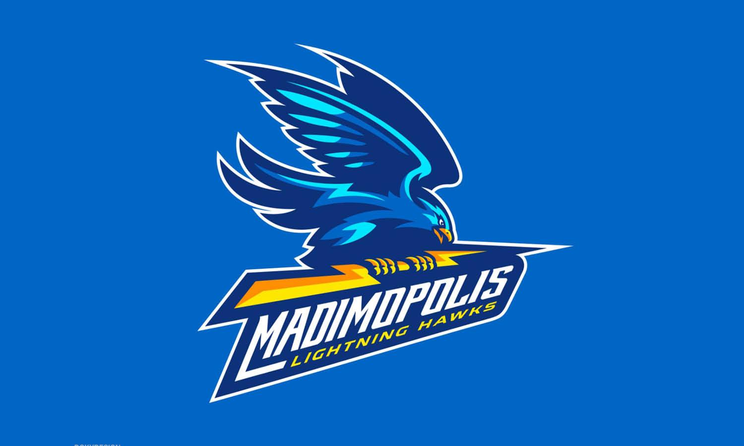
Source: Kakha Kakhadzen, Origen V3, Dribbble, https://dribbble.com/shots/19908938-Origen-V3
Aligning The Pictorial Logo Design With Brand Personality
A successful pictorial logo design should reflect the personality of the brand it represents. Every company has its own identity, values, and tone, and the logo should visually communicate these qualities. When the design aligns with the brand’s personality, it helps audiences understand what the company stands for.
Before creating the symbol, designers should clearly define the brand’s character. Some brands aim to appear professional and trustworthy, while others focus on creativity, innovation, or friendliness. A pictorial logo design should visually express these traits through its shapes, style, and overall composition.
For example, a modern technology company may prefer a sleek and minimal pictorial logo design with geometric shapes and clean lines. On the other hand, a children’s brand might use softer shapes and playful imagery to create a friendly and welcoming appearance. The design style should always support the brand’s message.
Consistency also plays an important role. The pictorial logo design should match the visual language used in other branding elements such as packaging, website design, and marketing materials. When all visual elements share a consistent style, the brand becomes more cohesive and recognizable.
By aligning the pictorial logo design with the brand’s personality, designers can create a symbol that feels authentic and meaningful. This connection strengthens the overall brand identity and helps customers form a clearer impression of the company.
Testing The Logo In Different Backgrounds And Formats
Testing is an essential step in creating a strong pictorial logo design. Even a well-crafted symbol may lose its impact if it does not perform well across different backgrounds and formats. Because logos appear in many environments, designers must ensure the pictorial logo design remains clear, balanced, and recognizable in every situation.
One important test involves placing the pictorial logo design on both light and dark backgrounds. A logo that looks good on a white background might lose visibility on darker surfaces. Designers often create alternative color versions of the logo to maintain clarity and contrast across various backgrounds.
Another useful step is testing the pictorial logo design in both color and black-and-white versions. A strong logo should still communicate its identity even without color. This ensures the symbol remains effective in printed materials, stamps, or situations where color is limited.
Different formats should also be considered during testing. The pictorial logo design may appear on websites, mobile apps, merchandise, packaging, and marketing materials. By previewing the logo in these real-world contexts, designers can identify potential issues with spacing, readability, or proportions.
Thorough testing helps refine the pictorial logo design and ensures it remains visually consistent across platforms. When a logo performs well in many environments, it becomes more reliable and strengthens the overall brand presence.
Refining And Polishing The Final Pictorial Logo Design
The final stage of creating a pictorial logo design focuses on refinement and polishing. After the main concept has been developed, designers review every detail to ensure the logo feels balanced, professional, and visually appealing. Small adjustments can significantly improve the overall quality of the final design.
Refinement often involves improving the alignment of shapes, adjusting spacing, and simplifying unnecessary elements. Clean edges and smooth curves help make the pictorial logo design appear more precise and visually polished. Even minor changes in proportion can enhance the harmony of the symbol.
During this stage, designers also review how the pictorial logo design communicates the brand message. The symbol should clearly represent the brand’s identity while remaining simple and recognizable. If any part of the design feels confusing or overly complex, it may be refined or removed.
Feedback can also be valuable when polishing a pictorial logo design. Sharing the design with colleagues, clients, or potential users can reveal insights that may not have been noticed during the initial design process. Fresh perspectives often help identify opportunities for improvement.
Once the refinements are complete, the pictorial logo design can be prepared for final use across different platforms. A well-polished logo not only looks professional but also strengthens brand recognition and ensures the symbol remains effective for years to come.
Conclusion
A well-crafted pictorial logo design can become one of the most powerful visual assets for any brand. By focusing on clear symbolism, simplicity, balanced shapes, and thoughtful color choices, designers can create a logo that communicates meaning quickly and effectively. A strong pictorial logo design should also remain recognizable at different sizes and across various platforms. Careful testing and refinement help ensure the final symbol feels professional and memorable. When all these elements work together, a pictorial logo design can strengthen brand identity, improve recognition, and create a lasting impression that supports long-term brand growth.
Let Us Know What You Think!
Every information you read here are written and curated by Kreafolk's team, carefully pieced together with our creative community in mind. Did you enjoy our contents? Leave a comment below and share your thoughts. Cheers to more creative articles and inspirations!








Leave a Comment