How to Develop Better Composition in Your Illustrations

Created by Aprisun | https://www.deviantart.com/aprisun/art/Seeing-the-Future-through-Art-977234627
In the realm of visual arts, mastering the art of composition is paramount for creating compelling illustrations. Composition, the thoughtful arrangement of elements within a work of art, serves as the backbone of visual storytelling, guiding the viewer's eye through the narrative woven by colors, shapes, and lines. For illustrators, understanding and applying the principles of composition is not just about enhancing aesthetics; it’s about communicating more effectively, engaging the audience, and breathing life into creative visions.
Whether you're a budding artist or a seasoned illustrator, refining your compositional skills can transform your work from good to unforgettable. This article delves into the essence of composition in illustration, offering actionable insights and techniques to elevate your art. From leveraging the rule of thirds and playing with perspective to understanding the interplay of color and contrast, we'll explore how these foundational elements work in harmony to create balance, depth, and focus in your illustrations.
Embarking on this journey will not only boost your confidence as an illustrator but also unlock new dimensions of creativity and expression in your work. Let’s dive into the intricacies of composition, unveiling the secrets to crafting visually stunning and emotionally resonant illustrations.
Understand the Basics of Composition
In the realm of illustration, mastering the art of composition is pivotal for creating visually compelling and coherent works. Composition, the way in which various elements are arranged within an illustration, serves not just as the backbone of visual storytelling but also as a guide for the viewer's eye through the narrative landscape. Understanding the basics of composition involves recognizing the fundamental principles that govern how these elements come together to form a cohesive whole.
Firstly, balance is crucial. It's about distributing visual weight in a manner that ensures stability within the illustration. Whether it's symmetrical, with mirrored elements on either side, or asymmetrical, which uses different elements to achieve visual equilibrium, balance keeps the viewer's gaze anchored.
Alignment and proximity come next, organizing elements in a way that they relate to each other and create a clean, orderly appearance. This doesn't mean everything must be in a straight line, but rather that the placement of elements should feel intentional and guide the viewer through the illustration seamlessly.
Contrast and hierarchy are also key components of composition. Contrast draws the eye to areas of difference, be it through color, shape, or size, while hierarchy uses these contrasts to direct attention to the most important parts of the illustration first.
Lastly, unity and variety work hand-in-hand to create a sense of cohesion within the diversity of elements. Unity ensures that all parts of the illustration feel like they belong together, while variety keeps the composition dynamic and engaging.
For illustrators, mastering these basics of composition is akin to learning the grammar of visual language. It enables the creation of illustrations that are not only beautiful but also effectively communicate their intended message or emotion.

Created by Aprisun | https://www.deviantart.com/greegw/art/Jerozolimskie-wedrowki-961400101
Use the Rule of Thirds to Your Advantage
The Rule of Thirds is a fundamental concept in the world of composition, acting as a simple yet powerful guideline for illustrators to enhance the visual impact of their work. This principle involves dividing the illustration into nine equal segments by drawing two equally spaced horizontal lines and two equally spaced vertical lines across the canvas. The points where these lines intersect are known as the points of interest.
Incorporating the Rule of Thirds into your illustrations encourages a more natural and engaging composition. Instead of placing the focal point in the center of the canvas, positioning it near or at one of the intersections makes the image more dynamic and aesthetically pleasing. This off-center composition mimics the way our eyes naturally scan visuals, leading to a more immersive viewing experience.
Furthermore, the Rule of Thirds can also guide the placement of other crucial elements and the direction of movement within the illustration. By aligning elements along the lines or intersections, illustrators can create a balanced and organized layout that subtly directs the viewer's gaze across the artwork.
The beauty of the Rule of Thirds lies in its versatility and simplicity. Whether you're working on a complex narrative scene or a minimalist design, applying this rule can dramatically improve the composition's balance, flow, and overall appeal. It's a fundamental tool in an illustrator's arsenal, enabling the creation of visually captivating and harmonious compositions that resonate with viewers.
Adopting the Rule of Thirds not only elevates the aesthetic quality of your illustrations but also enhances their communicative power, ensuring your visual stories are both seen and felt.
Experiment with Different Perspectives
In the realm of illustration, mastering the art of composition is akin to a chef perfecting their signature dish. It requires not just skill and technique, but also a profound understanding of how each element interacts within the space of your canvas. A crucial aspect of this is the perspective from which you choose to present your subject. Exploring different perspectives can transform a mundane scene into a captivating story, elevating the overall impact of your illustration.
Perspective, in the context of composition, is not just about rendering objects smaller as they recede into the distance; it's about how you, as the illustrator, guide the viewer's experience within the environment you've created. Traditional methods like one-point, two-point, and three-point perspective offer a mathematical approach to drawing objects in space, providing a sense of depth and realism. However, the exploration doesn't stop at these techniques. A bird's-eye view can give your audience a godlike overview of the scene, instilling a sense of omnipresence. Conversely, a worm's-eye view can make mundane objects towering and dramatic, imbuing them with a sense of grandeur and importance.
Moreover, the perspective you choose can significantly affect the emotional tone of your illustration. A close-up, for instance, creates intimacy, pulling the viewer into a private moment, while a distant perspective might evoke feelings of isolation or detachment. Playing with the angle and viewpoint can also reveal hidden layers of your story, encouraging viewers to linger and explore your work more deeply.
Incorporating unconventional perspectives or mixing multiple viewpoints can challenge traditional composition norms, pushing the boundaries of your illustration. This experimentation not only makes your work stand out but also deepens your understanding of spatial relationships, ultimately enhancing your compositional skills. By embracing the diverse possibilities that perspectives offer, you enrich the narrative quality of your illustrations, making each piece a unique exploration of space and story.

Created by Aprisun | https://www.deviantart.com/atarts/art/Mermay-2021-881199496
Play with Color and Contrast
The manipulation of color and contrast is a powerful tool in the arsenal of an illustrator looking to enhance the composition of their work. Beyond mere aesthetics, color and contrast can dictate the focus, mood, and overall impact of an illustration, guiding the viewer's eye and emotions through the visual narrative you're crafting.
Understanding color theory is foundational. Colors evoke emotions and set the tone of your illustration. Warm colors can create a feeling of warmth and excitement, while cool colors might suggest calmness or detachment. Using this knowledge to your advantage allows you to infuse your compositions with deeper emotional undertones, subtly guiding the viewer's psychological response to your work.
Contrast, on the other hand, is about the difference in visual properties that makes an object (or its representation within an illustration) distinguishable from other objects and the background. High contrast areas attract the viewer’s attention first, acting as visual cues to where they should look. By strategically placing contrasting elements within your composition, you can create focal points that draw the viewer’s eye to the most important parts of your illustration.
But color and contrast aren’t just about drawing attention. They also play a crucial role in creating depth and dimension. Lighter hues tend to recede, while darker shades appear to come forward. This can be used to create an illusion of depth in a two-dimensional space. Additionally, varying the saturation and brightness of colors across your illustration can add layers of complexity, making your composition more dynamic and engaging.
Experimenting with color schemes and contrast levels can transform the same scene from tranquil to tumultuous, simply by altering these elements. This manipulation requires not just an understanding of color theory but also a keen eye for the emotional tempo of your illustration. It's about balancing harmony and tension within your composition, using color and contrast not just as embellishments, but as integral components of the story you're telling.
In summary, mastering the use of color and contrast is essential for any illustrator aiming to enhance the composition of their work. These elements are vital in creating a compelling visual narrative, one that captivates and communicates effectively with the viewer.
Create Depth with Layering
In the expansive world of illustration, the technique of layering stands out as a pivotal method for adding depth and dimension to your compositions. This approach not only enriches the visual experience but also enhances the storytelling aspect of your work. Layering involves strategically organizing elements in your illustration into foreground, middleground, and background layers, each serving a unique purpose in the composition.
The foreground typically features elements that are most closely related to the viewer, often rendered in greater detail and with more vibrant colors to emphasize their proximity. This layer plays a crucial role in establishing the narrative focus of your illustration, drawing the viewer's attention to key subjects or actions.
The middleground acts as the bridge between the foreground and the background, providing context and supporting the main subjects. This layer often contains elements that add to the story or elaborate on the setting, contributing to a fuller understanding of the illustration’s context without overpowering the focal points.
Finally, the background offers a backdrop that sets the scene. It's usually depicted with less detail and more muted colors to create the illusion of distance. This layer is essential for establishing the setting and mood of the illustration, giving the viewer a sense of place and time.
By effectively layering these three components, illustrators can create a sense of depth that makes the scene more realistic and engaging. This technique also allows for a more nuanced narrative, as viewers are drawn into the illustration, moving visually from one layer to the next. Moreover, understanding how to manipulate these layers—through the use of color, detail, and scaling—can significantly enhance the composition of your illustrations, making them more dynamic and captivating.
Incorporating layering into your compositional toolbox not only elevates the aesthetic quality of your work but also deepens the viewer's engagement with your illustration. By mastering this technique, you unlock the potential to create rich, immersive worlds that beckon audiences to explore every inch of your canvas.

Created by Aprisun | https://www.deviantart.com/atarts/art/Mermay-2021-881199496
Incorporate Leading Lines
The strategic incorporation of leading lines is a fundamental technique in composition that can dramatically transform the effectiveness of an illustration. Leading lines guide the viewer's eye through the artwork, creating a visual path that highlights important elements and creates a cohesive narrative flow. This method is especially powerful in directing attention, establishing a sense of movement, and enhancing the overall storytelling of your illustration.
Leading lines can be anything in the illustration that has a directional quality—roads, rivers, beams of light, or even the positioned limbs of a character. These lines act as visual cues that navigate the viewer's gaze across the composition, subtly pointing towards the focal points. The beauty of leading lines lies in their versatility; they can be bold and explicit or subtle and implied, yet they always serve to draw the viewer deeper into the story you're telling.
Implementing leading lines requires a thoughtful approach to the layout and structure of your illustration. It begins with identifying the key elements you want to emphasize and then arranging the compositional lines to lead towards these points. This might mean adjusting the environment, the angle of objects, or even the posture of characters to create a seamless flow that feels both intentional and natural.
Moreover, leading lines can also contribute to the emotional tone of your illustration. For instance, curved lines can evoke a sense of calm and gentleness, while straight, sharp lines might suggest speed, tension, or aggression. This emotional dimension adds another layer of depth to your composition, enabling a more immersive and impactful viewer experience.
Incorporating leading lines into your illustrations not only improves the visual appeal and navigational clarity of your compositions but also enriches the narrative depth. As an illustrator, mastering the use of leading lines allows you to wield greater control over how your stories are experienced, making each piece not just a static image but a journey that unfolds before the viewer's eyes.
Utilize Framing
Framing within the context of illustration composition is a potent technique that artists can leverage to enhance the visual impact and narrative clarity of their work. This approach involves using elements within the illustration itself to create a 'frame' around the focal point or main subject, effectively drawing the viewer’s eye directly to the area of interest. Framing not only focuses the viewer's attention but also adds depth to the composition, enriching the visual narrative and guiding the viewer through the story being told.
The concept of framing is versatile; it can be achieved through various means such as architectural elements (windows, doorways), natural scenery (branches, foliage), or even the strategic placement of characters and objects. These frames within frames serve to isolate and highlight the main subject, making it stand out against the rest of the composition. This technique is especially useful in complex illustrations with multiple elements, as it helps to avoid visual clutter and maintain clarity.
Moreover, framing can significantly contribute to the mood and atmosphere of the illustration. For example, a narrow frame might create a sense of confinement or tension, while a broader, open frame could evoke feelings of freedom or vastness. By carefully considering the type and size of the frame, illustrators can subtly influence how the viewer perceives the illustration’s emotional tone.
Incorporating framing into your compositional strategy requires a keen eye for detail and an understanding of how different elements within your illustration can interact to form natural or implied frames. Effective use of this technique can transform a good illustration into a great one, by not only enhancing its aesthetic appeal but also by deepening the viewer's engagement with the artwork. As such, mastering framing is essential for any illustrator seeking to elevate their compositional skills and create more compelling, visually arresting illustrations.

Created by Aprisun | https://www.deviantart.com/snatti89/art/Cherryblossom-season-742349414
Adjust Scale and Proportion
Adjusting scale and proportion is a dynamic compositional strategy in illustration that involves altering the size relationships between objects within a scene. This technique can be a powerful tool for illustrators, as it allows for the manipulation of visual hierarchy, the enhancement of narrative elements, and the creation of dramatic or surreal effects that captivate the viewer. By intentionally deviating from realistic proportions, artists can emphasize certain aspects of their illustration, guiding the viewer's focus and adding layers of meaning.
The scale of an object in relation to its surroundings or other elements in the illustration can significantly impact the composition's overall balance and mood. Enlarging an object makes it more dominant and can signify its importance within the narrative, while reducing its size can diminish its role or create a sense of distance. Such adjustments can help to create focal points, direct the viewer’s attention, and convey particular emotions or themes.
Proportion, similarly, involves the relationship of size between different parts of an object or figure. Playing with proportion can introduce an element of fantasy or exaggeration that enhances the storytelling aspect of an illustration. For instance, exaggerating the size of a character’s eyes can convey emotion more powerfully, or altering the proportions of a landscape can evoke a particular atmosphere.
Moreover, the thoughtful manipulation of scale and proportion can challenge the viewer's perceptions and expectations, inviting them to explore the illustration more deeply. It can create a sense of wonder, make a social commentary, or simply add humor. This technique demands a solid understanding of both realistic proportions and how their alteration affects the composition’s narrative and visual impact.
In essence, adjusting scale and proportion provides illustrators with a versatile means of expression, enabling them to manipulate visual interest, narrative emphasis, and emotional depth. Mastery of this technique allows for the creation of more engaging, thought-provoking illustrations, showcasing the illustrator’s creativity and enhancing the viewer's experience.
Experiment with Composition in Thumbnails
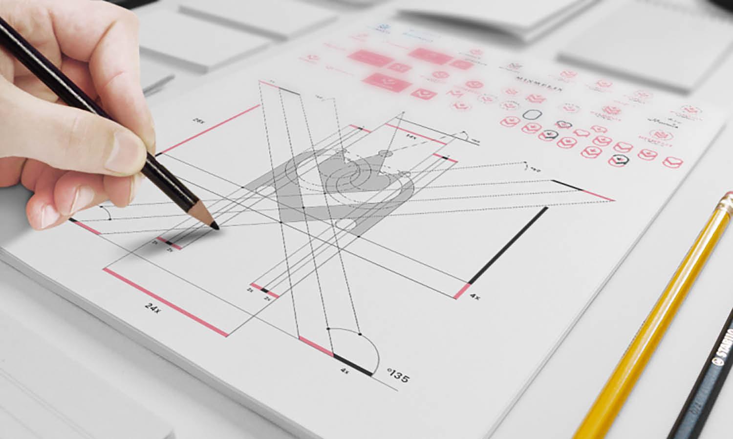
A powerful technique for any illustrator aiming to enhance their composition skills is the creation of thumbnail sketches. These small, quick sketches are an efficient way to explore various compositional possibilities without committing to a detailed drawing. Experimenting with composition in thumbnails allows illustrators to visualize how different arrangements affect the overall feel and balance of their illustrations, making it easier to identify the most compelling layout before diving into the final piece.
The process of creating thumbnails is both liberating and strategic. It encourages spontaneity and intuition, enabling artists to play with elements like framing, perspective, and the placement of key subjects without the pressure of perfection. This freedom often leads to innovative compositions that might not have been discovered through a more cautious approach. Additionally, working in a smaller format forces illustrators to focus on the essentials of their composition, emphasizing the importance of simplicity and clarity in visual storytelling.
Thumbnail sketches also serve as a visual brainstorming session, where multiple ideas can be compared and contrasted. This comparison can highlight strengths and weaknesses in different compositions, guiding the illustrator toward more effective arrangements that enhance the narrative and visual impact of their work. Moreover, the practice of creating multiple thumbnails cultivates an illustrator's ability to think critically about composition, encouraging a deeper understanding of how different elements interact within a confined space.
Incorporating the habit of sketching thumbnails into your illustration workflow can significantly improve the quality of your compositions. This technique not only streamlines the creative process by reducing the time spent on less effective layouts but also enhances your flexibility and problem-solving skills as a designer. Ultimately, experimenting with composition in thumbnails is an invaluable exercise for refining your artistic vision and achieving more dynamic, engaging illustrations.

Created by Aprisun | https://www.deviantart.com/tamberella/art/Painting-the-Whales-874140177
Study and Analyze Masterworks
One of the most enriching practices for any illustrator seeking to master the art of composition is the study and analysis of masterworks. By examining the works of great artists and illustrators, one can gain invaluable insights into the principles and techniques that make a composition truly stand out. This practice goes beyond mere admiration; it involves a deep, analytical engagement with the artworks, exploring how each element contributes to the overall effect of the piece.
Studying masterworks allows illustrators to observe first-hand how successful compositions are constructed. It reveals how masters of the craft manipulate elements such as line, color, light, and shadow to guide the viewer's eye, evoke emotions, and tell a story. This study is not about copying styles but understanding the underlying principles that can be adapted and applied to one's work.
Moreover, analyzing masterworks exposes illustrators to a variety of styles and approaches, expanding their creative repertoire. It encourages artists to question why certain compositions feel balanced, dynamic, or evocative. What techniques did the artist use to achieve depth? How do the elements of the composition interact to create a focal point? These questions prompt critical thinking and foster a more nuanced approach to creating illustrations.
Engaging with masterworks also inspires illustrators to push their boundaries and experiment with new techniques and ideas. It can lead to a profound appreciation for the diversity and complexity of visual storytelling, enriching the illustrator's own creative expression.
In summary, studying and analyzing masterworks is a transformative practice that not only enhances an illustrator's composition skills but also deepens their connection to the rich tradition of visual art. It is an essential step in the journey towards developing a unique voice and vision in the competitive field of illustration.
Conclusion
Composition in illustration is a fundamental aspect that significantly impacts the effectiveness and appeal of your artwork. By mastering various compositional techniques, from experimenting with perspectives to studying masterworks, illustrators can enhance the visual storytelling and emotional depth of their creations. The journey to improving composition is ongoing, involving constant learning, experimentation, and analysis. Embracing these practices not only elevates your illustrations but also enriches your artistic expression. Remember, each piece is an opportunity to explore new ideas and push the boundaries of your creative vision. Let composition be your guide to crafting more engaging, dynamic, and memorable illustrations.
Let Us Know What You Think!
Every information you read here are written and curated by Kreafolk's team, carefully pieced together with our creative community in mind. Did you enjoy our contents? Leave a comment below and share your thoughts. Cheers to more creative articles and inspirations!


Leave a Comment