10 Tips to Create a Fantastic Flat Illustration

Created by jelee.jelee | https://www.instagram.com/p/C4-aL4JNLDG/
In the realm of digital art and design, flat illustration stands out for its minimalist beauty, bold color palettes, and crisp lines that convey complex ideas through simple visuals. This design trend, celebrated for its clean aesthetic and ease of use across various media, has captured the imagination of artists, designers, and audiences alike. Crafting an interesting flat illustration requires more than just a good concept; it demands a keen understanding of design principles, a creative approach to simplification, and a thoughtful application of color and composition.
Flat illustrations are not just about stripping down elements to their bare essentials but about telling a story, evoking emotions, and engaging viewers in the most straightforward yet compelling way possible. Whether you're designing for websites, mobile apps, or marketing materials, mastering the art of flat illustration can significantly enhance your visual content, making it more accessible, memorable, and effective.
As we dive into the nuances of creating captivating flat illustrations, remember that the goal is to balance simplicity with creativity. By focusing on essential details, maintaining coherence in design, and experimenting with vibrant colors and geometric shapes, you can develop illustrations that not only stand out but also resonate with your audience. Let's explore the steps and techniques to unleash the full potential of flat illustration in your creative projects.
Choose a Compelling Color Palette
Selecting the right color palette is crucial in creating a flat illustration that captures attention and communicates effectively. Colors not only set the tone and mood of your design but also play a vital role in making your illustration visually appealing and memorable. When working on a flat illustration, the challenge is to choose colors that complement each other while ensuring that the design remains clear and vibrant.
Start by considering the message or emotion you wish to convey through your illustration. Warm colors can evoke feelings of happiness and energy, while cool colors might suggest calmness and professionalism. Utilizing a limited color palette can help in maintaining the simplicity characteristic of flat design, but it's essential to ensure sufficient contrast. This contrast enhances readability and helps in distinguishing between different elements in your design.
Experimentation is key in finding a compelling combination. Tools like Adobe Color or Coolors can help you explore color schemes and find harmonious palettes. Remember, the colors should support the overall theme of your illustration and help in highlighting the most critical parts of your design.
Accessibility is another important consideration. Ensure your color choices are accessible to all audiences, including those with color vision deficiencies. Testing your designs for color contrast and readability can prevent potential issues and ensure your flat illustration is enjoyed by a wider audience.
In summary, a well-chosen color palette is a powerful tool in flat illustration. It can turn a simple design into a captivating piece of art that stands out and speaks to the viewer, making your work not just seen but felt.

Created by jelee.jelee | https://www.instagram.com/p/C1_srcFt1hV/
Simplify Your Shapes
Simplifying shapes is the cornerstone of creating an engaging flat illustration. This approach involves breaking down complex visuals into basic geometric forms, making the design clean, readable, and visually appealing. The beauty of flat illustration lies in its ability to convey messages and tell stories through simplified shapes, allowing viewers to focus on the essence of the illustration without being overwhelmed by unnecessary details.
When simplifying shapes, start by identifying the core elements of your subject. Focus on the most important features that define it and consider how these can be represented using basic shapes like circles, squares, and triangles. This process requires a balance between abstraction and realism, ensuring that while the shapes are simplified, the subject remains recognizable and relatable to the audience.
The use of simple shapes also facilitates a stronger composition. By arranging geometric forms in a thoughtful manner, you can guide the viewer's eye across the illustration, emphasizing key points and creating a sense of harmony and balance. This simplicity in design not only makes your flat illustration more aesthetically pleasing but also enhances its effectiveness in communication.
Moreover, simplifying shapes can make your illustrations more versatile, allowing them to be easily scaled and adapted across different mediums without losing clarity or impact. Whether for digital interfaces, print materials, or branding, the clean lines and clear forms of flat illustration ensure your design remains impactful at any size.
In embracing the simplicity of shapes, remember that creativity is not about complexity. By distilling visuals to their essence, you create powerful, memorable flat illustrations that resonate with viewers, demonstrating that sometimes, less truly is more.
Focus on Typography
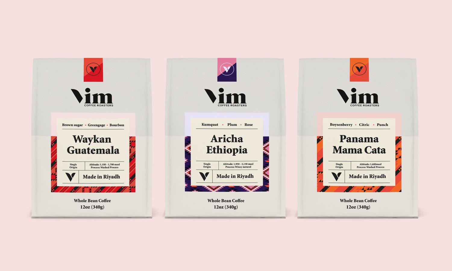
In the visually-driven world of flat illustration, typography is not just a medium of text communication; it's an integral part of the design that contributes to the overall aesthetic and message. The choice of typeface, size, color, and placement can significantly impact the effectiveness of your illustration, making it crucial to give typography the attention it deserves.
When incorporating typography into your flat illustrations, consider the typeface's personality and how it aligns with the message you want to convey. A well-chosen typeface can complement your illustration, reinforcing the tone and mood you're aiming for. For instance, sans-serif fonts often align with the simplicity and modernity of flat design, offering a clean, accessible look that enhances readability.
The color of your typography should harmonize with your illustration's color palette, ensuring that text is not only legible but also aesthetically integrated into the design. Contrast is key here: selecting a text color that stands out against the background can draw attention to your message without overwhelming the visual harmony.
Placement and spacing are equally important. Typography should be positioned thoughtfully within the illustration to maintain balance and ensure that the text and imagery work together cohesively. Pay attention to kerning, leading, and alignment to optimize readability and visual appeal.
Ultimately, focusing on typography means considering it as an essential element of your flat illustration, rather than an afterthought. By carefully selecting and integrating typography into your design, you can enhance the narrative, improve user engagement, and elevate the overall impact of your work.

Created by nima_nima_studio | https://www.instagram.com/p/C1r_IRDrB7d/
Add Depth with Layering
While flat illustration is characterized by its minimalist approach and lack of three-dimensional detailing, adding depth through layering is a technique that can introduce a subtle complexity and visual interest to your designs. This approach allows you to create a sense of space and dimension within the confines of a flat aesthetic, enriching the viewer's experience without compromising the style's integrity.
Layering in flat illustration is achieved by strategically arranging elements so that they overlap, creating a visual hierarchy that guides the viewer's eye through the design. This can be done by placing more prominent elements in the foreground and less critical elements in the background, using scale and positioning to suggest depth. Even in a flat design, such techniques can mimic the way objects interact in a three-dimensional space, providing a more dynamic and engaging composition.
Color and contrast play crucial roles in effective layering. By using lighter and darker shades of your color palette, you can create the illusion of depth, making some elements appear closer than others. Additionally, applying subtle shadows or highlights—while keeping them consistent with the flat aesthetic—can further enhance the layered effect without introducing unwanted complexity.
Furthermore, layering can be used to create focal points within your illustration, directing attention to specific elements and improving the overall flow of the design. By carefully considering which elements to emphasize and how they interact with each other spatially, you can create a more structured and compelling composition.
Incorporating depth through layering in flat illustration requires a delicate balance. The key is to enhance the visual interest and complexity of your design subtly, without overshadowing the simplicity and clarity that define the flat design aesthetic.
Experiment with Patterns and Textures
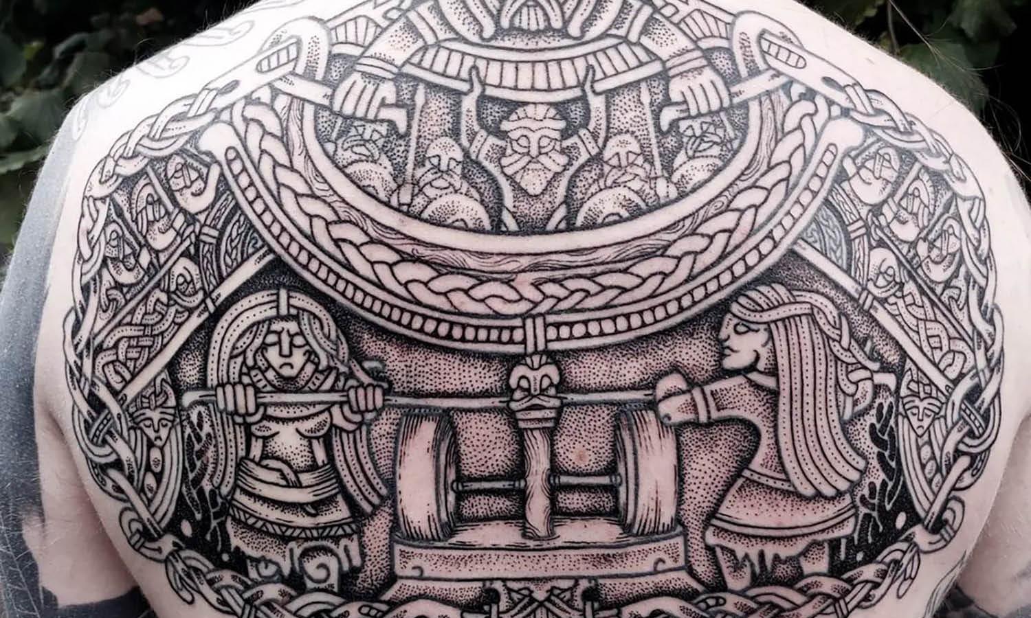
Incorporating patterns and textures into flat illustrations can elevate the visual interest and depth of your design while maintaining its characteristic simplicity. This technique is particularly effective in adding dimension and richness to flat illustrations without compromising the clean, modern aesthetic that defines the style. Experimenting with patterns and textures allows designers to introduce variety, guide the viewer's eye, and even convey emotions or atmospheres within the constraints of flat design.
When integrating patterns, consider their scale and the role they play within your illustration. Small, subtle patterns can serve as an excellent background or filler, adding complexity to large areas without overwhelming the viewer. Larger, bold patterns can act as focal points or help define specific elements within your design. The key is to ensure that the patterns complement the overall composition without detracting from the simplicity and readability of your illustration.
Textures offer a similar range of possibilities. They can be used to simulate real-life materials, bring warmth to your illustration, or add a tactile quality that flat designs often lack. However, it's important to use textures judiciously; too much texture can clutter your design and undermine the flat aesthetic. Aim for a balance where textures enhance the illustration's visual appeal without introducing unnecessary complexity.
Experimenting with patterns and textures within flat illustrations requires a thoughtful approach. By carefully selecting and applying these elements, you can add depth and interest to your designs, creating more engaging and dynamic visuals. Remember, the goal is to enhance your flat illustrations, not overshadow the clean, bold lines and colors that make them stand out.

Created by azu_illustration | https://www.instagram.com/p/C131KU7y0bL/
Balance Warm and Cool Colors
Balancing warm and cool colors is a fundamental aspect of creating visually appealing and harmonious flat illustrations. Warm colors, such as red, orange, and yellow, evoke emotions of warmth, passion, and energy, while cool colors like blue, green, and purple suggest calmness, serenity, and professionalism. The art of balancing these colors in flat illustration lies in using them to create a composition that is both dynamic and pleasing to the eye.
A well-balanced color scheme can enhance the visual impact of your illustration, guiding the viewer’s attention and conveying the intended mood or message. When balancing warm and cool colors, consider the overall feeling you wish to evoke. Warm colors can be used to highlight important elements or areas where you want to draw attention, while cool colors can provide a soothing background or complement the warmer tones without competing for the viewer's focus.
The contrast between warm and cool colors can also add depth and dimension to a flat illustration. This is particularly effective in flat design, where depth is implied through color relationships rather than through detailed rendering or perspective. By strategically placing warm and cool colors, you can create the illusion of space and form within a simplified design framework.
To achieve harmony in your flat illustration, experiment with different hues, saturations, and values of warm and cool colors. The use of color theory, such as complementary or analogous color schemes, can help in finding the right balance. Remember, the goal is to create a cohesive and engaging illustration that utilizes the emotional and visual strengths of both warm and cool colors, ensuring your design is not only balanced but also impactful.
Narrate a Story
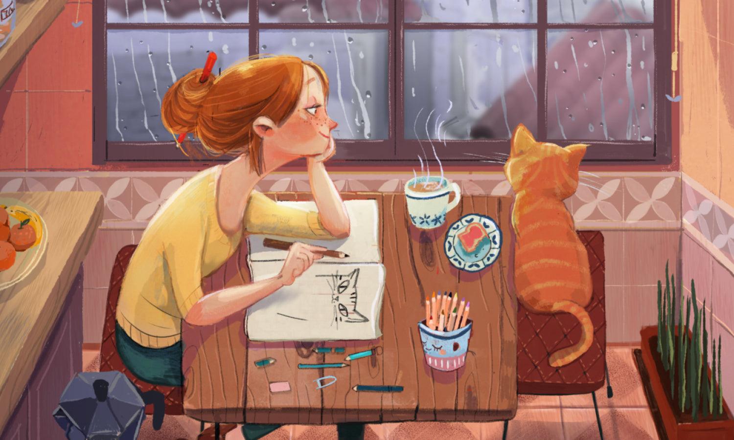
In the world of flat illustration, narrating a story isn’t just about adding characters or scenes; it’s about evoking emotions, conveying messages, and engaging the viewer through minimalistic visuals. A well-crafted flat illustration can tell a compelling story without the need for complex details or textures, relying instead on strategic use of shapes, colors, and composition. This storytelling approach enhances the connection between the viewer and the illustration, making the message more impactful and memorable.
To effectively narrate a story through flat illustration, start by defining the core message or emotion you wish to convey. Once the foundation is set, consider how each element of your design contributes to this narrative. Use colors to set the mood, shapes to suggest movement or stability, and composition to guide the viewer’s eye through the story you’re telling. Remember, every choice in your illustration should serve the story, whether it's a dramatic visual metaphor or a subtle background element that adds context.
Creating a narrative within a flat illustration also involves understanding the audience. A story that resonates with viewers often contains elements that are relatable or evocative. Whether it’s a universal experience, an emotional journey, or a simple moment captured in time, the story should invite the audience to reflect, feel, or imagine.
Narrating a story through flat illustration requires a balance between simplicity and expressiveness. By focusing on the essentials and using design elements intentionally, you can create powerful narratives that captivate and communicate effectively, proving that even the simplest illustrations can tell profound stories.

Created by karina.holsart | https://www.instagram.com/p/C3DpnohLLcO/
Ensure Readability and Clarity
In the visually driven world of flat illustration, ensuring readability and clarity is paramount. These principles are not just about making your design legible; they're about making it accessible and understandable at a glance. Flat illustrations, with their emphasis on simplicity and minimalism, must communicate ideas quickly and efficiently, making readability and clarity essential to their effectiveness.
To achieve high readability in your flat illustrations, pay careful attention to the choice of colors and contrast. High contrast between the background and the elements ensures that your design stands out and is easy to decipher. Similarly, selecting a color palette that differentiates elements without overwhelming the viewer can significantly improve clarity.
Typography, when part of your illustration, plays a critical role in readability. Choose fonts that complement the overall design and are easy to read across various devices and sizes. The spacing between letters and words, known as kerning and leading, respectively, should also be optimized to enhance legibility.
Clarity in flat illustration is achieved by focusing on the essential elements and stripping away unnecessary details that may clutter the design. Each component should serve a purpose, whether to inform, direct attention, or contribute to the overall narrative of the piece.
By prioritizing readability and clarity, designers can create flat illustrations that not only capture attention but also communicate their intended message effectively and efficiently. This focus ensures that your illustrations are not just seen but understood and appreciated by a wide audience.
Incorporate Negative Space
Incorporating negative space effectively is a key technique in the creation of engaging flat illustrations. Negative space, the area around and between the subjects of an image, is not merely a passive background but a powerful design tool that can enhance the clarity, composition, and overall impact of your illustration. Utilizing negative space wisely can transform a good flat illustration into a great one, adding sophistication and depth to a seemingly simple design.
When designing a flat illustration, consider how negative space can be used to define shapes, create balance, and focus the viewer’s attention on the most important elements of your composition. Instead of filling every part of the canvas with color or detail, allow for areas of unoccupied space to provide breathing room for the eye. This not only improves readability but also adds a sense of elegance and intentionality to your design.
Negative space can also play a crucial role in storytelling within your illustration. It can suggest concepts, emotions, or relationships between elements without explicitly detailing them, leaving room for the viewer’s imagination to fill in the gaps. This subtle use of negative space invites engagement and personal interpretation, making the illustration more memorable and impactful.
To master the use of negative space in flat illustrations, practice viewing your compositions as a balance of positive and negative spaces. Experiment with different arrangements and proportions to see how they affect the overall feel and clarity of the illustration. Remember, negative space is an active part of your design toolkit, capable of transforming the simplicity of flat design into a visually rich and compelling narrative.

Created by madebyralu | https://www.instagram.com/p/C2eo_jTtt7i/
Iterate and Refine
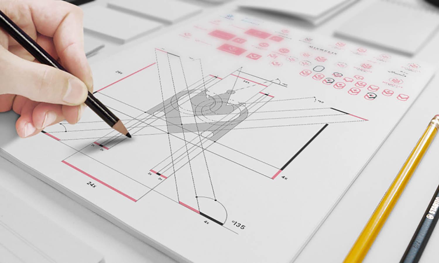
The process of creating an engaging flat illustration doesn't end with the first draft; it evolves through iteration and refinement. This phase is crucial for transforming a good design into an exceptional one. Iteration allows designers to explore different compositions, color schemes, and details, ensuring that every element of the illustration is optimized for maximum impact.
Refinement is about fine-tuning your illustration, making subtle adjustments to improve balance, contrast, and visual flow. It's during this stage that you critically assess your work, asking whether each element aligns with the overall message and aesthetic you aim to achieve. This meticulous attention to detail can elevate the quality of your flat illustration, ensuring it communicates effectively and stands out visually.
Iterating and refining your illustration also involves seeking feedback from peers or potential users. Fresh perspectives can uncover areas for improvement that you might have overlooked, offering insights into how your illustration is perceived by others. This feedback loop is invaluable for enhancing the clarity, readability, and overall appeal of your design.
Moreover, iteration and refinement are opportunities to experiment with new techniques and ideas. They encourage a mindset of continuous learning and growth, which is essential in the ever-evolving field of design.
In summary, the iterative process and constant refinement are key to mastering flat illustration. They push the boundaries of creativity, ensuring that your final piece is not just visually appealing but also deeply resonant with your intended audience. Embrace this process as a vital part of your creative journey, and watch as your flat illustrations evolve from good to exceptional.
Conclusion
Flat illustration, with its clean lines, vibrant colors, and minimalist approach, offers a unique way to communicate complex ideas through simple design. Mastering this art form requires understanding its principles, experimenting with elements like color, shapes, and negative space, and iterating your work to perfection. By focusing on storytelling, readability, and visual harmony, you can create illustrations that not only look stunning but also connect with your audience on a deeper level. Remember, the journey of creating an engaging flat illustration is a blend of creativity, precision, and continuous learning. Embrace these challenges, and let your illustrations tell stories that captivate and inspire.
Let Us Know What You Think!
Every information you read here are written and curated by Kreafolk's team, carefully pieced together with our creative community in mind. Did you enjoy our contents? Leave a comment below and share your thoughts. Cheers to more creative articles and inspirations!







Leave a Comment