10 Design Rules To Create An Effective Print Advertisement

Source: Jack Forrest, Posters & Posters, Behance, https://www.behance.net/gallery/103874349/Posters-Posters
In the realm of marketing, print advertisements hold a timeless appeal and a proven track record of effectiveness. Despite the surge in digital media, the tactile nature and visual permanence of print advertisements make them an indispensable tool in a marketer's arsenal. Crafting a compelling print advertisement, however, requires more than just aesthetic appeal; it demands a strategic blend of design principles to capture and retain viewer attention.
This article delves into 10 essential design rules that are foundational for creating impactful print advertisements. These guidelines cater to both novice and seasoned designers aiming to enhance their print media strategies. By integrating these design rules, you can ensure that your print advertisements not only catch the eye but also convey the message effectively and prompt the desired response from your target audience.
We will explore how the intelligent use of color, space, and typography can transform a simple idea into a powerful print advertisement. Whether you are promoting a product, announcing an event, or building brand awareness, these design rules will equip you to create print materials that resonate and engage.
Keep It Simple and Clear: Minimalism in Print Advertisement Design
One of the most effective design rules for crafting a print advertisement is the principle of simplicity. A minimalist approach not only enhances the aesthetic appeal but also significantly improves the ad's communication efficiency. In an age where consumers are bombarded with information, a simple and clear advertisement can cut through the noise and capture attention more effectively.
The key to simplicity in print advertisements lies in focusing on the core message. Use concise language and avoid cluttering the space with excessive text or graphics. The choice of font and color palette also plays a critical role. Opt for fonts that are easy to read and limit the color scheme to a few complementary shades to maintain visual harmony and enhance message clarity.
Images should be purposeful and powerful, chosen to evoke emotions or actions relevant to the product or service being advertised. A single, striking image can communicate more effectively than a busy collage of multiple pictures. This notability ensures that the viewer's attention is immediately drawn to the most important part of the advertisement.
Additionally, maintaining ample white space around text and visual elements can prevent the advertisement from feeling overcrowded. This space acts as a visual pause, allowing the audience to absorb the message without feeling overwhelmed.
Create a Focal Point: Guide Viewer’s Eyes
Designing an effective print advertisement involves directing the viewer's attention to a specific focal point. This focal point is the area where you want your audience to focus their attention immediately upon viewing the advertisement. Establishing a clear focal point is essential as it guides the viewer's eyes through the advertisement in a way that reinforces the ad's message and maximizes impact.
The creation of a focal point can be achieved through various design elements. Contrast is a powerful tool in achieving this—using contrasting colors, sizes, or shapes can make the focal area stand out from the rest of the design. Additionally, the strategic use of lines or the arrangement of visual elements can direct the viewer's gaze to the desired spot.
Positioning is also crucial. Placing the focal point in a prominent location, such as the center or at one of the intersections according to the Rule of Thirds, can enhance visibility and attention. The chosen focal point should be the element that best communicates the key message or value proposition of the advertisement, whether it's a product image, a compelling headline, or a unique graphic.
Ensure Legibility: Font Size and Type Matter
Legibility is paramount in print advertisements to ensure that the message not only captures but also retains the viewer's attention. Selecting the appropriate font size and type can dramatically affect how easily the audience can read and understand your ad. When designing your print advertisement, consider the fundamental role that typography plays in communication.
Firstly, choose a font that aligns with the tone of your message but is also easy to read at various sizes. Sans-serif fonts, such as Arial or Helvetica, are often recommended for their clarity and simplicity, making them ideal for quick reads in an advertising context. Serif fonts, like Times New Roman, may be used for more traditional or formal advertisements, as they convey a sense of respectability and reliability.
The size of the text is equally crucial. It must be large enough to be readable from a typical viewing distance without straining the eyes. This is especially important for essential elements like headlines and calls to action. Consider the environment in which the advertisement will be displayed; larger text sizes may be necessary for outdoor advertisements viewed from a distance.

Source: John John Dias, Bloom Fundings, Behance, https://www.behance.net/gallery/209176005/Bloom-Fundings?
Use Emotional Appeals: Connect with Your Audience
Emotional appeals are a powerful tool in print advertisements, capable of influencing the attitudes and behaviors of the target audience. By tapping into specific emotions, advertisements can create a deeper connection with the viewer, making the message more memorable and impactful. Understanding and implementing emotional appeals effectively is a crucial design rule for creating compelling print advertisements.
Firstly, identify the core emotions that align with your brand values and campaign objectives. Whether it’s happiness, security, fear, or pride, choosing the right emotional trigger can dramatically enhance the effectiveness of your advertisement. For instance, an insurance company might use fear-based appeals highlighting security and protection, whereas a travel agency might evoke feelings of wanderlust and joy.
Moreover, the language used in the advertisement must complement the emotional tone. Emotional language can persuade and motivate the audience to take action. Phrases that resonate on a personal level can strengthen the emotional connection, urging the audience to engage with the brand.
Incorporating emotional appeals into your print advertisement design not only attracts attention but also fosters a stronger bond with the audience, enhancing the overall impact of your message.
Balance Text with Visuals: Harmonize Content
Achieving a harmonious balance between text and visuals is essential in the design of effective print advertisements. This balance ensures that the ad communicates its message clearly and aesthetically, enhancing both readability and viewer engagement. When text and images are well-integrated, they work together to reinforce the ad’s message without overwhelming the viewer.
To balance text with visuals, start by defining the hierarchy of your content. Determine what needs immediate attention—often the visual—and what provides additional information or a call to action, typically the text. Use scale and contrast to establish this hierarchy visually. Larger, bolder elements will capture attention first, so decide whether that should be an image or a headline based on your advertising goals.
Spacing also plays a critical role in this balance. Ensure there is enough white space around textual and visual elements to prevent the advertisement from appearing cluttered. This space helps to separate different elements, making the information easier to digest.
Furthermore, the choice of images and words should be complementary. Select visuals that illustrate the message of your text and use concise, impactful text that enhances the visuals. For example, if the visual is dynamic and full of action, your text should be direct and to the point, driving home the message quickly and effectively.
Leverage Color Psychology: Choose Colors Wisely
The strategic use of color in print advertisements is not just about aesthetics but also about utilizing color psychology to influence viewer emotions and behaviors. Colors have the power to evoke specific feelings and actions, making them a crucial element in the effectiveness of a print advertisement.
When selecting colors for your print advertisement, consider the emotions and associations tied to different hues. For instance, blue can evoke feelings of trust and security, often used by financial institutions. Red, known for its urgency and energy, is frequently used in advertisements that aim to excite or alert the viewer, such as sales or promotions.
It’s also essential to consider the cultural context of your target audience since color perceptions can vary widely between cultures. What works in one region might not resonate in another, potentially affecting the ad's effectiveness.
Furthermore, the contrast between colors can affect legibility and viewer engagement. High contrast, such as black text on a white background, is typically the easiest for reading and should be used to highlight the most critical parts of your message. Conversely, low-contrast color schemes can be used to create a soft, subtle look but may reduce readability if not handled carefully.
Maintain Brand Consistency: Logos and Color Schemes
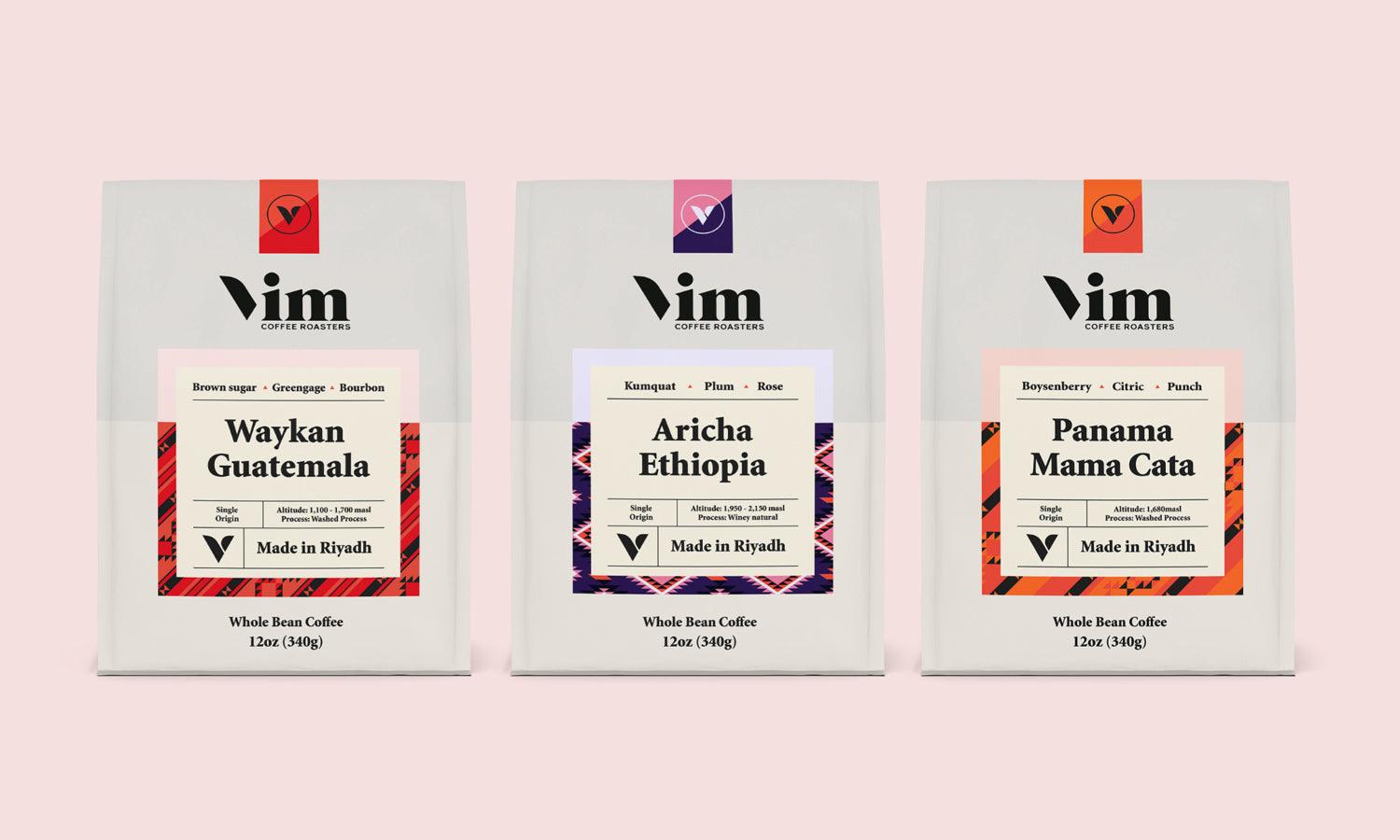
Maintaining brand consistency in print advertisements is crucial for building and reinforcing brand recognition and trust. Consistent use of logos, color schemes, and visual styling ensures that your advertisements are immediately identifiable to the audience, linking them back to your brand regardless of the context in which they appear.
When designing a print advertisement, incorporate your brand’s logo in a prominent but unobtrusive position. The logo should act as a signature, not the main focus, unless the ad aims to enhance brand awareness specifically. Consistent logo placement across different ads reinforces brand identity and aids in brand recall.
Color schemes play a significant role in brand consistency. Utilize your brand’s primary and secondary colors to design your advertisements. This not only enhances visual appeal but also ensures that the advertisements align with the overall brand aesthetic. Consistent colors help evoke the brand’s intended emotional response in the audience, which can be critical for long-term engagement and loyalty.
In addition to logos and colors, maintain consistent typography and imagery that reflect the brand’s values and message. This includes using a set family of fonts and a consistent style of photography or illustration.

Source: John John Dias, AKSOY, Behance, https://www.behance.net/gallery/203198289/AKSOY?
Use High-Quality Images: Enhance Visual Appeal
The use of high-quality images is a pivotal design rule for creating effective print advertisements. Images not only capture the viewer's attention but also communicate and reinforce your message much faster than text alone. The clarity, resolution, and artistic quality of the images you choose can significantly impact the overall perception of your advertisement.
Firstly, ensure that the images are of high resolution and are professionally shot or created. Low-quality, pixelated images can deter viewer interest and negatively affect the credibility of the ad and the brand it represents. High-definition images, on the other hand, convey professionalism and enhance the visual appeal of your print advertisement.
Select images that align with the message and tone of your advertisement. They should be relevant to the product or service you are promoting and should resonate with your target audience. For instance, lifestyle images that depict people interacting with your product or benefiting from your service can be particularly effective as they help viewers visualize themselves in similar scenarios.
Additionally, consider the composition and framing of your images. They should be well-composed, with a clear focus on the subject, and should be framed in such a way that complements the layout of your advertisement. Proper use of lighting and color in the images can also play a crucial role in setting the mood and enhancing the impact of the advertisement.
Highlight the Call to Action: Make It Stand Out
A critical component of any print advertisement is the call to action (CTA). This is the part of the ad that instructs the audience on what to do next, whether it's to visit a website, call a phone number, or look for more information. Making the CTA stand out is paramount in driving audience engagement and conversion from the advertisement.
To highlight the CTA, it should be prominently positioned within the layout of the advertisement. Ensure it contrasts with the rest of the elements in terms of size, color, and placement. Using vibrant colors that stand out against the background can make it more noticeable. Typography also plays a significant role; selecting a bold and readable font will help make the CTA clear and legible.
Besides visual prominence, the language of the CTA is crucial. It should be action-oriented, concise, and compelling. Phrases like “Call Now,” “Visit Today,” or “Find Out More” directly encourage viewers to take action. The CTA should convey a sense of urgency or benefit, motivating the audience to act promptly.
Include Contact Information: Ensure Accessibility
Including contact information is a crucial element in the design of effective print advertisements. It not only serves the practical purpose of letting customers know how to reach you but also establishes the legitimacy of your brand and builds trust. Properly incorporating this information into your advertisement can influence the success of your marketing efforts.
Contact information should be clearly visible and easy to find within the advertisement. This typically includes a phone number, website, physical address, or social media handles, depending on the nature of the ad and the intended response. For service-based businesses, including a phone number or a QR code that links directly to a contact page can facilitate immediate action.
The placement of contact information should be strategic. It should be positioned in a location within the ad where it is likely to be seen after the main message, such as the bottom corner or along the lower edge. This positioning follows the natural reading flow, ensuring that the information is noticed at the crucial moment when a potential customer decides to make contact.
Conclusion
Mastering the design rules for creating effective print advertisements is essential for any marketer looking to make a significant impact. From understanding your audience to using high-quality images and making emotional appeals, each element plays a crucial role in the success of your advertisement. By focusing on these key aspects, designers can craft compelling, visually appealing, and memorable print advertisements that not only attract but also resonate with the target audience. Implementing these design principles effectively will ensure that your print advertisements stand out in a crowded marketplace and achieve the desired response from viewers.
Let Us Know What You Think!
Every information you read here are written and curated by Kreafolk's team, carefully pieced together with our creative community in mind. Did you enjoy our contents? Leave a comment below and share your thoughts. Cheers to more creative articles and inspirations!









Leave a Comment