
Brand Logo History & Evolution Case Studies

A logo may appear to be a simple combination of shapes, colors, and letters, but it often carries decades of history. As companies expand, reposition themselves, adopt new technologies, and respond to audience expectations, their logos evolve alongside them. Studying brand logo history reveals how visual identity reflects shifts in culture, commerce, and design.
Some brands preserve nearly the same logo for generations, making only subtle refinements. Others introduce dramatic redesigns to signal a new direction. Success depends on whether the change protects brand recognition while solving a genuine communication or usability problem.
Logo case studies span many industries. Entertainment companies need identities that support storytelling. Luxury brands rely on heritage and exclusivity. Food brands prioritize familiarity, while sports and technology companies require logos that perform across products and digital platforms.
By examining logo design history across these industries, we can better understand why brands change, what they preserve, and how strong visual identities remain recognizable over time.
What Brand Logo History Reveals About a Company
A company’s logo history can reveal its origins, desired image, and intended audience. Early logos often connect to a founder, local market, original product, or production method. As the company grows, these references may be simplified or replaced with symbols that work internationally.
Typography can communicate whether a brand wants to appear established, innovative, friendly, or premium. Color choices may reflect industry conventions or emotional associations, while symbols can communicate ideas such as speed, trust, creativity, or heritage.
When reviewing a logo timeline, examine more than the final design. Changes in spacing, proportions, lettering, color, and composition can reveal shifting priorities. Logo evolution records changes in business strategy, cultural relevance, and audience expectations.
How Logo Design Has Evolved Over Time
Early commercial logos were designed for advertisements, storefronts, labels, and packaging. Many featured detailed illustrations, frames, crests, seals, and elaborate lettering. These elements communicated craftsmanship and legitimacy but were difficult to reproduce at small sizes.
During the twentieth century, modernist design encouraged businesses to adopt cleaner geometry, simpler typography, and standardized corporate identity systems. Logos were expected to work consistently across buildings, stationery, vehicles, advertisements, and product packaging.
The digital era introduced another major shift. Logos now appear on websites, application icons, social profiles, smartwatches, mobile screens, and animated interfaces. Designs suited to printed packaging may become unreadable as tiny icons.
As a result, contemporary logo design often emphasizes scalability, simplicity, and flexibility. Many companies now use responsive identity systems containing several variations rather than relying on one fixed logo for every situation.
Why Brands Change Their Logos
Brands update logos when the existing identity no longer supports practical or strategic needs. A company entering international markets may need a symbol that works across languages, while one expanding into new categories may require a broader identity.
Changes in positioning can motivate a redesign as well. A brand may want to appear more premium, modern, approachable, youthful, or technologically advanced. In other cases, a company may need to distance itself from an outdated reputation.
Logos must remain clear on small screens, packaging, social platforms, and digital interfaces. Complicated illustrations, narrow lettering, and subtle details may perform poorly in these environments.
Cultural expectations can also change. Symbols, language, or visual references that once seemed acceptable may later feel outdated or exclusionary. A thoughtful redesign allows a brand to remain relevant without abandoning the recognition it has built.
The Main Types of Logo Evolution
Gradual Refinement
Gradual refinement adjusts typography, spacing, proportions, or color while keeping the identity familiar. Audiences may barely notice, but the logo often becomes cleaner and easier to use.
Simplification
Simplification removes unnecessary detail so the design remains recognizable at different sizes. It is particularly useful when a logo must appear clearly on mobile screens, social media profiles, product labels, and application icons.
Modernization
Modernization may introduce contemporary typography, cleaner geometry, or a more flexible composition while retaining the brand’s most recognizable visual elements.
Complete Rebranding
A complete rebranding creates a substantially different identity, usually following a merger, strategic repositioning, reputation problem, new ownership, or major expansion.
Returning to Heritage
Some brands move in the opposite direction by returning to their heritage. They may reintroduce an older symbol, historic color palette, or traditional lettering style. This can help communicate authenticity, longevity, and renewed confidence in the company’s origins.
The right approach depends on how much recognition the existing logo holds and how closely it still reflects the company’s direction.

Entertainment & Media Logo Design History Case Studies
Entertainment logo history shows how brands remain recognizable while supporting creativity, storytelling, and changing formats. Their logos appear in film introductions, television graphics, streaming platforms, merchandise, and physical attractions.
Disney
Walt Disney logo history is closely associated with imagination, childhood, and storytelling. Its handwritten appearance gives the brand a personal character, while the core lettering remains recognizable across films, television, theme parks, streaming, and consumer products.
Marvel
Marvel logo history shows how a bold wordmark can support a wide entertainment universe across films, comics, merchandise, and digital platforms. Its compact block lettering works well in title sequences, posters, and small digital formats.
Netflix
Netflix logo history reflects the company’s transition from a physical media service to a global streaming brand, with increasingly streamlined forms suited to screens and application icons. The simplified red wordmark improves clarity across television interfaces, mobile devices, and promotional materials.
Together, these examples show that entertainment logos benefit from balancing consistency with visual flexibility.
Fashion & Luxury Logo Design History Case Studies
Fashion and luxury logo history often centers on typography, monograms, and heritage symbols. Appearing on clothing, handbags, packaging, storefronts, jewelry, and small product details, these identities must communicate value with little visual information.
Chanel
Chanel logo history demonstrates the power of symmetry and repetition through the interlocking “C” symbol. Its simple geometry makes it suitable for packaging, hardware, fabric patterns, and advertising. The mark also reflects the importance of founder-based identity within luxury branding.
Gucci
Gucci logo history shows how the double-G monogram functions as both a logo and decorative pattern. It can appear as a small detail or cover an entire surface while remaining connected to the brand. This versatility serves fashion, accessories, beauty products, and retail spaces.
Louis Vuitton
Louis Vuitton logo history demonstrates how a recognizable monogram can function as both a corporate signature and a repeating visual pattern across products, packaging, and retail environments.
For fashion audiences, simplification can feel elegant, but removing too much heritage may also make a brand less distinctive.
Food & Beverage Logo Design History Case Studies
Food and beverage logo history often depends on familiarity. Consumers repeatedly see these identities on bottles, cups, menus, shelves, signs, and delivery applications. A redesign must improve usability without making the product difficult to recognize.
Coca-Cola
Coca-Cola logo history exemplifies long-term visual consistency. Its flowing script has been refined, but the wordmark’s personality remains familiar. Rather than replacing it, the brand has developed supporting graphics, packaging systems, and advertising styles.
Pepsi
Pepsi has taken a more experimental approach. Its identity moved from script-based lettering toward the recognizable red, white, and blue globe. The globe has appeared in flat, dimensional, tilted, and heritage-inspired forms. These updates show how a brand can follow changing design trends, although frequent redesigns can sometimes weaken continuity.
Starbucks
Starbucks gradually simplified its siren illustration, reducing surrounding details and eventually removing the company name from the primary mark. This became possible because the character had gained strong global recognition.
These examples demonstrate how packaging visibility, nostalgia, and repeated exposure shape food and beverage logo evolution.
Continue Reading
- Versace Logo Design: History & Evolution
- Oreo Logo Design: History & Evolution
- Adidas Logo Design: History & Evolution
- Adobe Logo Design: History & Evolution
- TikTok Logo Design: History & Evolution
Sports & Wellness Logo Design History Case Studies
Sports wellness logo history often uses visual ideas connected to motion, strength, speed, balance, and personal progress. These logos must work on footwear, clothing, equipment, event signage, mobile applications, and sponsored content.
Nike
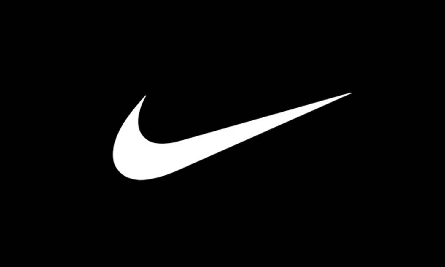
Nike logo history began with the Swoosh alongside the company name, but it eventually became recognizable alone. Its curved form suggests movement without illustrating an athlete. The mark’s power comes from its shape and decades of consistent use across products, campaigns, and sporting events.
Adidas
Adidas has used stripes as a recurring brand asset across several logo systems. Different variations support performance products, lifestyle collections, and heritage lines, yet the stripe concept maintains continuity. This approach shows how a company can operate multiple identities without losing its central visual language.
Puma
Puma’s leaping cat communicates agility and energy through a direct visual metaphor. Its active pose works naturally within a sports context while remaining clear enough for clothing and footwear.
For audiences, these designs feel effective because they are simple, energetic, and immediately recognizable. Their histories also show that consistent application can give a basic shape significant cultural meaning.
Technology Logo Design History Case Studies
Technology logo history must adapt to rapidly changing products and interfaces. A mark that once appeared mainly on office equipment or printed software boxes may now need to function as an application icon, device emblem, website header, loading animation, and social profile image.
Apple
Apple’s earliest identity used a detailed illustration of Isaac Newton, but the design was too complex for broad commercial use. The company soon adopted the bitten apple silhouette, initially presented with rainbow stripes. As Apple’s products and materials became more streamlined, the logo shifted toward flexible monochrome treatments. The silhouette remained stable even as its colors and surface effects changed.
Microsoft
Microsoft logo history moved through several stylized wordmarks before adopting a cleaner identity supported by a four-square symbol. The geometric window form works across software, hardware, retail, and corporate communications while also suggesting a connected family of products.
Google logo history illustrates how a colorful wordmark can be simplified for digital clarity while preserving the familiar letter sequence and color system associated with the brand. The move toward a cleaner sans-serif typeface improved readability across search pages, mobile screens, and application interfaces.
These cases show why technology brands often favor simple geometry, strong silhouettes, and adaptable identity systems.

What Successful Logo Evolutions Have in Common
They Protect Recognizable Brand Assets
Successful logo evolutions identify which elements already hold recognition, such as a familiar silhouette, distinctive typeface, color combination, monogram, or recurring graphic device. Preserving them helps audiences connect the new design with the brand they know.
They Respond to Real Business Needs
Strong redesigns respond to practical or strategic needs. They may improve readability, support digital applications, unify multiple product lines, or communicate a meaningful shift in the company’s direction. Changes made only to follow a fashionable style are less likely to remain effective over time.
They Balance Familiarity With Freshness
The best updates balance familiarity with freshness. A new version should feel improved without becoming disconnected from the company’s history, remaining recognizable when simplified or modernized.
They Work as Flexible Identity Systems
Modern brands must think beyond one logo. They need coordinated wordmarks, icons, secondary marks, horizontal arrangements, and simplified versions. These variations should work across packaging, websites, social platforms, products, advertising, and physical environments.
Logo evolution is most effective when it strengthens a complete identity system rather than merely changing one isolated graphic.
Common Risks in Logo Redesigns
Removing Too Much Personality
Removing too much personality is a major redesign risk. Simplification can improve clarity but make a logo resemble other minimalist identities. Distinctive typography, unusual proportions, or heritage details should not be discarded without considering their value.
Ignoring Audience Attachment
Brands may underestimate audience attachment. Customers often connect familiar logos with memories, products, places, or experiences. Sudden changes can feel unnecessary when the original identity remains widely recognized.
Following Short-Lived Trends
A design created primarily to look fashionable today may quickly appear dated. Trend-driven typography, gradients, effects, or visual treatments may not provide a strong foundation for a long-term identity.
Changing Without a Clear Purpose
Redesigns can fail when audiences do not understand their purpose. If a company changes its logo without a broader strategic reason, the update may seem cosmetic or wasteful.
Communicating the Change Poorly
Clear communication can reduce resistance. Explaining how the new identity supports future products, improved accessibility, or a wider brand transformation helps audiences understand why the change was made.
How to Analyze a Logo History Case Study
Identify What Stayed Consistent
When examining a brand logo history timeline, begin by identifying what stayed consistent. Look for recurring colors, shapes, letterforms, symbols, or compositions. These elements often represent the strongest sources of brand recognition.
Examine What Changed
Consider whether the typography was simplified, decorative details were removed, colors were adjusted, or the symbol became more prominent than the company name. Determine whether the update improved readability, scalability, or versatility.
Consider the Business Context
A redesign may coincide with international expansion, new leadership, a merger, a product launch, or a change in audience. Understanding the business context helps explain why a visual change was considered necessary.
Review the Role of Technology
Logos designed for mobile screens and application icons face different requirements from those created for storefronts or printed packaging. Technology can therefore have a major influence on simplification and responsive logo design.
Evaluate Audience Response and Long-Term Performance
Instead of judging one version in isolation, compare the full logo sequence. The most meaningful question is whether each change helped the identity remain recognizable, useful, and relevant over time.
Frequently Asked Questions
What Is Brand Logo History?
Brand logo history examines how a company’s visual identity has developed and why it changed. It covers early trademarks, typography, colors, symbols, redesigns, and contemporary applications. It also connects those visual developments with changes in the company’s products, strategy, audience, technology, and cultural environment.
Why Do Companies Change Their Logos?
Companies may redesign their logos to improve digital performance, attract new audiences, enter international markets, modernize their image, or represent expanded services. A redesign can also correct practical issues such as poor readability or excessive detail. Strong updates usually retain familiar elements that protect existing recognition.
Why Are Modern Logos Becoming Simpler?
Simpler logos are generally easier to reproduce and recognize across mobile applications, websites, packaging, social platforms, and small interfaces. However, minimalism is helpful only when it improves clarity without removing the brand’s personality. A basic wordmark or geometric symbol is not automatically distinctive or memorable.
What Makes a Logo Evolution Successful?
Successful logo evolution improves relevance and functionality while preserving meaningful brand equity. The new identity should represent the company accurately, perform across important applications, and remain distinguishable from competitors. It should feel like a purposeful continuation of the brand rather than an unrelated response to a temporary design trend.
How Often Should a Brand Update Its Logo?
There is no standard schedule. A redesign becomes appropriate when the existing identity no longer represents the business, performs poorly in important media, or causes confusion. Brands should not replace an older logo solely because of its age if it remains recognizable, relevant, and functional.
Can a Logo Redesign Harm a Brand?
Yes. A redesign can weaken recognition when it removes familiar elements too quickly, looks generic, or lacks a clear strategic reason. Negative reactions are more likely when customers feel emotionally attached to the previous identity. Research, application testing, and a carefully planned introduction can reduce these risks.
Why Do Some Brands Return to Older Logo Designs?
Brands sometimes revive earlier identities to restore character, authenticity, or historical continuity. This may happen after a heavily simplified redesign feels generic or disconnected from the company’s heritage. The revived version is usually refined for modern production and digital use rather than reproduced with every original detail.
Conclusion
Brand logo history shows that visual identity is never completely separate from business development. Logos change because companies grow, technologies shift, audiences evolve, and design requirements become more complex. Some brands protect a familiar wordmark for generations, while others rely on flexible symbols, monograms, or repeated reinvention.
The entertainment, luxury, food, sports, wellness, and technology case studies explored here demonstrate that there is no single formula for successful logo evolution. Coca-Cola benefits from consistency, MTV uses flexibility, Chanel protects its monogram, and Apple relies on a strong silhouette.
What connects successful examples is their ability to preserve meaningful recognition while improving clarity and adaptability. A redesign should not simply make a logo look newer. It should help the identity work more effectively across products, platforms, and audience experiences.
The strongest logos are living components of wider brand systems—capable of evolving without losing the qualities that made them memorable.
You May Also Like
- MGM Logo Design: History & Evolution
- Prada Logo Design: History & Evolution
- Pepsi Logo Design: History & Evolution
- Puma Logo Design: History & Evolution
- Nintendo Logo Design: History & Evolution
Let Us Know What You Think!
Every information you read here are written and curated by Kreafolk's team, carefully pieced together with our creative community in mind. Did you enjoy our contents? Leave a comment below and share your thoughts. Cheers to more creative articles and inspirations!
Related Articles








Leave a Comment