
Sports & Wellness Logo Design History Case Studies

Sports and wellness logos do more than identify a company or product. They communicate movement, strength, discipline, health, belonging, and personal progress before an audience reads a single word. A successful mark must feel distinctive while remaining clear on clothing, equipment, packaging, storefronts, and screens. This need for adaptable recognition also appears in food and beverage logo history, where identities must work consistently across packaging and storefronts.
Studying sports wellness logo history within the broader field of brand logo history reveals how visual identities respond to technology, fashion, culture, and consumer expectations. Traditional sports brands often use bold forms and symbols of speed or victory, while wellness brands may connect movement with lifestyle, balance, and community.
Enduring identities succeed through more than appearance. Consistent use, memorable products, athlete associations, retail experiences, advertising, and repeated exposure build recognition. Nike, Adidas, Reebok, Lacoste, and Lululemon show how brands can preserve strong visual ideas while adapting to new markets and platforms.
What Makes Sports and Wellness Logo History Distinctive?
Designing for Energy and Recognition
Sports logos must often be understood in a fraction of a second. They appear on athletes in motion, televised competitions, footwear, uniforms, equipment, stadium signs, and distant merchandise. This encourages bold silhouettes, condensed typography, stripes, mascots, and shapes that imply speed, strength, or impact.
Unnecessary detail can disappear when a logo is embroidered onto a cap or reduced to a product label. Strong sports branding therefore relies on recognizable forms that remain clear across sizes, materials, and environments.
Communicating Health and Personal Progress
Wellness branding often addresses a different emotional need. Rather than presenting exercise only as competition, it may position movement as part of a healthier, balanced lifestyle. Softer curves, open spacing, and approachable visual systems can feel supportive rather than intimidating.
This direction reflects how fitness has expanded beyond professional athletes and traditional gyms. Modern audiences may seek confidence, recovery, community, mindfulness, or sustainable habits instead of elite performance alone.
Responding to New Platforms
Sports and wellness identities once developed mainly for print, uniforms, storefronts, packaging, and broadcast graphics. Today, they must also work as app icons, wearable interfaces, animations, social media avatars, and digital shopping tools. This favors simpler forms and flexible systems that move easily between physical and digital experiences.
Nike: Turning a Simple Mark Into a Symbol of Motion
The Creation of the Swoosh
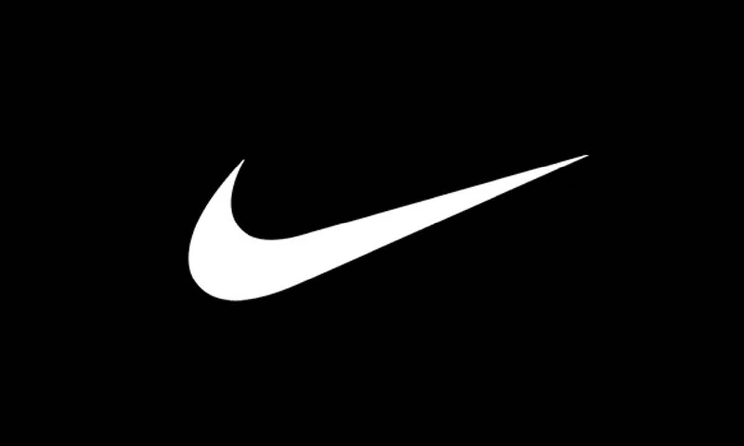
The Nike logo history demonstrates how a simple shape can acquire enormous cultural meaning. Created by graphic design student Carolyn Davidson in 1971, its sweeping, asymmetrical curve communicates speed and direction even when the image is still.
The design is commonly connected to the wing of Nike, the Greek goddess of victory, but audiences need not understand that reference. The Swoosh suggests momentum and achievement without depicting a shoe, athlete, ball, or particular sport.
From Wordmark to Independent Symbol
Early applications paired the Swoosh with the Nike name, connecting the unfamiliar symbol with the company. As recognition increased, the brand became confident enough to use the mark independently.
Consistent product placement, memorable advertising, athlete endorsements, and major sporting moments gave the Swoosh emotional value. It became associated with ambition, confidence, performance, and determination.
What Designers Can Learn From Nike
Nike shows that a sports logo does not need to explain every product or service. One distinctive visual gesture can be more memorable than a complicated combination of sporting symbols.
The Swoosh succeeds because its silhouette is recognizable and the wider brand continually reinforces its meaning. It shows how a compact mark can grow more powerful as recognition and emotional associations accumulate.
Adidas: Building a Flexible Identity Through Repetition
From Three Stripes to the Trefoil
The Adidas logo history includes several changes, but the three-stripe element creates continuity. Initially associated with the company’s footwear, the stripes became a recognizable device across shoes, clothing, packaging, advertising, and equipment.
The Trefoil gave Adidas a more expressive symbol as the brand expanded into apparel. Its leaf-like form retained the familiar stripes, introducing a fresh identity without abandoning an established feature.
The Trefoil later became closely associated with Adidas Originals and heritage products, connecting sports branding with themes also seen in fashion luxury logo history. It retained value even after newer performance marks entered the brand system.
The Performance Logo and Expanding Brand Architecture
The sloping three-bar performance mark resembles a mountain or ascending path. It communicates challenge, effort, and progress while keeping the stripe system central to the Adidas identity.
Adidas uses a broader brand architecture instead of requiring one logo to represent every category identically. Performance products, heritage collections, streetwear, and fashion collaborations can use different expressions while sharing familiar elements.
What Designers Can Learn From Adidas
Adidas illustrates the value of owning a repeatable visual asset. Individual logos may evolve, but the stripes provide a recognizable thread across generations and product categories.
Multiple marks can confuse audiences when they lack a clear relationship. Adidas reduces this risk by repeating established shapes and cues. Its variations remain connected to the same visual foundation.
Reebok: Redefining Identity Across Performance and Fitness Culture
From a British Wordmark to a Global Sports Identity
Reebok logo history reflects the brand’s movement from a British footwear company into a global sports and fitness business. Earlier identities emphasized the Reebok name alongside references to the United Kingdom, reinforcing its origins and manufacturing heritage.
As Reebok expanded internationally into running, aerobics, training, basketball, and everyday athletic footwear, its visual branding became faster, cleaner, and better suited to a worldwide audience.
The Vector Logo and a Sense of Motion
The Reebok Vector became one of the brand’s most recognizable symbols. Its angled lines suggested speed, direction, and forward movement, suiting footwear, apparel, advertisements, and equipment.
The Vector could also work separately from the company name. Like Nike’s Swoosh and Adidas’s stripes, consistent product placement helped it build recognition.
The Delta and Reebok’s Fitness Positioning
Reebok later introduced a triangular Delta symbol connected with physical, mental, and social transformation. It reflected a stronger focus on fitness communities and training culture rather than traditional competitive sports alone.
The Delta gave the brand a broader wellness purpose, but major changes can weaken recognition when audiences know an earlier symbol better. Reebok’s later return to heritage elements, including the Vector, showed the continuing value of established visual equity.
What Designers Can Learn From Reebok
Reebok shows how identity can change with market position. A logo created for performance footwear may eventually need to support fitness programs, lifestyle apparel, collaborations, and heritage products.
Its history also highlights the risk of replacing a well-known symbol too completely. Strategic redesign should signal where a brand is going without erasing what made it recognizable. Combining modern and heritage elements can support both progress and continuity.
Lacoste: Turning a Sports Mascot Into a Lifestyle Emblem
The Origins of the Crocodile
Lacoste logo history offers a different perspective on sports wellness logo history. Rather than using an abstract symbol of movement, the brand chose an animal connected to French tennis player René Lacoste, whose competitive reputation and nickname shaped its personality.
The crocodile appeared directly on Lacoste’s tennis shirts instead of being hidden inside a collar or limited to packaging. It became a visible part of the product, allowing customers to display their connection with the brand.
The embroidered mark suggested determination, confidence, and sporting character. Its compact shape also remained recognizable at a small size.
From Tennis Clothing to Global Lifestyle Branding
As Lacoste expanded beyond tennis shirts, the crocodile moved across footwear, fragrances, accessories, leather goods, and casual clothing. It retained the brand’s sporting heritage even on products unrelated to competition.
This transition shows how a sports identity can become a lifestyle brand without abandoning its story. Customers may encounter Lacoste through fashion rather than tennis, but the crocodile preserves its connection with sport and its founder.
What Designers Can Learn From Lacoste
Lacoste demonstrates the potential of a mascot based on an authentic story. Animal symbols become more valuable when they communicate a particular personality and remain visually distinctive.
Repeating the crocodile directly on clothing transformed it into both a logo and a design feature. Lacoste shows how heritage can support a sporting brand’s expansion into a wider lifestyle market.
Lululemon: The Rise of Lifestyle Wellness Branding
Moving Beyond Traditional Sports Imagery
Lululemon logo history demonstrated that an athletic brand could feel aspirational without aggressive sports imagery. Its compact symbol, clean wordmark, controlled retail environments, and recognizable apparel created an identity associated with movement, lifestyle, and community.
The logo does not depict yoga, clothing, strength, or a specific exercise. This abstraction lets it represent broader wellness across leggings, bags, jackets, storefronts, digital platforms, and event materials.
Connecting the Logo With Community
Lululemon strengthened its identity through stores, ambassadors, classes, events, and local communities that connected the logo with active routines and shared experiences.
This approach presents fitness as part of everyday identity rather than a specialized competitive world. The same symbol can speak to yoga practitioners, runners, gym members, casual consumers, and people interested in active living.
Creating a Consistent Retail Experience
The logo, typography, product presentation, store interiors, packaging, and digital experience work together to communicate a controlled lifestyle image.
This consistency matters in wellness branding, where customers often purchase more than functional clothing. The logo anchors wider associations with confidence, belonging, comfort, progress, and self-care.
What Designers Can Learn From Lululemon
Lululemon shows that wellness brands need not rely on leaves, heartbeat lines, yoga poses, or medical imagery. An abstract symbol can become meaningful when the surrounding experience is clear and consistent.
It also highlights the need to design for both products and communities. A wellness identity must work on clothing and packaging while supporting classes, social content, events, and customer relationships.
Continue Reading
- Oakley Logo Design: History & Evolution
- Onitsuka Tiger Logo Design: History & Evolution
- Puma Logo Design: History & Evolution
- Fila Logo Design: History & Evolution
- Columbia Sportswear Logo Design: History & Evolution
Shared Patterns Across Sports and Wellness Logo Redesigns
Simplification Without Losing Recognition
A clear pattern in sports wellness logo history is gradual simplification. As identities move onto smaller screens and more products, detailed artwork becomes harder to reproduce consistently.
Successful simplification preserves a familiar feature. Nike retains the Swoosh, Adidas repeats the stripes, Reebok reconnects with the Vector, Lacoste protects the crocodile, and Lululemon maintains its central symbol. Supporting details may change, but each brand remains identifiable.
Removing too much can make a logo generic. The goal is to identify which elements carry recognition and make them clearer and more adaptable.
Moving From One Logo to a Visual System
Modern brands use typography, color, motion, photography, patterns, icons, packaging, retail design, and digital interfaces to create a complete visual experience.
A logo anchors this system but cannot perform every task alone. Sports and wellness brands need graphics for products, athletes, campaigns, collaborations, events, communities, classes, retail spaces, and social content.
Balancing Heritage With New Audience Expectations
Sports audiences often form strong attachments to familiar symbols, so a redesign that removes heritage too aggressively can feel like a rejection of the brand’s history.
Reebok demonstrates this challenge. A fresh logo may support a new strategy, but abandoning a familiar symbol can weaken continuity. Effective redesigns balance new positioning with recognizable features that already carry trust.
Practical Lessons From Sports Wellness Logo History
These case studies offer useful principles for designers and brand owners. Begin with one clear visual idea instead of combining health, speed, strength, balance, and movement into a crowded mark. A distinctive stripe, animal, shape, letterform, or gesture is easier to remember than generic references.
Define the experience the identity should communicate. A performance brand may feel powerful and competitive, a yoga studio calm and supportive, and a lifestyle apparel company confident and community-oriented.
Test logos on uniforms, equipment, clothing, signage, packaging, websites, apps, social profiles, and merchandise from the beginning. A mark that works at only one size or on one material creates practical limitations.
Use common visuals such as dumbbells, heartbeat lines, leaves, shields, and running figures carefully. They identify the category but rarely create meaningful differentiation alone.
When redesigning an established identity, preserve recognizable features unless there is a clear strategic reason to remove them. Strong sports and wellness identities evolve through thoughtful refinement rather than change for its own sake.
Frequently Asked Questions
Why Are Sports and Wellness Logos Usually Simple?
Simple marks remain visible on products that move, fold, stretch, or appear at a distance. They can also be embroidered, printed in one color, reduced for an app icon, or enlarged for stadium signage. This adaptability supports recognition across physical products, digital platforms, broadcasts, and international markets.
How Have Sports Logos Changed Over Time?
Many sports identities have moved from detailed illustrations and name-heavy compositions toward cleaner symbols and flexible systems. Earlier logos primarily served print and products. Contemporary marks must also work on mobile screens, social media, video, wearable technology, and animated digital interfaces.
What Makes a Sports Logo Become Iconic?
An iconic logo begins with distinctiveness and versatility, but recognition develops through use. Memorable products, athlete partnerships, campaigns, cultural relevance, and repeated exposure attach meaning to the design. Audiences eventually recognize both the symbol and its associated experiences and values.
Should an Established Sports Brand Redesign Its Logo?
A redesign may help when a logo reproduces poorly, feels inconsistent, or no longer supports the brand’s direction. However, recognizable colors, shapes, typography, or symbols should usually remain. Evolution protects familiarity and trust while helping the identity function in contemporary applications.
How Do Wellness Logos Differ From Traditional Sports Logos?
Traditional sports identities often emphasize speed, strength, rivalry, and competition. Wellness logos may instead suggest balance, inclusivity, progress, and community. The distinction is increasingly fluid because many consumers combine training, leisure, mental well-being, and personal style within one active lifestyle.
Conclusion: What Enduring Sports and Wellness Logos Teach Us
Nike, Adidas, Reebok, Lacoste, and Lululemon show that enduring logos combine clarity with emotional meaning. Nike and Adidas communicate performance through movement and repetition, while Reebok reflects changing fitness strategies. Lacoste turns sporting heritage into a lifestyle emblem, and Lululemon emphasizes community and identity without literal exercise imagery.
The strongest marks adapt to new products, technologies, audiences, and media while protecting recognizable features. Sports wellness logo history shows that visual identities gain value through authentic stories, cultural relevance, consistent experiences, and long-term audience recognition.
You May Also Like
- Gold’s Gym Logo Design: History & Evolution
- Gymshark Logo Design: History & Evolution
- New Balance Logo Design: History & Evolution
- Converse Logo Design: History & Evolution
- Speedo Logo Design: History & Evolution
Let Us Know What You Think!
Every information you read here are written and curated by Kreafolk's team, carefully pieced together with our creative community in mind. Did you enjoy our contents? Leave a comment below and share your thoughts. Cheers to more creative articles and inspirations!
Related Articles








Leave a Comment