Reebok Logo Design: History & Evolution

Image Courtesy of Reebok
The story of Reebok logo design is a fascinating journey through sport, culture, and global branding. From its early beginnings as a British athletic footwear company to its rise as an international fitness powerhouse, Reebok has continually refined its visual identity to match the spirit of each era. Every version of the Reebok logo reflects shifting trends in athletic performance, street style, and consumer expectations.
Over the decades, the Reebok logo design has transformed from traditional wordmarks to bold symbols like the Vector and the Delta. Each redesign was more than a cosmetic change; it represented a strategic move to connect with new audiences and reinforce the brand’s position in the competitive sportswear market. Whether associated with classic running shoes, 1980s aerobics culture, or modern CrossFit communities, Reebok’s evolving logo tells a deeper story about innovation and reinvention.
In this article, we will explore the complete history and evolution of Reebok logo design, highlighting key milestones, design elements, and the meaning behind each transformation. If you are passionate about branding, graphic design, or athletic heritage, this visual journey through Reebok’s identity will offer valuable insight into how a logo can shape and reflect a brand’s legacy.
Reebok Logo Design History
1958 - 1977
Let's rewind the clock and travel back to the late '50s. You ready? Here comes the next chapter in our deep dive into the Reebok logo design timeline. The brand hit the scene in 1958 with a logo that was a departure from the Union Jack design they originally started with. This was Reebok reaching for a modern, streamlined aesthetic and, boy, did they deliver!
The 1958 logo featured a light sans-serif inscription that had an airy vibe, quite fitting for a brand named after an African Antelope (yeah, fun fact, that's what Reebok means). Breaking away from the conventional, the brand’s name was split into two segments by an abstract geometric shape. This shape was artfully contoured with thin zig-zag lines, giving the logo an added dynamic element. To add to that, two horizontal zig-zag lines were placed above this mysterious shape, injecting an extra bit of flair.
So what's the big deal, you might ask? For graphic designers like us, this was a masterstroke of design thinking. The zig-zag contouring wasn’t just eye-catching; it offered a sense of motion, almost like the antelope the brand was named after. This version of the Reebok logo design played a significant role in setting the tone for what the brand would become: a trendsetter, a mover, a game-changer.
The design language spoke to the aesthetics of the era while keeping an eye on the future, proving that logos need to not just represent a brand but also evolve with the times. It's a textbook case of how attention to detail, even something as subtle as zig-zag contouring, can create a memorable and timeless brand identity. If you’re ever stuck in a design rut, revisiting icons like this can spark your creative genius.

Image Courtesy of Reebok
1977 - 1993
Fast-forward to 1977 and buckle up because Reebok made another giant leap in its logo design journey. This time, nostalgia made a comeback— the British flag returned to the brand’s visual identity, but with a modern twist.
Positioned on the right side of a bold blue wordmark, the Union Jack found a new home. But the real game-changer here was the typeface— a custom, sharp sans-serif with diagonal lines and rounded angles on the letters. And guess what? This typeface is so iconic that it's still being used by the brand today.
In the landscape of the '70s and '80s, where brands were playing it safe, Reebok decided to be a disruptor. The font’s sharp angles, coupled with the familiarity of the British flag, created a paradox of tradition meeting innovation. It was like old-world craftsmanship shaking hands with new-world flair.
For us graphic designers, this period in Reebok logo design history is a killer example of how you can blend heritage and modernity without diluting brand essence. The logo remained recognizable yet fresh, relevant yet rooted. It’s an inspiration to any designer trying to balance these often-conflicting elements.
So there you have it, another chapter in the thrilling tale of Reebok’s ever-changing but always brilliant logo design. Remember, the genius is in the details, whether it's an abstract zig-zag or a custom typeface that stands the test of time.

Image Courtesy of Reebok
1993 - 1997
Let's jump into the 90s, the era of grunge, the Internet, and of course, a pivotal chapter in the Reebok logo design saga. In 1993, Reebok rolled out a logo that would become iconic in the annals of branding. Gone were the zig-zags and British flags—this was Reebok reimagining itself for a new generation.
The '93 emblem is one you'll recognize: two smooth blue lines that merged gracefully into a single flow, intersected by a razor-sharp red triangle. If the previous logos told a story of evolution, this one screamed revolution. This radical design was then paired with a custom wordmark that appeared in a lighter shade of blue compared to the previous versions.
Now, why is this relevant to us graphic designers? Well, the answer lies in the visual tension created by the contrasting elements. The smooth lines had a calming, fluid aspect, while the red triangle cut through like a bolt of energy. This balance between tranquility and dynamism made the logo an instant classic.
The choice of colors was also a stroke of genius. The soothing blue tones highlighted Reebok's trustworthy reputation, while the red accent symbolized speed and passion. In essence, the '93 Reebok logo design managed to encapsulate the brand's essence in a simple yet profoundly impactful way. It's a masterclass in how a well-thought-out design can speak volumes.

Image Courtesy of Reebok
1997 - 2000
Alright, fasten your seatbelts, folks, because we're zooming ahead to 1997. Just when you thought the Reebok logo design couldn't get any better, they went ahead and switched things up yet again. This time, the iconic symbol moved from its side-position to the top of the logo. And if that wasn't enough, the color palette got an entire overhaul, turning into an elegant light gray.
The significance? The new hue added an air of sophistication and lightness, highlighting the brand's professional attributes. For graphic designers, this is a lesson in how color can change the entire mood of a design. Light gray isn't just a neutral color; it's a statement that communicates elegance and versatility.
The rearrangement also played a key role. By moving the symbol to the top, Reebok was signaling a paradigm shift, subtly pointing to their focus on higher standards and quality. It was no longer just an athletic brand; it was becoming a lifestyle choice.
For those of us in the design world, the '97 to 2000 period of Reebok's logo design history is like a short course in how to elegantly evolve a brand identity. They managed to retain the core elements while introducing subtle changes, making it a perfect example of how to refresh a brand without losing its essence.
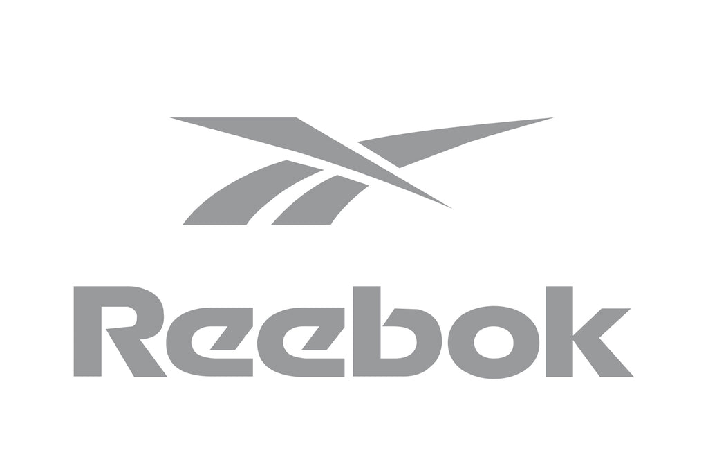
Image Courtesy of Reebok
2000 - 2005
Let's flip the calendar to Y2K—a year of wild predictions, fears of digital meltdown, and yet another seismic shift in Reebok logo design. Picture this: the iconic emblem remains, but virtually everything else changes. Welcome to the new millennium, Reebok style!
The emblem we've come to associate with the brand gets a brand-new backdrop: a smooth parallelogram outlined in thick blue. Inside this frame, the background is divided into two segments—light gray for the emblem and pristine white for the wordmark. And speaking of the wordmark, get this—the typeface has been completely overhauled. We're talking about sharp, square sans-serif letters, italicized to convey a sense of speed and motion. But the real kicker? The text is in a fiery, intense red, injecting the design with a newfound zest and energy.
For those of us who eat, sleep, and breathe design, this Reebok logo design era is a virtual playground of creative lessons. The use of the parallelogram isn’t just for show; it brings a dynamic element, making the logo appear almost 3D. The new typeface represents a brand in motion—literally, in the case of an athletic brand like Reebok, but also metaphorically, as the company aimed to adapt and evolve in a new digital era.
The bold red color of the wordmark? That’s the brand telling us it’s ready to embrace its own power and strength. This color choice is a nifty lesson in how a hue can amplify the emotional resonance of a design. Seriously, can't you just feel the passion and energy radiating from it?

Image Courtesy of Reebok
2005 - 2008
You've got your iPod, Facebook is becoming a thing, and Reebok? Well, they’re flipping the script again with their logo design. Say hello to "RBK"!
In this era, the company starts using the abbreviated name "RBK" in a unique, sharp font. The letters are set to the left of the blue emblem, all wrapped in a blue rectangular frame with deliciously rounded corners. This frame not only serves as a visual boundary but also creates a unity between the elements, making them appear as one cohesive brand mark.
So why should we, the graphic design aficionados, care about this? First off, the abbreviation is not just a trendy fad; it’s a strategic move to modernize the brand. Shortening the name to "RBK" gives it a contemporary, edgy feel—exactly what you’d want for a brand aimed at younger consumers. Secondly, the unique sharp font brings an aggressive touch to the logo, reinforcing the brand's high-performance narrative.
The blue frame with rounded corners, on the other hand, adds a subtle touch of softness and approachability. It's like Reebok is telling us, "Hey, we’re tough and high-performing, but we’re also friendly and accessible." It’s this complex mixture of messaging that makes this era of Reebok logo design so intriguing.

Image Courtesy of Reebok
2008 - 2014
Time to set our time machines to 2008. iPhones are disrupting the market, people are dancing to Beyoncé's "Single Ladies," and Reebok is hitting us with yet another logo redesign. This time, it's all about minimalism, baby!
In a drastic pivot from their earlier designs, the 2008 version of the Reebok logo said goodbye to emblems and hello to simplicity. The logo was stripped down to a neat, traditional sans-serif typeface in a light shade of blue. Yes, you heard it right—the emblem that had been a staple in their visual identity was completely removed.
So, why is this period crucial for us, the keepers of the design flame? For starters, it's a striking example of how minimalism can impact a brand's identity. The logotype alone carried the message, highlighting the name without any additional fluff. The light blue conveyed a sense of calm, sophistication, and reliability, showing that sometimes less really is more. This experimental approach gave the brand a clean slate and served as the foundation for future redesigns.
From a graphic design perspective, it's interesting to observe how taking something away can add so much. The stripped-back look leaves room for interpretation and allows the products themselves to take center stage. In essence, the logo turned into a blank canvas upon which various brand narratives could be painted.

Image Courtesy of Reebok
2014 - 2019
Alright, let's jump ahead to 2014. Selfies are a cultural phenomenon, streaming is changing how we consume media, and Reebok—ever the changemaker—is unveiling a new chapter in their logo design story.
Say hello to a sleek, smooth logotype now dressed in classic black. But wait, there's more—a brand new geometric emblem has entered the chat. Comprising a red triangle divided into three equal segments, this icon is visually striking and loaded with symbolism.
What's the takeaway for us graphic designers? The black logotype, smooth yet bold, conveys a timeless elegance, while the geometric emblem adds a layer of complexity and meaning. The triangle's three segments can be interpreted in multiple ways—perhaps as a nod to the brand's commitment to physical, mental, and social well-being, or as a trifecta of speed, power, and precision.
The red color in the emblem, reminiscent of their older designs, adds a touch of passion and energy, creating a stunning visual contrast with the black logotype. It's an exciting and dynamic change, demonstrating that the brand isn't afraid to evolve while paying homage to its past.
So, there you have it. The 2014-2019 era of Reebok logo design showcases how balancing the old with the new can result in a compelling visual narrative. As we delve deeper into logo evolution, Reebok continues to be a remarkable case study for design innovation and brand strategy.

Image Courtesy of Reebok
2019 - Present
Time to hit the fast-forward button to our current reality—2019 to the present. Netflix binge-watching is our weekend plan, TikTok dances are a whole vibe, and Reebok? Well, they’re diving into their roots with a revamped take on a vintage look. Hold on to your Wacom pens because this Reebok logo design is a fascinating fusion of the old and new!
In a surprising move, the brand decides to roll back the clock and re-embrace its 1979 logo version, albeit with some modern twists. Picture this: the sharp, iconic symbol we all know and love is now stationed right below the wordmark. Gone are the vibrant blues and reds; in comes a sleek, monochrome palette that screams power and distinction.
For all of us design geeks out there, this latest chapter in the Reebok logo design saga is pure gold. It's a nod to the principle that sometimes the past offers the best inspiration for the present. By revisiting an older design, Reebok manages to create an emotional connection with long-time fans while staying current and edgy. The monochrome color scheme amplifies this by adding a contemporary, powerful flair. It's as if Reebok is telling us, "We honor our heritage, but we're fully equipped to tackle today's world."
The location of the emblem under the wordmark is not just an aesthetic choice; it also repositions the brand’s identity. This layout creates a sense of unity and balance between the text and the symbol, presenting a cohesive image that communicates the brand's strength and reliability.
So, if you've ever wondered how to merge vintage aesthetics with modern sensibilities in your designs, take a page from Reebok's playbook. This is a masterclass in maintaining brand continuity while staying in tune with current trends. Keep that creative juice flowing, because in the realm of logo design, the only constant is change!

Image Courtesy of Reebok
What Is The History Of Reebok Logo Design?
The history of Reebok logo design is a dynamic journey that mirrors the brand’s growth from a small British athletic company into a global sportswear icon. Founded in 1958, Reebok took its name from the African antelope “rhebok,” a symbol of speed and agility. From the very beginning, the Reebok logo design aimed to communicate performance, motion, and competitive spirit.
The Early Wordmark Era
The earliest versions of Reebok logo design were simple and typography-driven. In its formative years, the logo focused on clean lettering that emphasized clarity and professionalism. During the 1970s and 1980s, as Reebok expanded internationally, the Union Jack was incorporated into the logo. This addition proudly highlighted the brand’s British heritage and gave the Reebok logo design a distinctive identity in the competitive athletic market.
The Iconic Vector Revolution
In 1993, Reebok introduced one of its most recognizable symbols: the Vector logo. This marked a bold new chapter in Reebok logo design. The Vector symbol, featuring dynamic lines that suggested speed and forward movement, reflected the brand’s strong association with professional sports and high-performance gear. It became synonymous with classic Reebok sneakers and apparel throughout the 1990s and early 2000s. For many fans, this era represents the golden age of Reebok branding.
The Delta Transformation
In 2014, Reebok shifted direction once again with the introduction of the Delta logo. This redesign signaled a strategic focus on fitness and CrossFit culture. The triangular Delta symbol represented physical, mental, and social transformation. Unlike previous versions of Reebok logo design, which leaned heavily into sports performance, the Delta emphasized personal growth and community. It was a bold, modern move aimed at redefining the brand’s image for a new generation of fitness enthusiasts.
Return To Heritage
Interestingly, Reebok later reintroduced the Vector logo to reconnect with its heritage and retro appeal. This move demonstrated how powerful nostalgia can be in branding. By bringing back a beloved element of Reebok logo design, the company balanced modern innovation with classic identity. The return of the Vector symbol reaffirmed the brand’s roots in sport while appealing to streetwear culture and longtime fans.
Overall, the history of Reebok logo design is a story of adaptation, reinvention, and bold creativity. Each redesign reflects shifts in athletic trends, consumer expectations, and brand strategy. From the early wordmarks to the Union Jack, the Vector, and the Delta, every phase of Reebok’s visual identity captures a unique moment in sports history. The evolution proves that a logo is never just a graphic—it’s a living symbol of a brand’s ambition and cultural impact.
How Does Reebok Logo Design Reflect Its Athletic Heritage?
The story of Reebok logo design is deeply rooted in sport, speed, and competitive spirit. From its earliest days as a British running shoe company to its rise as a global fitness powerhouse, Reebok has consistently used its logo to communicate athletic heritage. Every curve, line, and symbol within the Reebok logo design carries subtle references to motion, endurance, and performance.
British Roots And Sporting Beginnings
Reebok’s athletic heritage begins in Bolton, England, where the company focused on performance running shoes. Early versions of Reebok logo design were clean and typography-driven, emphasizing reliability and craftsmanship. The addition of the Union Jack in the 1970s reinforced the brand’s British identity. This design choice was more than patriotic decoration; it positioned Reebok as a serious contender in international athletics, highlighting its origins in competitive track and field innovation.
The Vector And Performance Power
Perhaps the most iconic example of Reebok logo design reflecting athletic heritage is the Vector symbol introduced in the 1990s. The angled lines of the Vector suggest speed, forward momentum, and precision. It visually echoes the stripes often seen on performance footwear, creating a strong connection between product function and brand identity. During this era, Reebok sponsored elite athletes across basketball, football, and running, and the Vector logo became synonymous with peak performance. The design felt energetic and bold, perfectly matching the brand’s competitive ambitions.
The Fitness Revolution And The Delta
When Reebok shifted its focus toward fitness and CrossFit in the 2010s, the Reebok logo design evolved again. The Delta logo symbolized transformation—physical, mental, and social. The triangular form conveyed strength and balance, qualities central to athletic training. While different in style from the Vector, the Delta still reflected Reebok’s athletic heritage by emphasizing discipline, resilience, and community-driven sport. It showed that athleticism was not limited to professional arenas but extended to everyday individuals striving for self-improvement.
Blending Heritage With Modern Street Culture
In recent years, the return of the Vector logo demonstrates how Reebok logo design continues to honor its athletic roots. Vintage sneakers and retro sportswear have surged in popularity, and the classic Vector instantly reconnects consumers with Reebok’s performance legacy. This revival highlights how deeply the logo is tied to moments in sports history, from 1980s aerobics to 1990s basketball courts.
Ultimately, Reebok logo design reflects its athletic heritage by consistently visualizing movement, strength, and evolution. Whether through the Union Jack, the dynamic Vector, or the symbolic Delta, each redesign aligns with the brand’s commitment to sport. The logo is not just a graphic mark; it is a visual record of Reebok’s journey through decades of athletic innovation and cultural impact.
How Has Reebok Logo Design Influenced Sports Branding?
The influence of Reebok logo design on sports branding is bigger than many people realize. Over the decades, Reebok has not only adapted to trends but has often helped shape them. From performance-driven visuals to lifestyle-focused reinventions, Reebok logo design has demonstrated how a brand mark can evolve while still maintaining athletic credibility. Its journey offers a blueprint for how sports brands balance heritage, innovation, and cultural relevance. Today, iconic sports logos even extend beyond apparel and advertising into visual culture, appearing on merchandise, décor, and branded displays such as custom neon signs that celebrate athletic identity in retail stores and gyms.
Redefining Performance Identity
When the Vector logo debuted in the 1990s, it instantly communicated speed, motion, and strength. The sharp, angled lines became a visual shorthand for athletic performance. This era of Reebok logo design influenced other sports brands to adopt cleaner, more dynamic symbols that could easily live on shoes, jerseys, and global advertising campaigns. The Vector proved that a simple yet bold icon could become inseparable from an athlete’s identity on the field or court.
Blending Sport With Lifestyle
Another major contribution of Reebok logo design to sports branding was its ability to cross into lifestyle culture. During the aerobics boom of the 1980s and the sneaker culture explosion of the 1990s, the logo appeared not just in gyms but on streets, in music videos, and in everyday fashion. Reebok demonstrated that a sports logo could be both performance-driven and style-forward. This dual positioning influenced how other brands approached collaborations, limited releases, and streetwear partnerships.
Strategic Reinvention And The Delta Era
The introduction of the Delta logo marked a bold strategic shift. Instead of focusing purely on elite sports, Reebok logo design began emphasizing fitness transformation and community. The triangular Delta symbol represented physical, mental, and social change. This move influenced sports branding by highlighting emotional storytelling. Brands began realizing that logos could represent not just competition, but personal growth and lifestyle values. Reebok’s pivot showed that redesigning a logo can signal a deeper brand evolution.
The Power Of Nostalgia In Modern Branding
When Reebok reintroduced the Vector logo, it reinforced another important lesson in sports branding: nostalgia sells. By bringing back a classic element of Reebok logo design, the brand tapped into retro trends while honoring its athletic heritage. This strategy has become common across the sports industry, where heritage logos are revived to build authenticity and reconnect with loyal fans.
Ultimately, Reebok logo design has influenced sports branding by demonstrating adaptability without losing identity. Whether through bold performance symbols, lifestyle integration, or strategic reinvention, Reebok has shown that a logo is more than decoration. It is a powerful branding tool that can define eras, inspire athletes, and shape the visual language of the entire sports industry.
Conclusion
The evolution of Reebok logo design reflects more than changing graphics; it captures the spirit of athletic ambition and cultural shifts across decades. From its early wordmarks and British heritage to the bold Vector and transformative Delta symbol, each Reebok redesign represents a clear moment in sports history. The brand’s ability to adapt while preserving its core identity demonstrates the power of thoughtful visual storytelling. Reebok continues to honor its performance roots while embracing modern trends, proving that strong logo design can carry legacy, inspire movement, and remain instantly recognizable around the world.
Let Us Know What You Think!
Every information you read here are written and curated by Kreafolk's team, carefully pieced together with our creative community in mind. Did you enjoy our contents? Leave a comment below and share your thoughts. Cheers to more creative articles and inspirations!






Leave a Comment