Tips for Creating Striking Minimalistic Logos

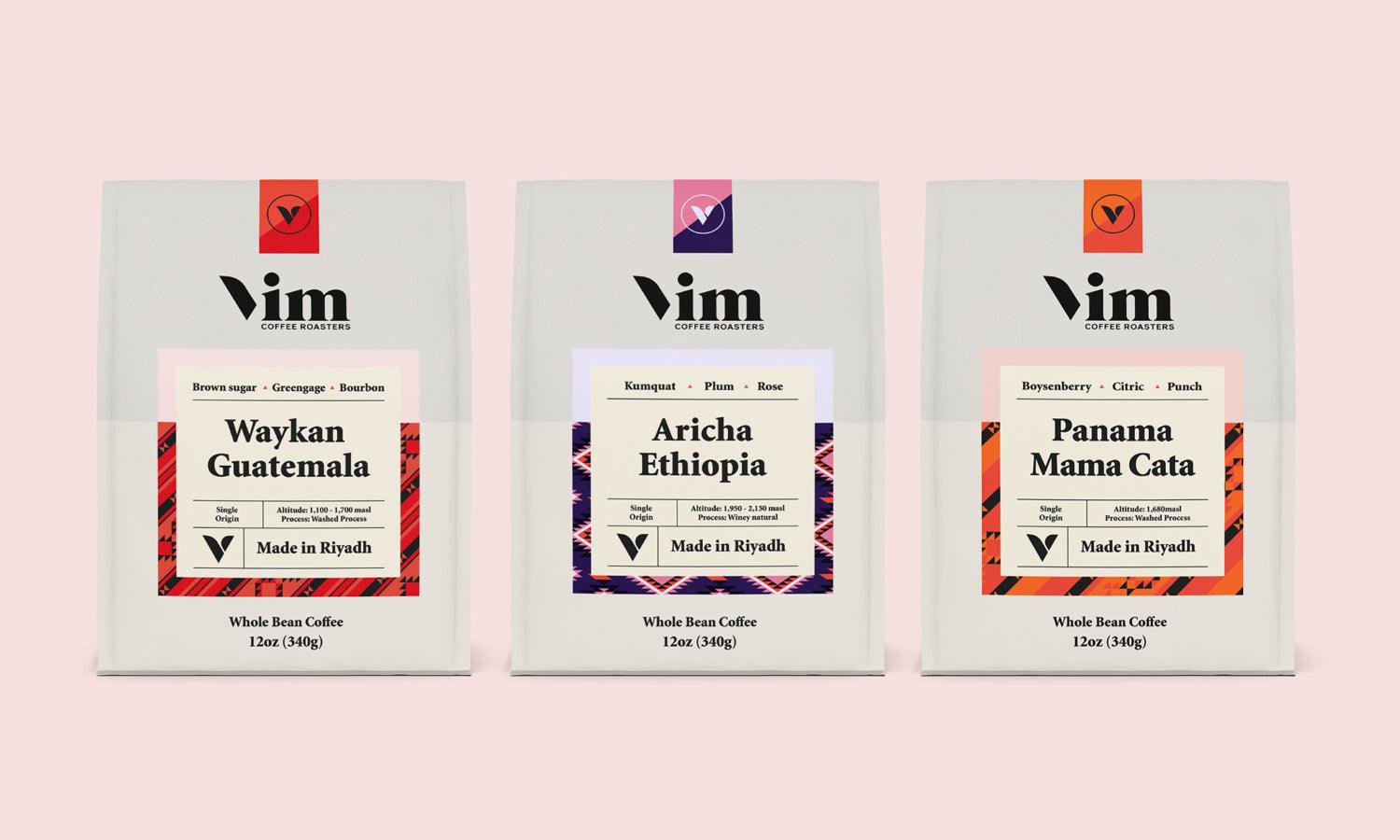
Minimalistic logos are often praised for their elegance and effectiveness. But what exactly makes a minimalistic logo stand out? For designers, crafting a logo with minimal elements can seem challenging, however with a few key tips and tricks, you can create logos that are both simple and striking.
As you work on your design, remember to protect it. There are several ways to do that. One simple option is to use a VPN for PC, which will secure your designs by encrypting your IP address. This is especially important if you’re using public WiFi and collaborating online.
In this article, we’ll explore more practical advice for designing minimalistic logos that leave a lasting impression.
Focus on Simplicity
Start with the Basics
When creating a minimalistic logo, simplicity is your best friend. Begin by focusing on the essential elements that represent the brand. Avoid adding unnecessary details. Instead, think about the core message or values of the brand and how to convey them with just a few shapes or lines.
Choose Your Shapes Wisely
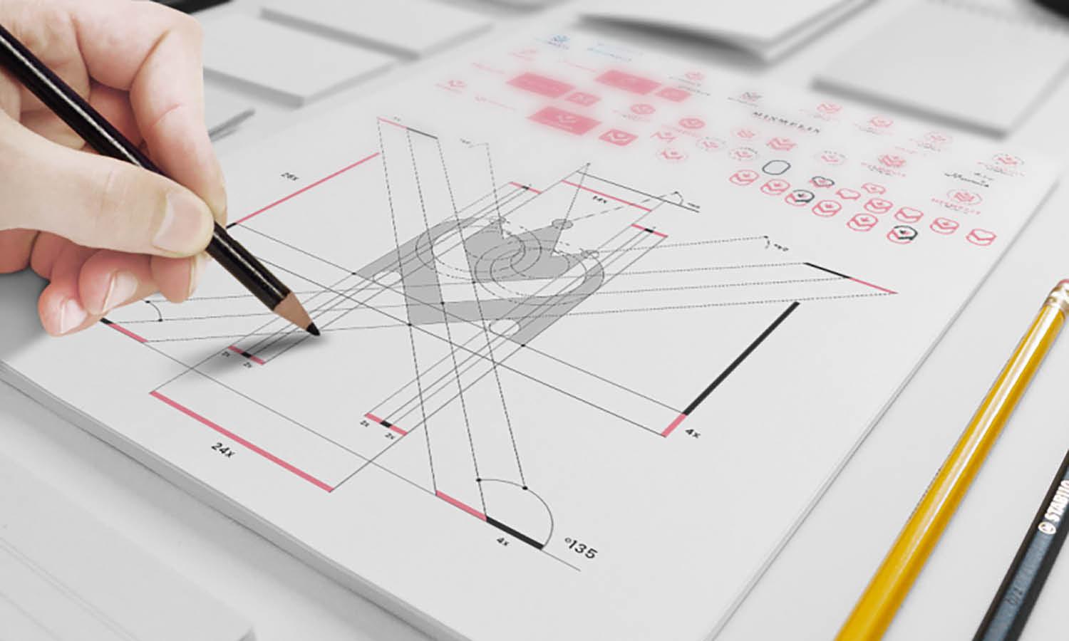
Shapes play a crucial role in minimalistic logos. Simple geometric shapes like circles, squares, and triangles can be very effective. They are easy to recognize and reproduce, making them ideal for a clean and modern look. Experiment with these shapes to create a logo that is both visually appealing and straightforward.
Limit Your Color Palette
Stick to One or Two Colors
In minimalistic design, color can be a powerful tool. However, it’s important to use it sparingly. Choose one or two colors that complement each other and reflect the brand’s identity. Using too many colors can clutter the design and take away from its simplicity. A limited color palette helps the logo stay clean and focused.
Use Contrast Effectively
Contrast is key in making a minimalistic logo stand out. By using contrasting colors, you can create a logo that is both eye-catching and easy to read. For example, a dark shape on a light background, or vice versa, can improve the visibility of your design. Make sure the contrast is strong enough to ensure the logo is clear and memorable.
Opt for Clean Typography
Choose Simple Fonts
Typography is an important part of any logo design, but in minimalistic logos, less is more. Choose simple, clean fonts that are easy to read. Avoid ornate or overly complex fonts that can detract from the overall simplicity of the design. A straightforward typeface will help your logo stay elegant and professional.
Adjust Font Spacing
The spacing between letters, known as kerning, can greatly affect the look of your logo. In minimalistic design, proper spacing helps maintain clarity and balance. Make sure the letters are well-spaced and not too close together. This ensures that the text remains legible and contributes to the overall harmony of the logo.
Ensure Versatility
Design for Different Sizes
A good minimalistic logo should work well in various sizes. Whether it’s on a business card or a billboard, the logo should remain clear and recognizable. Test your design in different sizes to ensure it maintains its impact and doesn’t lose details when scaled down.
Create a Black and White Version
Minimalistic logos should be versatile enough to work in both color and black and white. This is important for different applications, such as print or digital media. Make sure your logo looks great without color, as this will help it stand out in various contexts and maintain its effectiveness.
Creating a striking minimalistic logo involves focusing on simplicity, using limited colors, and choosing clean typography. By sticking to basic shapes, limiting your color palette, and ensuring versatility, you can design a logo that is both elegant and effective. With these tips, even amateur designers can craft logos that are memorable and impactful.


