10 Important Kerning Tips for Better Typography Design

Source: Eastofrome, Instagram, https://www.instagram.com/p/C-C6-JLCCVV/
Kerning is one of the most overlooked yet essential elements in professional typography design. It refers to the adjustment of space between individual letterforms to achieve visually pleasing and balanced text. While it may seem like a minor detail, proper kerning can dramatically improve the readability, harmony, and overall aesthetics of a design. Whether you're crafting a logo, building a brand identity, or setting headlines for print or web, kerning plays a significant role in how your message is perceived.
Inconsistent spacing between letters can create unwanted visual tension, making even the most elegant typeface look awkward or unpolished. On the other hand, well-kerned text feels intentional, refined, and easier on the eyes. Typography design is not just about choosing the right font—it’s about how each character interacts with the next.
Mastering kerning requires a trained eye, attention to detail, and a good understanding of letter shapes and spacing principles. Even seasoned designers revisit the basics to maintain clarity and precision in their work. In this article, we’ll explore ten important kerning tips that will help you elevate your typography design and create compositions that are both beautiful and functional. Let’s start fine-tuning your typographic instincts.
Kern at Large Font Sizes First
In typography design, kerning at large font sizes is a critical first step. Large text, such as headlines or logos, magnifies any inconsistencies in letter spacing, making them more noticeable and potentially disruptive to the visual harmony of the design. By adjusting the spaces between characters in larger displays, designers can ensure that the type appears balanced and aesthetically pleasing before applying similar adjustments to smaller text scales.
This process involves scrutinizing each pair of letters and modifying the spacing so that it looks visually consistent across the word or phrase. For example, the gap between 'A' and 'V' may need to be reduced to prevent the design from looking disjointed. The goal is to create a sense of uniformity and flow that enhances the overall impact of the message.
Kerning at larger scales not only helps in achieving a more polished look but also serves as a guide for subsequent text sizes. Once the kerning is perfected in large font sizes, it can be adjusted proportionally for smaller text, ensuring coherence throughout the typography design. This meticulous attention to detail at the initial stage can significantly elevate the quality of the final design, making it more effective and engaging.
Trust Your Eyes, Not Just Tools
In the realm of typography design, trusting your eyes over automated tools is essential for achieving optimal kerning. While design software comes equipped with kerning algorithms, these tools often lack the nuance and context-sensitive judgment that a human eye can provide. Auto-kerning features tend to apply uniform adjustments that might not suit every typographic situation, especially when dealing with unique or custom fonts.
Designers are encouraged to manually adjust the kerning by visually examining the spacing between each character pair. This approach allows for more precise control over the text’s appearance, ensuring that the typography not only looks good on a technical level but also feels right aesthetically. It's about balancing the objective measurements with the subjective appeal of the text.
Zooming in on the letters and evaluating the negative space as shapes of their own can help designers see beyond the characters to their actual visual impact. Sometimes, what seems technically correct might not look visually pleasing and vice versa. By relying on their trained eye, designers can make adjustments that enhance readability and visual flow, which are often overlooked by automated tools.
This hands-on engagement with each character pair makes a significant difference in the overall quality of the typography design, turning a good project into a great one by the smallest of tweaks. Trusting your instincts and experience often leads to a more refined and personalized outcome, resonating better with the intended audience.
Kerning for Different Fonts
Kerning varies significantly across different fonts, making it an essential aspect of typography that requires a tailored approach for each typeface. Serif fonts, known for their decorative features and complexity, often need more nuanced kerning to accommodate their varied stroke weights and detailed serifs. The goal is to achieve a balanced and harmonious look, where each letterform's unique characteristics are considered to maintain even visual spacing.
Sans-serif fonts, with their cleaner and more uniform lines, might seem easier to kern, but they still present challenges. The simplicity of sans-serif fonts means that any kerning imperfections are more noticeable. Designers must carefully adjust the spacing to ensure that the text looks uniformly distributed without awkward gaps or overly tight spaces.
Script fonts, which mimic handwriting, require a particularly delicate kerning touch. Since these fonts often have overlapping strokes and varied baselines, standard kerning rules do not always apply. Instead, designers must visually balance the text to reflect natural handwriting while maintaining legibility and aesthetic appeal.
When kerning for different fonts, it is crucial to consider the context in which the text will be used. Display fonts used in large headings or logos may need more aggressive kerning adjustments compared to text fonts used in body copy. Understanding the unique properties and intended use of each font type allows designers to apply kerning effectively, ensuring that typography is not only readable but also visually engaging.

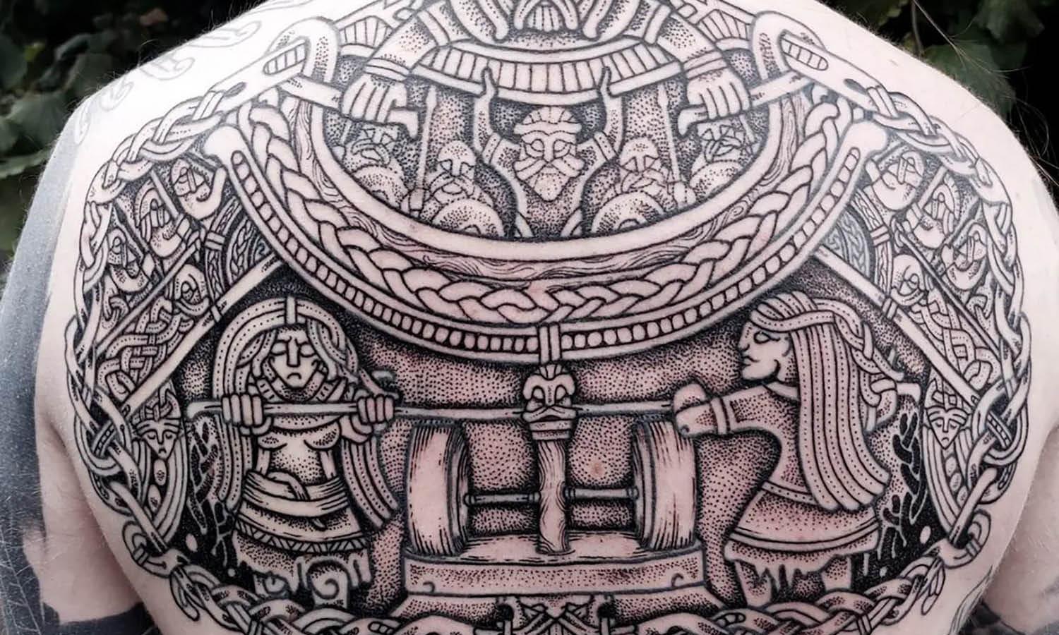
Source: Andrewfootit, Instagram, https://www.instagram.com/p/BxhKmJbhRRV/
Master Manual Kerning Techniques
Mastering manual kerning techniques is crucial for typography professionals seeking to elevate their design work. Manual kerning involves adjusting the spacing between individual pairs of letters, rather than relying on the automatic settings provided by design software. This process allows for precision and customization, which are often necessary for high-quality typographic results.
To begin manual kerning, start by setting the type in your desired font at the intended size. This step is important as kerning can look different depending on the size of the text. Zoom in on your workspace so you can clearly see the spaces between the characters. Look for visual tension or awkward gaps that might disrupt the text's harmony.
Using design software like Adobe Illustrator or InDesign, select the Type Tool and place the cursor between the two characters you want to kern. Adjust the kerning by typing in values, using the kerning field in the character panel, or pressing alt/opt + left/right arrows to nudge the spacing. It’s crucial to do this while considering the overall look of the word or sentence, rather than focusing too closely on individual letter pairs.
A useful technique is to squint your eyes slightly or blur your vision while looking at the text. This method helps to see the text as shapes and spaces rather than as letters, aiding in identifying areas where the spacing does not feel even.
Utilize Kerning Pairs Wisely
Kerning pairs are specific combinations of two characters that, due to their shape and alignment, often require manual adjustment to maintain typographic harmony. Understanding and utilizing kerning pairs wisely is a cornerstone of effective typography. Each typeface comes with inherent kerning pair adjustments that cater to the most commonly problematic letter combinations, such as 'AV', 'LA', and 'TO'. However, the nuances of custom design work often demand additional attention.
Designers must assess kerning pairs by considering the visual space between characters, not just the measurable distance. For example, round characters like 'O' and 'C' might visually appear farther apart than angular characters like 'V' and 'W', even if the actual space is the same. Effective kerning modifies these spaces to create a uniform visual flow across all text.
To utilize kerning pairs wisely, start by identifying the key character combinations in your text that disrupt visual consistency. Focus on adjusting these pairs first, as they have a significant impact on the overall appearance of the design. Remember, while software can provide a good starting point with auto-kerning features, manual tweaking is often necessary to achieve perfection
Practicing with different fonts and layouts will enhance your ability to see which pairs need adjustment and by how much. This skill not only improves the readability of your designs but also elevates the aesthetic quality, ensuring your typography communicates with both clarity and style.
Explore Kerning in Various Design Software
Kerning is an essential feature of typography that can be meticulously adjusted in various design software to achieve perfect text alignment and spacing. Popular design tools like Adobe Illustrator, Adobe InDesign, and Sketch offer robust kerning capabilities that cater to the needs of both novice and professional designers.
In Adobe Illustrator, kerning can be adjusted by selecting the 'Type Tool', clicking between two letters, and using the alt/opt + left/right arrows to nudge the spacing. This method provides immediate visual feedback and allows for precise control. Additionally, Illustrator's 'Optical Kerning' feature automatically adjusts the spacing based on the shapes of the letters, which can be a great starting point before making manual tweaks.
Adobe InDesign operates similarly but adds more detailed control over kerning through its 'Kerning and Tracking' panel. Designers can use predefined kerning settings or customize their own, applying these to individual text elements or entire paragraphs, which is particularly useful for long text layouts.
Sketch, primarily used for digital design, integrates kerning adjustments directly into its text styling interface, enabling designers to fine-tune text appearance swiftly within user interface designs. Sketch's approach is intuitive, making it ideal for designers who balance typography with interactive elements.
Adjust Kerning for Different Sizes
When designing typographic elements across various sizes, adjusting kerning becomes crucial for maintaining visual consistency and readability. As text scales up or down, the perceived space between letters can change, often requiring a different kerning approach to ensure the typography remains aesthetically pleasing and legible.
For larger text, such as headlines or signage, even minor kerning errors can become glaringly apparent. Larger sizes magnify the space between characters, potentially creating awkward gaps that disrupt the flow of reading. Designers must tighten kerning to compensate for these gaps, ensuring that each letter sits harmoniously next to its neighbors.
Conversely, when text is scaled down, letters can appear to merge if the kerning is too loose. This is particularly problematic for body text in printed materials or on digital screens, where clarity is paramount. In these cases, slightly increasing the space between characters can improve legibility and prevent the text from looking cluttered.
Adjusting kerning for different sizes involves a keen eye and an understanding of how typography interacts with human visual perception at various scales. Designers should preview their work at the actual size it will be viewed to accurately assess and adjust kerning. Digital design tools offer features that simulate different viewing contexts, which can be invaluable in this process. By carefully refining kerning across different sizes, designers ensure that their typography is effective and attractive in any setting.

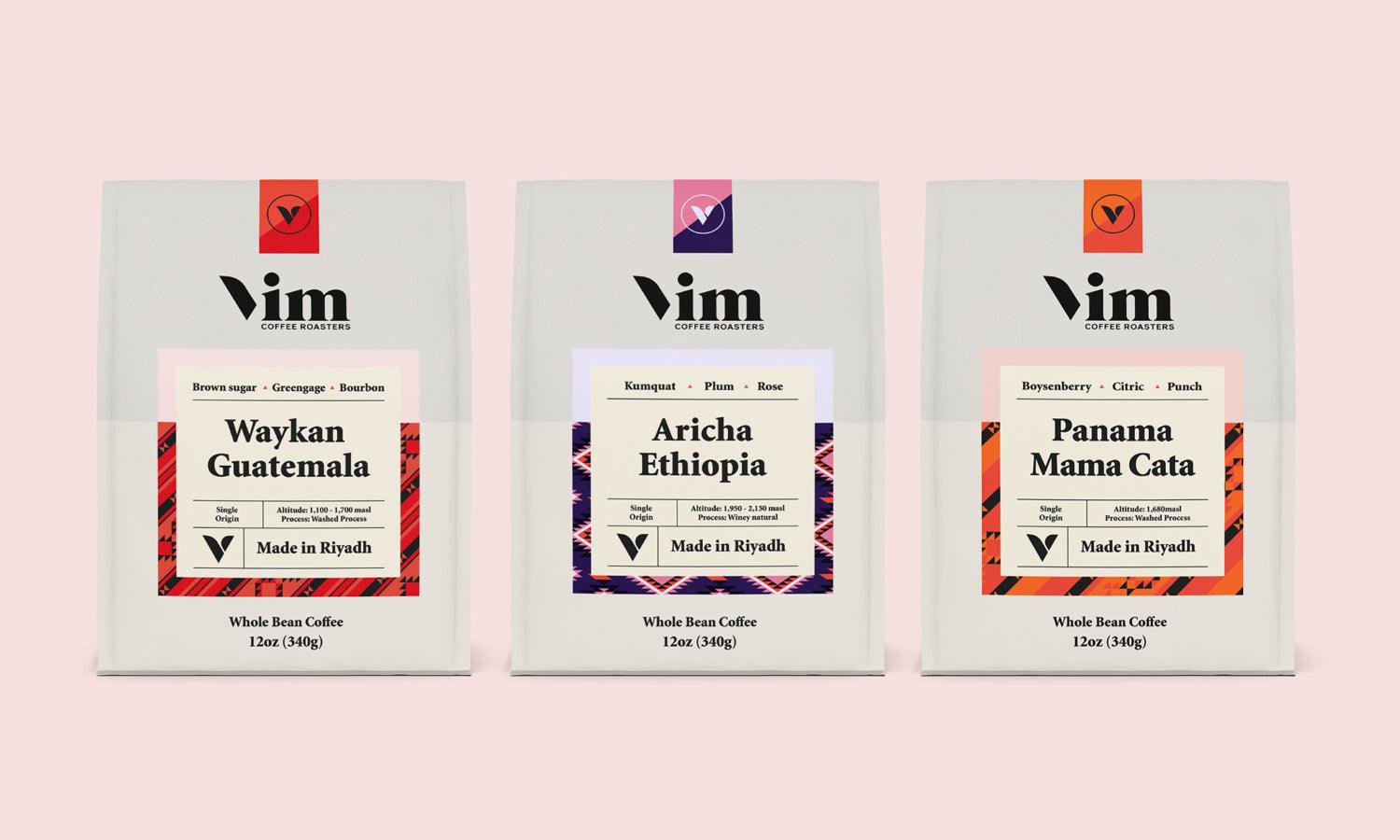
Source: Steve Wolf, Vive Organic, Dribbble, https://dribbble.com/shots/25416550-Vive-Organic
Consider the Impact of Color on Kerning
The interplay between color and kerning is a nuanced aspect of typography that can significantly influence the legibility and visual impact of text. When text color contrasts sharply with its background, the spacing between letters can appear more pronounced, potentially creating an optical illusion of more extensive spacing. This phenomenon requires a tighter kerning approach to maintain visual harmony and readability.
Conversely, when the text and background colors are similar or have low contrast, letters can seem to blend together, making them difficult to distinguish. In such cases, increasing the spacing slightly through looser kerning can enhance legibility by defining each character more clearly against the background.Designers must also consider the psychological effects of color on perception and how this impacts kerning. Warm colors, such as reds and oranges, tend to advance visually, potentially making text appear closer together, while cool colors like blues and greens might recede, giving an impression of increased spacing.
To effectively manage the impact of color on kerning, it is essential to test typography in the actual color schemes used in the final design. This testing should occur under various lighting conditions, as changes in light can alter how colors and spacing are perceived. Tools in design software that allow for color overlays and background adjustments can aid in these assessments, providing designers with a comprehensive view of how kerning modifications interact with color choices.
Learn from Kerning Mistakes
One of the best ways to master the art of kerning in typography is by learning from common kerning mistakes. These errors often stem from either too much or too little spacing between characters, leading to text that looks unbalanced or difficult to read. Recognizing these mistakes not only improves your current project but also enhances your ability to preemptively spot potential issues in future designs.
A typical kerning mistake is neglecting the relationship between round and straight characters. For example, the space between 'O' and 'T' might appear wider than between 'T' and 'I' due to the roundness of 'O'. Without adjusting this spacing, the text can look uneven. Another common error is failing to consider the visual impact of upper and lowercase letter combinations, such as 'A' and 'v', where the uppercase letter can overshadow the lowercase, making the pair look disjointed.
By analyzing examples of poor kerning, designers can develop a more intuitive sense of how to balance space effectively. Many design forums and books showcase "before and after" scenarios that highlight how small kerning adjustments can transform the readability and appeal of text. Additionally, experimenting with different types of text and layouts can provide practical experience and build a deeper understanding of how kerning affects visual communication.
Learning from these mistakes requires an eye for detail and a willingness to iterate on your work. By continually refining your kerning technique, you can ensure that your typography communicates your intended message effectively and beautifully.
Seek Feedback on Your Kerning Choices
Seeking feedback on your kerning choices is an invaluable step in the design process that can significantly enhance the quality and professionalism of your typography. Kerning, an often subjective aspect of typography, benefits greatly from diverse perspectives to ensure that the text is not only aesthetically pleasing but also universally readable.
Engaging with other designers, either through formal critiques or informal discussions, can provide new insights into your kerning decisions. Feedback from peers can highlight issues that you might not have noticed, such as inconsistent spacing that could affect readability or the overall design's impact. Moreover, different designers bring varied experiences and techniques to the table, offering alternative approaches and solutions to kerning challenges.
In addition to peer reviews, user testing is another effective method for evaluating kerning in real-world contexts. Presenting your designs to a broader audience, especially non-designers, can help assess how well your text communicates to people unfamiliar with the nuances of typography. This type of feedback is particularly useful for projects aimed at a general audience, such as web design, advertising, and public signage.
Using digital tools that allow for easy sharing and commenting can facilitate this feedback process. Platforms like Behance, Dribbble, and even social media provide environments where designers can post their work, receive critiques, and learn from the community. Embracing this feedback, whether positive or constructive, is crucial for developing a more refined kerning sensibility and, by extension, more effective typographic designs.
Conclusion
Mastering kerning within typography design is pivotal for any designer seeking to elevate their visual communications. By implementing these strategic tips—from adjusting for problem pairs to testing the text upside down—you can enhance both the aesthetics and functionality of your typographic projects. Remember, the key to successful typography design lies in the details. Meticulous attention to the spacing between letters will not only improve readability but also contribute to the overall harmony and professionalism of your designs. Embrace these practices to ensure your typography resonates with precision and elegance in every context.
Let Us Know What You Think!
Every information you read here are written and curated by Kreafolk's team, carefully pieced together with our creative community in mind. Did you enjoy our contents? Leave a comment below and share your thoughts. Cheers to more creative articles and inspirations!






Leave a Comment