
30 Best Type Specimen Poster Design Ideas You Should Check

Source: Cotypefoundry, RM Mono, Instagram, https://www.instagram.com/p/CphQtrJyn2k/
Type specimen posters are more than mere displays of font families—they are an exploration of creativity, where each curve and serif dances across the page. These designs are not just about showcasing a typeface; they make the letters come alive, telling their own story with every bold line and delicate whitespace. From the minimalist to the complex, the vintage to the ultra-modern, we’ll take you on a journey through layouts that push boundaries and palettes that pop.
Are you ready to transform your appreciation of the ABCs? Get set to be inspired by designs that do more than just sit pretty—they echo the personality of the typefaces they represent, proving that in the world of type specimen poster design, the font is the star of the show!
Type Specimen Poster Design Ideas

Source: Catarina_vaz, Instagram, https://www.instagram.com/p/B3uB2J1hjlV/

Source: Luca Marsano, Instagram, https://www.instagram.com/p/CIqhOY2p5UN/

Source: Grillitype, Orell Füssli, Instagram, https://www.instagram.com/p/CCoJXfgDbAZ/

Source: Drawdownbooks, Moki Type Specimen, Instagram, https://www.instagram.com/p/CvaXvCTx-te/

Source: S.vd.z, Instagram, https://www.instagram.com/p/CB4TodRBF88/
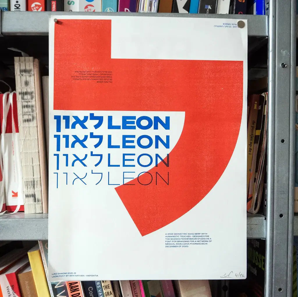
Source: Liadshadmi, Leon, Instagram, https://www.instagram.com/p/CsiYTNFtw2t/

Source: Ohezin, Sang Hee Song’s Solo Exhibition, Instagram, https://www.instagram.com/p/CZaE5buJh0T/

Source: Yumitsang.design, Instagram, https://www.instagram.com/p/Cr1qhPqLXbX/

Source: Herzbergdesignco, Fang, Instagram, https://www.instagram.com/p/CrbHE44uFVA/

Source: Intervaltype, Instagram, https://www.instagram.com/p/CuWu35tMj84/

Source: Macrhinofonts, Instagram, https://www.instagram.com/p/CvM9pGLtnFJ/

Source: Adrien_midzic, Instagram, https://www.instagram.com/p/CuH9iK6rH9V/

Source: Rayitasazules, Neurath, Instagram, https://www.instagram.com/p/CoiHaV-IAIu/

Source: Typespecimens, Gt Ultra, Instagram, https://www.instagram.com/p/CdOGNOcsIZ4/

Source: Username, Dailyjanniee, Instagram, https://www.instagram.com/p/CrH5T0bvG9v/

Source: Typeandmedia, Instagram, https://www.instagram.com/p/CuRcEPCrta2/

Source: Hoodzpahdesign, Instagram, https://www.instagram.com/p/B9E8821gqNb/

Source: Bmnicks, Darks Wicked Pitcher Jacks, Instagram, https://www.instagram.com/p/CgK1YXDuAr8/

Source: Icographica, BallPill Type Specimen, Instagram, https://www.instagram.com/p/CHtO_MzFEGU/

Source: Allyssa_designs, Elephant, Instagram, https://www.instagram.com/p/Crzs8-POfCi/

Source: Due_std, Instagram, https://www.instagram.com/p/CKR4Bb0D1RC/

Source: Certes_design, Empreinte Numérique, Instagram, https://www.instagram.com/p/CrdlSqktJ-f/

Source: Litcreate, Graphit, Instagram, https://www.instagram.com/p/CtgoTEcLXjZ/

Source: Bruno King, Vendetta Type Specimen, Behance, https://www.behance.net/gallery/203289855/Vendetta-Type-Specimen

Source: Candela Sanguinetti, Brixton, Instagram, https://www.instagram.com/p/CwQ436YP_Rb/

Source: Laura Beretti, Avenir Specimen, Behance, https://www.behance.net/gallery/5957577/Avenir-Specimen-type-poster

Source: Toria D Paul, Behance, https://www.behance.net/gallery/195678009/Type-Specimen-Poster

Source: Katie Majewski, Behance, https://www.behance.net/gallery/63735217/Type-Specimen-Poster

Source: Madeline Savoie, Behance, https://www.behance.net/gallery/67018413/Type-Specimen-Poster

Source: Cotypefoundry, RM Mono, Instagram, https://www.instagram.com/p/CphQtrJyn2k/
What Are the Best Practices for Type Specimen Poster Design?
Creating a type specimen poster is not just about flaunting a typeface—it’s about storytelling through typography. Here are five best practices to consider when designing a type specimen poster that not only captivates but communicates the character of a typeface in a fun and engaging way.
Emphasize Character Individuality
Every typeface has its own personality, so your poster should highlight what makes it unique. Is it elegant, quirky, robust, or delicate? Use the design to amplify these traits. This might mean playing with scales, weights, and styles within the typeface family. For instance, dramatically oversized characters can showcase intricate details, while smaller scales might demonstrate the typeface’s legibility in text-heavy layouts. This approach not only captivates the viewer but also gives a clear insight into the typeface's versatility and application.
Color and Contrast Are Your Friends
Dive into color with enthusiasm! Type specimen posters are an excellent opportunity to experiment with bold and unexpected color combinations that enhance the typeface's visibility and impact. Contrast, whether through color, size, or spacing, can help individual characters pop and make the overall design more dynamic. However, it's crucial to balance boldness with harmony so that the typeface remains the hero of the story.
Contextual Creativity
Context is king in type specimen poster design. Incorporate elements or themes that resonate with the typeface's history or intended use. For instance, a vintage serif might be paired with classic illustrations or ornate borders, while a modern sans-serif could be showcased through minimalistic, clean layouts. Creating a scenario around the typeface gives viewers a sneak peek into how it could work in real-world applications, enhancing its allure and utility.
Layout and Composition
How you arrange the type on your poster can make or break the design. Consider hierarchy and alignment to guide the viewer’s eye across the poster. Start with the most striking, attention-grabbing feature, usually the typeface name or its most distinctive character. From there, lead the viewer through different styles and weights, using layout techniques like grids or asymmetric compositions to add visual interest. Keep spacing in mind; ample white space can help the details of each character stand out, making the design breathable and easy to digest.
Interactive Elements
Finally, why not make your type specimen poster interactive? This could be as simple as including a QR code linking to a digital type library, or as complex as augmented reality features where viewers can see the typeface in various contexts through their smartphones. Interactive elements not only engage your audience further but also provide a modern twist to the traditional format, making your poster not just a display but an experience.
By incorporating these practices into your type specimen poster design, you can create a piece that does more than display a typeface—it celebrates it in all its typographic glory!
What Are Some Creative Layout Ideas for Type Specimen Posters?
When it comes to showcasing a typeface in a type specimen poster, the layout does more than just support the text; it can transform it into a visual symphony. Here are five creative layout ideas to elevate your type specimen poster design, ensuring each one is a true spectacle of typography.
The Diagonal Dynamism
Break away from the conventional horizontal and vertical text alignments by introducing diagonal layouts. This dynamic arrangement can inject movement and energy into your poster, making the typeface feel more vibrant and engaging. Imagine the letters cascading across the page in a controlled yet whimsical fashion, leading the viewer’s eye along a path that showcases each character’s form and function. This layout not only catches the eye but also allows for creative use of space, giving each letter ample room to shine.
Layered Typography
Play with depth by layering type over compelling imagery or using multiple type layers to create a 3D effect. You could have the main typeface in the foreground with more subtle, supportive text in the background, or vice versa. This technique not only adds a tactile quality to your design but also allows for rich, contextual storytelling. For example, a bold, modern sans-serif might overlay a cityscape to suggest its suitability for signage in urban environments, or a delicate script might be layered over floral images to emphasize its elegance.
Grids Galore
Utilize a grid system to organize different characters and styles of the typeface. This structured layout can be particularly effective for type specimen posters because it imposes order and allows for comparison. You could vary column widths or row heights to fit different characters or styles, creating a clean yet visually interesting matrix of typography that invites viewers to linger and explore.
Circular Configurations
Arrange your typeface in a circle or around a central point on the poster. This can be a striking way to display type that emphasizes round or circular characters, or simply to create a focal point that draws the viewer in. This layout can also suggest movement and continuity, ideal for typefaces that boast a fluid, seamless style. Circular configurations can be particularly eye-catching and suggest a sense of completeness, embodying the cyclical nature of design trends.
Interactive Pathways
Create a visual narrative or journey through the use of paths or trails that lead the viewer through different aspects of the typeface. This could be a literal path illustrated among the letters or a more abstract progression from one style or weight to another. You could incorporate arrows or dotted lines to guide the eye, making the poster not just a static design but an interactive experience. This layout idea is perfect for engaging viewers, making them part of the exploration of the typeface.
These layout ideas not only enhance the aesthetics of your type specimen poster but also amplify the unique qualities of the typeface itself. By pushing the boundaries of traditional layouts, you can create a type specimen poster that is not just informative but also irresistibly captivating.
What Are the Best Examples of Innovative Type Specimen Posters?
In the world of type specimen poster design, innovation doesn't just happen—it's crafted with precision, creativity, and a touch of typographic magic. Here are five examples of type specimen posters that set the standards high and inspire designers to think outside the box.
Helvetica Forever by Lars Müller Publishers
This poster is a celebration of one of the most ubiquitous typefaces, Helvetica. Designed by Lars Müller Publishers, the Helvetica Forever poster not only showcases the typeface but also its impact on design culture. The layout is straightforward yet powerful, with a chronological arrangement of Helvetica's use in famous logos and texts, making it a historical journey as much as a typographic display. This approach not only educates but also connects emotionally with its audience by showing how integral Helvetica has been in everyday visual experiences.
Garamond’s World by Antonio Cavedoni
Dive into the elegance of Claude Garamond’s creations with this type specimen poster that feels like a trip back in time. Antonio Cavedoni designs it to highlight the beauty and historical significance of the Garamond typeface. The poster features excerpts from classic literature and documents, typeset in various Garamond iterations, surrounded by ornate illustrations and decorative elements typical of the Renaissance period. It’s a poster that serves as both a tribute and a practical showcase of the typeface’s versatility.
Futura: The Typeface by Bauer Type Foundry
This poster is an ode to Futura, the geometric sans-serif typeface that became a symbol of modernity. Designed by the Bauer Type Foundry, it uses minimalistic design elements to emphasize Futura’s geometric shapes. Blocks of color and simple, effective compositions demonstrate Futura's application in different contexts, from large display texts to small, readable paragraphs. This clean and modern approach reflects the typeface’s functionality and aesthetic appeal.
Lost Type Co-op Field Guide
Not just a poster but an entire collection, the Lost Type Co-op Field Guide features typefaces from various designers in a beautifully illustrated catalog format. Each page is dedicated to a different typeface, accompanied by unique artwork and layout designs that reflect the typeface’s personality. This creative endeavor not only highlights the individuality of each font but also demonstrates how type can interact dynamically with graphic elements to tell a story.
Type Hike’s National Parks Series
This series combines typography with a love for nature and conservation. Designers from around the country created posters that feature a typeface inspired by a specific U.S. National Park. Each poster is a unique artistic interpretation of the park’s essence, captured through carefully chosen type elements and illustrative techniques. This collection not only showcases innovative type design but also promotes environmental awareness, making it a powerful example of design with a purpose.
These examples illustrate how type specimen posters can transcend their basic function of displaying fonts. They become pieces of art that educate, inspire, and resonate with audiences, proving that when it comes to design, the letters we read are as impactful as the words they form.
What Fonts Are Best Suited for Type Specimen Poster Design?
Selecting the perfect font for a type specimen poster design is like picking the right outfit for a grand ball—every detail matters and making a statement is key! The goal is to showcase the typeface’s personality, functionality, and unique charm. Here, we’ll strut through a lineup of five font types that dazzle and shine when featured in type specimen posters.
Serif Splendor
Serif fonts carry a timeless elegance, making them a top choice for type specimen posters that aim to evoke a sense of tradition and reliability. Think of classics like Garamond or Times New Roman, which display beautifully in print, flaunting their sophisticated serifs and balanced structures. These fonts aren’t just letters; they’re the regal rulers of the typography kingdom, perfect for a design that demands respect and attention.
Sans Serif Simplicity
For a cleaner, more modern vibe, sans serif fonts are the go-to. Fonts like Helvetica and Futura offer crisp lines and a neat appearance, making them ideal for designs that aim to be minimalist yet striking. Sans serifs excel in delivering clarity and readability, ensuring that each character pops off the page and dances before the eyes without the fuss of frills.
Script Elegance
If your type specimen poster design is meant to whisper sweet nothings into the viewer’s ear, then a script font like Brush Script or Edwardian Script can do the trick. These fonts are all about fluidity and grace, mimicking the art of hand-drawn lettering. They are perfect for evoking emotions and adding a personal touch to your design, curling and swirling as if a dainty quill penned them.
Display Drama
When the poster needs to scream from the rooftops, display fonts like Impact or Bebas Neue step into the spotlight. These are the showstoppers, designed to make heads turn with their bold and often dramatic flair. Display fonts are all about impact and are best used when the message is short, sweet, and needs to stick.
Monospaced Uniformity
For a more industrial, tech-driven look, monospaced fonts like Courier or Consolas are your allies. These fonts have a uniform character width, offering a unique aesthetic that harks back to the days of typewriters and early computer interfaces. They’re fantastic for designs that call for a mechanical or text-heavy approach, aligning every letter and space with military precision.
Choosing the right font for your type specimen poster design isn’t just about beauty; it’s about character and how well a font’s personality aligns with your creative vision. Mix and match these styles to create a poster that not only informs but also captivates. Remember, in the vibrant world of type specimen poster design, fonts aren’t just seen—they’re experienced!
What Are Some Famous Type Specimen Poster Design Examples?
Unleashing the magic of typography through posters is an art form that has been celebrated for ages. Here, we’ll journey through a colorful gallery of famous type specimen poster designs that not only highlight unique fonts but have also made their mark in design history. So, buckle up; this tour is going to be a font-filled fiesta!
Futura Bold Adventures
A groundbreaking type specimen poster that took the design world by storm, this example showcases the geometric clarity of Futura Bold. Its streamlined letters and bold presence make it a star in both print and digital realms. The poster itself is a minimalist masterpiece, demonstrating the font’s potential by cleverly arranging letters to form captivating, abstract shapes.
Garamond’s Grace
Stepping back in time, a type specimen poster featuring Garamond epitomizes elegance and readability. Known for its role in publishing classics, Garamond's poster often layers different font weights and sizes to showcase its versatility. From fine books to polished posters, Garamond remains a go-to for designers seeking a touch of historical charm.
Helvetica’s Heroics
If there’s a poster child for Swiss design, it’s Helvetica. This type specimen poster is a staple in design studios around the world, revered for its neat alignment and utilitarian grace. The poster typically features a grid-based layout that demonstrates the font’s unrivaled ability to convey clear, concise messages—a true hero in the world of typography!
Bodoni’s Bold Statements
Featuring stark contrasts between thick and thin strokes, a Bodoni poster is all about drama. It captures the font’s modernist spirit and its flair for high-fashion magazine headlines. The type specimen poster for Bodoni often plays with scale, using massive, tightly spaced headlines against delicate text to showcase the font’s range from glamorous to gritty.
Caslon’s Classical Allure
Another historical gem, the Caslon type specimen poster harks back to the era of the American Declaration of Independence. It uses traditional layouts that reflect the timelessness of the font. This poster typically combines Caslon’s text with classical ornamentation, presenting a rich tapestry of type that feels both authoritative and inviting.
Each of these type specimen poster designs not only celebrates the unique qualities of its respective typeface but also serves as a visual lexicon for designers and typographers. By studying these iconic examples, one can appreciate the art of typography and its profound impact on design aesthetics.
Conclusion
The art of type specimen poster design is an engaging way to highlight the distinctiveness of various typefaces. By carefully selecting fonts that resonate with the intended message and aesthetic, designers can create compelling and effective posters. Whether opting for the elegance of serif, the clarity of sans serif, the allure of script, the impact of display, or the precision of monospaced fonts, each choice plays a crucial role in the effectiveness of the design. Remember, a well-crafted type specimen poster not only showcases typography but also elevates it, turning simple fonts into powerful tools of visual communication.
Let Us Know What You Think!
Every information you read here are written and curated by Kreafolk's team, carefully pieced together with our creative community in mind. Did you enjoy our contents? Leave a comment below and share your thoughts. Cheers to more creative articles and inspirations!
Related Articles


Leave a Comment