
30 Best Real Estate Website Ideas You Should Check
Source: Vide Infra, Loftec, Behance, https://www.behance.net/gallery/58260143/Loftec
Looking for inspiration to create or revamp your real estate website? You’re in the right place! In today’s fast-paced digital world, a real estate website is more than just an online listing platform—it’s the heart and soul of your business. Whether you're a seasoned agent, an ambitious broker, or a property developer, having a standout site can make all the difference in attracting clients and closing deals.
This article showcases some of the best real estate website ideas that blend creativity, functionality, and user experience. From sleek, modern designs to innovative tools like virtual tours and mortgage calculators, there’s something here for everyone. We’ll dive into the details of what makes these websites tick and why they work so well.
So, get ready to explore the hottest trends, must-have features, and out-of-the-box ideas that can help your site stand out from the crowd. By the end of this article, you’ll have plenty of inspiration to turn your real estate website into a powerhouse that drives leads and wows visitors. Let’s make your digital footprint as valuable as the properties you’re selling!
Real Estate Website Ideas

Source: Slana Bogomolov, Archit, Behance, https://www.behance.net/gallery/82851991/ARCHIT-CONCEPT

Source: Lead Me, Zigmus, Behance, https://www.behance.net/gallery/117326307/Real-Estate-Search-Service-in-Poland-%28ZIGMUS%29

Source: Alena Bushuyeva, The Independent, Behance, https://www.behance.net/gallery/110442361/The-Independent

Source: Mariusz Mitkow, Vacation Investment, Behance, https://www.behance.net/gallery/116817385/Vacation-Investments-Web-Design-Ui-Ux

Source: Murygin.dsgn, Residential Tower, Behance, https://www.behance.net/gallery/117278421/Residential-tower-Website-concept

Source: Alīna Locmere, BIG, Behance, https://www.behance.net/gallery/116274457/Real-Estate-Website-redesign

Source: CreativePeople Agency, ProGroup, Behance, https://www.behance.net/gallery/62865103/Progroup

Source: Hamza Anjum, Resco, Behance, https://www.behance.net/gallery/114520039/RESCO-Real-Estate-Website

Source: Arthur Bondarenko, Estate Club House, Behance, https://www.behance.net/gallery/104253417/ESTATE-CLUB-HOUSE

Source: iRina Teut, Be, Behance, https://www.behance.net/gallery/116157469/Real-Estate

Source: Outpost, Playa Grande, Behance, https://www.behance.net/gallery/115777897/Playa-Grande-Website

Source: Grokhotov Studio, Grad Engineering, Behance, https://www.behance.net/gallery/113155375/Grad-engineering

Source: Hardy Branding, Villagio, Behance, https://www.behance.net/gallery/103671501/Villagio-Website-Design

Source: Ivan Aleinikov, Nebo Apartment, Behance, https://www.behance.net/gallery/104330799/NEBO-Apartments-Premium-Real-Estate

Source: Jamie Griarte, 8M, Behance, https://www.behance.net/gallery/116308403/8M-Real-Estate-UIUX

Source: Jatu K Sari, Real Estate, Behance, https://www.behance.net/gallery/117557957/Real-Estate-Web-Design

Source: Ekaterina Sidorovich, Estate Service 24, Behance, https://www.behance.net/gallery/117333923/WEBSITE-Rent-and-sale-of-REAL-ESTATE-in-Europe

Source: IMQ Digital Agency, Odesskiy, Behance, https://www.behance.net/gallery/52519711/Apartment-Complex-Odesskiy

Source: Outline2Design Agency, Keller Henson, Behance, https://www.behance.net/gallery/89223009/Keller-Henson-Website

Source: Tran Mau Tri Tam, Mihome, Behance, https://www.behance.net/gallery/65477869/MI-Home-Free-Sketch-App-Template

Source: Ray Rodriguez, Svensson Architecture Studio, Behance, https://www.behance.net/gallery/101623597/Svensson-Website-%28UIUX%29

Source: Haru no Asya, Landing Page, Behance, https://www.behance.net/gallery/115650715/prodazha-elitnoj-nedvizhimosti-Landing-Page

Source: Md Said, Landing Page UI UX, Behance, https://www.behance.net/gallery/117514077/Real-Estate-Landing-Page-UI-UX-design-Design-Only

Source: Rafsan Sam, Real Estate, Behance, https://www.behance.net/gallery/94264997/Real-Estate-Landing-Page-Home-Staging

Source: Óscar Pico, Hlive, Behance, https://www.behance.net/gallery/116817193/HLIVE-Real-Estate-Web

Source: Semih Saral, Pavilion Garden, Behance, https://www.behance.net/gallery/100024987/Pavilion-Garden-Landing-Page-Building-Real-Estate

Source: Andrey Lohmatov, Baltic Arch, Behance, https://www.behance.net/gallery/78634007/Baltic-Arch

Source: David Robert, Real-Estate-Website-Design, Behance, https://www.behance.net/gallery/212054741/Real-Estate-Website-Design

Source: Katya Gorbova, Tiny Space, Behance, https://www.behance.net/gallery/200168815/TINY-SPACE-Brand-Identity-Refresh-Web-Design

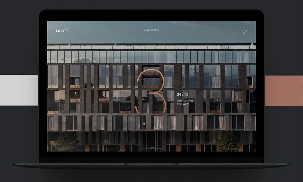
Source: Vide Infra, Loftec, Behance, https://www.behance.net/gallery/58260143/Loftec
What Are The Essential Features Of A Real Estate Website?
Designing a real estate website? Get ready to merge style, functionality, and a truckload of nifty features that make home buyers and sellers swoon! But it's not just about looking pretty; your real estate website needs to be as practical as a Swiss Army knife. Here’s the lowdown on the five essential features that every real estate website must have to truly shine
Dynamic Search Functions
Let's face it, no one likes to wade through clutter. An intuitive search feature is the heart of any real estate website, allowing users to filter through listings with ease. Think beyond the basics like location and price—consider advanced filters such as property type, proximity to schools, or even walk scores. Make sure the search results are easy to navigate and include high-quality photos and essential information right off the bat.
High-Resolution Photo Galleries and Virtual Tours
A picture is worth a thousand words, and in real estate, probably a few thousand dollars! High-resolution images are crucial in capturing the essence of the property. Throw in 360-degree virtual tours, and you’ve got yourself a digital open house that visitors can stroll through from the comfort of their pajamas. This visual storytelling not only boosts engagement but also helps potential buyers form an emotional connection to the property.
Responsive Design
With more than half of the internet’s traffic coming from mobile devices, a mobile-friendly design isn’t just nice to have—it’s a must. A responsive real estate website adjusts seamlessly to fit any screen size, ensuring that your listings look just as stunning on a smartphone as they do on a desktop. This adaptability enhances user experience and helps keep your site looking sharp and professional across all devices.
Client Testimonials and Success Stories
Nothing builds trust like a chorus of happy clients. Including a section for testimonials and success stories on your real estate website not only adds credibility but also connects potential clients with the human aspect of your business. Whether it's a video testimonial or a few lines of text, hearing about successful transactions makes prospects more likely to consider your services.
Interactive Maps and Neighborhood Information
Buying a house is as much about the location as it is about the square footage. An interactive map feature is essential for highlighting property locations and giving potential buyers a feel for the neighborhood. Go the extra mile by including details about local amenities, schools, parks, and even commute times. This not only helps buyers visualize their life in a new place but also positions your website as a one-stop shop for all things real estate.
Sprinkle these essential features into your real estate website, and you're not just selling properties—you're providing a valuable resource that guides your visitors from casual browsers to happy homeowners. Now that’s a blueprint for success!
What Is The Best Hosting Option For A Real Estate Website?
When it comes to picking the best hosting option for your real estate website, think of it like choosing a plot for your dream home: location, foundation, and amenities matter! In the digital world, your hosting provider is the plot on which your website resides. Get it right, and you’re set for success. Here’s how to choose a hosting provider that ensures your real estate website is not just up and running but sprinting ahead of the competition!
Reliability and Uptime
You wouldn’t showcase a home that’s prone to blackouts, would you? Similarly, a reliable host with excellent uptime (ideally 99.9% or higher) is critical. Your real estate website needs to be accessible around the clock, as house hunting is a 24/7 activity. Make sure the hosting service comes with strong reviews and a proven track record for stability. After all, every minute your site is down could mean a missed opportunity to connect with a potential buyer.
Speed and Performance
If a real estate website loads slowly, visitors will bounce faster than a lowball offer on a hot property. A fast-loading site keeps users engaged and contributes significantly to a positive user experience. Look for hosting providers that offer solid-state drives (SSDs), optimized server resources, and advanced caching technologies to keep your listings loading smoothly and swiftly.
Security Features
Security in real estate isn’t just about sturdy locks and surveillance cameras. Online, your real estate website needs robust security to protect sensitive client information and prevent cyber threats. Opt for a host that provides automatic backups, malware scanning, and advanced firewalls. SSL certificates are a must to secure user data and boost your site’s credibility (and Google appreciates it too!)
Scalability
Just as a growing family might need a home with room to expand, your real estate website needs a hosting environment that can grow with your business. Whether you're starting with a few property listings or managing a large portfolio, your hosting provider should allow you to easily upgrade your resources without downtime. Look for options like cloud hosting, which can seamlessly handle increased traffic and data as your site scales.
Customer Support
In the real estate business, the quality of your service makes all the difference—and the same goes for web hosting. Choose a provider that offers excellent customer support, available 24/7. Whether you need help with a technical issue or have questions about configuring your server, reliable support can be as crucial as a quick closing. Bonus points if the support team is knowledgeable about WordPress if you’re using it as your platform.
Selecting the right hosting provider for your real estate website is crucial in building a robust online presence that attracts clients and drives sales. Consider these key features, and choose a host that aligns with your website’s needs and your business goals. With the right foundation, your real estate website will be a bustling hub of activity, much like a well-loved home!
What Are The Best Marketing Strategies For A Real Estate Website?
Ah, marketing a real estate website! It’s like throwing the most enticing open house party in town—you need the right invites, decor, and buzz to draw the crowd. If you want your real estate website to be the go-to hub for prospective buyers and sellers, buckle up! Here are five sparkling marketing strategies that’ll put your website on the real estate map faster than you can say “sold!"
Content That Connects
Think of your website's content like the curb appeal of a home. It’s the first thing visitors notice and what keeps them around. Crafting engaging, valuable content—not just listings but also blogs, guides, and local real estate news—can set your site apart. Become the authority on “how to buy a home in [your area]” or “tips for selling your property quickly.” Engaging content boosts your visibility and establishes trust with your audience.
Stunning Visuals and Virtual Tours
In real estate, seeing is believing. High-quality photos and immersive virtual tours allow prospective buyers to visualize themselves in the space. Why not go the extra mile by using drone footage to showcase the neighborhood or creating 360-degree videos of the interiors? These visuals make your listings hard to ignore and easy to fall in love with.
Leverage Social Media
Your real estate website should be the hub of your online presence, but social media is where you can really spark conversations. Platforms like Instagram and Facebook are perfect for showcasing properties with eye-catching photos and engaging posts. Use these platforms to share success stories, customer testimonials, and behind-the-scenes looks at your day-to-day operations. Social media ads can also be targeted to reach specific demographics, making sure your properties are seen by the right eyes.
Email Marketing Campaigns
Email isn’t just old school—it’s a powerful tool to directly connect with your clients. Segment your audience and send them personalized updates about properties that meet their interests. Newsletters can include market trends, tips for homebuyers, and new listings. Make sure your emails are mobile-friendly and visually appealing, so they shine in any inbox.
Client Reviews and Testimonials
Word of mouth is as valuable as a prime piece of real estate. Encourage satisfied clients to leave reviews on your website and online platforms like Google and Yelp. Displaying these testimonials prominently can significantly boost credibility. You could even feature case studies of successful sales or happy buyers and sellers to tell a story that resonates with prospective clients.
Add Interactive and Engaging Visuals
Modern real estate websites aren’t just about listings anymore — they’re about creating experiences. Many successful property platforms now include high-resolution images, immersive 3D tours, and virtual walkthroughs to keep visitors engaged.
Another feature gaining rapid traction is AI Virtual Staging. With tools like AI Virtual Staging, agents and homeowners can instantly transform empty room photos into beautifully furnished spaces using artificial intelligence. This approach not only saves thousands in traditional staging costs but also helps buyers visualize the full potential of a property. The result? More attractive listings and faster sales.
By blending these modern visuals with sleek web design, you create a user experience that’s both engaging and conversion-focused — a crucial advantage in today’s competitive real estate market.
Implementing these strategies can transform your real estate website from just another listing page to a bustling marketplace where deals are closed, and dreams of new homes are realized. Get creative, stay genuine, and watch as your website becomes as sought-after as a beachfront property at sunset!
What Are The Best Themes For A Real Estate Website?
Choosing the right theme for your real estate website is like picking the perfect outfit for an open house—it needs to be impressive, inviting, and leave a lasting impression. Whether you’re a solo realtor, a bustling agency, or somewhere in between, your website’s theme can make or break how potential clients view your business. So, let’s dive into five of the best themes that will make your real estate website as eye-catching as a beachfront villa at sunset!
Elegant Estates
For those who cater to the luxury market, the "Elegant Estates" theme offers a sleek, modern design that highlights high-end properties with style. This theme typically features large, high-resolution images that showcase your most impressive listings. The navigation is designed to ooze luxury and simplicity, ensuring that potential buyers and sellers can easily find what they’re looking for without fuss. Key features include advanced search filters, interactive maps, and a section for client testimonials that add an extra layer of sophistication.
Urban Spaces
Ideal for real estate focused on bustling city properties, the "Urban Spaces" theme is all about dynamic, engaging visuals and a contemporary feel. It uses bold colors and clean lines to create a sense of energy and modernity that appeals to urbanites. This theme often includes features like “property of the week” showcases, neighborhood guides, and transit information. It’s perfect for showing off high-rise apartments, trendy lofts, and commercial spaces.
Suburban Retreats
This theme is perfect for showcasing family homes and suburban properties. "Suburban Retreats" emphasizes community features, school districts, and local amenities. The layout is warm and welcoming, with softer colors and more traditional design elements. It typically includes a lot of space for property details, photo galleries, and virtual tours, making it easy for families to imagine themselves moving right in.
Eco Living
As more people look for sustainable and eco-friendly living options, the "Eco Living" theme is becoming increasingly popular. This theme highlights properties that feature energy-efficient designs, sustainable materials, and green technologies. The design itself often incorporates earthy colors and clean, minimalist lines to reflect the eco-conscious values of your potential buyers. Features like detailed information on energy ratings and green amenities are key selling points.
Vacation Getaways
For real estate agents specializing in holiday homes or rental properties, the "Vacation Getaways" theme can make viewers feel like they're already on vacation. This theme usually features vibrant, captivating imagery of picturesque locations and uses a light, airy design to evoke a sense of relaxation and escape. Interactive galleries, booking integration, and reviews are crucial features that help potential renters or buyers make that all-important decision to book.
When choosing a theme for your real estate website, remember that it's not just about looks—it's about functionality and how well it aligns with the properties you're selling and the clients you're targeting. Each of these themes can be customized with your brand in mind, ensuring that your website not only looks great but also performs flawlessly. Now, get ready to dress your website for success and watch as it opens doors to countless opportunities!
What Content Should Be Included On A Real Estate Website?
Crafting content for your real estate website? It’s all about setting the stage for potential buyers and sellers to make one of the biggest decisions of their lives. Like a well-staged home, your website needs to present information that is not only appealing but also functional and informative. Here are five types of content that are essential to any real estate website, designed to attract, engage, and convert visitors into happy clients!
Property Listings
The bread and butter of any real estate website! High-quality, up-to-date listings are essential. Each listing should include detailed descriptions, high-resolution photos, and key features of the property. Don’t forget to add virtual tours or video walkthroughs to give potential buyers the best possible view of the property. Information should be easy to access and presented in a way that makes visitors want to click through for more details.
About Us Page
People want to know who they’re doing business with, especially in a field as personal as real estate. Your About Us page should tell a story that connects with your audience. Highlight your real estate expertise, experience, and the unique attributes of your team. This page should reinforce your credibility and showcase why you’re the best choice in the area.
Local Market Insights
Show off your expertise with content that educates potential clients about the local real estate market. This could include blog posts or articles on market trends, tips for home buyers and sellers, and updates on local real estate laws and regulations. Such insights not only help position you as an expert but also help your website become a valuable resource for anyone interested in real estate in your area.
Interactive Tools and Resources
Engage visitors by offering tools that they can use to understand the market better or to plan their real estate transactions. This could include mortgage calculators, cost of living comparisons, or maps with local amenities like schools and parks. Tools like these enhance the user experience and keep people coming back to your website for more than just property listings.
Clear Calls to Action (CTAs)
Every page on your real estate website should have a clear, compelling call to action. Whether it’s prompting visitors to schedule a viewing, contact an agent, download a buyer’s guide, or sign up for a newsletter, CTAs should be visible and persuasive. They guide users through the website, helping to convert passive visitors into active leads.
Sprinkle your real estate website with these essential content types, and you’ll be setting up a virtual space that’s as welcoming and informative as a Sunday open house. With the right content, your website won’t just attract visitors—it’ll turn them into leads and, eventually, happy homeowners. So, start filling your site with engaging, useful content, and watch your real estate business grow!
Conclusion
A successful real estate website is more than just a showcase of listings. It serves as a comprehensive hub that supports both buyers and sellers through their journey in the property market. By integrating captivating visuals, detailed property information, local insights, and compelling content, your site can offer a seamless user experience that builds trust and authority. Remember, the best real estate websites are those that effectively combine functionality, aesthetics, and useful information to meet the needs of their audience. Focus on enriching your website with these elements to stand out in the competitive real estate landscape.
Let Us Know What You Think!
Every information you read here are written and curated by Kreafolk's team, carefully pieced together with our creative community in mind. Did you enjoy our contents? Leave a comment below and share your thoughts. Cheers to more creative articles and inspirations!
Related Articles


Leave a Comment