30 Best Church Logo Design Ideas You Should Check

Source: Allan Peters, First Free, Behance, https://www.behance.net/gallery/31419775/First-Free
When it comes to creating a meaningful brand identity, nothing communicates vision and values quite like a church logo design. A great design blends timeless faith elements with modern creativity, offering both spiritual depth and visual appeal. Whether your goal is to represent tradition, highlight community, or reflect contemporary growth, the right design can make a lasting impression on members and visitors alike.
From elegant crosses and stained-glass patterns to minimalist symbols of unity and peace, church logo design has evolved into a space of endless possibilities. Many churches are embracing bold color palettes, clean typography, and versatile shapes that work seamlessly across bulletins, websites, signage, and even social media. These ideas are not just about beauty—they serve as a bridge between faith and everyday life, capturing attention while staying true to the mission.
In this article, we’ll showcase some of the best ideas that can inspire your own journey toward a memorable church logo design. Whether you’re leaning toward traditional icons, modern interpretations, or creative combinations of the two, you’ll find plenty of inspiration here to guide your design choices and help your logo stand out with purpose and personality.
Church Logo Design Ideas

Source: Jordan Singer, Canby Christian Church, Dribbble, https://dribbble.com/shots/18007685-Canby-Christian-Church

Source: Kevin Kinley, Dribbble, https://dribbble.com/shots/4124090-Logo-reject

Source: Studio David, Santa Rosa Seventh-Day Adventist Church, Dribbble, https://dribbble.com/shots/23984587-Santa-Rosa-Seventh-Day-Adventist-Church

Source: Marina Homenchuk, NGI, Behance, https://www.behance.net/gallery/190518821/NGI-Logo-Design

Source: Dylan Thompson, Doxa Church, Behance, https://www.behance.net/gallery/148658981/Doxa-Church-Rebrand

Source: Eli Maughan, The Gathering, Behance, https://www.behance.net/gallery/145813895/Church-Branding

Source: Coric Design, St. John the Beloved, Dribbble, https://dribbble.com/shots/24097669-St-John-the-Beloved-Badge-Logo

Source: Andrew Wiseman, Midtown Church, Behance, https://www.behance.net/gallery/141152771/Midtown-Church-Brand-Identity

Source: Morgan Carter, Trinity, Dribbble, https://dribbble.com/shots/6095613-Trinity-Logo-and-Branding

Source: Peter Voth, Grace Covenant Church, Dribbble, https://dribbble.com/shots/19113293-Grace-Covenant-Church-Gilbert-Arizona-pt-II

Source: Hans-Jørgen Kristiansen, Dribbble, https://dribbble.com/shots/26161182-Classical-Church-Logo-Not-in-Use

Source: Estera Nicula, Immanuel Christian Church, Dribbble, https://dribbble.com/shots/23869494-Immanuel-Christian-Church-Logo-Design

Source: Mateus Cardoso, International Christian Center, Behance, https://www.behance.net/gallery/116714589/ICC-International-Christian-Center-%28Proposta%29

Source: Zymein Harrison, Unity Church, Behance, https://www.behance.net/gallery/216564929/Unity-Church

Source: Mathew Oyeniyi, Glorious Royal Rock Christian Church, Behance, https://www.behance.net/gallery/108218087/GLORIOUS-ROYAL-ROCK-CHRISTIAN-CHURCH-Brand-identity

Source: Matheus Felipe Flores, Rede Apostólica Cristã, Behance, https://www.behance.net/gallery/138088707/Rede-Apostolica-Crista-Redesign-Branding

Source: Yasmin Kênnya, Fire, Behance, https://www.behance.net/gallery/137768921/FIRE-id-social-media-church-youth-ministry

Source: Peter Voth, Cornerstone Presbyterian Church, Behance, https://www.behance.net/gallery/123544061/Cornerstone-Presbyterian-Church

Source: Orville Dela Peña, Behance, https://www.behance.net/gallery/181543911/Church-Logo

Source: Martin Lorenzo da Rocha, Igreja Batista do Prado, Behance, https://www.behance.net/gallery/111951795/Igreja-Batista-do-Prado

Source: Peter Voth, King's Cross Church, Behance, https://www.behance.net/gallery/101409785/Kings-Cross-Church

Source: Elif Kameşoğlu, North Dunedin Baptist Church, Dribbble, https://dribbble.com/shots/19774806-North-Dunedin-Baptist-Church-Logo-Design

Source: Marden Jump, Pilar, Behance, https://www.behance.net/gallery/123837589/Igreja-Pilar

Source: Isaiah Guerrero, The Kingdom Co, Behance, https://www.behance.net/gallery/145618937/Brand-Identity-The-Kingdom-Co

Source: Maddie Hathcox, East Lake United Methodist Church, Behance, https://www.behance.net/gallery/122232813/East-Lake-United-Methodist-Church

Source: Dimitrije Mikovic, Citizens Church, Behance, https://www.behance.net/gallery/105422887/Citizens-Church

Source: Larissa Costa, Instituto Gênesis, Behance, https://www.behance.net/gallery/134244493/INSTITUTO-GENESIS-Identidade-Visual

Source: Charles Honig, Garden Church, Behance, https://www.behance.net/gallery/84422753/Garden-Church-Logo-Design

Source: Frank Antony, Amazing Love, Behance, https://www.behance.net/gallery/59588801/Amazing-Love-Logo-Brand

Source: Allan Peters, First Free, Behance, https://www.behance.net/gallery/31419775/First-Free
What Symbols Of Unity Fit Church Logo Design?
Symbols carry powerful messages, and in church logo design, unity is one of the most meaningful values to highlight. Churches are not only places of worship but also centers of community, belonging, and togetherness. When thoughtfully incorporated, symbols of unity make a logo resonate with members and newcomers alike. Here are five symbols that beautifully represent unity in church logo design.
Interlocking Circles For Togetherness
Circles have always symbolized eternity and completeness, but when interlocked, they beautifully represent relationships and connection. In church logo design, overlapping circles can symbolize individuals and communities coming together in faith. This simple yet elegant shape communicates inclusivity and belonging while maintaining a modern and approachable aesthetic.
The Dove As A Symbol Of Peace
The dove has long been a universal emblem of peace, but in church logo design, it also embodies unity under the Holy Spirit. A single dove in flight can suggest collective hope and guidance, while multiple stylized doves create imagery of people united in worship. Its soft and graceful form makes it versatile across both traditional and contemporary church identities.
Linked Hands For Fellowship
Few shapes capture the spirit of unity better than linked or open hands. In church logo design, hands reaching outward or holding one another signify support, compassion, and community. This symbol reflects the warmth and care that churches provide, sending a welcoming message to anyone who sees the logo. Paired with faith-centered icons, linked hands create a powerful emblem of love and togetherness.
The Cross With Radiating Lines
The cross remains the most central symbol in church logo design, but when surrounded by radiating lines or a halo-like circle, it transforms into an emblem of shared light and unity. This variation suggests that the faith extends outward, connecting people and guiding communities. The radiance symbolizes strength through togetherness and reflects the idea of shared blessings.
Trees And Branches For Growth
Trees are timeless symbols of life, and their branching forms can represent individuals connected through one strong trunk—faith. In church logo design, a tree with multiple branches or leaves suggests growth, nurturing, and unity among diverse people. Whether stylized in a modern geometric way or drawn in a soft organic style, the tree communicates harmony and collective strength.
Unity is one of the most cherished values in church logo design, and these symbols bring it to life with meaning and beauty. From circles and hands to doves and trees, each carries a message that celebrates togetherness. By weaving such imagery into logos, churches create visuals that not only stand out but also reflect the deeper bonds of their faith communities.
What Shapes Represent Faith In Church Logo Design?
Shapes are one of the most powerful tools in visual communication, and when it comes to church logo design, they carry deep symbolic weight. Faith has always been expressed through timeless imagery, and incorporating meaningful shapes can instantly connect people to a message of hope, spirituality, and unity. Let’s break down five shapes that beautifully represent faith in church logo design while keeping things creative and unique.
The Cross As The Central Shape
The most recognizable symbol of faith is, without question, the cross. In church logo design, the cross takes center stage in countless creative variations—simple lines, stylized outlines, or abstract interpretations. It instantly communicates spirituality, sacrifice, and hope. Whether a bold geometric cross or a delicate silhouette, this shape remains a universal anchor in church branding.
Circles For Eternity And Unity
Circles are beloved in church logo design because they symbolize wholeness, eternity, and the infinite love of God. They can stand alone or surround other elements, creating a sense of inclusiveness and community. Many designers weave circles into halos, stained-glass patterns, or even abstract sunbursts, offering a modern yet deeply spiritual touch.
Triangles Representing The Trinity
Triangles bring strong meaning to church logo design by representing the Holy Trinity—Father, Son, and Holy Spirit. Pointing upward, they also symbolize aspiration and spiritual growth. Triangles can be subtle, like in stained-glass motifs, or bold and geometric for a contemporary church identity. Their stability as a shape reinforces the idea of a firm foundation in faith.
Doves And Wing Shapes For Peace
In church logo design, organic shapes like wings or dove outlines often symbolize peace, guidance, and the presence of the Holy Spirit. These shapes feel softer and more approachable than rigid geometry, and they create warmth within a design. A dove in flight can be stylized into abstract curves or flowing lines, making the logo memorable while communicating divine inspiration.
Open Hands And Heart Shapes For Community
Faith is also about love, service, and togetherness. Shapes resembling open hands or hearts reflect compassion and the welcoming nature of a church. These organic forms add a human connection, inviting members and newcomers alike to feel embraced. In church logo design, combining hands with other symbols—like a cross within a heart—creates a deeply relatable and inviting image.
Shapes in church logo design aren’t just decorative; they are powerful vessels of meaning. From strong geometric forms to organic and flowing outlines, each shape can tell a story of faith, hope, and community. By thoughtfully choosing shapes that resonate, churches can create logos that are not only beautiful but also deeply meaningful to their congregation.
What Colors Are Best for Church Logo Design?
Selecting the perfect palette for a church logo design is more than just picking hues that look heavenly together; it's about conveying your church's spirit and ethos through color. The power of color psychology can play a pivotal role in how your congregation and community perceive your church. Here are five color choices that are popularly believed to be the most effective in church logo design, each capable of evoking specific emotions and connections:
Blue: Tranquility and Faithfulness
Blue is a frequent flyer in the palette of church logo designs—and for good reason. This color is often associated with depth and stability. It evokes feelings of tranquility, trust, and faith, which are core elements in any church's mission. Lighter blues can be soothing and peaceful, while darker shades convey strength and reliability. Using blue in your church logo can create a sense of serenity and spiritual calm that welcomes all.
White: Purity and Simplicity
White is the quintessential symbol of purity, which is a significant aspect of many faiths. It represents cleanliness, peace, and new beginnings. White can stand alone or be used to accentuate other colors, helping to create designs that feel open and uncluttered. A church logo incorporating white can convey a message of hope and clarity, offering a sanctuary of peace amidst the chaos of life.
Green: Growth and Renewal
Green is the color of growth, life, and renewal—attributes that many churches wish to embody. It’s an encouraging and restorative color that resonates deeply with themes of resurrection and eternal life, common narratives in many Christian teachings. Utilizing green in your church logo can suggest a vibrant, life-giving community that nurtures spiritual growth and renewal among its congregation.
Purple: Royalty and Spirituality
Purple has historically been associated with royalty, nobility, and prestige. In a spiritual context, it symbolizes the sovereignty of Christ and can be seen as a color denoting a deep reverence for God. It’s a rich color that can give your church logo a touch of elegance and solemnity, making it ideal for traditional churches that want to emphasize their historical roots and sacred mission.
Gold or Yellow: Optimism and Divine Glory
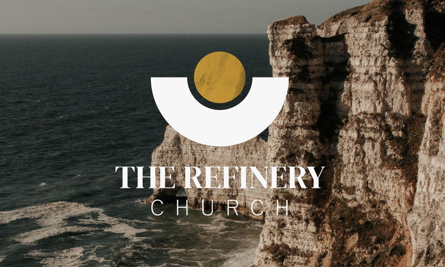
Gold and yellow are colors that shine with optimism, enlightenment, and divine glory. These colors are bright and welcoming, capable of inspiring feelings of warmth and cheerfulness. Gold adds a luxurious and timeless aspect to your logo, suitable for a church that wants to highlight its enduring commitment to its faith. Yellow, being the color of sunlight, symbolizes hope and happiness, which can help to create a welcoming and friendly atmosphere.
Choosing the right colors for your church logo design isn’t just about aesthetics; it’s about storytelling through visuals. The colors you select can define your church’s identity and how it’s perceived by the community. Remember, the goal is to create a logo that communicates your church's values and mission effectively—color is a powerful tool to help achieve that. So, let your colors truly reflect what your church stands for, and watch as they speak to the hearts of all who gaze upon your logo!
What Fonts Are Most Suitable For Church Logo Design?
Fonts are more than just letters—they’re a voice, a personality, and in the world of church logo design, they can carry spiritual weight. The right font doesn’t just look pretty; it communicates values, tradition, and community. Let’s explore five font styles that shine brightest when crafting a memorable and meaningful church logo design.
Serif Fonts For Tradition And Authority
Serif fonts are timeless, echoing stability and reverence. They’re often chosen in church logo design to highlight tradition, respect, and a sense of rootedness in history. The small strokes at the ends of the letters give a classical appearance, making them ideal for churches that want to emphasize long-standing heritage or a more formal identity. Fonts like Times New Roman or Garamond bring authority while still feeling approachable.
Script Fonts For Warmth And Grace
When a church wants to highlight fellowship, compassion, or a sense of personal connection, script fonts become the go-to. Flowing and elegant, they mimic the beauty of handwritten calligraphy. In church logo design, script fonts are often used to express grace, love, and hospitality. Imagine a swirling, soft script paired with a cross or dove—it instantly creates warmth and a welcoming tone.
Sans Serif Fonts For Modern Simplicity
For churches embracing a more contemporary identity, sans serif fonts provide clean lines and readability. Their simplicity makes them versatile across print, signage, and digital platforms. In church logo design, sans serif fonts often suggest clarity, inclusiveness, and a forward-looking vision. Fonts like Helvetica, Open Sans, or Montserrat can strike a perfect balance between modern style and spiritual depth.
Decorative Fonts For Unique Identity
Sometimes, a church wants to stand out with a logo that feels vibrant and full of personality. Decorative fonts—carefully chosen—can achieve that. In church logo design, these fonts may mimic stained glass, stone carvings, or even cultural patterns that connect with the local community. They should be used sparingly, often paired with simpler text, to ensure legibility while still adding character.
Bold Fonts For Strength And Presence
Faith often conveys strength and resilience, and bold fonts capture that spirit perfectly. In church logo design, thicker, heavier fonts give a sense of confidence and power, ensuring the logo stands out. Bold typefaces are excellent when paired with minimalist shapes like a cross or circle, creating a logo that’s memorable yet not overly complicated.
Fonts in church logo design are more than stylistic choices—they are vessels of meaning. From serif tradition to script grace, sans serif modernity to bold declarations, every font tells a story. The key is finding the style that best reflects the mission, community, and personality of the church, turning text into a symbol of faith.
What Are Creative Ideas For Church Logo Design?
Creativity and faith may seem like an unusual pair, but when it comes to church logo design, the two go hand in hand. A well-crafted logo can reflect tradition while still embracing modern trends, making it memorable for both long-time members and newcomers. If you’re looking for inspiration, here are five creative ideas that can make a church logo design both meaningful and visually exciting.
Stained Glass Inspirations
Stained glass has been a signature element of churches for centuries, and it remains a brilliant source of design inspiration. In church logo design, abstract shapes and colorful patterns modeled after stained-glass windows can create a sense of warmth and sacred artistry. This approach brings heritage into a modern format while making the logo vibrant and eye-catching.
Minimalist Cross Variations
The cross will always be central to church identity, but creative reimagining can make it feel fresh. In church logo design, minimalist interpretations—like geometric lines, negative space, or subtle outlines—keep the symbol recognizable while adding a modern edge. This approach is perfect for churches aiming for simplicity and elegance without losing deep meaning.
Nature-Themed Designs
Trees, rivers, mountains, and even sunlight are powerful metaphors for growth, renewal, and divine creation. In church logo design, these natural elements can symbolize unity and spiritual life. A tree with branching leaves can suggest community, while flowing water can represent baptism and new beginnings. These designs offer a creative and relatable touch.
Typography With Personality
Fonts are often overlooked, but they can be a playground for creativity. In church logo design, unique typography can elevate the message—whether it’s bold and strong for authority, script-style for grace, or modern sans serif for inclusiveness. Pairing meaningful type with subtle faith symbols, like a cross integrated into a letter, creates a logo that feels both clever and heartfelt.
Symbolic Abstract Marks
Abstract design allows room for imagination while still communicating unity and faith. In church logo design, this could include overlapping shapes that represent people, geometric patterns inspired by community, or radiant circles suggesting divine light. These marks are versatile, scalable, and perfect for use across digital platforms, giving churches a forward-thinking and creative identity.
Creativity in church logo design isn’t about reinventing faith—it’s about expressing timeless values in fresh, engaging ways. From stained-glass inspirations and minimalist crosses to nature themes and bold typography, there are endless opportunities to craft a logo that reflects both tradition and innovation. By weaving meaning into design, a church logo becomes more than a symbol; it becomes a beacon of unity, hope, and creativity.
Conclusion
A thoughtful church logo design can become a powerful symbol that communicates faith, unity, and community. By blending traditional elements such as crosses or doves with modern touches like abstract shapes or creative typography, churches can create a logo that resonates with both heritage and contemporary audiences. Whether inspired by stained glass, nature, or minimalist forms, a strong church logo design provides a lasting identity that supports outreach and connection. Ultimately, the right design goes beyond aesthetics—it reflects values, inspires trust, and offers a welcoming image that invites people into the heart of the church’s mission.
Let Us Know What You Think!
Every information you read here are written and curated by Kreafolk's team, carefully pieced together with our creative community in mind. Did you enjoy our contents? Leave a comment below and share your thoughts. Cheers to more creative articles and inspirations!


Leave a Comment