
10 Proper Ways to Use Icon Design in Your Works
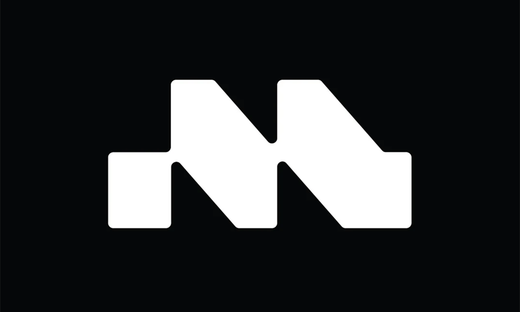
Source: Laura Nunes, UMAUMA Icons, Behance, https://www.behance.net/gallery/198743157/UMAUMA-Icons?
Icon design plays a pivotal role in enhancing user interfaces, offering a visual shorthand that aids users in navigating and understanding digital environments effortlessly. In the digital age, where the clarity of communication can greatly influence user experience, well-designed icons serve as crucial elements that bridge the gap between intuitive user interaction and aesthetic appeal.
This article explores ten essential strategies to utilize icon design effectively within your projects. Whether you're a graphic designer, a web developer, or a content creator, understanding how to incorporate icons can streamline your work processes and elevate the overall user experience. We will delve into the principles of consistency, simplicity, and functionality, ensuring that every icon you use not only looks appealing but also performs its intended function seamlessly.
By adhering to these guidelines, you can create more engaging and user-friendly designs that resonate with your audience and support the usability of your projects.
Understand the Purpose of Each Icon
In the realm of icon design, recognizing the distinct purpose of each icon is paramount. Icons function as efficient tools within user interfaces, aiming to communicate specific actions and content succinctly. They bypass language barriers and reduce the cognitive load for users by replacing text with easily interpretable visuals. Effective icon design should simplify user interactions, guiding them through digital environments with clarity. Whether signaling the ability to delete, the direction of navigation, or the initiation of a search, each icon must embody a clear message that users understand at a glance.
This necessitates a designer's deep understanding of the context in which an icon operates as well as the potential cultural interpretations of its imagery. By focusing on the intent behind each icon, designers create a more intuitive user experience that enhances the functionality of websites and applications. Always consider the context and avoid ambiguity in your icons to ensure they fulfill their purpose effectively.
Maintain Consistency in Design
Consistency is a cornerstone of successful icon design, crucial for creating a coherent visual language across a digital product. When icons within a set are designed with a consistent style, they form a cohesive group that enhances the user's ability to understand and navigate the interface. Consistency involves aligning the icons’ visual elements—such as line width, size, color, and complexity—so that no single icon feels out of place. This uniformity not only strengthens the usability of the icons but also reinforces the brand's identity, providing a seamless experience for users.
For designers, maintaining consistency means establishing strict design guidelines and adhering to them throughout the creative process. It also requires regular reviews and adjustments to ensure that all icons continue to meet these standards as new ones are developed. Consistent icon design helps users predict the interactions within your application, reducing learning time and increasing overall user satisfaction.
Choose Familiar Symbols
In icon design, selecting familiar symbols is essential for immediate recognition and intuitive user interaction. Familiar symbols leverage universal visual languages, enabling users to understand functionality without reliance on textual explanations. This approach not only speeds up navigation but also enhances user experience by making interfaces more accessible and easier to use. For instance, a magnifying glass universally represents "search," while a house icon denotes "home." These symbols transcend cultural and linguistic barriers, making them vital in global applications.
However, the choice of symbols must consider cultural variations to avoid misinterpretation. What is familiar in one culture may be obscure or have different connotations in another. Therefore, thorough research and sometimes localization are necessary to ensure that icons resonate well with the target audience. Additionally, testing with users from different backgrounds can provide insights into the effectiveness and acceptance of the symbols used.
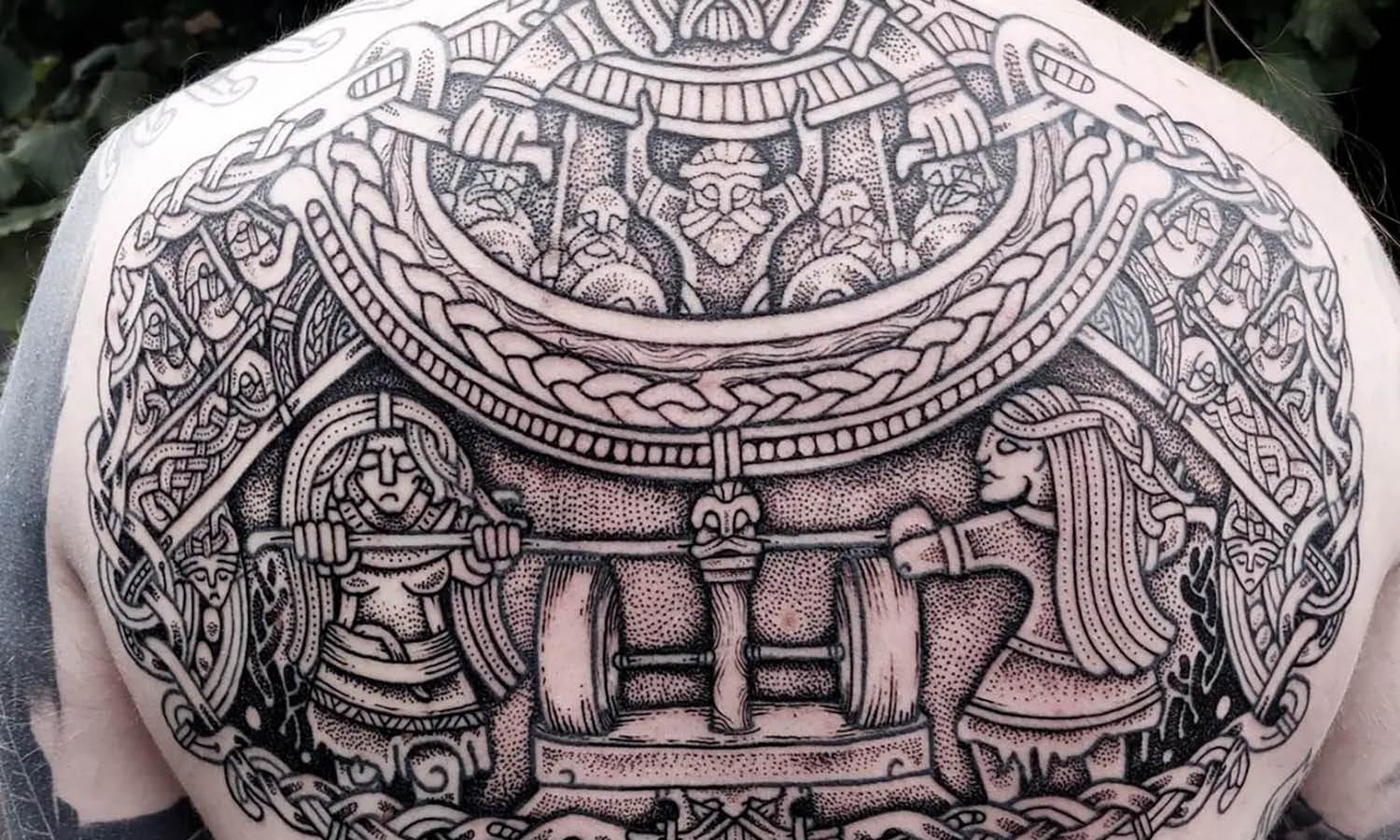
Source: Forma & Co, Universal Icon Set (500 Icons for £39), Behance, https://www.behance.net/gallery/191069695/Universal-Icon-Set-(500-icons-for-39)?
Use Appropriate Sizes
Choosing the appropriate size for icons in design is crucial for functionality and aesthetics. Icons must be large enough to be easily recognizable but small enough to fit elegantly within the interface without overwhelming other elements. The ideal icon size depends on its application context and the device it's intended for. For instance, desktop applications may allow for larger icons than mobile interfaces, where screen space is limited.
Consistency in icon size across a platform maintains a clean and organized appearance while ensuring user comfort in navigation. It's also important to consider different display resolutions and ensure that icons are scalable without losing clarity. Vector icons are particularly beneficial for maintaining sharpness at various sizes and resolutions.
In responsive design, icons should adjust to different screen sizes and orientations to improve usability. Testing icons in multiple environments is essential to determine optimal sizes that enhance readability and interaction. Properly sized icons contribute to a balanced design and can significantly improve the user's experience by making interfaces more approachable and easier to use.
Prioritize Simplicity in Icon Design
In the realm of icon design, simplicity is paramount. Simplistic icons are not only aesthetically pleasing but also enhance the user's ability to quickly grasp what each symbol means, thereby improving functionality across digital platforms. When designing icons, it's essential to focus on the fundamental features that convey the icon’s purpose without introducing unnecessary details that can clutter the visual space and confuse users.
Effective icon design should employ clean lines and limited color palettes to ensure that the symbols are understandable at a glance, especially when scaled down for smaller displays. This approach helps in maintaining clarity and recognizability, which are crucial for user navigation and interaction. Designers should strive to strip down icons to their most basic elements, removing any ornamental aspects that do not add to the icon's immediate recognition.
Use Icons to Enhance Readability
Icons are powerful tools in improving the readability of content by breaking up text and illustrating concepts, making information easier to digest. In icon design, the use of visually intuitive symbols can guide users through a set of instructions or navigation more smoothly than text alone. This visual assistance helps in making interfaces user-friendly, especially in environments where quick information retrieval is critical.
The strategic placement of icons next to complex information can highlight key points and create visual anchors, aiding in quicker comprehension and recall. For instance, icons used in menus, tooltips, and buttons convey function and action without the need for lengthy descriptions, thereby speeding up the interaction process. Additionally, icons can also serve to draw attention to important features or data in applications, enhancing user engagement and the overall effectiveness of the design.
To maximize their impact, icons should be contextually relevant and designed with a clear understanding of their symbolic meanings to ensure they add real value to the content. Properly executed, icons can transform textual information into an interactive, visually enriched experience that enhances both the aesthetics and the practicality of a project.
Use Icons to Guide Users
In the realm of user interface design, icons play a pivotal role as navigational aids, directing users smoothly from one task to another. Effective icon design should intuitively guide users, minimizing reliance on text and enhancing the speed of interaction. This is especially crucial in environments where quick decision-making is necessary, like in mobile apps or busy web pages. Icons can signal actions (like sending a message with an envelope icon), reveal more information (a question mark), or navigate (arrows for next and previous).
To maximize their guiding potential, icons should be placed strategically within the interface. For instance, a shopping cart icon is best positioned in the upper right corner, where users expect to find it based on prevailing design conventions. Additionally, consistency in the visual presentation of icons ensures that once a user learns what an icon does, the knowledge is transferable across various sections of the application or website.
When using icons to guide users, consider their universal comprehensibility. Opt for symbols with clear meanings to avoid ambiguity and ensure they perform well in usability tests. Properly implemented, icons not only make the user journey smoother and faster but also contribute to a cleaner and more organized design aesthetic.
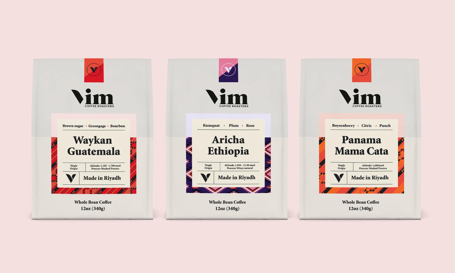
Source: Makers Company, UKG | Brand Iconography, Behance, https://www.behance.net/gallery/205364675/UKG-Brand-Iconography?
Match Icons with Brand Aesthetics
Icons are more than just practical tools within digital platforms; they are also potent elements of brand identity. Matching icon design with brand aesthetics is crucial to creating a cohesive user experience and reinforcing brand recognition. Icons that reflect a brand’s style, values, and color scheme can significantly enhance the visual harmony of a design and strengthen the emotional connection with the audience.
To integrate icons seamlessly with brand aesthetics, begin by defining the brand’s visual elements — colors, shapes, and graphic styles. Icons should adhere to these guidelines to ensure they resonate with the brand’s overall look and feel. For example, a luxury brand might use sleek, minimalist icons in gold and black to convey elegance and exclusivity, while a tech company might opt for bold, geometric icons that communicate innovation and precision.
Consideration of typography and color palette when designing icons ensures that they not only match but also complement the other design elements. Consistency across all visuals helps to create a unified and recognizable brand image that users can identify and relate to across various touchpoints.
Maintain Visual Hierarchy
Maintaining a visual hierarchy with icon design is essential for creating an intuitive and efficient user interface. Icons play a significant role in directing attention and guiding user interactions based on their importance and function. Effective icon hierarchy involves using size, color, and placement to establish the relative prominence of various icons within a design. For instance, more significant actions like "save" or "send" may be represented with larger or more vividly colored icons compared to less critical actions.
The positioning of icons also contributes to visual hierarchy. Placing high-priority icons in prominent locations ensures they are noticed first and accessed easily. Additionally, the use of contrasting colors can highlight essential functions, guiding the user’s eye naturally through the interface. It's crucial to balance the design so that key icons stand out without overwhelming lesser elements, maintaining an organized and aesthetically pleasing layout.
In digital interfaces, consistency in icon style and spacing can further reinforce hierarchy, making the interface more predictable and easier to navigate. By clearly differentiating between primary and secondary actions through icon design, users can quickly understand and adapt to the functionality of the application, enhancing overall usability and satisfaction.
Experiment with Icon Animations
Icon animations can significantly enhance user engagement and improve the interactive experience of digital interfaces. When used judiciously, animations bring static icons to life, providing visual feedback in response to user actions or indicating the status of processes like loading or syncing.
Experimenting with subtle movements, such as hover effects, rotation, or changes in color, can make icons more dynamic and informative. For example, an animation that transitions a menu icon into a cross when activated can visually communicate that it’s possible to close the menu. Such animations help in making interfaces intuitive and reducing the cognitive load on users by visually demonstrating the results of their interactions.
However, it's essential to use icon animations sparingly to avoid distracting from the primary content or making the interface overwhelming. The key is to enhance functionality rather than detract from it. Ensure that animations are smooth, quick, and well-timed to maintain a professional and polished look. Testing different animations with real users can provide valuable feedback on their effectiveness and appeal.
Conclusion
Mastering icon design is essential for creating user-friendly and aesthetically pleasing digital interfaces. By focusing on clarity, consistency, and context, designers can leverage icons as powerful tools to enhance usability and guide user interactions. Whether through familiar symbols, appropriate sizes, or dynamic animations, each aspect of icon design plays a crucial role in improving the user experience. As digital environments become more complex, the thoughtful application of icons will continue to be a fundamental element in design strategies, helping to bridge communication gaps and streamline user interactions effectively.
Let Us Know What You Think!
Every information you read here are written and curated by Kreafolk's team, carefully pieced together with our creative community in mind. Did you enjoy our contents? Leave a comment below and share your thoughts. Cheers to more creative articles and inspirations!
Related Articles


Leave a Comment