10 Easy Steps To Create A Minimalist Product Design

Source: Kevin Lau, Design of Pet Feeder, Behance, https://www.behance.net/gallery/120252231/Design-of-pet-feeder
In the realm of product design, minimalism is more than just an aesthetic choice; it's a philosophy that emphasizes utility and simplicity. A minimalist product design focuses on the essentials, removing any superfluous elements that do not serve a functional purpose. This approach not only enhances the usability of the product but also appeals to the contemporary consumer, who increasingly values clean lines and sustainable quality over ornate detailing. Whether you're a seasoned designer or a newcomer to the field, adopting a minimalist approach can transform the way you conceptualize and execute your design projects.
This article outlines ten easy steps to guide you through the process of creating a minimalist product design. Each step is designed to help you focus on functionality, maintain aesthetic integrity, and achieve a balance between form and function. As we dive into these steps, remember that minimalism isn't about making things plain or boring; it's about achieving better design through simplicity.
Define Your Core Functionality
The first step in creating a minimalist product design is to clearly define the core functionality of your product. This involves stripping back to the essentials and focusing on what the product needs to accomplish for the user. In minimalist design, every feature, button, and interface element should serve a purpose, contributing to the overall functionality without adding unnecessary complexity. Start by identifying the primary function your product serves.
Ask questions like: What is the fundamental problem it solves? Who are the end users? What are their needs? By concentrating on these aspects, you can ensure that the design remains intuitive and user-friendly. Simplifying the product to its basic functions also helps in eliminating distractions, making the user experience more seamless. This approach not only makes the product easier to use but also enhances its aesthetic appeal, adhering to the minimalist mantra that less is more.
Use a Neutral Color Palette
In minimalist product design, the choice of color plays a crucial role in conveying simplicity and elegance. A neutral color palette is preferred because it helps create a clean and uncluttered look. Neutral colors like whites, grays, and beiges are timeless and versatile, making them ideal for a minimalist design. These colors tend to blend smoothly with different environments and complement other design elements without overwhelming them. When using a neutral palette, you can focus on the quality of materials and the craftsmanship of the product rather than relying on bold colors to attract attention.
It’s important to choose shades that not only reflect light and space but also evoke a sense of calm and serenity. This subtlety in color choice can significantly enhance the product's usability by reducing visual fatigue and maintaining the user's focus on the essential elements of the design. Remember, the goal is to enhance the product’s functionality and user experience by keeping the design simple yet profoundly impactful.
Implement Geometric Shapes
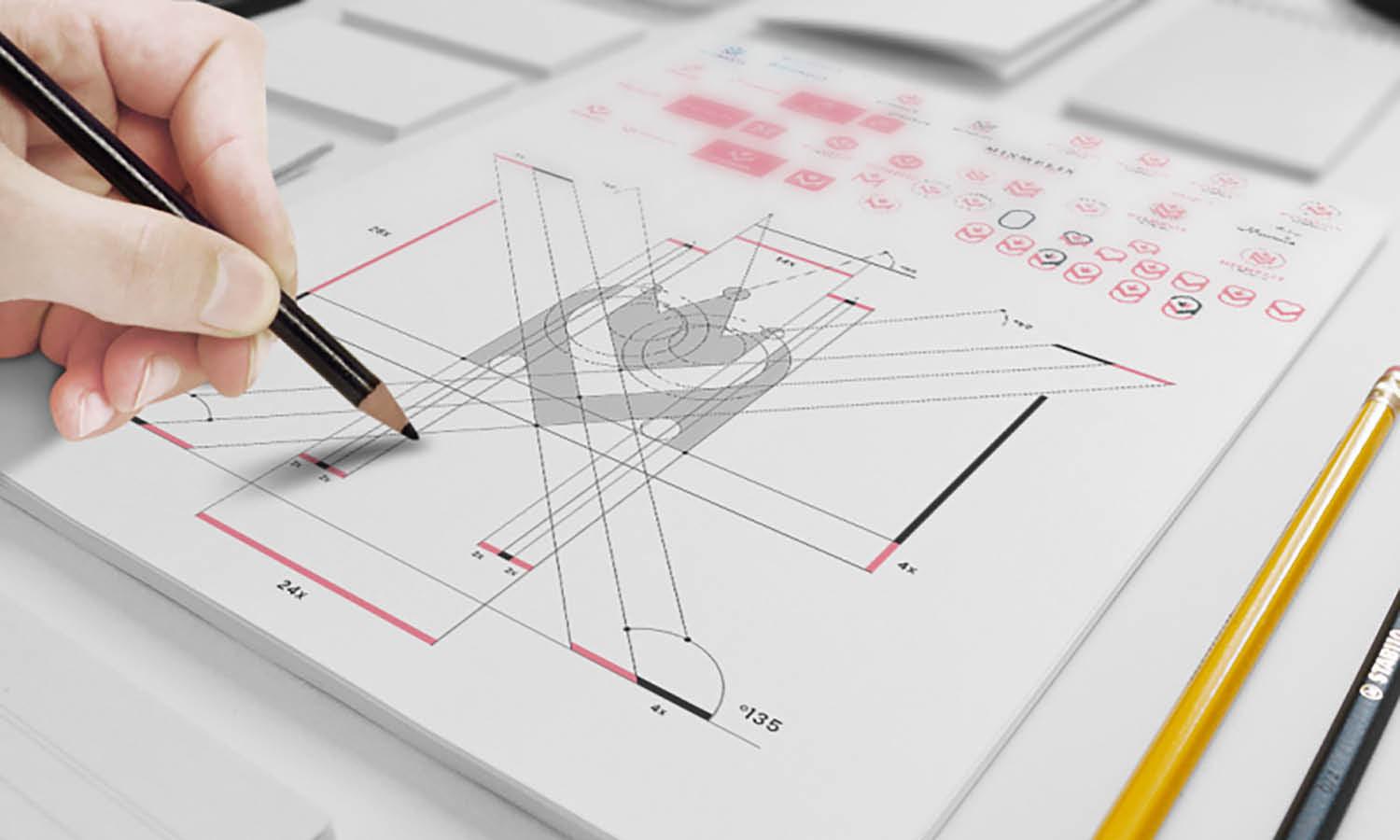
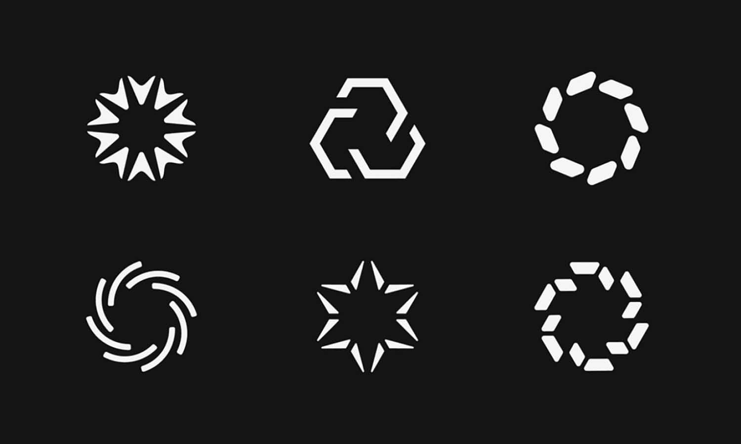
In minimalist product design, the use of geometric shapes is a fundamental technique for creating clean, recognizable forms that are visually appealing and easy to understand. Geometric shapes such as circles, squares, and triangles can be used to convey stability, efficiency, and harmony. These shapes are inherently simple and devoid of unnecessary details, making them perfect for minimalist design. When implementing these shapes, consider their psychological impact and how they can enhance the product's functionality. For instance, a circle might suggest continuity and protection, making it suitable for products intended to convey safety.
Squares and rectangles, with their straight edges and equal proportions, suggest stability and reliability. To effectively use geometric shapes in your designs, focus on alignment, proportion, and balance. Ensure that these shapes do not compete with the functionality of the product but rather enhance the user's interaction with it. By incorporating geometric shapes thoughtfully, you can create a product that is not only aesthetically pleasing but also communicates its purpose clearly and directly, embodying the principles of minimalist design.

Source: Kevin Lau, Design of Pet Feeder, Behance, https://www.behance.net/gallery/120252231/Design-of-pet-feeder
In the realm of product design, minimalism is more than just an aesthetic choice; it's a philosophy that emphasizes utility and simplicity. A minimalist product design focuses on the essentials, removing any superfluous elements that do not serve a functional purpose. This approach not only enhances the usability of the product but also appeals to the contemporary consumer, who increasingly values clean lines and sustainable quality over ornate detailing. Whether you're a seasoned designer or a newcomer to the field, adopting a minimalist approach can transform the way you conceptualize and execute your design projects.
Focus on Usability
A cornerstone of minimalist product design is an unwavering focus on usability. This involves designing products that are not only aesthetically minimal but also highly functional and intuitive for the user. To achieve this, every element of the product must serve a clear purpose and enhance the user experience. Start by simplifying the interface and eliminating any features or elements that do not support user tasks. This might mean reducing the number of buttons, streamlining menus, or hiding advanced settings under a simpler option. Consider the user journey from start to finish and ensure that each step is logical and straightforward.
Pay attention to the ergonomics of the design—how the product feels in hand, how easy it is to operate, and how effectively it performs its intended function. Testing with real users is critical in this process; gather feedback to identify pain points and areas for improvement. By focusing on usability, you ensure that the minimalist design improves the product's overall effectiveness and user satisfaction, making the minimalism meaningful rather than merely aesthetic.
Choose Quality Over Quantity
In minimalist product design, the adage "less is more" is not just about reducing the number of elements, but also about emphasizing the quality of what remains. Choosing quality over quantity means selecting superior materials that not only last longer but also enhance the user experience. High-quality materials can improve the functionality and durability of the product, making it more sustainable and desirable. For example, using premium metals, high-grade plastics, or sustainable fabrics can significantly impact the product's feel and performance. Furthermore, focusing on quality extends to the manufacturing process. Precise craftsmanship ensures that every detail, no matter how minimal, is executed with care, reflecting the product's integrity and design ethos.
This commitment to quality helps create a product that stands out in the market, not through ornate details or embellishments, but through its refined simplicity and superior performance. As you design, continually ask whether each element and material choice enhances the product's core functionality and user experience. By prioritizing quality over quantity, you ensure that every aspect of the product is there for a reason, contributing to a holistic minimalist design that resonates with consumers who value both aesthetics and functionality.
Integrate Subtle Branding
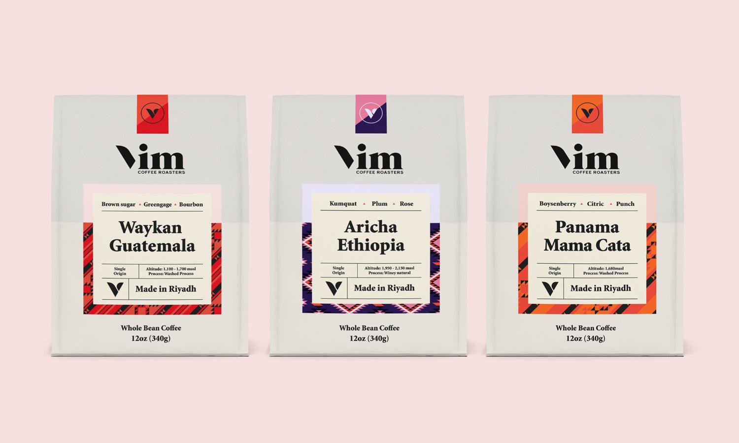
Subtle branding is a crucial aspect of minimalist product design, allowing the brand to convey its identity without overwhelming the product's clean aesthetic. In a minimalist design, the branding should be seamlessly integrated into the product, complementing rather than dominating. This can be achieved through thoughtful placement, choice of color, and scale. Consider using a monochromatic color scheme for the logo that matches the product's overall design to ensure it blends well without disappearing. Placement is also key; positioning the logo in a less conspicuous spot can subtly hint at the brand while maintaining the product's sleek look.
Another effective strategy is to use branding as a functional element of the design. For example, the logo can double as a button or a latch. This not only keeps the design clean but also adds a layer of interaction between the product and the user. By integrating branding in this understated manner, you preserve the minimalist integrity of the design while still providing the necessary brand recognition. It's a delicate balance to strike, but when done correctly, it can significantly enhance the product's appeal and align with the minimalist philosophy of less is more.
Emphasize Texture Over Decoration
In minimalist product design, the emphasis shifts from decorative embellishments to the subtle use of texture. This approach aligns with the minimalist ethos of reducing visual clutter while enhancing sensory experience. Textures can engage the sense of touch, offering a tactile dimension that brings depth and interest to simple designs. For instance, a matte finish can convey sophistication, while a brushed metal offers a tactile feel without complicating the visual aesthetic. By selecting materials with distinctive textures, designers can create a sense of luxury and quality without the need for additional decorative elements.
This tactic not only adheres to minimalist principles but also appeals to consumers looking for products that stand out through understated elegance. When incorporating textures, consider their practicality and how they contribute to the overall user experience. Textures should not only be pleasing to touch but also functional, such as providing grip or reducing fingerprints and smudges. By thoughtfully integrating texture into the design, you can enhance the product's usability while maintaining a clean and simple aesthetic.

Source; Radiance, Basik - Eco-Packaging for Supplements, Behance, https://www.behance.net/gallery/136044419/basik-eco-packaging-for-supplements
Opt for Discrete Functionality
Discrete functionality is a key principle in minimalist product design, where the functionality of the product is integrated seamlessly into its form without being overtly obvious. This approach maintains the aesthetic integrity of the design while ensuring the product remains highly functional. For example, hinges, buttons, and interfaces can be designed to blend into the product, becoming almost invisible when not in use. This not only preserves the sleek lines and uncluttered surfaces that are characteristic of minimalist design but also surprises and delights the user with hidden functionalities.
The challenge lies in balancing accessibility and intuitiveness with aesthetic minimalism. Designers must ensure that while the functional elements are discreet, they are still easy to use and do not compromise the user experience. Techniques such as touch-sensitive surfaces, retractable controls, and integrated sensors can help achieve this balance. By opting for discrete functionality, you create a product that embodies simplicity and sophistication, where every element serves a purpose and nothing is superfluous.
Limit the Number of Features
In minimalist product design, limiting the number of features is crucial to maintaining clarity and simplicity. This approach ensures that each feature included is essential and enhances the user's experience without contributing to complexity. By focusing on the most critical functions, designers can avoid the common pitfall of over-engineering the product, which can lead to a cluttered interface and dilute the overall purpose. The key is to prioritize features based on user needs and the core functionality of the product.
Every feature should undergo rigorous evaluation to determine its necessity and impact on the user experience. This process not only simplifies the design but also improves the product's usability, as users spend less time navigating through unnecessary options. Additionally, a limited feature set can lead to better performance and lower production costs, making the product more efficient and sustainable. Adopting this minimalist approach helps in creating a product that is not only visually appealing and easy to use but also truly aligned with the principles of minimalist design.
Adopt a User-Centric Design Approach
Adopting a user-centric design approach is fundamental in minimalist product design. This strategy focuses on the needs and experiences of the user, ensuring that every element of the product serves a purpose and enhances usability. By prioritizing the user, designers can strip away non-essential features and aesthetics that do not add value. In implementing a user-centric approach, extensive user research and testing are key. Understanding user behavior, preferences, and challenges allows designers to craft solutions that are not only minimal but also highly functional and intuitive.
This research should guide the design process, from the initial concept to the final product, ensuring that the user's needs are at the forefront. Additionally, a user-centric mindset encourages simplicity and efficiency, hallmarks of minimalist design, by focusing on what is most important to the user. Ultimately, this leads to a cleaner, more accessible product that resonates more deeply with its intended audience, providing a seamless and satisfying user experience.
Conclusion
Embracing minimalist product design is not merely about adopting a visual style but about committing to a philosophy of simplicity and functionality. By refining the design to its core elements, prioritizing quality, and focusing on the user's needs, designers can create products that are not only aesthetically pleasing but also highly functional and intuitive. Minimalist design challenges us to think deeply about the purpose of each element, ensuring that everything included serves a meaningful role. This approach not only leads to better products but also promotes a more thoughtful and sustainable approach to design.
Let Us Know What You Think!
Every information you read here are written and curated by Kreafolk's team, carefully pieced together with our creative community in mind. Did you enjoy our contents? Leave a comment below and share your thoughts. Cheers to more creative articles and inspirations!








Leave a Comment