10 Steps to Create A Minimalist Poster Design

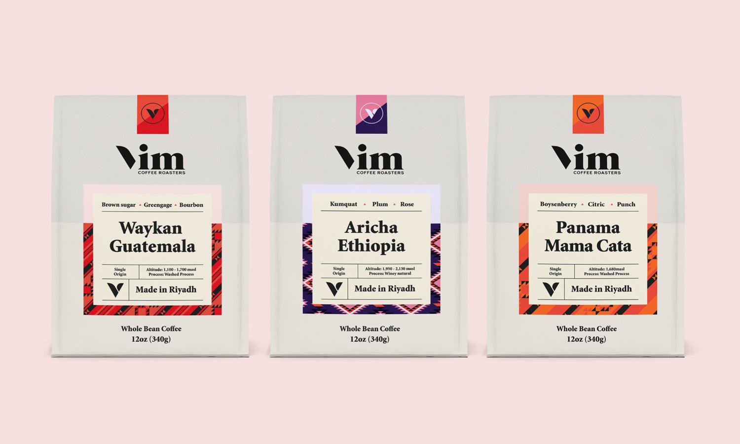
Source: Minal Studio, Maitha Brand Identity, Behance, https://www.behance.net/gallery/99142683/Maitha-Brand-Identity
Minimalist poster design embodies the principle of "less is more," focusing on simplicity and the essential elements to convey messages clearly and effectively. In today's visually saturated world, the minimalist approach cuts through the noise, offering a clean, uncluttered aesthetic that captures attention and communicates quickly. Designing a minimalist poster requires a deliberate choice of color, typography, and composition to ensure every element serves a purpose.
This article will explore 10 key steps to create a minimalist poster design, guiding both novice and seasoned designers through the process of refining their artistic expression into something impactful yet simple. Whether you are designing for marketing campaigns, events, or personal projects, mastering the art of minimalist design can transform the way your content is perceived and elevate your visual communication strategy. Join us as we delve into the essentials of creating a minimalist poster that not only looks professional but also effectively communicates your message with precision and style.
Define the Core Message
Defining the core message is a crucial step in creating a minimalist poster design. It involves distilling the poster’s purpose and intended message into a clear, concise statement that guides the entire design process. This clarity is vital as it influences every choice made during the design, from the selection of colors and fonts to the arrangement of elements on the canvas. Start by asking key questions: What is the primary message or emotion the poster should convey? Who is the target audience, and what is the most direct way to reach them? This foundational understanding helps in crafting a poster that not only looks good but also communicates effectively.
In minimalist design, where every detail counts, knowing the core message ensures that nothing on the poster is superfluous. Each element introduced should reinforce or directly relate to this message, creating a cohesive and focused piece. For instance, if the message is to promote a serene and natural product, the design might feature earth tones and simple, clean fonts that reflect calmness and simplicity.
Choose a Simple Color Scheme
Selecting a simple color scheme is pivotal in minimalist poster design, as it sets the mood and tone of the communication while ensuring visual impact. A minimalist approach typically involves using a monochromatic palette or limited color selections to create harmony and balance. By choosing one dominant color and complementing it with subtle accents, designers can evoke specific emotions and direct viewer attention efficiently. The choice of colors should align with the poster’s core message; for example, blue can convey calmness and trust, while red might evoke energy and urgency.
Additionally, using contrasting colors for text and essential elements can enhance readability and highlight critical areas of the poster. It’s also effective to employ varying shades of the same color to create depth and interest without the complexity of multiple hues. This strategy keeps the design clean and focused. When deciding on colors, consider the cultural context and the psychological impact, as different colors can mean different things in various cultures and contexts.
Use Negative Space
Negative space, or the space around and between the subject of an image, is a fundamental element in minimalist poster design. It is not merely empty space, but a powerful tool to enhance the focus and readability of your design. Utilizing negative space effectively can transform a simple poster into a striking visual statement.
This design technique involves deliberately incorporating areas without busy textures or elements, allowing the viewer’s eye to rest and naturally gravitate towards the most important parts of the poster. In minimalist design, less is indeed more. Negative space can be used to form interesting shapes, or to highlight and isolate the main message or image, making it stand out even more.
For example, a large, empty area could surround a small text to draw attention directly to that message, making it seem more profound or important. This approach not only emphasizes the central elements but also gives the poster a clean, uncluttered look, which is appealing in today’s cluttered visual landscape.
The key to mastering negative space lies in balancing the visual weight of elements, ensuring that the poster doesn’t feel too empty or too crowded. Skillful manipulation of negative space can result in a sophisticated design that communicates more with less.

Source: Geoffrey Mark Taylor, Shinko 新古, Behance, https://www.behance.net/gallery/132799995/Shinko-
Use Simple Typography
In minimalist poster design, typography is not just a means of communication but also an integral design element. Using simple typography enhances the clarity and impact of the message while contributing to the overall aesthetic. Selecting a straightforward, legible font is crucial, as it ensures that the message is accessible to the audience at a glance. Minimalist designs often favor sans-serif fonts for their clean lines and contemporary feel, but selecting the right typeface depends on the message and the audience.
When implementing typography in minimalist design, consider the weight, spacing, and size of the text to create a visual hierarchy. The most important information should stand out and be immediately identifiable, which can be achieved by varying font sizes and weights. Keep the number of fonts to a minimum—usually one or two—to avoid visual clutter.
Moreover, the arrangement of text should complement the other elements of the design, maintaining balance and alignment. Effective use of typography in minimalist design is not about decorating but about making a statement. Simplicity in type choice and layout helps to convey the message directly and beautifully, adhering to the minimalist mantra that less is more.
Focus On Composition
Composition is a cornerstone of effective minimalist poster design. A well-composed poster guides the viewer’s eye to the most important information seamlessly and naturally. In minimalist design, where every element counts, the arrangement can make or break the visual impact of the poster.
To achieve a strong composition, start with a clear focal point: where do you want the viewer’s attention to be drawn immediately? Use the rule of thirds to place key elements at strategic points that naturally catch the eye. Balance is also critical in minimalist design; the placement of text and images should create a visual equilibrium that feels stable and aesthetically pleasing.
Furthermore, consider the flow of the design. How does the eye move across the poster? Arranging elements in a way that leads the viewer through the content can enhance understanding and retention of the message. Lines, whether implicit or explicit, can direct attention and add to the overall composition.
Highlight Key Information
Highlighting key information is crucial in minimalist poster design to ensure that the most important messages are immediately apparent to the audience. In a design style characterized by simplicity, the strategic placement and presentation of essential details can significantly impact effectiveness and viewer engagement. Start by identifying the information that is most critical to communicate—this could be a headline, a brand name, or a call to action. Once identified, make these elements stand out by using larger or bold fonts, contrasting colors, or placing them in the focal area of the layout.
Effective use of hierarchy plays a vital role in guiding the viewer’s attention to this information first. Organize content in a way that the eye naturally follows, emphasizing key information sequentially and ensuring it's not lost in the simplicity of the design. Additionally, minimalism doesn’t mean omitting embellishments entirely but using them wisely to enhance the visibility of crucial data without cluttering the visual space.
Incorporate Geometric Shapes
Incorporating geometric shapes is a powerful technique in minimalist poster design, offering a visually striking and organized way to convey complexity through simplicity. Geometric shapes—such as circles, squares, and triangles—provide a sense of order and balance, lending the design a clean, modern look that is both attention-grabbing and aesthetically pleasing.
When using shapes in your design, consider their meanings and implications. For example, circles often represent unity and protection, while squares suggest stability and balance, and triangles can imply motion or direction. Use these shapes to frame important information, create backgrounds, or as key elements of the visual hierarchy within your poster.
The placement of geometric shapes should be strategic to guide the viewer’s eye towards the most important content or to structure the information on the poster effectively. They can also be used to create contrast or to segment different parts of your message visually, making the communication clear and easy to digest.
Geometric shapes can blend beautifully with minimalist design principles by reinforcing the message with simple yet powerful visual elements. Their versatility and visual appeal make them invaluable tools in creating engaging and effective minimalist posters that stand out while maintaining a sleek and uncluttered look.

Source: Markiewicz Studio, Industry Day South-West, Behance, https://www.behance.net/gallery/92639973/Industry-Day-South-West
Use Visual Hierarchy
Visual hierarchy is a fundamental concept in minimalist poster design that organizes information in a way that leads the viewer’s eye through the design in a logical, pleasing, and effective manner. In minimalist designs, where less is more, the careful arrangement of elements according to their importance enhances clarity and improves the impact of the message. To establish a strong visual hierarchy, start by deciding which element should be the focal point, often the most crucial piece of information or image.
Use size, color, and placement to differentiate between levels of importance. Larger, bolder elements naturally draw more attention, making them ideal for headlines or key messages. Color can also be used to highlight important aspects, with brighter or contrasting colors drawing the eye more than muted tones. Placement plays a critical role; positioning important information centrally or along natural sightlines ensures visibility and prominence.
Typography is another tool in establishing hierarchy. Varied font weights, sizes, and spacing can help distinguish between primary and secondary information, guiding the viewer through the content in a structured way.
Apply Consistent Margins
Consistent margins are essential in minimalist poster design, contributing to a clean and ordered appearance that is visually appealing and easy to interpret. Margins—the space around the elements of your design—act as a frame for your content, influencing how the viewer perceives the layout. Well-applied, consistent margins help to create a sense of balance and structure, which is vital in minimalist design where every detail counts.
To effectively apply margins in your design, start by defining the space around the edge of the poster. This boundary should be uniform to maintain an organized look. Consistent margins not only enhance the overall visual impact by creating a neatly framed area but also improve readability and focus. They provide breathing room around text and images, preventing the design from feeling cramped or overloaded.
Furthermore, consistent margins across different elements like text blocks, images, and titles help to establish a rhythmic flow, making the poster more visually coherent. The viewer’s eye can move comfortably from one element to another, facilitated by the uniform spaces that subtly guide their attention across the design. In minimalist poster design, where simplicity and impact are key, consistent margins are crucial for maintaining a harmonious and effective composition.
Stick To A Consistent Theme
When crafting a minimalist poster design, consistency is key to creating a strong visual impact. This involves choosing a central theme that resonates throughout the entire design, ensuring that all elements support and enhance the theme rather than detract from it. Whether you opt for a monochromatic color scheme, geometric shapes, or minimalist line art, the theme should be clearly identifiable and uniformly applied.
This consistent thematic approach helps in maintaining a clean and uncluttered look, which is essential in minimalist design. It allows the viewer to quickly grasp the concept without unnecessary distractions. For instance, if you are using sharp, angular lines to convey a sense of modernity, ensure these are reflected across all design elements from the typography to the imagery.
Conclusion
Mastering minimalist poster design involves a deep understanding of space, composition, and simplicity. By focusing on the essentials—such as a simple color scheme, clear typography, and effective use of visual hierarchy—designers can create impactful, visually appealing posters that communicate their messages with clarity and precision. Remember, the strength of minimalist design lies in what you choose to leave out just as much as what you include. As you refine your skills in minimalist design, you'll learn to convey more with less, ensuring that every element serves a purpose and contributes to a cohesive, compelling poster.
Let Us Know What You Think!
Every information you read here are written and curated by Kreafolk's team, carefully pieced together with our creative community in mind. Did you enjoy our contents? Leave a comment below and share your thoughts. Cheers to more creative articles and inspirations!









Leave a Comment