
Logo Colors, Shapes & Symbols Guide

Choosing the right visual elements is one of the most important parts of creating a logo. Before someone reads a brand name or learns what a company does, they may already form an impression from its color, shape, and symbol.
That is why understanding logo colors shapes and symbols can help you make more intentional design decisions. Colors can influence mood and association, shapes can make a logo feel stable, energetic, friendly, or precise, and symbols can communicate ideas that words may take longer to explain.
None of these elements has a single universal meaning. A blue logo does not automatically make a company trustworthy, just as a triangle does not automatically make a brand innovative. Industry, culture, typography, composition, and brand personality all affect how a design is perceived.
The goal is therefore not to follow rigid design rules. It is to understand common visual associations and use them thoughtfully so every element supports a clear, recognizable brand identity.
How Logo Colors Influence Brand Perception
Color is often one of the first things people notice in a logo. It can shape the overall mood of a design before viewers consciously examine the typography or symbol.
Different colors carry familiar associations, but they should be treated as starting points rather than fixed psychological formulas.
What Different Logo Colors Commonly Communicate
Red often feels energetic, bold, passionate, and urgent. It can work well for brands that want to appear confident or exciting, although bright red may feel aggressive when overused.
Blue is frequently associated with stability, trust, professionalism, and calmness. Because of these qualities, it appears often in technology, finance, healthcare, and corporate branding.
Green commonly suggests nature, growth, health, freshness, and sustainability. However, deeper shades can feel traditional or premium, while bright greens may appear youthful and energetic.
Yellow can communicate optimism, warmth, friendliness, and attention. It is visually noticeable but may need darker supporting colors to remain readable.
Orange combines some of the energy of red with the friendliness of yellow. It can feel approachable, creative, enthusiastic, and informal.
Purple is often connected with imagination, creativity, luxury, and sophistication. Its character can change considerably depending on whether the shade is soft, bright, or dark.
Black can communicate strength, authority, elegance, simplicity, or exclusivity. It is particularly effective in identities that depend on strong typography or minimal design.
White represents openness, cleanliness, simplicity, and clarity, especially when used as negative space or against darker backgrounds.
Why Context Changes Color Meaning
Color rarely communicates alone. A dark blue geometric logo may feel corporate and dependable, while the same blue paired with rounded lettering and playful illustration can feel much more casual.
Cultural context also matters. Colors may carry different ceremonial, emotional, or symbolic associations in different regions.
Instead of asking only, “What does this color mean?” consider asking, “What does this color communicate in this specific logo, industry, and brand context?”
What Logo Shapes Communicate
Shapes give logos structure and strongly affect their visual personality. Curved forms can feel gentle and approachable, while angular geometry can suggest precision, movement, or strength.
Understanding these associations helps designers choose forms that reinforce the intended character of a brand.
Circles, Ovals, and Rounded Shapes
Circular forms often suggest unity, connection, continuity, and completeness. Because circles have no sharp corners or clear ending point, they can also feel welcoming and harmonious.
Rounded shapes are useful for brands that want to appear friendly, community-focused, accessible, or human. They are commonly seen in consumer products, digital platforms, wellness brands, and services built around connection.
However, circles do not have to feel soft. A bold circular mark with heavy typography can still communicate confidence and strength.
Squares and Rectangles
Squares and rectangles often convey order, reliability, stability, and structure. Their straight edges and balanced proportions can make a logo feel controlled and professional.
These shapes are particularly common in technology, architecture, financial services, and corporate identities because they naturally create a sense of organization.
A rigid square can feel serious, while rounded corners can soften the same basic form and make it appear more approachable.
Triangles and Angular Shapes
Triangles tend to feel dynamic because their points naturally direct the eye. They may communicate movement, progress, strength, ambition, or innovation.
Orientation changes the effect. An upward-pointing triangle may suggest growth or achievement, while a sideways form can imply forward movement. Sharp angles can also make a brand feel technical, competitive, or energetic.
Organic and Irregular Shapes
Not every logo needs perfect geometry. Organic forms inspired by plants, hand-drawn marks, flowing curves, or irregular silhouettes can communicate creativity, individuality, nature, and spontaneity.
These shapes are especially useful when a brand wants to feel more expressive or less corporate. Their irregularity can create personality, although they still need enough structure to remain recognizable.
Understanding Symbols in Logo Design
Symbols allow a logo to communicate through imagery rather than relying entirely on words. A strong symbol can reference what a company does, represent a broader idea, or become meaningful simply through repeated association with the brand.
Literal Symbols
Literal symbols depict something directly connected to the business or its industry.
A gardening company might use a leaf. A bookstore may incorporate a book. An outdoor brand could use a mountain, while a construction company might reference a tool or building form.
The advantage is immediate understanding. Viewers can often identify the general business category quickly.
The drawback is familiarity. If dozens of competitors use the same obvious symbol, the logo can become difficult to distinguish.
Conceptual and Metaphorical Symbols
A symbol does not need to show the actual product or service. It can represent a quality the brand wants to communicate.
An arrow might symbolize progress or direction. A bridge can represent connection. A shield may suggest protection, while wings can imply freedom or speed.
These metaphorical approaches often give designers more creative flexibility because they focus on ideas instead of objects.
Abstract Symbols
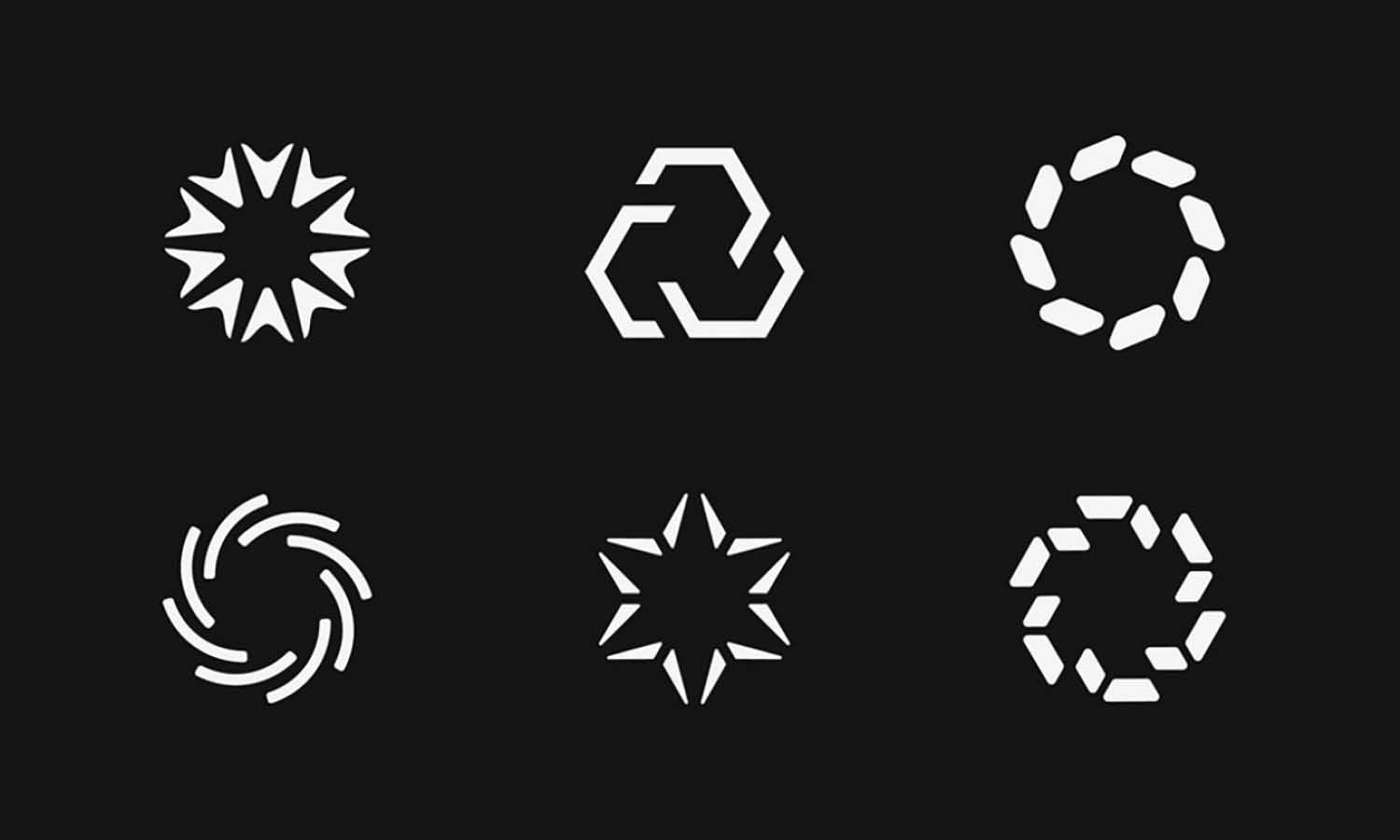
Abstract logo marks may not represent anything immediately recognizable. Instead, they use custom geometry, lines, or shapes to create a distinctive visual identity.
Their main strength is uniqueness. Because the design is not tied to an obvious object, the symbol can gradually acquire meaning through consistent brand use.
An abstract logo does not need a complicated story behind every curve. Distinctiveness, simplicity, and memorability are often more useful than forcing hidden symbolism into the design.
How Colors, Shapes, and Symbols Work Together
The most useful way to understand logo colors shapes and symbols is to look at them as a connected visual system rather than three separate decisions.
A logo becomes stronger when these elements support a consistent brand impression.
Reinforcing the Same Brand Message
Color, form, and symbolism can reinforce one another.
For example, a security company might combine blue with a structured geometric shape and a shield symbol. Each choice supports ideas such as reliability, protection, and stability.
An environmentally focused brand might use green alongside soft rounded forms and a leaf-inspired mark, creating an identity that feels natural and approachable.
A premium creative brand could combine black with sharp geometry and an abstract monogram to create a more sophisticated, contemporary impression.
The exact combination matters more than any individual element.
Creating Contrast and Personality
Not every visual element needs to communicate the same trait.
Contrast can make a logo more distinctive. A highly structured symbol might be paired with a warm color to make the identity feel less formal. A playful icon could be balanced by restrained typography so the brand still appears professional.
This allows designers to create more nuanced personalities instead of relying on obvious visual formulas.
Avoiding Too Many Visual Messages
Problems often appear when a logo tries to communicate everything at once.
A design might combine several colors, multiple symbolic ideas, complicated geometry, and decorative typography in an attempt to represent every brand value. The result is usually harder to understand and remember.
Choose one or two primary qualities to emphasize. Let the remaining visual elements support those ideas instead of competing for attention.
How to Choose the Right Visual Elements for a Logo
Understanding symbolism is useful, but the real challenge is deciding what fits a specific brand.
A practical selection process can prevent design choices from becoming purely decorative.
Start With the Brand Personality
Before choosing colors or shapes, identify a small number of characteristics the brand should communicate.
- Reliable
- Innovative
- Friendly
- Premium
- Energetic
- Traditional
- Playful
Prioritizing a few qualities gives the design direction. If a brand needs to feel reliable and modern, for example, its visual decisions should support those qualities rather than introducing unrelated messages.
Consider the Audience and Industry
People interpret logos partly through expectations built from other brands they already know.
A financial company may benefit from visual cues associated with stability, while a children's product can usually support more playful forms and brighter colors.
Following every industry convention, however, can make a logo look generic. The goal is to appear appropriate enough for the category while maintaining a recognizable point of difference.
Choose Meaning Before Decoration
Every major visual element should have a reason to exist.
This does not mean every curve requires a detailed symbolic explanation. It simply means colors, shapes, and symbols should contribute to the brand rather than being added because the composition feels empty.
If removing an element makes the logo clearer without losing meaning, that element may not be necessary.
Test the Logo in Real Applications
A visually meaningful logo still needs to function.
Test it at small digital sizes, in black and white, on light and dark backgrounds, and in places such as social media profiles, packaging, printed materials, or signage.
Complex symbols can lose detail when reduced, and subtle color relationships may disappear in monochrome reproduction. Testing helps reveal these problems before the identity is finalized.
Common Mistakes When Using Logo Colors, Shapes, and Symbols
One common mistake is treating color psychology as a strict formula. Choosing blue simply because it supposedly represents trust does not guarantee that audiences will see the brand that way. The complete visual identity determines the impression.
Another issue is relying too heavily on generic symbols. Leaves, globes, light bulbs, arrows, and swooshes can all work, but familiar imagery needs distinctive execution to avoid blending in with competitors.
Designers can also become overly focused on hidden meaning. Clever negative space and layered symbolism can be memorable, but a logo should not become a puzzle that requires explanation before it makes visual sense.
Too many colors, symbols, or competing shapes can create similar problems. Complexity often weakens recognition rather than adding meaning.
Finally, avoid ignoring scalability. Thin details and intricate illustrations may look impressive on a large screen but disappear when the logo becomes a small app icon, website favicon, product label, or social avatar.
Frequently Asked Questions
What Do Colors Mean in Logo Design?
Logo colors can create associations with qualities such as trust, energy, luxury, nature, or friendliness. Their meanings are not universal, however. Industry conventions, cultural context, typography, imagery, and surrounding colors all affect interpretation. Designers should therefore consider the complete identity rather than selecting colors based only on simplified psychology charts.
What Is the Best Shape for a Logo?
There is no single best logo shape. Circular forms can feel welcoming and unified, squares may suggest reliability and structure, while triangles often communicate movement or strength. The most suitable form depends on the brand personality, audience, industry, and the practical environments where the logo will appear.
Should a Logo Symbol Represent What the Company Does?
Not necessarily. Literal symbols can make a company's activity easier to understand, but abstract or conceptual symbols often create more distinctive identities. A strong logo mark can represent a broader idea, brand value, or personality instead of showing the product directly. Recognition and relevance are more important than literal representation.
How Many Colors Should a Logo Have?
Many effective logos use one to three primary colors because limited palettes are generally easier to recognize and reproduce consistently. There is no strict maximum, though. Additional colors can work when they serve a clear purpose, but using several colors simply for decoration can make the identity feel unnecessarily complicated.
Can a Logo Have a Hidden Meaning?
Yes. Hidden meanings can add depth through negative space, symbolic shapes, or clever visual relationships. However, they should complement the design rather than become its only strength. A logo still needs to be distinctive, readable, and memorable for people who never notice the hidden idea behind it.
Conclusion
Understanding logo colors, shapes, and symbols makes it easier to create identities with greater purpose and consistency. Color helps establish emotional tone, shape influences visual character, and symbols can communicate ideas ranging from literal products to abstract brand values.
These associations are useful guides, not fixed rules. The same color or shape can feel very different depending on typography, composition, industry, audience, and cultural context.
When choosing visual elements, focus on the qualities the brand genuinely needs to communicate. Keep the concept clear, avoid unnecessary complexity, and test the design in practical applications. The strongest logo colors shapes and symbols work together naturally, creating a memorable identity without requiring viewers to decode every design decision.
Related Articles






Leave a Comment