Less Is More? What Does It Really Mean?

Source: Albert Exergian, Mathematics Poster Series, Behance, https://www.behance.net/gallery/111427209/Mathematics-Poster-Series?isa0=1#
The phrase "less is more" has resonated through the corridors of design and architecture for decades, embodying a philosophy that champions simplicity over complexity. Often attributed to the minimalist architect Ludwig Mies van der Rohe, this principle advocates for the power of reduction, suggesting that stripping designs to their core essentials can lead to a clarity and elegance that excess cannot achieve. In today's fast-paced world, where sensory overload is common, embracing a "less is more" approach can be a breath of fresh air.
This philosophy is not just about aesthetic minimalism but is deeply ingrained in functionality, sustainability, and the user experience. By exploring how "less is more" influences various aspects of design and lifestyle, this article aims to provide a deeper understanding of its implications and enduring appeal. Whether it's in creating sleek, user-friendly products, or in crafting clear, impactful messages in marketing, the minimalist approach offers a pathway to efficiency and effectiveness that resonates across different domains.
Origins of the “Less Is More” Philosophy
The philosophy of less is more traces back to architect Ludwig Mies van der Rohe, a visionary known for his minimalist approach in architecture and design. In the early 20th century, Mies van der Rohe introduced a new way of thinking about form and function, advocating for simplicity over ornamentation. His belief was that beauty and functionality could be achieved by stripping away unnecessary elements, leaving only the essentials. This concept resonated deeply within the design community, sparking a movement toward clean, purposeful design that prioritized function as highly as form.
This philosophy of less is more wasn’t confined to architecture; it spread across various creative fields, including graphic design, product design, and digital design. By focusing on essentials, designers realized they could create powerful visuals that communicated clearly and effectively. Removing clutter allowed each element to have greater impact, enhancing the overall design’s readability and purpose.
The less is more philosophy has since become a guiding principle for designers worldwide. It encourages a thoughtful, disciplined approach to design that values simplicity and functionality over excess.
Minimalism as a Design Principle
Minimalism is an embodiment of the less is more philosophy, placing simplicity at the forefront of design. This principle encourages designers to focus on essential elements, eliminating anything that does not serve a clear purpose. Minimalism is about clarity—where form follows function, and every part of the design is intentional. By adopting a minimalistic approach, designers create visuals that are clean, focused, and easy to understand.
Minimalism aligns with the idea that design should be functional, user-centric, and timeless. By reducing clutter and focusing on essential components, minimalist design not only looks sophisticated but also improves user experience. This approach emphasizes usability and straightforward communication, making it applicable to everything from digital interfaces to branding. Ultimately, minimalism as a design principle reflects the less is more ethos, reminding designers that simplicity can lead to powerful, memorable designs.
Clarity and Focus Through Visual Hierarchy
In design, clarity and focus are essential for effective communication. The principle of less is more plays a significant role in achieving this clarity by emphasizing a strong visual hierarchy. Visual hierarchy is the arrangement of elements in a way that directs the viewer's attention, guiding them through the content in a deliberate, purposeful manner. With minimal design, a clear hierarchy ensures that essential information stands out, making it easier for viewers to process and understand the message.
Designers use size, contrast, color, and placement to create this hierarchy, which tells the viewer what is most important on the page. For example, larger fonts or bold colors draw attention to primary information, while smaller or subtler elements direct focus on secondary details. By removing unnecessary elements, the less is more approach helps prevent visual clutter, allowing each part of the hierarchy to shine and enhancing the user’s comprehension of the design.

Source: Meh Design Studio, Nu., Behance, https://www.behance.net/gallery/112932163/NU-Makeup-Branding-Packaging
Color Theory in “Less Is More” Design
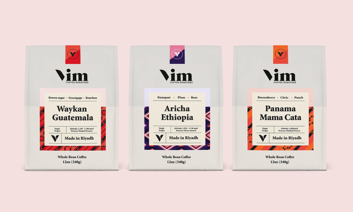
In minimalist design, color theory plays a vital role in conveying the message with simplicity and impact. The less is more philosophy encourages designers to use color sparingly and purposefully, often limiting the palette to one or two primary colors, complemented by neutrals. This approach helps create a clean, cohesive design that draws attention to the most critical elements.
Minimalist designs frequently use muted tones or monochromatic color schemes to create a calm, sophisticated look. Soft grays, whites, and blacks are common choices, as they provide a neutral backdrop that highlights focal points without overwhelming the viewer. When bolder colors are used, they serve as accents that guide the viewer’s eye to essential parts of the design, such as calls-to-action or logos.
In a less is more design, color can also evoke specific emotions and reinforce brand identity. For example, blue often symbolizes trust and reliability, while red can convey energy and urgency. By choosing colors that align with the brand’s message, designers can create an emotional connection with the audience using minimal visual elements.
Typography as a Key Element
Minimalist design typically employs sans-serif fonts due to their clean, modern appearance. Sans-serif fonts are known for their simplicity, which aligns well with the minimalist approach and ensures that text remains legible across different devices and formats. Additionally, using only one or two font families helps maintain a cohesive look, preventing the design from appearing cluttered or overwhelming.
Hierarchy in typography is also crucial in minimalist design. Designers can use variations in font size, weight, and spacing to establish a clear visual hierarchy, guiding the viewer’s eye to essential information first. For example, a larger, bold typeface can emphasize headings or calls-to-action, while smaller text conveys supporting details.
In less is more design, typography is more than just text; it’s a powerful design tool that communicates both style and substance. By selecting fonts carefully and using them thoughtfully, designers can achieve clarity, focus, and aesthetic harmony. This approach to typography supports the minimalist philosophy, proving that simplicity in design can be both beautiful and functional.
Leveraging White Space for Impact
White space, or negative space, is a powerful element in the less is more philosophy, allowing designers to create impactful, balanced layouts. Rather than filling every area with visuals or text, white space provides a visual break, enhancing readability and focus. This “empty” space draws attention to essential elements by making them stand out, giving the design a sense of harmony and elegance.
White space isn’t just the blank areas around elements; it’s a strategic design choice that adds structure and flow. When used effectively, white space guides the viewer’s eye naturally from one element to the next, making the design feel intuitive and organized. This technique supports visual hierarchy, helping designers establish what is most important on the page.
Minimalist designs often use generous white space to create a sophisticated, clean look that reflects the less is more approach. This simplicity enhances the visual impact of each element, creating a more memorable and enjoyable experience for the viewer. Additionally, white space promotes a calm, uncluttered aesthetic, which aligns with user-centered design principles by reducing cognitive load.
Enhancing Brand Identity With Simplicity
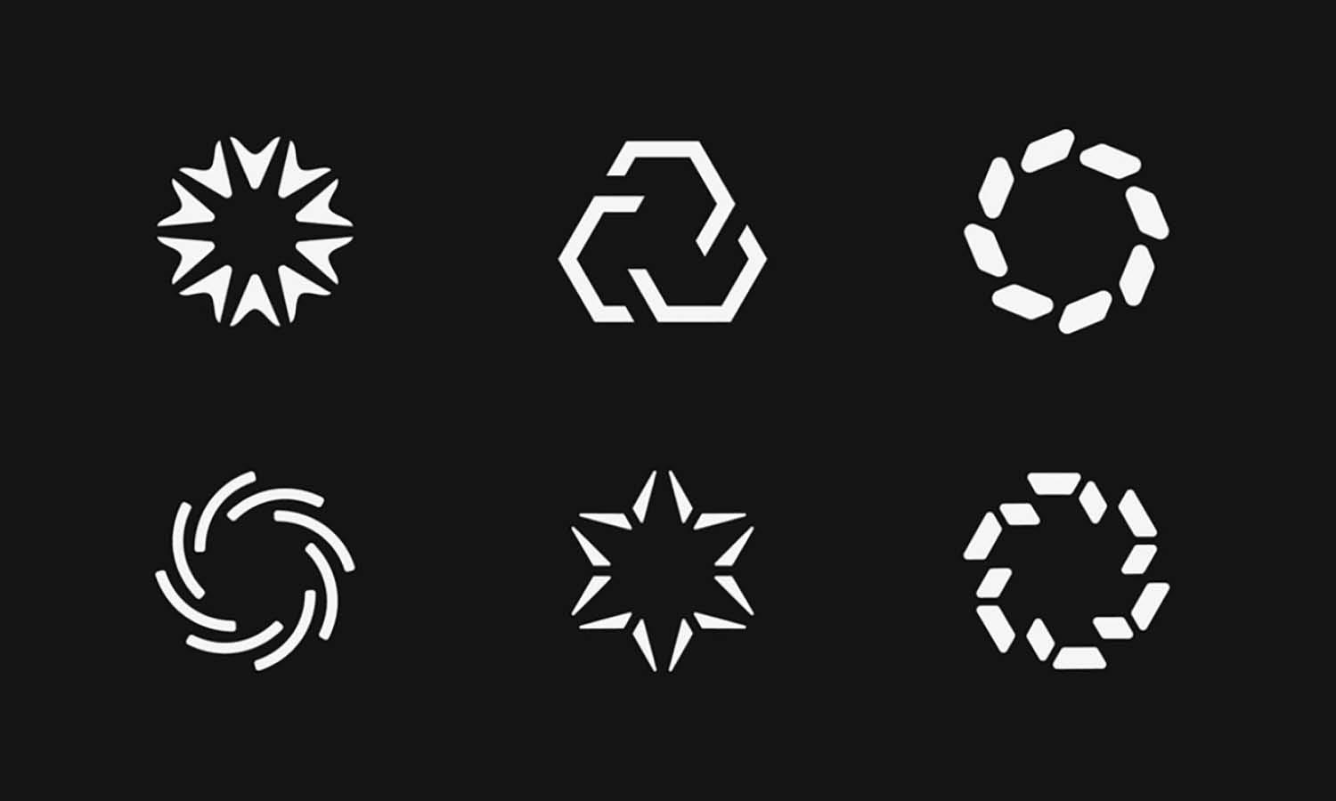
A minimalist approach to brand identity involves careful selection of colors, fonts, and shapes to create a design that stands out without overwhelming the audience. Iconic brands often use this approach; for instance, logos like Nike’s swoosh or Apple’s apple symbol are globally recognized for their simplicity. These brands prove that a streamlined design can carry a powerful message, often becoming more memorable than complex visuals.
Simplicity in brand identity also promotes consistency across various platforms. A clean, minimal design is versatile and adaptable, easily applied to different mediums, from websites and social media to print materials. This adaptability strengthens brand recognition, as the design remains visually consistent across all touchpoints.

Source: Brand Consultant, TU7UHARI, Behance, https://www.behance.net/gallery/100587783/TU7UHARI
Functionality Over Form in Product Design
In product design, the less is more philosophy emphasizes the importance of functionality, focusing on how a product works rather than unnecessary embellishments. This approach aligns with user-centered design, prioritizing the practical needs of the consumer above all else. When a product is stripped down to its essentials, it often becomes easier to use and more intuitive, enhancing the user experience.
Designers practicing less is more in product design aim to create items that serve their purpose without distractions. This approach can be seen in iconic products like the iPhone, where every design element, from button placement to screen size, is meticulously crafted for ease of use. Minimalist product designs tend to have a clean, uncluttered appearance, which not only looks modern but also makes the product more functional and durable.
Timelessness in Design Through Minimalism
Minimalist design has a unique ability to stand the test of time, embodying the less is more philosophy that values simplicity and clarity. By focusing on essential elements and avoiding trends, minimalist design maintains relevance and appeal across changing styles and preferences. A design grounded in simplicity and purpose is less likely to appear outdated, making it a strong choice for brands seeking a timeless identity.
Timeless design is also versatile, adapting well across various mediums and formats. A minimalist logo or layout can be scaled, altered, or modernized without losing its essence. This adaptability strengthens brand consistency, as the design remains recognizable regardless of how it’s used or where it’s displayed.
Sustainable Design Practices
Sustainability and the less is more philosophy share common ground in their commitment to reducing waste and prioritizing functionality. Minimalist design often involves using fewer resources, aligning with sustainable practices that aim to minimize environmental impact. By focusing only on essential elements, minimalist design reduces material and energy consumption, making it an eco-friendly choice in various applications, from product design to packaging.
In product and packaging design, minimalism can lead to simpler, more resource-efficient solutions. For instance, using fewer materials or opting for recyclable options can significantly lower a product's environmental footprint. Additionally, minimalist packaging often eliminates excess wrapping and focuses on clean, functional aesthetics that appeal to environmentally conscious consumers.
Digital design also benefits from a less is more approach in sustainability. Websites with minimal, lightweight designs load faster, reducing energy use on servers and devices. By simplifying design elements and avoiding unnecessary graphics or scripts, designers can create user-friendly, sustainable digital experiences.
Conclusion
Embracing the "less is more" philosophy in design and beyond offers a pathway to clarity, efficiency, and elegance that often surpasses the cluttered alternatives. This minimalist approach not only enhances aesthetic appeal but also improves functionality and user experience. As we move forward, the principles of minimalism are likely to play an increasingly significant role in how we design, work, and live, urging us to consider the impact of simplicity on our daily lives. Whether in architecture, technology, or lifestyle, "less is more" remains a powerful guide to achieving more with less.
Let Us Know What You Think!
Every information you read here are written and curated by Kreafolk's team, carefully pieced together with our creative community in mind. Did you enjoy our contents? Leave a comment below and share your thoughts. Cheers to more creative articles and inspirations!








Leave a Comment