
10 Major Tips To Creating An Interactive Web Design

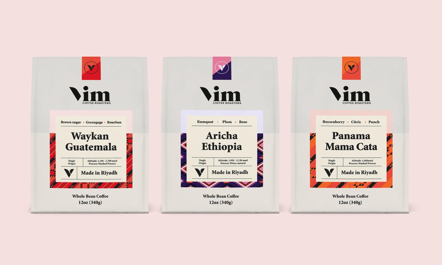
Source: Midwam, https://midwam.com/en
Interactive web design is not just about aesthetics; it's about creating a user experience that is engaging, intuitive, and memorable. In today’s fast-paced digital world, users expect websites to be not only informative but also responsive and interactive. Whether it’s through smooth navigational menus, lively micro-interactions, or real-time content updates, an interactive web design can dramatically enhance the user’s journey on a site.
This aspect of design focuses on allowing users to feel a sense of control and participation, making their interactions with your site more meaningful and personal. For businesses, this means improved user satisfaction and increased retention, directly influencing conversions and brand loyalty. As we explore the 10 major tips for crafting an effective interactive web design, we'll focus on strategies that blend visual excellence with functionality, ensuring your website is as efficient as it is appealing.
Each tip is designed to help you better connect with your audience, keeping them engaged and motivated to return. Let's delve into these essential strategies that can transform your site into a dynamic and interactive space.
Emphasize User-Centric Navigation
In interactive web design, user-centric navigation stands as a cornerstone, guiding users effortlessly through a website's journey. This navigation style prioritizes the user’s experience, ensuring that every interactive element is intuitive, accessible, and enhances the overall usability of the site. A well-designed navigation system is not only about aesthetics but also about facilitating smooth transitions between pages and ensuring that users can find the information they need without confusion. Implementing features like sticky headers, breadcrumb trails, and clearly labeled menus can drastically reduce the cognitive load on users.
Dropdowns should be simple and expansive, offering direct paths to specific content without overwhelming the user with choices. Additionally, incorporating search functionality with auto-complete suggestions can further streamline the navigation process, especially on content-rich sites. These navigational frameworks should adapt to various devices, maintaining consistency and functionality across all platforms to ensure that the user experience is seamless regardless of how the website is accessed.
Incorporate Micro-Interactions
Micro-interactions are vital in crafting an engaging interactive web design. These small, functional animations play a significant role in enhancing user experience by providing feedback, demonstrating an action’s result, or simply adding a layer of polish and professionalism to the design. Micro-interactions can include elements like button animations that confirm a click, progress bars that visually depict the loading process, or subtle hover effects that indicate interactivity.
Each action, no matter how minor, offers a moment of communication with the user, affirming their actions and guiding their journey through your digital space. For example, changing the color of a button upon hovering can signal the ability to proceed, while a swipe animation can indicate more content is available. These interactions not only increase the usability of a website but also make the experience more satisfying and memorable for users.
Importantly, they should be designed to be fast and lightweight to maintain performance without impacting the site’s speed. Effective use of micro-interactions can lead to a more intuitive and responsive environment, encouraging users to engage more deeply with the content. Through thoughtful integration of these dynamic elements, designers can significantly enhance the interactivity of a web design.
Prioritize Responsive Design
Responsive design is a fundamental aspect of interactive web design, ensuring that a website provides an optimal viewing experience across all devices and screen sizes. This approach addresses the diversity of devices in the market, from smartphones to large desktop monitors, making web content accessible and user-friendly regardless of the device used. A responsive website automatically adjusts its layout, images, and functionalities to match the screen on which it's displayed, eliminating unnecessary resizing, scrolling, or panning.
This fluidity not only enhances usability but also supports interactivity, as users can navigate the site with ease, engage with content effectively, and enjoy aesthetically pleasing visual elements that are consistent across all platforms. Tools like CSS media queries are pivotal in implementing responsive designs, allowing web elements to adapt based on the conditions of each device. Moreover, a responsive design significantly improves site performance and load times, contributing to a better user experience and higher engagement.

Source: Rafee Alam, Biodrip - Healthcare Website | Landing Page Design, Behance, https://www.behance.net/gallery/204962141/Biodrip-Healthcare-Website-Landing-Page-Design?
Enhance Engagement with Dynamic Content
Enhancing user engagement in interactive web design often involves the integration of dynamic content. This content changes in real-time based on user interactions or external factors, providing a personalized experience that captivates and retains user interest. By implementing elements such as live data feeds, personalized recommendations, or interactive storytelling, designers can create a vibrant environment that responds to the user's actions or preferences.
Dynamic content keeps the website fresh and relevant, encouraging users to return for new experiences each time they visit. Techniques such as AJAX and APIs facilitate the seamless update of content without the need to reload the entire page, making the interaction smoother and quicker for the user. For instance, a news site might display live updates or breaking news in a ticker format, or an e-commerce site might dynamically showcase products based on browsing history.
Additionally, incorporating user-generated content, such as comments or social media feeds, can further enhance the dynamic nature of the site. This approach not only makes the user feel valued and involved but also increases the time spent on the site, which is vital for building a loyal user base. Dynamic content is key to creating a responsive, engaging, and highly interactive web presence that stands out in today’s competitive digital landscape.
Create Interactive Sliders
Interactive sliders are a dynamic component of interactive web design, providing an engaging way to display content such as images, products, or services. By incorporating sliders, designers can save space while offering users control over the content they wish to view. To maximize usability, ensure sliders are easy to navigate, with clear and accessible controls. Incorporate smooth transitions and animation effects to maintain user interest and provide a polished look.
It’s also important to integrate responsive design principles, ensuring sliders perform well on devices of all sizes by adjusting images and controls accordingly. For added interactivity, consider embedding options like zoom on hover or clickable elements within the slide. This not only enhances the functionality but also increases the time users spend interacting with the elements.
Additionally, sliders should be optimized for speed to avoid affecting the overall site performance. Well-implemented interactive sliders can significantly enhance the visual appeal of a website and provide a user-friendly method to browse through multiple items, making them an essential tool in modern web design.
Utilize Parallax Scrolling
Parallax scrolling is an innovative technique in interactive web design that adds depth and visual interest to the browsing experience. By making background elements move slower than foreground elements during scrolling, parallax creates a 3D illusion that engages users and enhances storytelling. This method is particularly effective in drawing attention to important site elements, such as calls-to-action or key content, by creating a dynamic, multi-layered visual experience.
When executed well, parallax scrolling can lead to a memorable and emotionally impactful user experience that encourages visitors to stay longer and explore more deeply. However, it's essential to use this technique judiciously as excessive movement can be distracting or disorienting for users. To optimize the benefits of parallax scrolling, it should be integrated thoughtfully into the design to support the overall narrative and objectives of the site without compromising usability and performance.
This approach not only captivates the user but also subtly guides them through the content, making the interaction with your website not just informative but also a visually immersive experience. Parallax scrolling, when aligned with the principles of good interactive web design, can transform a flat page into a captivating story that unfolds as the user scrolls, making your website not just seen but experienced.
Offer Real-Time Interaction
Real-time interaction in interactive web design enhances the user experience by making digital environments more dynamic and responsive. Integrating live chat options, real-time notifications, and updates can transform user engagement from passive viewing to active participation. This immediate interaction is crucial for services such as online customer support, where it can significantly reduce response times and improve customer satisfaction. In e-commerce, real-time updates about product availability or prices ensure that the information presented is current and reliable, helping users make informed decisions swiftly.
Additionally, implementing features like social media feeds that update continuously can keep content fresh and encourage users to spend more time on the site. Techniques such as WebSockets or server-sent events are technical solutions that facilitate these kinds of real-time communications without overloading the server or causing delays.

Source: No Fishing Net, https://www.no-fishing.net
Prioritize Loading Speed
In the realm of interactive web design, prioritizing loading speed is essential for retaining user interest and satisfaction. A slow-loading website can frustrate users, leading to a higher bounce rate and reduced engagement. To ensure a swift, responsive experience, optimize image sizes, minify CSS and JavaScript files, and leverage browser caching. Implementing lazy loading for images and videos can also enhance loading times by downloading content only when it enters the viewport.
Additionally, consider using a Content Delivery Network (CDN) to distribute the load, speeding up the delivery of your website's resources globally. Advanced techniques like asynchronous loading for non-critical resources can prevent them from blocking the rendering of important content, thus maintaining a smooth user experience. Regular testing and monitoring of the website’s performance are crucial for identifying bottlenecks and areas for improvement.
Design with Accessibility in Mind
Designing with accessibility in mind is essential in creating an inclusive interactive web design. This approach ensures that all users, including those with disabilities, can easily navigate, understand, and interact with your website. Start by following the Web Content Accessibility Guidelines (WCAG), which outline how to make web content more accessible to people with a range of disabilities. Utilize semantic HTML to structure content properly, making it understandable for screen readers. Color choices should be made with high contrast ratios to assist those with visual impairments.
Additionally, all interactive elements should be operable through keyboard inputs as well as by mouse to accommodate users with limited mobility. Include alternative text for images, and ensure that all forms and controls are labeled clearly for easy identification. Designing for accessibility not only broadens your audience but also reflects a commitment to diversity and inclusion.
By integrating these principles into your interactive web design, you create a user-friendly environment that welcomes and supports every visitor, reinforcing the ethos of universal design.
Test and Optimize for User Experience
Testing and optimizing for user experience are critical processes in interactive web design to ensure that the final product is not only functional but also user-friendly and engaging. It involves continuous evaluation of the website’s interactive elements, such as navigation, responsiveness, loading times, and accessibility, to identify areas for improvement. Start by conducting usability tests with real users to gather genuine feedback on how the website performs in various scenarios. Use this data to refine elements that might not be as intuitive or effective as intended.
Incorporate A/B testing to compare different versions of a webpage and determine which features most positively impact user behavior and satisfaction. Tools like heatmaps and session recordings can provide insights into how users interact with your website, highlighting what attracts their attention and what goes unnoticed. This analysis allows designers to make informed decisions about layout adjustments, color changes, and content placement to enhance usability.
Conclusion
Interactive web design is at the heart of creating engaging digital environments that captivate and retain user attention. By implementing thoughtful navigation, responsive layouts, dynamic content, and other interactive elements, designers can craft websites that are not only functional but also immersive. It's essential to continuously test and optimize these elements to meet user expectations and adapt to new technological advances. Whether through improved accessibility, faster load times, or engaging animations, a focus on interactive design enriches the user experience, ultimately leading to increased satisfaction and loyalty. This approach ensures that your website remains competitive and relevant in the ever-evolving digital landscape.
Let Us Know What You Think!
Every information you read here are written and curated by Kreafolk's team, carefully pieced together with our creative community in mind. Did you enjoy our contents? Leave a comment below and share your thoughts. Cheers to more creative articles and inspirations!
Related Articles


Leave a Comment