How to Integrate Shapes and Brand Identity into Logo Designs

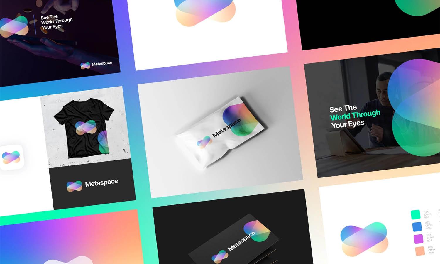
Source: Mattheus Ferreira, Satori Consult | Brand & Visual Identity, Behance, https://www.behance.net/gallery/115457113/Satori-Consult-Brand-Visual-Identity
Integrating shapes and brand identity into logo designs is a fundamental aspect of visual branding that serves to communicate a company’s essence at a glance. Shapes are not merely aesthetic elements; they are powerful tools that encapsulate and project the brand’s core values and attributes. This integration involves a strategic blend of design principles and psychological insights, aiming to create logos that are not only visually appealing but also resonate deeply with the target audience.
Effective logo design starts with a deep understanding of the brand’s identity—its mission, vision, and the emotions it wishes to evoke. Designers must choose shapes that align with these elements, leveraging geometry to evoke stability, dynamism, or innovation, depending on the brand’s personality.
This article explores practical strategies for designers to harness the power of shapes to enhance brand identity, ensuring that the logos they create offer immediate brand recognition and a lasting impression. Whether you are a seasoned designer or a business owner looking to understand more about logo design, these insights will guide you in creating a visual identity that stands out in a crowded marketplace.
Understand the Brand's Core Values
The initial step to effectively integrate shapes and brand identity into logo designs is understanding the brand's core values. Every shape incorporated into a logo must reflect the essence and ethos of the brand it represents. This deep dive into the brand’s foundation helps designers choose shapes that are not just visually appealing but also meaningful. A brand that values innovation and technology might lean towards angular, sharp shapes that convey forward-thinking and cutting-edge qualities. Conversely, a brand that prides itself on trust and stability may prefer squares and rectangles, which symbolize strength and reliability.
This understanding allows designers to craft logos that are true representations of the brand, ensuring that every curve, angle, or line aligns with what the brand stands for. This strategic alignment helps forge a stronger connection with the target audience, enhancing brand recognition and loyalty. By starting with a clear grasp of what the brand aims to communicate, designers can create more than just logos; they create enduring symbols of the brand’s identity.
Choose Shapes Wisely
Choosing the right shapes in logo design is crucial for conveying the intended brand message. Each shape has inherent psychological implications that can enhance or undermine the brand's identity. Circles, often used to represent unity, commitment, and stability, are perfect for brands that want to emphasize community and continuity. Triangles, pointing upwards, suggest growth and dynamic movement, ideal for businesses that want to project a sense of innovation or aggression. Squares and rectangles convey reliability and professionalism, making them suitable for financial institutions and legal firms where trust is paramount.
Designers must consider these subconscious cues when selecting shapes to ensure that the logo communicates the right message to its audience. Moreover, the interplay of different shapes can add layers of meaning to the design, making it a powerful tool in establishing brand identity. Wise selection of shapes not only aligns with the brand’s values but also sets the tone for customer interactions, influencing perceptions through simple yet profound visual elements.
Use Colors to Enhance Shapes
In the realm of logo design, the strategic use of color can significantly amplify the impact of shapes in conveying brand identity. Colors carry their own set of associations and emotions, which, when paired with shapes, can enhance the message a logo intends to deliver. For instance, blue, often associated with professionalism, trust, and serenity, works well with stable shapes like squares and circles to reinforce these feelings. On the other hand, red can evoke feelings of excitement and passion, which complements angular or asymmetrical shapes that suggest dynamism and innovation.
Moreover, the contrast and complementarity of colors can help make shapes stand out or blend seamlessly with each other, depending on the desired effect. Designers must consider the psychological impact of color choices and their cultural significances to ensure that the colors chosen resonate with the target audience and support the brand’s messaging. Utilizing color theory—like analogous, complementary, or triadic schemes—can also aid in creating a cohesive look that enhances visual communication through shapes. Ultimately, when colors and shapes are harmoniously integrated, they create a powerful logo that is visually appealing and effectively communicates the brand’s ethos.

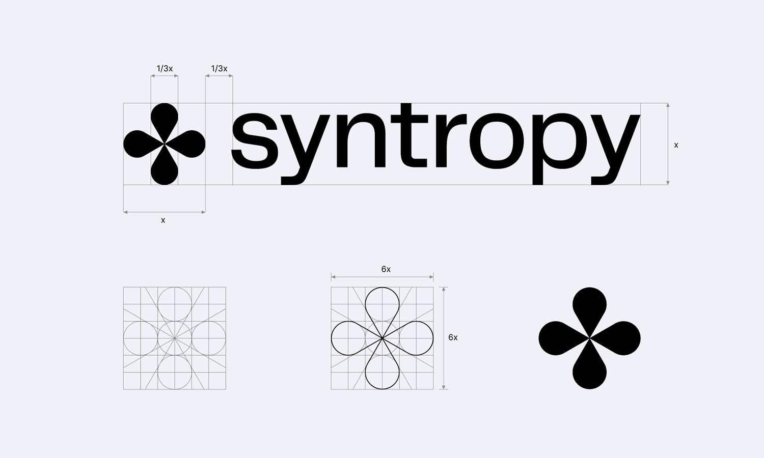
Source: Ihor Tlvnl, Omni, Behance, https://www.behance.net/gallery/180644065/Omni
Keep It Simple
Simplicity in logo design is not just a trend but a fundamental principle that enhances brand recall and recognition. When integrating shapes and brand identity into logo designs, the simplicity of the form can often speak louder than a complex arrangement. Simple shapes are easily recognizable, memorable, and more likely to endure as the brand evolves. They translate well across different media, whether digital or print, and remain legible at various sizes, from tiny mobile screens to large billboards.
The key to simplicity is not minimalism for its own sake but the ability to convey the brand's message with the least amount of shapes and lines necessary. A simple logo design avoids visual clutter, focusing on essential elements that reflect the brand's core values. It’s about finding the most straightforward way to express the brand identity, making the logo accessible to a broad audience. This approach also allows for greater flexibility in applications, ensuring that the logo can adapt to various contexts while maintaining its integrity. Designers should strive to strip away any superfluous elements, leaving only what’s crucial to impart the brand’s identity effectively.
Consider the Logo's Scalability
Scalability is a critical factor in logo design, ensuring that the logo maintains its effectiveness and clarity across all sizes and applications. When integrating shapes and brand identity into logo designs, it is essential to create a logo that is as impactful on a small mobile screen as it is on a large billboard. This scalability involves careful consideration of the simplicity and distinctiveness of shapes.
Designers must ensure that the shapes used are not too intricate or detailed that they lose their form when scaled down. A good practice is to test the logo in multiple sizes during the design process to check for legibility and impact. Additionally, the choice of shapes should allow for versatility, making the logo adaptable to various formats and contexts without losing its identity.
Effective scalable logo design often relies on a strong silhouette or outline, which can be easily recognized at any size. This recognizability is crucial for brand recall and visual identity in a crowded market.
Incorporate Negative Space
Negative space, or the space around and between the elements of a logo, is a powerful tool in logo design. It can transform a simple logo into a visually engaging and memorable brand symbol. When integrating shapes and brand identity into logo designs, using negative space creatively can add a layer of sophistication and meaning.
Effective use of negative space involves allowing the background to form part of the logo’s design, creating shapes that may not be immediately apparent but reveal themselves upon closer inspection. This technique can enhance storytelling within the logo, making the brand more intriguing and differentiated in the marketplace.
Designers should consider how negative space can be used to convey dual meanings or to emphasize particular aspects of the brand's identity. For example, the negative space within a logo might form a hidden symbol relevant to the brand, such as a subliminal smile in a customer service logo or a hidden leaf in an environmental company’s emblem.
Incorporating negative space requires a balanced approach to ensure that the logo remains clear and effective without relying heavily on color or detailed graphics, which may not translate well across all media. This strategy not only enhances the visual impact of the logo but also ensures it is adaptable and effective in both minimal and more complex applications.
Reflect the Industry
When designing a logo, it is crucial to reflect the industry to which the brand belongs. This alignment ensures that the target audience instantly connects the logo with the brand's field of operation. Integrating shapes that are characteristic of a specific industry can play a significant role in making the logo speak for itself. For instance, circular shapes are often used in healthcare to symbolize care and continuity, while sharp, angular shapes are favored in the tech industry to convey innovation and efficiency.
The choice of shapes should not only resonate with the brand’s identity but also with the broader expectations of the industry’s audience. This consideration helps in establishing immediate recognition and trustworthiness. A construction company might benefit from sturdy, robust shapes like squares and triangles that imply strength and stability, whereas an art studio might opt for more fluid, abstract shapes to express creativity and flexibility.
Understanding industry standards and expectations can also prevent a logo from appearing out of context or misaligned with industry norms, thereby avoiding potential customer confusion. By reflecting the industry in its logo design, a brand can communicate its place within the market more clearly and effectively, fostering a quicker connection with its audience.

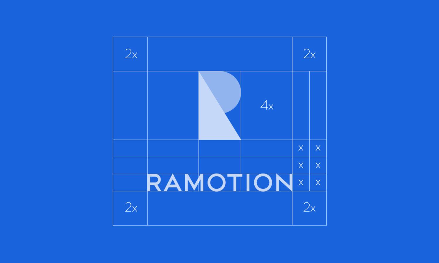
Source: Fieon Art, Brand Identity, Behance, https://www.behance.net/gallery/181866161/Brand-Identity-Branding
Experiment with Geometry
Experimenting with geometry in logo design can lead to innovative and memorable logos that stand out in a competitive market. Geometric shapes offer a wide range of possibilities in terms of symmetry, balance, and modernity, making them ideal for creating distinct and scalable logos. By combining, overlapping, or segmenting geometric shapes, designers can create complex visuals that maintain clarity and impact.
Geometric designs are not only visually appealing but also versatile, lending themselves well to various interpretations and adaptations. For example, a hexagon can symbolize stability and efficiency, suitable for businesses in the engineering or technology sectors. Meanwhile, a series of interlocking circles or ellipses can suggest connectivity and community, perfect for social networks or collaborative platforms.
The use of geometry also allows for a play of patterns that can make a logo more dynamic and engaging. Designers can explore different arrangements of geometric forms to find a unique composition that captures the brand’s essence. This approach can include using tessellations, grids, or radial patterns to create a sense of movement and energy.
Balance Symmetry and Asymmetry
Balancing symmetry and asymmetry is a crucial aspect of integrating shapes and brand identity into logo designs. Symmetrical designs are aesthetically pleasing and convey a sense of order and stability, which can be particularly effective for brands looking to project an image of reliability and professionalism. For instance, symmetrical logos are often used by government institutions and healthcare organizations to communicate trust and security.
Asymmetry, on the other hand, can introduce dynamism and interest, making a logo more memorable and engaging. Asymmetrical logos tend to convey movement and modernity, which are desirable traits for innovative, cutting-edge companies. The key is to use asymmetry in a way that still maintains balance within the design, ensuring that no one part of the logo overwhelms the others.
Designers must consider the psychological impact of each approach and decide which aligns best with the brand’s messaging. Sometimes, a combination of both elements can be employed to achieve a unique effect, drawing the viewer’s eye through a calculated play of tension and interest. By thoughtfully applying symmetry and asymmetry, designers can create logos that not only capture the essence of the brand but also stand out visually in a crowded marketplace.
Prototype and Test
Prototyping and testing are essential phases in the process of integrating shapes and brand identity into logo designs. This stage involves creating multiple versions of a logo and examining how well each conveys the brand’s identity across various applications and platforms. Prototyping allows designers to experiment with different shapes, color schemes, and compositions to find the most effective visual solution.
Testing these prototypes with target audiences provides invaluable feedback that can influence the final design. This feedback can reveal how the logo is perceived, whether its message is clear, and if it resonates with the intended demographic. Testing can be conducted through focus groups, A/B testing, or digital surveys, providing insights into the logo’s performance in real-world scenarios.
Furthermore, it’s important to test the logo’s scalability and visibility in different formats and sizes, from tiny app icons to large billboards. This ensures the logo remains functional and effective no matter where it is displayed. Through iterative prototyping and rigorous testing, designers can refine the logo to better meet the strategic goals of the brand, ensuring it not only looks good but also works hard to build brand recognition and loyalty.
Conclusion
Effectively integrating shapes and brand identity into logo designs requires a thoughtful approach that considers the brand's core values, industry standards, and the psychological impact of shapes and colors. By balancing elements like symmetry and asymmetry, and employing strategic use of negative space, designers can create logos that are not only visually striking but also deeply resonant with the target audience. Prototyping and testing further refine these designs, ensuring they perform well across various platforms and sizes. Mastering these aspects can dramatically enhance a brand’s visual identity, making it memorable and impactful in a competitive market.
Article Meta Description


Leave a Comment