Logo Design Variations That Every Brands Should Have

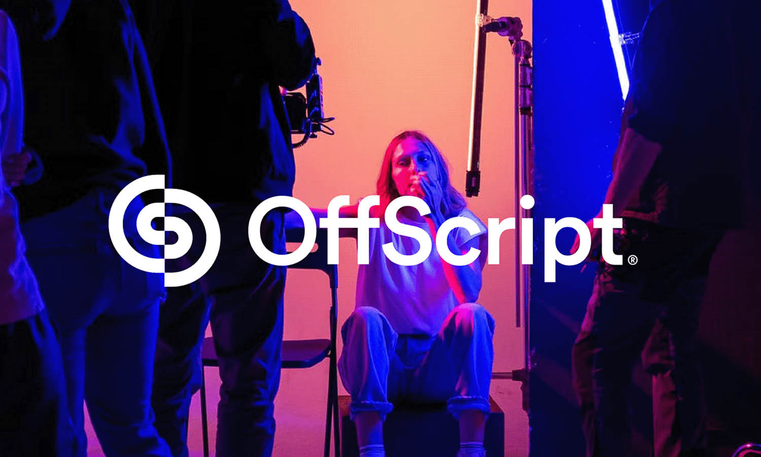
Source: Habibi, Brand Logo Talento, Dribbble, https://dribbble.com/shots/20227280-Brand-Logo-Talento
Branding consistency across multiple platforms is crucial for businesses to establish their identity and maintain visibility. However, consistency doesn’t mean using a one-size-fits-all approach. This is where logo design variations become essential. Different contexts and formats require distinct logo adaptations to ensure optimal impact and functionality. From the main branding materials to digital applications and special events, having a suite of logo variations allows a brand to remain flexible without sacrificing its identity.
These variations cater to specific needs—whether it’s a simplified icon for mobile apps or a monochrome version for official documents. Each adaptation serves a unique purpose, helping brands to engage effectively with diverse audiences and maintain a cohesive identity across all touchpoints. By understanding the importance of logo design variations, brands can strategically enhance their market presence and ensure they are prepared for any branding challenge that comes their way.
Primary Logo: The Cornerstone of Brand Identity
The primary logo is the central element of a brand's visual identity, encapsulating its essence in a distinctive and memorable design. This logo variation is the most detailed and often includes the full brand name along with its emblem or symbol, and possibly a tagline. It's designed to make a strong impression, conveying the brand's core values and personality at a glance. Utilized in a variety of high-visibility scenarios such as storefronts, main website headers, and primary marketing materials, the primary logo is vital for establishing brand recognition.
Its design should be scalable, maintaining clarity and impact at different sizes. It must also be versatile enough to work across various media, from digital displays to print. The primary logo sets the tone for all other brand elements and logo variations, providing a consistent reference point that reinforces the brand's presence in the competitive market landscape. As such, it plays a crucial role in building a cohesive and strong brand identity that resonates with audiences.
Secondary Logo: Versatile Branding for Every Occasion
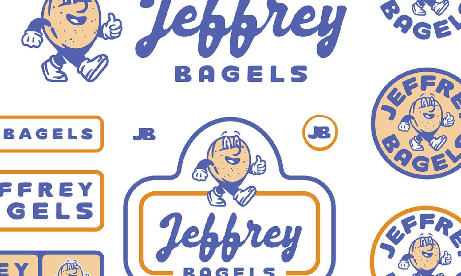
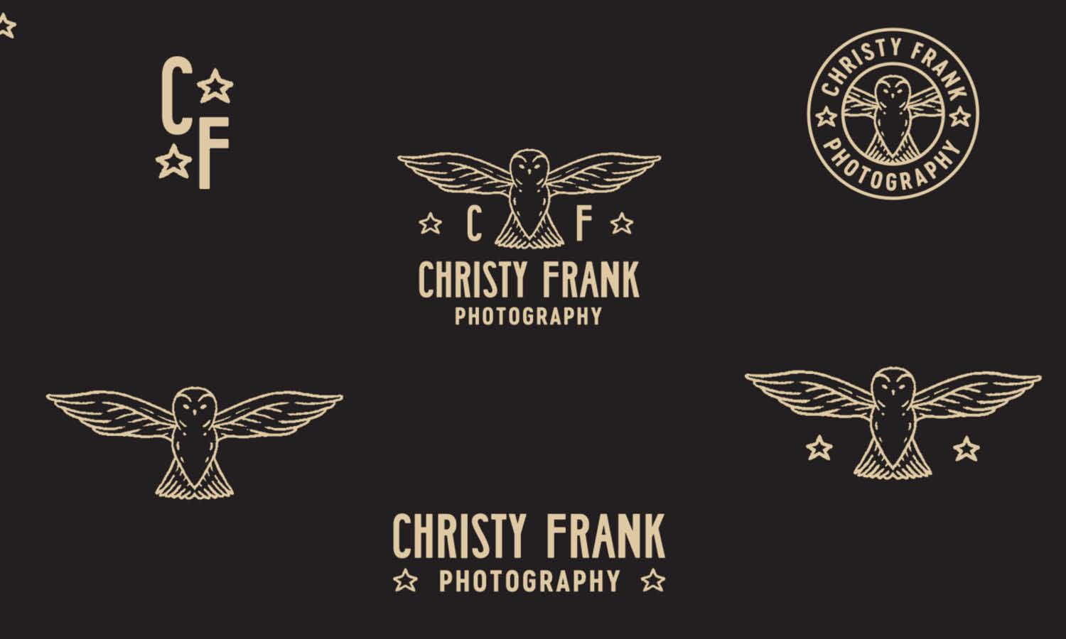
A secondary logo acts as a supportive branding element, offering a simplified or condensed version of the primary logo to fit smaller spaces or less formal applications. This variation typically maintains key components of the main logo but is pared down to enhance versatility. It might exclude elements such as the tagline or reduce the logo to a single color to ensure clarity at a smaller scale. The secondary logo is essential for situations where the primary logo’s complexity could overshadow the content or reduce legibility, such as social media icons, promotional products, or app icons.
It allows brands to stay visible and recognizable even when full detailing is not possible, maintaining brand continuity. Crafting a secondary logo requires a balance between simplicity and maintaining the brand's essence, ensuring that even in its most reduced form, the logo continues to communicate the brand’s identity effectively. This adaptability is key to modern branding, where multiple touchpoints and varying format requirements demand flexibility without losing the brand connection.
Monochrome Logo: Essential for Versatile Brand Applications
The monochrome logo is a critical variation within the spectrum of logo design variations, providing brands with a universally adaptable option that ensures visibility and recognition across all mediums. This version strips the logo down to one color, typically black or white, which is crucial for applications where color printing is not feasible or where the logo must be displayed over backgrounds of varying hues and patterns. The monochrome logo excels in functional scenarios such as legal documents, merchandise, fabrics, and when used as a watermark in videos and images. Its simplicity aids in maintaining the integrity and recognizability of the logo even in limited color scenarios.
Designing an effective monochrome logo involves ensuring that the logo’s core features are distinguishable without reliance on color gradients or multiple colors. This not only helps in cost reduction for printing but also increases the brand's flexibility in marketing and promotional activities. The monochrome version is especially important for maintaining consistency in co-branding situations and when placed within complex visual contexts, ensuring that the brand’s identity remains front and center.

Source: Mike Bruner, Leisure Club, Dribbble, https://dribbble.com/shots/17086899-Leisure-Club-drib
Iconic Logo: A Symbolic Representation for Brand Recognition
An iconic logo distills the brand's identity into a simple, memorable symbol, which becomes synonymous with the brand itself. This logo variation is particularly effective for global brands that need to be recognized instantly across diverse markets. The iconic logo is a small, emblematic version of the primary logo, designed to stand alone without text, making it ideal for apps, favicons, and social media profiles where space is at a premium. Crafting an iconic logo requires a focus on the most distinctive aspects of the brand’s visual elements, capturing its essence in a more abstract or stylized form.
This simplification should not dilute the brand’s identity but rather emphasize its unique features in a clear and concise manner. The challenge lies in maintaining enough detail to ensure recognizability while being minimalistic enough to adapt to the smallest sizes. An effective iconic logo ensures that even when the brand name is not visible, the symbol alone is enough to evoke the brand in the mind of the viewer, reinforcing brand presence with just a glance.
Horizontal and Vertical Formats: Adapting to Spatial Needs
The adaptability of a logo in horizontal and vertical formats is a vital consideration for brands aiming to maintain visual consistency across various platforms. Horizontal logos are traditionally favored for their ease of incorporation into website headers, letterheads, and banners, where the landscape orientation offers ample space for elongated designs. This format typically allows for the brand name to be displayed alongside the icon in a linear arrangement, facilitating clear visibility and recognition. Conversely, vertical logos are advantageous in spaces where height is more abundant than width, such as on stands, posters, and certain digital interfaces.
This format stacks the icon and text vertically, making efficient use of compact spaces and ensuring the logo remains impactful without horizontal stretching. Designing logos to excel in both orientations ensures that a brand can seamlessly integrate its visual identity in diverse settings without compromising on design integrity or brand recognition. Effective use of horizontal and vertical formats in logo design not only enhances aesthetic flexibility but also ensures that the brand remains recognizable and adaptable to various media and contexts.
Responsive Logo: Ensuring Clarity Across Devices
A responsive logo adapts to different sizes and platforms, ensuring that a brand's identity remains consistent and clear, regardless of where it appears. As digital interfaces vary from large desktop monitors to compact smartphone screens, having a logo that scales effectively is crucial. This variation involves creating a set of logos that range from the full-scale primary logo to more simplified forms that retain recognizability at smaller sizes. Elements of the logo such as text, details, and even colors may be adjusted or removed in smaller versions to maintain legibility and impact.
For instance, a logo may appear in its full complexity on a company website but may be reduced to just an iconic symbol on a mobile app icon or user interface. This approach not only enhances user experience by making the logo easy to identify at various resolutions but also protects the brand’s image from becoming distorted or unclear. Responsive logo design is an essential strategy in today’s mobile-first world, where consumers encounter brands across a myriad of devices, ensuring that first impressions are both positive and lasting.
Text-Only Logo: Highlighting Typography in Brand Identity
A text-only logo, focusing solely on the name or initials of a brand, emphasizes typography as the primary design element. This logo variation leverages unique font styles, sizes, and spacing to convey the brand's personality and values. By omitting graphic symbols or emblems, the text-only logo ensures that the brand name itself becomes a memorable visual symbol. This approach is particularly effective for brands with distinctive names or those seeking a minimalist aesthetic. It is also highly adaptable for legal documents, corporate communications, and situations where a simplified logo is required to maintain professional elegance.
Designing an effective text-only logo involves selecting or customizing a typeface that resonates with the brand’s identity, ensuring it is legible across various media and scales. The choice of font can communicate everything from luxury and sophistication to fun and accessibility, making typography a powerful tool in brand differentiation. Additionally, a well-designed text-only logo can be particularly potent in markets where brand recognition through name is a strategic priority, making every mention of the brand visually impactful.

Source: Lance, Custom Logotypes, Dribbble, https://dribbble.com/shots/23663974-Custom-Logotypes-Recent-Work
Contextual Logo: Tailoring Brand Identity for Specific Audiences or Events
Contextual logos adapt the standard logo to specific situations, events, or audiences, incorporating thematic elements that resonate with particular contexts. This logo variation allows brands to engage deeply with audiences during festivals, seasonal campaigns, or special promotions by integrating relevant imagery, colors, or motifs. For instance, a brand might add holiday-specific elements to its logo during the Christmas season or adopt local cultural symbols for regional marketing efforts. Contextual logos not only demonstrate a brand's dynamism and relevance but also strengthen emotional connections with the audience by aligning the brand identity with their experiences and environments.
Designing a contextual logo requires a sensitive balance between maintaining the brand’s core identity and incorporating new elements that reflect the particular occasion or audience. This strategy enhances the brand’s engagement and visibility, making it appear more approachable and responsive to consumer sentiments. Contextual logos are a creative tool for brands to stay current and connected with their markets, showing adaptability without losing the essence of their identity.
Favicon: Small Yet Significant Brand Symbols
The favicon, or favorite icon, represents a brand in the smallest forms on web browsers and mobile screens. This tiny logo variation appears in browser tabs, URL bars, and bookmarks, offering a unique opportunity for brands to maintain visibility even in minimal digital spaces. Due to its small size, typically 16x16 pixels, the design of a favicon must be exceptionally clear and concise. It often distills the brand’s primary logo into a simple, recognizable symbol that can be identified at a glance. Effective favicon design is crucial as it helps users locate and return to a website more easily, enhancing user experience and brand recall.
This small graphic plays a significant role in a brand's digital identity, acting as a constant visual reminder of the brand’s presence in a crowded digital environment. Creating a favicon requires focusing on the most iconic element of the brand's logo and ensuring it is legible even at reduced sizes. This ensures consistency across all digital platforms, reinforcing the brand’s identity in every user interaction.
Watermark Logo: Protecting Brand Content with Subtlety
A watermark logo is a translucent variation of the primary logo used to identify and protect visual content created by a brand. Commonly seen on images, videos, and digital documents, the watermark logo serves as a subtle but clear claim of ownership, discouraging unauthorized use while maintaining the integrity of the visual content. The design of a watermark logo must be unobtrusive enough not to detract from the content itself, yet distinct enough to be recognizable. This balance is achieved by adjusting the opacity and choosing a monochrome color scheme that blends well with a variety of backgrounds. Employing a watermark logo not only secures the brand’s creations from misuse but also enhances brand exposure as the content circulates, potentially reaching a wide audience.
It acts as a constant, gentle reminder of the brand’s presence, ensuring that every shared piece of content contributes to building brand recognition and trust. Designing an effective watermark logo involves understanding the contexts in which the content will be viewed and ensuring the logo’s visibility is optimized for those conditions without overshadowing the main message or aesthetics of the content.
Conclusion
In the dynamic world of branding, having a suite of logo design variations is essential for maintaining a flexible and cohesive brand identity across various platforms and contexts. Each logo variation, from the primary emblem to the subtle watermark, plays a critical role in how a brand is perceived and interacts with its audience. By strategically implementing these variations, brands can ensure that their identity remains robust, adaptable, and resonant in all interactions. Whether viewed on a massive billboard or a tiny mobile screen, the right logo variation ensures that a brand is always seen in the best light, enhancing recognition and fostering trust.
Let Us Know What You Think!
Every information you read here are written and curated by Kreafolk's team, carefully pieced together with our creative community in mind. Did you enjoy our contents? Leave a comment below and share your thoughts. Cheers to more creative articles and inspirations!





Leave a Comment