
10 Major Tips for Using Grids in Graphic Design

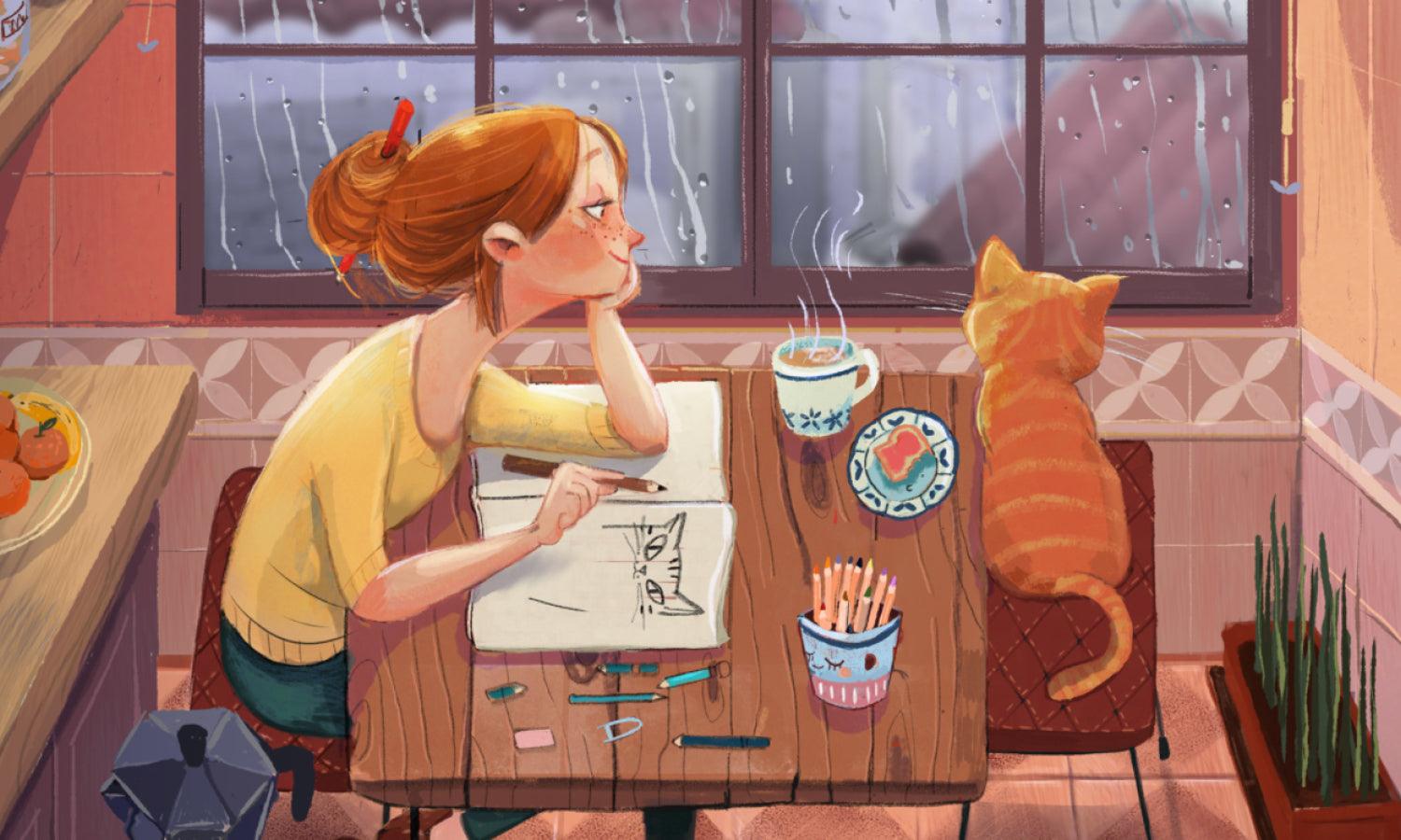
Source: David Rindlishbacher, Architecture Portfolio, Behance, https://www.behance.net/gallery/75528481/Architecture-Portfolio
In the world of graphic design, structure plays a crucial role in creating visuals that are both appealing and effective. One of the most powerful tools designers rely on is the grid. A grid provides a framework that helps organize content, align elements, and establish consistency across a layout. Whether you are working on digital interfaces, print materials, or branding projects, understanding how to use a grid can significantly improve your design quality.
Using a grid in graphic design is not about limiting creativity; instead, it enhances clarity and balance. It allows designers to present information in a way that feels natural and easy to navigate. From beginners to experienced professionals, mastering grid systems can transform the way you approach layout design.
This article explores practical tips that will help you use a grid more effectively in your graphic design projects. By learning how to structure your work, maintain alignment, and create visual hierarchy, you can produce designs that are both visually engaging and highly functional. With the right approach, a grid becomes more than just a guide—it becomes a foundation for strong and impactful design.
Understand The Purpose Of Grid In Graphic Design
In graphic design, a grid serves as the invisible structure that holds your entire layout together. It is not just a technical tool but a strategic guide that helps designers organize content with clarity and precision. By using a grid, you can align elements consistently, create balanced compositions, and ensure that every part of your design feels connected.
The primary purpose of a grid in graphic design is to improve readability and visual flow. When elements are placed thoughtfully within a grid system, users can easily navigate through the content without confusion. This is especially important for projects like websites, magazines, and presentations where information needs to be communicated clearly.
Another key benefit of using a grid is consistency. It allows you to maintain uniform spacing, alignment, and proportions across different sections of your design. This consistency not only enhances aesthetics but also strengthens your overall design identity.
Understanding the purpose of a grid also helps you make better creative decisions. Instead of placing elements randomly, you can rely on a structured approach that supports both function and style. In graphic design, this balance between creativity and order is what makes a layout truly effective. By mastering the purpose of a grid, you lay a strong foundation for all your future design projects.
Choose The Right Type Of Grid
Selecting the right grid is an essential step in any graphic design project. Different types of grid systems are designed to serve different purposes, and choosing the appropriate one can greatly impact the effectiveness of your layout. A well-chosen grid helps you organize content efficiently while maintaining visual harmony.
For example, a column grid is commonly used in editorial and web design because it allows for flexible text and image placement. On the other hand, a modular grid is ideal for more complex layouts that require precise alignment across multiple sections. In graphic design, understanding these variations enables you to match the grid system with the needs of your project.
When deciding on a grid, consider the type of content you are working with. Text-heavy designs may benefit from a simple column structure, while image-focused layouts might require a more dynamic grid. The goal is to choose a system that supports both readability and visual appeal.
Using the right grid in graphic design also improves workflow efficiency. It provides a clear framework to follow, reducing guesswork and speeding up the design process. By selecting a grid that aligns with your project goals, you can create layouts that are both structured and visually engaging.
Maintain Consistent Alignment
Alignment is one of the most important principles when using a grid in graphic design. A well-aligned layout creates a sense of order and professionalism, making your design easier to read and visually appealing. When elements such as text, images, and icons are aligned within a grid system, they form a cohesive structure that guides the viewer’s eye naturally.
Using a grid helps eliminate guesswork when placing elements. Instead of positioning items randomly, you can rely on columns, rows, and guides to ensure everything lines up properly. This consistency improves not only the appearance of your design but also its functionality, especially in user interfaces and editorial layouts.
In graphic design, consistent alignment also enhances readability. When text blocks follow the same vertical or horizontal alignment, users can scan information more efficiently. This is particularly useful for designs that contain a lot of content, such as websites, brochures, or reports.
To achieve strong alignment, always pay attention to edges, spacing, and visual connections between elements. Even small misalignments can disrupt the overall balance of your design. By fully utilizing a grid, you can create layouts that feel structured, polished, and easy to navigate, which ultimately improves the effectiveness of your graphic design work.

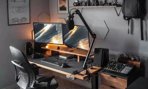
Source: Hrvoje Grubisic, Solitaire Digital - Company Website, Behance, https://www.behance.net/gallery/113608519/Solitaire-DigitalCompany-Website
Use Margins And Gutters Effectively
Margins and gutters are essential components of any grid system in graphic design. They define the space around and between elements, helping to create a layout that feels clean and well-organized. Without proper spacing, even the most carefully designed grid can appear cluttered and difficult to read.
Margins provide breathing room around the edges of your design, ensuring that content does not feel cramped. This outer space helps frame your layout and draws attention to the main content. In graphic design, generous margins often create a more refined and professional appearance.
Gutters, on the other hand, are the spaces between columns within a grid. They play a key role in separating content and maintaining clarity. Properly sized gutters prevent elements from overlapping visually and make it easier for users to distinguish between different sections.
When working with a grid, it is important to keep margins and gutters consistent throughout your design. This consistency reinforces structure and improves overall readability. In graphic design, thoughtful spacing is just as important as the content itself, and using margins and gutters effectively can elevate your layout to a more polished and user-friendly level.
Establish A Clear Visual Hierarchy
A strong visual hierarchy is essential in graphic design, and a grid plays a key role in achieving it. By using a grid system, you can organize content based on importance, ensuring that the most critical elements stand out. This structured approach helps guide the viewer’s attention and makes your design easier to understand.
In graphic design, a grid allows you to control the placement and scale of elements. For example, you can assign larger areas within the grid to headlines or key visuals, while smaller sections can be used for supporting text. This creates a clear flow that leads the viewer naturally from one point to another.
Consistency is also important when establishing hierarchy. Using the same grid throughout your layout ensures that similar elements are treated in a uniform way. This reinforces clarity and prevents confusion, especially in content-heavy designs.
By combining size, spacing, and positioning within a grid, you can create a visual hierarchy that enhances both readability and engagement. In graphic design, this structured approach ensures that your message is communicated effectively while maintaining a visually appealing layout.
Balance Flexibility And Structure
While a grid provides structure in graphic design, it should not limit your creativity. One of the most valuable skills a designer can develop is knowing how to balance flexibility with the rules of a grid system. A grid acts as a guide, but it is not meant to restrict your design choices entirely.
In graphic design, following a grid too rigidly can sometimes make layouts feel predictable or repetitive. To avoid this, designers often introduce small variations, such as overlapping elements or breaking alignment intentionally. These subtle changes can add visual interest while still maintaining overall balance.
The key is to use the grid as a foundation rather than a constraint. Start by aligning most elements within the grid to establish order, then selectively break the grid where it enhances the design. This approach allows you to maintain structure while introducing dynamic and engaging compositions.
Understanding when to follow and when to break the grid is what separates good design from great design. In graphic design, this balance creates layouts that are both organized and visually exciting, giving your work a professional yet creative edge.
Keep Typography In Harmony With The Grid
Typography and grid systems go hand in hand in graphic design. A well-structured grid helps you place text elements in a way that feels organized and easy to read. When typography aligns with the grid, it creates a strong visual rhythm that improves both aesthetics and usability.
In graphic design, one of the key practices is aligning text baselines and columns consistently within the grid. This ensures that paragraphs, headings, and captions follow a predictable structure. As a result, users can scan content more efficiently, especially in layouts such as websites, magazines, and brochures.
Spacing is another important factor. Line height, letter spacing, and paragraph spacing should all work within the grid system. Proper spacing prevents text from feeling crowded and enhances readability. A grid allows you to maintain consistent spacing across your entire design.
Additionally, using a grid helps you create contrast between different typographic elements. By assigning specific areas for headings and body text, you can establish a clear hierarchy. In graphic design, this harmony between typography and grid ensures that your message is both visually appealing and easy to understand.

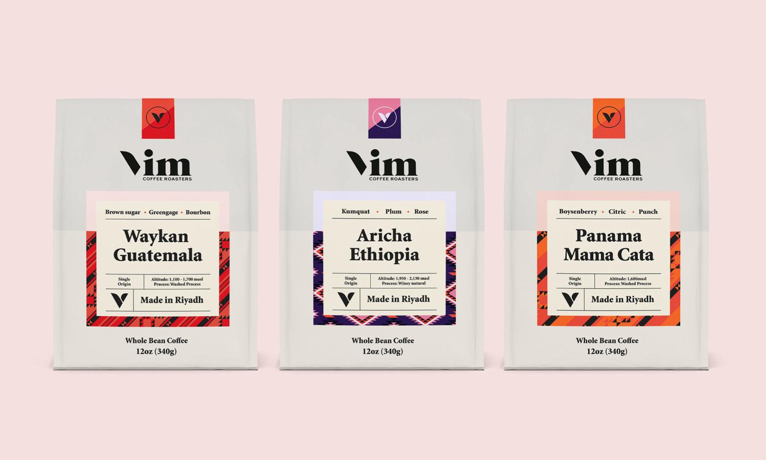
Source: Paloma D'Urbano, Afiche Tipografico | HAIKU, Behance, https://www.behance.net/gallery/112143089/Afiche-tipografico-HAIKU
Use Grid To Improve Responsiveness
In modern graphic design, responsiveness is essential, especially for digital platforms. A grid system plays a crucial role in creating layouts that adapt smoothly to different screen sizes. Whether viewed on a mobile phone, tablet, or desktop, a well-designed grid ensures consistency and usability.
Responsive graphic design relies on flexible grids that can adjust based on the screen width. By using relative units and scalable columns, you can reorganize content without losing structure. This makes it easier to maintain alignment and spacing across various devices.
A grid also helps prioritize content in responsive layouts. Designers can rearrange elements within the grid to highlight the most important information on smaller screens. This ensures that users always have access to key content, regardless of the device they are using.
By incorporating a responsive grid into your graphic design process, you create a seamless user experience. It allows your design to remain functional and visually consistent across different platforms. In today’s digital landscape, mastering responsive grid systems is a valuable skill that enhances both the performance and accessibility of your design work.
Test And Refine Your Layout
Creating a grid is only the first step in achieving a successful layout in graphic design. Testing and refining your design is where the real improvement happens. A grid provides structure, but it is important to evaluate how well your content works within that structure.
In graphic design, reviewing your layout allows you to identify areas that may feel unbalanced or unclear. You might notice that certain elements need more spacing, better alignment, or a different position within the grid. Making small adjustments can significantly improve the overall look and functionality of your design.
It is also helpful to test your design in different contexts. For digital projects, view your layout on multiple screen sizes to ensure the grid maintains consistency. For print, consider how the design appears when physically produced. These tests help confirm that your grid system supports the design effectively.
Refinement is an ongoing process. By continuously adjusting your grid and layout, you can achieve a more polished and professional result. In graphic design, this attention to detail ensures that your work communicates clearly and leaves a strong visual impression on your audience.
Practice Consistency Across Projects
Consistency is one of the most valuable advantages of using a grid in graphic design. Once you establish a grid system, applying it consistently across your project helps create a unified and recognizable visual style. This is especially important for branding and multi-page designs.
In graphic design, a consistent grid ensures that elements such as text, images, and spacing follow the same structure throughout. This uniformity makes your design easier to navigate and more visually appealing. Users can quickly understand the layout because it follows a predictable pattern.
Using the same grid across different pages or sections also improves efficiency. Designers can work faster because they already have a clear framework to follow. This reduces the need to constantly adjust layouts and helps maintain a steady workflow.
By practicing consistency with your grid, you strengthen both the clarity and identity of your design. In graphic design, a well-applied grid system creates harmony across all elements, resulting in a cohesive and professional final product that resonates with your audience.
Conclusion
Using a grid in graphic design is one of the most effective ways to create structured, balanced, and visually appealing layouts. From improving alignment and typography to enhancing responsiveness and consistency, a well-planned grid system supports both creativity and clarity. As you continue to practice, you will develop a better understanding of how to adapt a grid to different projects and styles. Remember, a grid is not a limitation but a powerful foundation that guides your design decisions. By mastering grid techniques, you can elevate your graphic design work and create experiences that are both functional and engaging.
Let Us Know What You Think!
Every information you read here are written and curated by Kreafolk's team, carefully pieced together with our creative community in mind. Did you enjoy our contents? Leave a comment below and share your thoughts. Cheers to more creative articles and inspirations!
Related Articles


Leave a Comment