30 Graphic Design Terms You Have to Know

Understanding graphic design terms is crucial for both new and seasoned professionals, as it not only facilitates effective communication with clients and collaborators but also enhances one's comprehension of the field's best practices and techniques. This introduction serves as your gateway to mastering these essential terms, providing you with a solid foundation to confidently navigate the complex and creative world of graphic design.
Whether you're drafting a project brief, critiquing a design, or exploring new design software, the language used can significantly influence the outcome of your endeavors. By familiarizing yourself with the key terms outlined in this article, you'll be better equipped to articulate your artistic vision and collaborate effectively, ensuring that your ideas translate seamlessly from concept to completion. Let’s delve into the 30 indispensable graphic design terms that will empower your communication and enhance your creative expertise.
Brand Identity
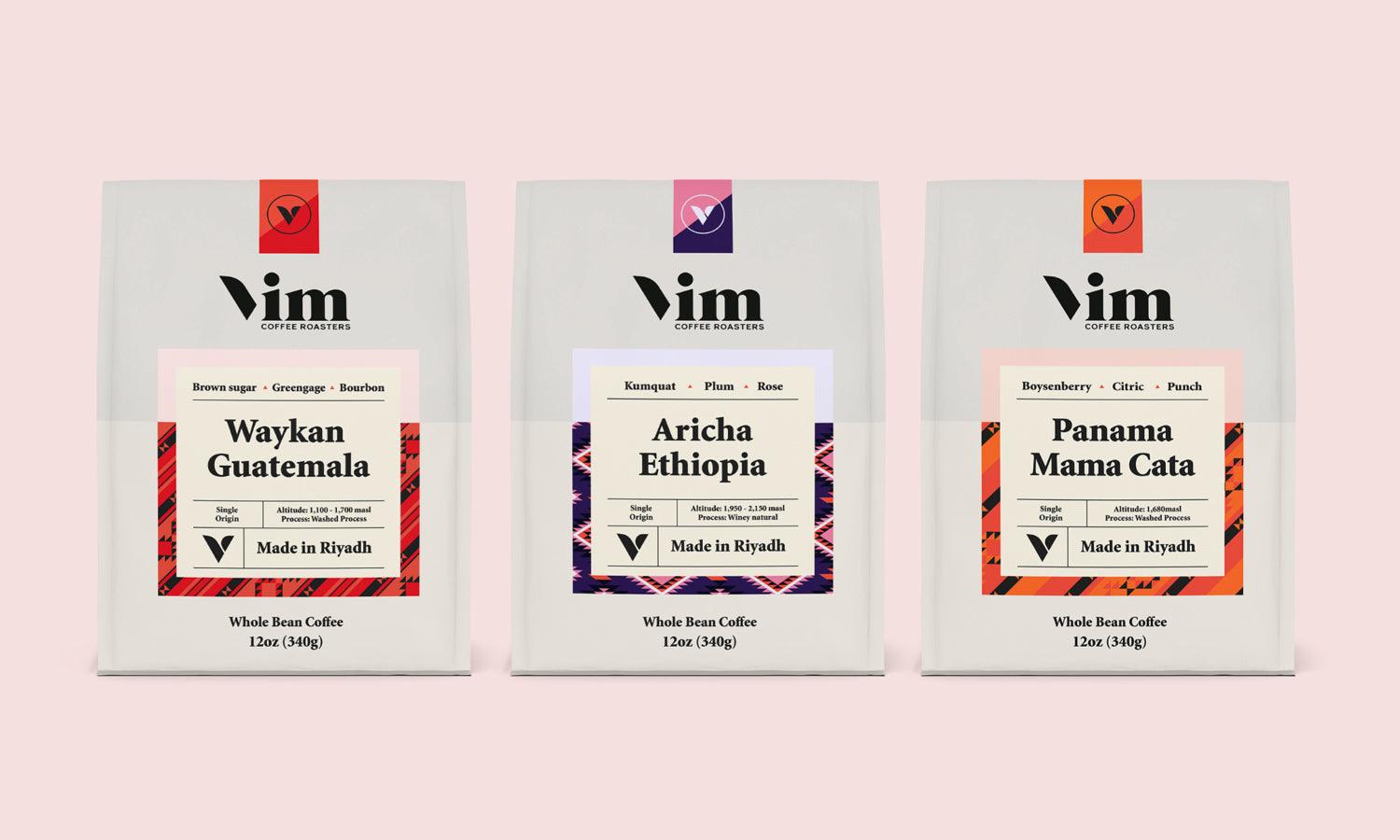
Brand identity is a pivotal graphic design term encompassing all visual elements associated with a brand. This includes logos, typography, colors, and marketing materials that together establish a distinctive presence in the consumer's mind, differentiating it from competitors. Effective brand identity is crucial as it not only reflects the brand’s ethos and values but also enhances recognition and loyalty among consumers.
Focal Point
The focal point in graphic design is the area of an artwork or design that draws the viewer's eye first. It's a fundamental graphic design term used to emphasize the most important element of a design, ensuring it captures attention and communicates the intended message effectively. Designers strategically use contrast, color, size, and placement to establish a strong focal point in their compositions.
Composition
Composition in graphic design refers to the arrangement of visual elements to create a harmonious and balanced layout. It's an essential graphic design term that dictates how different components like text, images, and shapes are organized within a space. Good composition enhances the aesthetic quality and effectiveness of a design by guiding the viewer’s eye across the layout in a fluid and intentional manner, ensuring a cohesive and impactful visual experience.
Vector Graphics
Vector graphics are pivotal graphic design terms, involving images created through mathematical equations rather than pixels. This allows for seamless scaling without any loss of quality, making them ideal for designs that need frequent resizing. They are especially useful in creating logos, technical drawings, and complex illustrations that require clean, clear lines and can be manipulated extensively without degrading the visual integrity.
CMYK Color Model
The CMYK color model is a cornerstone among graphic design terms, standing for Cyan, Magenta, Yellow, and Key (black). This model is crucial for print design as it mixes these four inks to create a full spectrum of colors on the physical page. Understanding CMYK is essential for designers to ensure that the colors in printed materials match their initial digital design intentions accurately.
RGB Color Model
The RGB color model, fundamental in digital graphic design terms, represents Red, Green, and Blue light used in electronic displays. By mixing these three colors at various intensities, it creates a wide range of colors visible on screens. This model is essential for any digital design work intended for viewing on electronic devices, as it directly influences how colors appear on different screens.
Style Guide
A style guide is an essential document in graphic design that outlines the standards for the visual presentation of a brand. It ensures consistency across all media by detailing how logos, fonts, colors, and other design elements should be used. A comprehensive style guide is a critical tool for maintaining brand identity and ensuring that all components are used correctly and cohesively in various applications.
Typography
Typography is a critical term in graphic design, referring to the technique of arranging type to make written language legible, readable, and visually appealing. It encompasses the selection of typefaces, point sizes, line lengths, line-spacing (leading), and letter-spacing (tracking and kerning), all crucial for effective communication. Good typography enhances the readability of content and can significantly impact the aesthetic and functionality of a design.
Raster Images
Raster images, essential graphic design terms, consist of pixels, each a tiny square of color, which together form detailed pictures. Unlike vector graphics, resizing raster images can lead to pixelation, affecting clarity and sharpness. These images are standard in digital photography and detailed graphic content where color depth and gradation are crucial. Understanding their properties is vital when working with photographic content and detailed textures in graphic design projects.
Font and Typeface
Font and Typeface are fundamental graphic design terms that refer to the style of text used in various design elements. A typeface is the design of lettering that can include variants such as different sizes, weights, and styles. A font refers to these variations within a typeface. Understanding the appropriate use of fonts and typefaces is crucial for effective visual communication, influencing both the aesthetics and readability of text in any design project.
Leading
Leading, a fundamental graphic design term, refers to the vertical spacing between lines of text. It's measured from baseline to baseline and affects the readability and overall visual comfort of text blocks. Appropriate leading can greatly enhance the clarity and accessibility of text, making it easier for the reader to follow along and absorb the information. It is especially crucial in multi-line text layouts, such as paragraphs and articles.
Tracking
Tracking, an essential graphic design term, involves adjusting the overall spacing between characters across words and blocks of text. Unlike kerning, which adjusts space between individual pairs of letters, tracking is applied uniformly to a range of characters. This adjustment can affect the density and texture of text, playing a crucial role in both readability and the visual impact of the text within the design, making it integral for setting the mood and readability of the content.
Kerning
Kerning, a vital graphic design term, involves adjusting the space between characters in a typeface to achieve visual harmony. Not all characters have the same spacing, which can disrupt readability and aesthetics if not properly managed. Effective kerning ensures that the spacing between each character is visually even, enhancing the overall appearance and readability of text, particularly in logos and large headlines where details are conspicuous.
Grid System
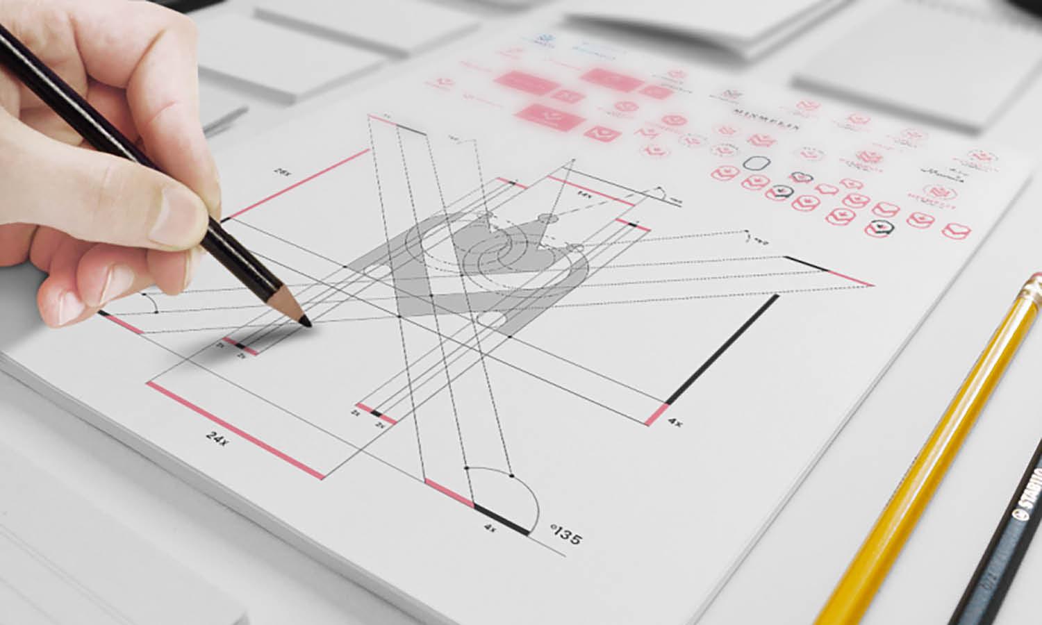
The Grid System is an essential graphic design term, referring to a structure comprising intersecting vertical and horizontal lines used to organize and align content. This system provides a skeletal framework that helps designers maintain consistency across their designs, ensuring that elements are evenly spaced and visually balanced. It's indispensable for creating complex layouts with a clean, orderly appearance.
Contrast
Contrast, a fundamental term in graphic design, refers to the juxtaposition of opposite elements to enhance visual interest and readability. By varying size, color, and type, designers can direct viewers' attention to key elements of the design. Effective use of contrast is essential for highlighting the most important aspects of any piece, making it a critical tool for dynamic and effective visual communication.
Balance
Balance is a fundamental graphic design term that involves arranging elements so that no one part of the work overpowers another. This equilibrium can be symmetrical, asymmetrical, or radial, creating a sense of harmony and stability. Achieving balance in design ensures that the composition is aesthetically pleasing and effectively communicates the intended message, making it crucial for creating engaging and effective visual layouts.
White Space
White Space, also known as negative space, is a crucial graphic design term. It refers to the unmarked portions of a page or design layout, which are not occupied by visual or textual elements. White space is instrumental in creating a clean, uncluttered design, improving readability, and emphasizing particular elements. Effective use of white space is key to a balanced, professional aesthetic that allows the viewer's eye to navigate the content comfortably.
Hierarchy
Hierarchy is a crucial graphic design term that organizes content in a way that naturally guides the viewer's eye to different levels of importance. It can be established through variations in size, color, contrast, and placement. Properly implemented hierarchy in design not only prioritizes information effectively but also enhances the aesthetics and functionality of the layout, ensuring that the most important elements stand out.
Alignment
Alignment is a key graphic design term that refers to the arrangement of elements to create a sharp, orderly appearance. It ensures that every item is visually connected, contributing to a cohesive look. Proper alignment increases readability, eliminates clutter, and enhances the overall professionalism of the design. Whether aligning text or graphical elements, consistent alignment is essential for organizing content in a clear and accessible way.
Proximity
Proximity, a crucial graphic design term, involves grouping related design elements together to create a visual connection. This principle helps organize information and guide the viewer's eye through the layout in a logical, cohesive manner. Effective use of proximity can significantly enhance the clarity and impact of a design by visually associating related items, simplifying the presentation of complex information.
Scale
Scale is an essential graphic design term that refers to the size of elements in relation to each other and to the overall design space. Manipulating scale can attract attention, emphasize importance, and create visual interest and hierarchy. Designers often use scale to make a significant impact with a focal point or to balance design elements effectively, making it a powerful tool in visual communication.
Bleed
Bleed is a critical graphic design term referring to the area that extends beyond the edge of where the sheet will be cut in the final format of a printed piece. This technique is used to ensure that the print extends all the way to the edge of the paper, avoiding unsightly white borders. Designers must carefully set the bleed to ensure that all background colors and patterns extend past the trim edge of the paper.
Saturation
Saturation, a fundamental term in graphic design, refers to the intensity and purity of a color. High saturation colors are vivid and rich, while low saturation colors appear more muted and gray. Adjusting saturation can dramatically affect the mood and visual impact of a design, making it a crucial tool for designers looking to evoke specific emotions or attract attention with bold, striking visuals.
Transparency
Transparency is a key graphic design term that refers to the opacity of an element within a design, allowing for the layering of objects without completely obscuring what lies beneath. This technique can be used to create depth, overlay effects, and subtle visual interest in compositions. Effective use of transparency can enhance the complexity of visuals while maintaining an organized and visually coherent layout.
Mockup
A mockup is an essential term in graphic design, representing a full-scale model of a design used to demonstrate, evaluate, or promote a product before final production. Mockups provide a visual representation, allowing designers and clients to explore different aesthetics and functionalities, ensuring the design meets expectations before substantial resources are committed. They are invaluable in refining designs, showcasing context, and enhancing the tangible feel of digital projects.
Pixel
A pixel, a fundamental unit in graphic design, is the smallest controllable element of a picture displayed on the screen. Each pixel is a dot or a square that displays a specific color. In digital graphics, pixels collectively create the complete image. Understanding how pixels work is crucial for digital designers, especially when working with detailed images or adjusting resolutions to ensure clarity and precision in visual presentations.
DPI
Dots Per Inch (DPI) is a critical graphic design term used to measure the resolution of an image or a printer's output capability. The higher the DPI, the sharper and more detailed the image. This term is especially important in print design, where high DPI values are essential for producing clear, crisp images and text. Understanding DPI is fundamental for designers aiming to achieve the best quality in printed materials.
Gutter
In graphic design, the gutter is the space between columns of text or the inner margins between facing pages in a spread. This essential design term ensures that text does not get lost in the binding of a publication and provides a clean visual separation to enhance readability. Proper gutter planning is vital in both print and digital layouts to maintain a balanced and functional design.
Color Palette
A color palette is a carefully selected combination of colors used consistently across a brand’s visual and marketing materials. It is an essential graphic design term that plays a crucial role in ensuring brand consistency and conveying the right emotional and psychological messages. Choosing the right color palette can dramatically affect how a brand is perceived, making it a critical decision in the branding process.
Aspect Ratio
Aspect ratio, a critical graphic design term, refers to the proportional relationship between the width and height of an image or screen. It is crucial in ensuring that images and designs are displayed correctly without unintended stretching or shrinking. Understanding aspect ratios helps designers maintain consistency and visual integrity across various media, from print layouts to digital displays, ensuring a cohesive appearance in all formats.
Conclusion
Familiarizing yourself with these graphic design terms is a critical step toward enhancing your proficiency and fluency in the field. Whether you're collaborating on projects, creating your own designs, or communicating with clients, a solid understanding of this vocabulary will improve your ability to execute and discuss your work effectively. As you continue to engage with the dynamic world of graphic design, keep revisiting and expanding your knowledge of these terms to stay ahead in this visually driven industry.
Let Us Know What You Think!
Every information you read here are written and curated by Kreafolk's team, carefully pieced together with our creative community in mind. Did you enjoy our contents? Leave a comment below and share your thoughts. Cheers to more creative articles and inspirations!







Leave a Comment