10 Tips To Create A Good Cake Shop Logo Design

Created by Meagan Dumford | https://dribbble.com/shots/17573727-Auntie-Em-s-Logo
Are you planning to open a cake shop? Or perhaps want to refresh your shop’s current logo? A good cake logo design goes a long way. It helps your customers recognize and memorize your brand while at the same time attracting potential customers and conveying your brand’s personality and value.
It helps your brand to stand apart from the competition as well. These are some of the many things that a good logo does. A logo is more than just a brand’s visual representation.
You may have delicious cakes in your shop. The problem is that your potential customers don’t know that. You need branding. You need something to attract potential customers so they can take the first bite and know the deliciousness of your cake. That is where a good logo comes in.

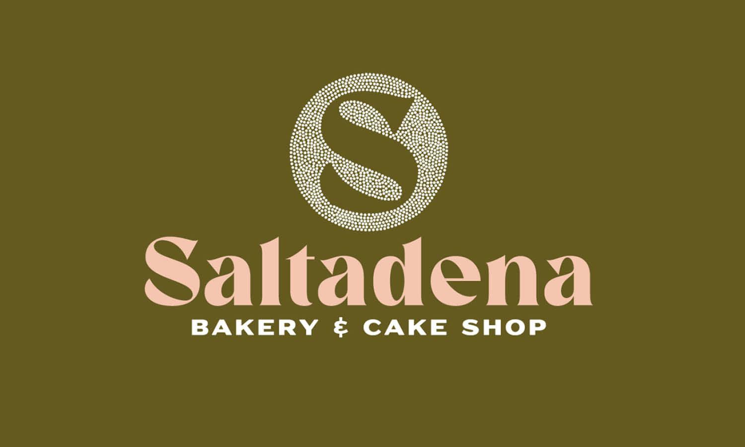
Created by Cameron Jennings | https://dribbble.com/shots/9104162-Saltadena-Bakery-Cake-Shop
Creating a good logo can be a difficult task. This is especially true for small businesses as they typically don’t have the necessary graphic design expertise or a lot of money to hire a graphic designer. Still, it must be done one way or the other.
The creation process takes time and resources. But when it is done right, the benefits will outweigh the time and resources you’ve put in. While everybody likes cakes, the task doesn’t become less difficult. It might even become more difficult.
Why? Because you want a logo that will become not only the face of your brand but also one that stimulates the appetite of the viewer and makes them associate the delicious taste of a cake with your brand.

Created by Mila Katagarova | https://dribbble.com/shots/19106340-Bakery-logo-and-food-truck-design
No need to worry. We are here to help. To make the logo creation process easier, we have collected ten tips that will help you create a good cake logo design. Ready to start your creative process? Let’s get to it right away.
10 Tips To Create A Good Cake Logo Design
- Find The Most Delicious Cake Logo Design Ideas
- Pick a Good Design Style
- Consider The Type Of Logo
- Find the Right Color Identity
- Try Different Fonts
- Implement The Brand Story With Symbolisms
- Create Your own Cakery Elements
- Play With The Negative Space
- Consider A Simple Memorable Tagline
- Be Different, Be Memorable

Created by Johannes Weber | https://dribbble.com/shots/5497190-Crown-Cake-Logo
1. Find The Most Delicious Cake Logo Design Ideas
A good logo design starts with inspiration. There are many ways you can try to find inspiration. For example, study the logos of successful brands that you like. Note that they don’t necessarily need to be in the same industry as you.
Take a good look at their logos. Is it text-based? Is it image-based? Perhaps a combination of the two? What makes the logo different or interesting? What does it communicate? Take note of their style, color, and text. Try to figure out what messages a brand’s logo is trying to communicate.

Created by Lua Correia | https://dribbble.com/shots/8216125-Mafalda-s-Cakery
Another way to find inspiration is to check out your competition. Stealing ideas is a no-no, of course. But there is no harm in finding inspiration in others’ works. Note that since you and your competition share the same target demography, you can learn what works well and what don’t. Also, you can learn what makes your competition different from you, which you can use to set your brand apart from them.
Finding inspiration from other brands, especially your competition, can help you learn what makes a logo good, which in turn will help you create your own good cake logo design.

Created by Simon Beale | https://dribbble.com/shots/10390311-Oh-Crumbs-Cakery
2. Pick a Good Design Style
A logo is much more complex than it appears. There are a lot of different elements that come into play, after all, from design style, color, typography, and casing to negative space and tagline.
If you focus on the whole, you may get overwhelmed really quickly. It is a much better idea to divide it into parts and focus on one part at a time.

Created by Ruslan Babkin | https://dribbble.com/shots/3534124-Cake-Magic
Now that you are feeling inspired, you can try picking a design style that fits your brand. Keep in mind that the fitting design style of a brand differs from one brand to another. In other words, there is no one-size-fits-all design style. There is no right or wrong, only what is most fitting for your brand.
- Classic: A style that keeps things simple and doesn’t incorporate unusual elements. It has staying power and communicates reliability.
- Retro: Featuring hand-illustration and worn elements with beige and brown color palettes, the style evokes feelings of nostalgia.
- Modern: A style that incorporates simple lines, minimal details, and a lot of white space.
- Fun and quirky: The fun and quirky style features cute and colorful elements that give off a positive and friendly vibe.

Created by Brad Mead | https://dribbble.com/shots/9042598-Day-Eighteen-Cupcake
3. Consider The Type Of Logo
When it comes to designing a logo, there are seven main types of logos one can choose from. These are wordmarks, letter marks, abstract logo marks, pictorial marks, mascots, emblems, and combination marks.
Since we are talking about creating a good logo design, let’s focus on the most commonly used ones. Namely, wordmarks, abstract logo marks, and combination marks.
- Wordmarks: Wordmarks, also known as logotypes, are a type of logo that uses the company’s name as the logo. As such, they are all about typography. This type of logo is especially good if your cake shop has a unique and catchy name.
- Abstract logo marks: Using recognizable shapes is very common when it comes to a cake logo design. That is not to say you can use abstract shapes, however. Properly designed, an abstract logo can make a symbol that is truly unique and yours only.
- Combination marks: While you can use only a symbol as a logo, we don’t recommend it, especially if your business is just getting started. The better option will be to combine a symbol with text. This way, it will be easier for your audience to recognize and memorize your logo.

Created by Minh Ngoc | https://dribbble.com/shots/14397273-Sweetescape-logo-animation
4. Find the Right Color Identity
The importance of colors can’t be understated. A good cake logo design has the right colors. Different colors have different meanings. Thus, knowing the meanings behind colors can help you communicate your brand to your customer and, at the same time, evoke particular emotions. For example,
- Red: Red stands for passion and excitement. It is also a good color for food-related brands.
- Orange: Orange is a playful and vibrant color. While it is not as often used as red, orange is just as energetic.
- Yellow: If you want a color that helps make your brand friendlier and more accessible, yellow is the go-to color.
- Blue: Blue is often associated with trustworthiness and reliability. The color is universal, cool, and calming.
- Gray: Gray is a perfect choice if you want to get a classic, mysterious look.
- Brown: Brown is a color that exhibits uniqueness and an aged look.
Note that while colors can help you communicate your brand and evoke emotions, avoid overusing them. The more colors are used, the harder it becomes to balance them. A lot of colors look overwhelming, too. So, find the right colors but limit the number of colors you are using.

Created by Christian Van Bebber | https://dribbble.com/shots/15043453-Van-s-Sweets-Logo
5. Try Different Fonts
The typography is an important consideration you want to keep in mind. With the right typography, your logo will be able to communicate your brand effectively. It can also show professionalism and reflect your brand’s personality.
For example, if you want that chic and timeless look, serif fonts are your best option. Likewise, if you want a clean and modern look, consider using sans serif fonts. For a more personalized and unique look, go for script fonts.

Created by Rainfall | https://dribbble.com/shots/4184632-Dolcesa-Sweethouse
The casing is important, too. Whether you should go for uppercase, lowercase, or a combination of the two, depends on what you want to convey. Suppose you want to convey a more authoritative feel; uppercase the text. If you want a more approachable and fun feel, go for lowercase. When you choose the right typography and casing, your logo will be able to:
- Capture your brand’s personality
- Show your customers what they can expect from your brand
- Tell a story about the brand
These are why trying different typographies and casing. If possible, run some testing so you can see to which your target audience responds positively the most. Getting a third-party opinion is good as well.

Created by Doğasu Ok | https://dribbble.com/shots/17827049-Cinderella-Cake-Bakery
6. Implement The Brand Story With Symbolisms
A good logo is capable of telling a story. The story is what makes your brand unique for the most part. You want a logo that can convey that story. Make it a story.
If you fail to incorporate your brand’s story into your design, you might end up with something that is too generic or, worse, indistinguishable from other logos in the industry.

Created by Anastasia Kurilenko | https://dribbble.com/shots/14587395-Early-bird
By incorporating a story into your cake logo design, you can:
- Communicate your brand’s message more effectively
- Communicate what makes your brand different and stand apart from the rest
- Elicit certain emotions you want to communicate
Ideally, when your target audience sees your logo, it should create a positive impression and cement itself in their memory. A memorable brand’s visual representation helps you build a reputation. Not only that, but it will also make it easier to create a good first impression. The first impression is very important, and you have only one chance to create it.
The more memorable the design, the easier it will be for customers to remember it. Incorporate a story, make the design stands out and make it as memorable as possible.
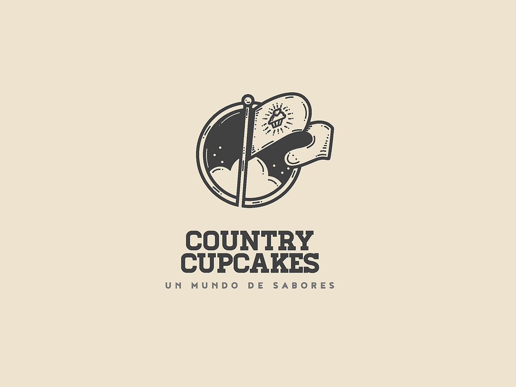
Created by Fragtal Branding | https://dribbble.com/shots/7029290-Country-Cupcakes-Brand
7. Create Your own Cakery Elements
A good cake logo design is simple and proportional. It can be tempting to add many design elements. However, simplicity is what you want to strive for. Focus on what you can take away rather than what you can add.
The simpler the design, the easier it is to recognize and memorize. Too many elements will make it difficult for your audience to get the message you want to convey. Simpler designs are just easier to absorb.

Created by Karl Waghorn-Moyce | https://dribbble.com/shots/4262151-Sea-of-Cakes
A simple design will help your customers:
- Understand the message
- Develop strong associations
- Identify your brand immediately when they encounter you again
There is also proportion. A brand’s visual representation will be used everywhere. A proportional one will make it easy to deploy it across different mediums.
The golden ratio is a helpful guideline in this. While beauty is in the eye of the beholder, we can agree that the golden ratio is always visually appealing. It helps ensure the portions of the design elements remain in balance, thus looking more in harmony, beautiful, and pleasant to the eye.
Following the ratio, no one element overpowers the others. They work together and in harmony toward the final image.

Created by Lucas Fields | https://dribbble.com/shots/19041250-The-Cake-Logo-Design
8. Play With The Negative Space
Negative space, also known as white space, is the empty space in and around a logo. It is easy to overlook negative space. After all, it is empty space. But, like any other design element, you can utilize it to make the overall design better.
For example, a lot of negative space can provide breathing room for your brand’s visual representation. Thus, making it looks sleek and less crowded. In addition, it is a good way to create a contrast and a balanced look.
Some brands even utilize negative space to create hidden imagery or double meanings. Basically, with negative space, you add something to the design with nothing.

Created by Audrey Elise | https://dribbble.com/shots/4144384-Naked-Cake-Bakery
The benefits of negative space are many. Here are some examples:
- Negative space helps create a background
- It makes it easier for your customers to process the design
- It makes the design more understandable
It is tempting to add many design elements. It is a common mistake that you must avoid. Focus on the fundamental design elements and put negative space in mind. As we said earlier, focus on what you can take away rather than what you can add. Again, experimenting will help a lot in this.

Created by Melvyn Paulino | https://dribbble.com/shots/5677084-Home-Cakes
9. Consider A Simple Memorable Tagline
Adding a tagline is a great way to communicate more about what your cake shop has to offer. You can also use the tagline to further cement your brand’s value. Note that these can only be achieved if you use them properly.
A tagline is not a must. But if you decide to add it, make sure that it adds something to the overall design. If it doesn’t add anything, just don’t add it.

Created by Lua Correia | https://dribbble.com/shots/8233963-Mafalda-s-Cakery
When used well, a tagline can:
- Complement the overall design by cementing your message further
- Let customers know what they can expect from your cake shop as it describes what your cake shop offers
- Create a positive association between your cake shop and what you offer as it describes your brand’s values
If you want to add a tagline, make sure it is short, unique, and fits with what your customers experience. If it is too long, generic, and doesn’t fit what your customers experience, it can result in a negative impression. So, do be careful with it.
Also, just like other text in your logo, make sure that the tagline is readable. Adding a tagline that is not readable is a no-no.
There is no big brand that doesn’t have a logo. This alone speaks of how important it is, even for big brands that already have a name for themselves.

Created by Adam Wiedman | https://dribbble.com/shots/3957058-H-Co-Bakeshop
10. Be Different, Be Recognisable
One of the reasons why brands create a logo is to be different from the competition. Rather than blending in the crowd, you want to stand apart. You don’t want to be just any other cake shop in your customers’ minds.
A brand’s visual representation should set the brand apart from the rest. This is easier said than done, however. But it has to be done nonetheless. If you fail to do so, you risk your brand being overlooked by your customers.

Created by Abdullah Hasani | https://dribbble.com/shots/2561964-Konditoria
The following are some benefits if you can be different:
- Allow you to tell your unique story
- Create a more memorable representation, and you won’t be mistaken for others
- Create a value proposition to your customers, giving them a reason why they choose you over the competition
Note that being different entails experimenting with different design styles, colors, and typographies. Figuring out which style, color, and typography work best and setting your brand’s visual representation apart takes time. But it will be worth it.
Checking out your competition is very helpful in this. When you know your competition, being different will be a lot easier. Not to mention you will know what works and what doesn’t.

Created by Zach Shuta | https://dribbble.com/shots/9270766-That-Cake-Stand
Final Words
While creating a good logo is not an easy task and is more likely to be daunting, the process can be fun and exciting, too. You can learn from other brands, including your competition. You can learn what works well with your audience and what don’t.
Not to mention the style, colors, and typographies experimentation. Whether you create the logo on your own or work with a professional graphic designer, you want to take your time. Never rush when it comes to creating a design. You want to make it good, and that will take time.
If you work with a graphic designer, communicate your brand to them clearly. That way, it will be easier for you and for them to figure out a design that fits your brand well.
When creating a cake logo design, keep our tips above in mind. If you do so, the process will be much easier. At the very least, you will know where to start the creative process. We hope this helps. Good luck.





Leave a Comment