Exploring Various Logo Types and Strategies for Effective Use

Source: Ruben Daems, OffScript | Brand Identity, Behance, https://www.behance.net/gallery/134999769/OffScript-Brand-Identity
A logo is more than just a small piece of art; it's the foundation of your brand's identity, playing a critical role in how your business is perceived by the public. In the diverse world of branding, understanding the various logo types and selecting the right one can significantly influence your company's success. This article dives into the different categories of logos, from traditional wordmarks to modern abstract designs, providing insights on how to effectively use each to enhance your brand's visibility and recall.
The choice of a logo type should align closely with your brand's personality, target audience, and industry expectations. Whether it's a simple yet striking symbol or a complex emblem, each logo type carries its own set of advantages and connotations. By exploring various logo types, businesses can discover the most effective strategies to connect with their audience, convey their brand message, and stand out in a competitive market. This sets the stage for a deeper understanding of each logo type's distinct characteristics and how they can be strategically implemented to bolster your branding efforts.
Symbol or Icon Logos
Symbol or icon logos are a quintessential element in the arena of branding, embodying the essence of a brand in a single, memorable image. These logos utilize distinctive icons or symbols that can be easily recognized and recalled by the audience, making them an effective tool for establishing brand identity. Icons such as the apple of Apple Inc. or the swoosh of Nike are prime examples of how simple imagery can represent a company's values and vision effectively.
When designing a symbol logo, it’s crucial to focus on simplicity and clarity to ensure that the logo remains functional across various mediums and sizes. The icon should be unique and versatile, capable of conveying the brand's message even without accompanying text. This type of logo is particularly effective for global brands that need a universally understandable representation without linguistic barriers.
Symbol logos are not just aesthetic elements; they are powerful branding tools that can evoke emotion and build recognition. They work well for brands that have a concise narrative or a strong visual element in their story. As we explore various logo types, symbol logos stand out for their ability to transcend cultural and language barriers, making them a popular choice for companies aiming to maintain a strong, enduring presence in the market.
Wordmark Logos
Wordmark logos focus on the name of the company, crafted with distinctive typography to make the brand instantly recognizable. This type of logo design is ideal for new businesses seeking to establish their name in the market or for those with a unique name that lends itself well to creative typography. Brands like Coca-Cola, Google, and Visa demonstrate the effectiveness of wordmark logos, where the name itself becomes a memorable visual, enhanced by custom fonts and colors.
The design of a wordmark logo requires a deep understanding of typography, as the choice of font can convey the personality of the brand—from classic and elegant to modern and dynamic. The color, spacing, and size of the font also play critical roles in enhancing readability and impact in various applications, from billboards to mobile screens.
Wordmark logos are particularly useful for creating a strong visual presence with the name alone, making them an excellent choice for those looking to emphasize brand name recognition. When exploring various logo types, wordmark logos are favored for their simplicity and ability to adapt across different branding materials. They are straightforward yet powerful, providing a direct and clear message about the brand without the need for additional graphic elements.
Lettermark Logos
Lettermark logos, also known as monogram logos, utilize the initials of a company’s name to create a visually appealing and memorable mark. This type of logo is particularly effective for companies with lengthy names, allowing them to simplify their brand identity into a few letters. Well-known examples include HBO (Home Box Office), IBM (International Business Machines), and CNN (Cable News Network).
The design of a lettermark logo focuses on typography and can often incorporate unique lettering styles to stand out. The choice of font is crucial as it needs to ensure that the logo remains clear and legible at various sizes and across different media. Additionally, lettermarks can be a creative way to play with design elements, such as integrating negative space or geometric shapes to add depth and interest.
Lettermark logos are excellent for streamlining corporate identities in industries where space is at a premium, such as technology, media, and fashion. These logos are not just functional; they are crafted to make a strong impression quickly and are particularly suitable for global companies needing a concise visual that transcends language barriers. When exploring various logo types, lettermarks offer a blend of tradition and modernity, making them a versatile choice for businesses aiming to project efficiency and professionalism through their brand.
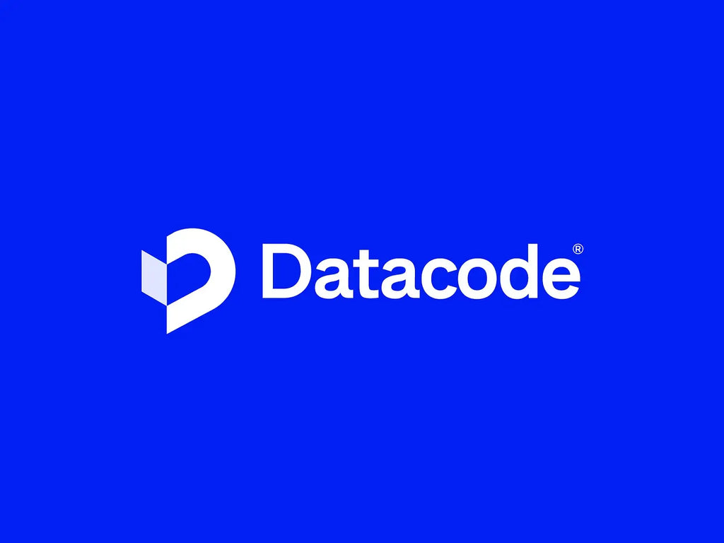
Source: Mohammad Sohel, DataCode Visual Identity, Dribbble, https://dribbble.com/shots/24922877-DataCode-Visual-Identity
Combination Marks
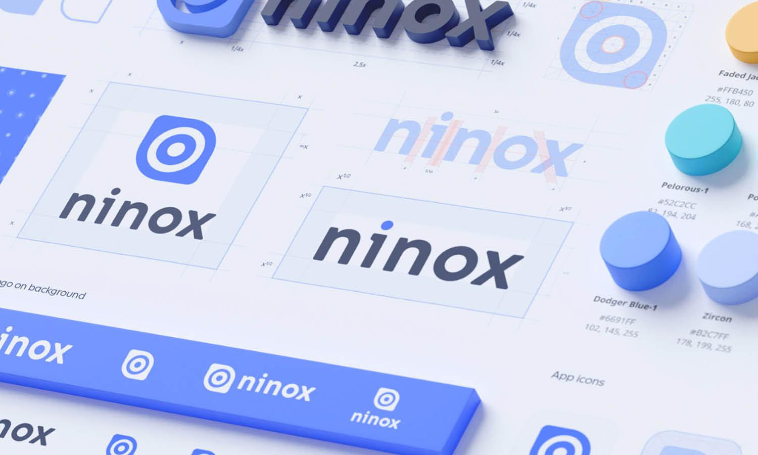
Combination marks are a dynamic class of logos that integrate both text and symbols to enhance brand recognition. This versatile logo type combines the benefits of wordmark and symbol logos, allowing companies to use them together or separately. Notable examples include the iconic Nike swoosh with its wordmark and Starbucks with its mermaid emblem and text.
The strategic use of combination marks can effectively communicate what a company does and what it stands for, providing visual clues through the icon and clarity through the text. This dual approach helps in building a robust brand identity as it works to reinforce the visual memory of the brand through multiple elements.
When designing a combination mark, it’s essential to maintain a balance between the symbol and the text to ensure neither overwhelms the other. The design should be cohesive, making it easy to separate or use together without losing its identity. This flexibility makes combination marks particularly appealing for businesses looking to establish a presence both in physical and digital markets.
Combination marks are suitable for businesses that are new or those looking to rebrand and strengthen their market presence. They are among the most effective logo types in various industries due to their adaptability and the comprehensive brand story they can tell. As we continue exploring various logo types, combination marks stand out for their ability to engage audiences with a rich visual narrative.
Emblem Logos
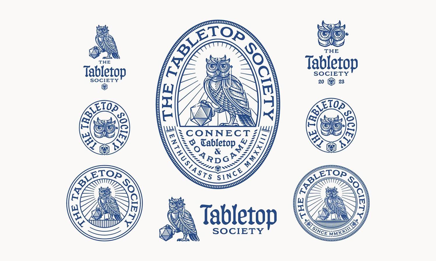
Emblem logos are distinguished by their classic appearance, which often encapsulates the company name within a symbolic frame. This logo type is reminiscent of traditional seals and crests, frequently used by schools, government agencies, and in industries where heritage and trust are paramount. Emblem logos are intricately designed, combining text and iconography to form a cohesive unit that evokes a sense of authority and establishment.
The design of an emblem logo typically involves detailed illustrations or iconography that are closely tied to the brand’s history or industry. These logos are less versatile compared to other types due to their complexity and detail, which can make them harder to read at smaller sizes. However, their sophisticated and formal style can significantly elevate a brand’s perception, associating it with timelessness and authenticity.
Businesses that choose emblem logos often aim to project stability and respectability. They are ideal for those that wish to highlight their long-standing history or traditional values. When exploring various logo types, emblems are particularly favored by organizations looking to emphasize a legacy connection, such as luxury brands, universities, and artisanal businesses. Their detailed and ornate design can make a powerful impact, conveying a deep sense of trust and excellence.
Abstract Logo Designs
Abstract logo designs use geometric forms or abstract shapes to represent a company in a simple but highly creative manner. Unlike representational logos, which depict recognizable images, abstract logos symbolize the company’s brand through unique, artistic expressions. This type of logo is effective for companies wishing to convey specific psychological messages or emotions without being tied to a specific image.
Abstract logos are particularly versatile in terms of branding, as they do not limit the brand to a literal interpretation. Their design is open to interpretation, often enabling a brand to evoke a range of emotions and connections with the audience. Examples of successful abstract logos include the BP starburst-y logo, which represents energy and vibrancy, and the Adidas flower, which symbolizes diversity and strength.
The creative freedom offered by abstract logos allows designers to experiment with color, shape, and form to create a truly unique identity that can stand out in a crowded market. These logos are particularly suitable for global companies that need a logo that transcends cultural differences without any linguistic barriers.
When discussing various logo types, abstract designs are praised for their ability to foster brand uniqueness and adaptability across multiple platforms. They cater to dynamic companies looking to express innovation and modernity. For businesses that want to present themselves as forward-thinking and original, an abstract logo provides an excellent opportunity to impress and engage a global audience.
Color Psychology in Logos
Color plays a pivotal role in logo design, influencing how a brand is perceived and interacting with the psychology of the viewer. Each color can evoke different feelings and associations, which is why selecting the right palette is crucial for effective branding. Red, for example, is often associated with energy, passion, and urgency, making it a popular choice for brands that want to appear bold and dynamic. On the other hand, blue conveys reliability, professionalism, and tranquility, which is why it is frequently used by financial institutions and healthcare companies.
The use of color in logos is not just about aesthetics; it's a strategic decision that can enhance brand recognition and influence consumer behavior. Green often represents growth and sustainability, making it ideal for organic or eco-friendly brands, while yellow, often used to grab attention, can evoke feelings of happiness and optimism.
When exploring various logo types, understanding the psychological impact of colors is essential. Designers must consider the cultural contexts and target audiences since color perceptions can vary globally. For instance, white is commonly associated with purity in many Western cultures, but it is traditionally worn at funerals in some Eastern cultures. Choosing the right colors can reinforce a brand's message and create a deeper emotional connection with its audience.
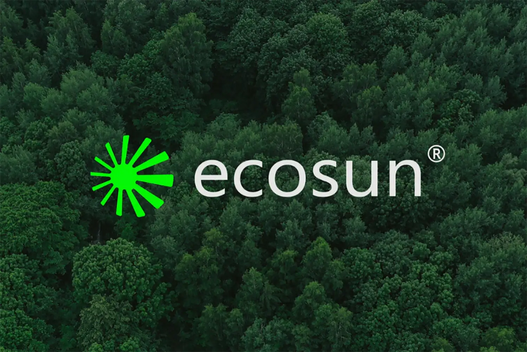
Source: Rashed Khan, Ecosun, Behance, https://www.behance.net/gallery/173410175/ecosun
Typography and Brand Personality
Typography in logo design is not merely about choosing a font but about finding a typeface that embodies the brand’s personality and resonates with its target audience. The style of lettering used in a logo can significantly impact the brand's overall perception, conveying traits such as reliability, excitement, or innovation. For example, a serif font might be used to suggest a classic, trustworthy quality suitable for legal or editorial brands, whereas a sans-serif font could project a clean, modern image, ideal for tech companies.
The choice of typography can also affect the readability of the logo, which is crucial for brand recognition. Designers must ensure that the typeface chosen is legible in various sizes and across different mediums, from digital displays to print materials. Furthermore, custom typography can help a brand stand out from competitors by adding a unique element that cannot be easily replicated.
When discussing various logo types, the integration of typography with the overall design is essential. For brands aiming to evoke a specific historical or artistic vibe, choosing a typeface that aligns with those periods or styles can enhance the authenticity of the branding. Additionally, mixing typography with other elements like color and imagery can create a cohesive and compelling visual identity.
Typography is more than just a tool to display a brand's name; it's a powerful expression of a brand's identity, capable of engaging emotions and reinforcing the message that a brand aims to communicate. This makes it an integral component of logo design in the exploration of various logo types.
Scalability and Versatility
A key aspect of effective logo design is ensuring scalability and versatility, crucial traits that allow logos to maintain their impact and legibility across a variety of formats and sizes. A scalable logo performs equally well whether it appears on a small business card or a large billboard. This adaptability extends to digital platforms, where logos must be recognizable at icon sizes for apps or social media profiles.
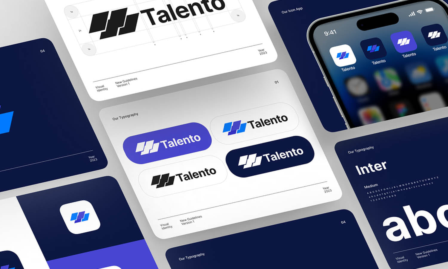
Versatility involves the logo's ability to adapt to different backgrounds and mediums without losing its identity. This can be achieved through the thoughtful use of colors and design elements that remain clear and distinct under various usage scenarios. For instance, a logo should be effective in both full-color and single-color versions, and it should work on both light and dark backgrounds.
When exploring various logo types, the principle of versatility also covers the logo's ability to be separated into components, such as a standalone icon or a wordmark that can be used independently while still being identifiable as part of the brand. This flexibility is particularly important for brands that operate in multiple sectors or that need to tailor their branding for different markets without losing coherence.
Designing with scalability and versatility in mind ensures that a logo will serve a brand effectively, no matter where or how it is displayed. This approach not only future-proofs the logo but also enhances its utility, making it a valuable asset in the brand’s visual identity toolkit.
Contextual Use of Logos
Understanding the contextual use of logos is essential for tailoring brand identity to different environments and audiences effectively. Logos may need to adapt to various applications, from digital media and print to merchandise and corporate communications. Each context demands specific considerations to ensure the logo communicates effectively and maintains its integrity.
For instance, a logo used on a digital platform must be optimized for quick recognition and clarity at smaller sizes, such as on mobile devices or in web headers. Conversely, the same logo on corporate merchandise like t-shirts or promotional items might need to be simplified to adapt to different materials or printing techniques.
Furthermore, the cultural context should not be overlooked. Logos that function well in one cultural environment might need adjustments to align with the visual preferences and cultural sensitivities of another. This adaptation can involve changes in color usage, typographic adjustments, or even the modification of symbolic elements to better resonate with different audiences.
When discussing various logo types, the ability to adapt a logo for its contextual use is crucial. This flexibility helps maintain a cohesive and recognizable brand identity across all touchpoints. It not only ensures that the logo remains functional and appealing in different settings but also reinforces the brand’s presence in a global marketplace. By considering the context in which a logo will be used, designers can create more versatile and enduring brand assets.
Conclusion
The exploration of various logo types and their strategic applications is essential for any brand looking to establish a strong and enduring identity. From the simplicity of symbol logos to the complexity of emblems, each logo type offers unique benefits and suits different brand needs. Understanding the psychological impact of color, the importance of typography, and the necessity for scalability and versatility can significantly enhance logo effectiveness. By carefully considering these elements, brands can ensure their logo not only captures their essence but also adapts seamlessly to diverse contexts and markets, strengthening their connection with the audience.
Let Us Know What You Think!
Every information you read here are written and curated by Kreafolk's team, carefully pieced together with our creative community in mind. Did you enjoy our contents? Leave a comment below and share your thoughts. Cheers to more creative articles and inspirations!





Leave a Comment