The Smallest Canvas: Designing Playing Cards as Tiny Works of Art
A deck of cards looks simple when it sits on a table. Fifty-two rectangles. Two jokers. A box that fits in your palm.
But for a designer, that small box is a whole world. It is a system, a story, and a test of discipline. You have little space and many decisions. Every line must work hard.
In a time when most design lives on glowing screens, playing cards stay stubborn and physical. They bend. They age. They hold fingerprints. People shuffle your work, throw it on the table, and see it from every angle. That is a good challenge for any creative.
Why Playing Cards Are a Serious Design Playground
Playing cards may look like toys, but they behave like a brand.
They must be:
- Legible at a glance
- Consistent across many variations
- Memorable enough to stand out
- Durable in real use
You are not designing one poster or one landing page. You are creating a system of related pieces that must work together. The back, the faces, the court cards, the indices, the suits, the box. Each has a job. Each must feel like it belongs.
Good card design is honest. If your layout is weak, players feel it after a few hands. If your contrast is poor, they squint. If your concept is shallow, they forget the deck in a drawer. The deck becomes a quiet critique of your choices.

Thinking in Systems: 54 Pieces, One Voice
Start with the system, not the decoration.
Ask yourself: What holds this deck together?
It could be a theme, a mood, a time period, a culture, or a story. Once you know that, every card becomes a variation on a clear thought.
Some useful lenses:
Hierarchy
The eye needs anchors. Indices and suit symbols are the main information. Make them strong, simple, and consistent. The rest is flavour.
Rhythm
The pips are like beats in a song. Their placement can feel stiff or musical. On number cards, keep them balanced. On court cards, let them dance a little, but never at the cost of clarity.
Contrast
Ink versus paper, foreground versus background. If a player can’t tell a heart from a diamond in low light, the design failed. Start in black and white. Colour comes after the forms are solid.
Repetition with small surprises
The suits share a language but have their own personality. Maybe spades feel sharp and cold, while clubs are round and playful. Keep the bones the same—change the details.
When you work on decks, you learn to love constraints. The card size is fixed. The corner indices must sit where players expect them. Within those rules, you are free. The frame makes the art stronger.
Telling Stories in a Deck
A good deck can tell a story without a single word.
The courts—Kings, Queens, and Jacks—are the natural cast. They can be kings and queens of anything: cities, trades, elements, myths, or modern subcultures. Their clothing, tools, and posture all speak.
You can also let the aces set the tone. A simple pip, blown up with detail and texture, can say more about your theme than a long explanation. A deck about jazz might have an Ace of Spades built from a trumpet’s curves. A deck about architecture could turn the suits into floor plans.
Think in layers:
- Surface layer: the first impression, the “wow” moment when someone opens the box.
- Usability layer: the calm, reliable shapes that make the cards easy to read.
- Discovery layer: small details that appear after many games—hidden icons, repeated motifs, little jokes.
This last layer is where you build loyalty. People return to decks that reward their attention.
From Screen to Table: Making It Real
Many designers stop at mockups. The cards look perfect on a bright monitor. But real cards live in dim rooms, on crowded tables, in fast hands.

Before you finalise your deck, test it like this:
Print rough prototypes
Not glossy, not perfect. Just print-and-cut on regular paper. Shuffle them. Spread them in a fan. Put them on a messy desk. You will see problems that the screen never showed you.
Check legibility at a distance.
Lay the cards out and step back. Can you still tell suits and ranks? A deck should work in motion and in bad lighting, not only in a carefully lit product shot.
Watch other people handle them.
Give the cards to someone who has never seen your design. Ask them to sort the suits or play a quick game. Say nothing. Their hesitation will tell you what needs work.
Respect production realities
Bleed, safe zones, alignment, coating, and thickness all change how your design feels. Some makers who specialise in custom playing cards offer templates and precise specs. They are not just technical notes; they are part of your design toolkit.
Turning a Deck into a Portfolio Piece
For a creative audience, a custom deck is more than a fun side project. It can be a flagship portfolio item.
It shows:
- How you build and manage a visual system?
- How you handle limitations?
- How do you think about user experience in the real world?
- How do you translate a story into consistent, repeatable graphics?
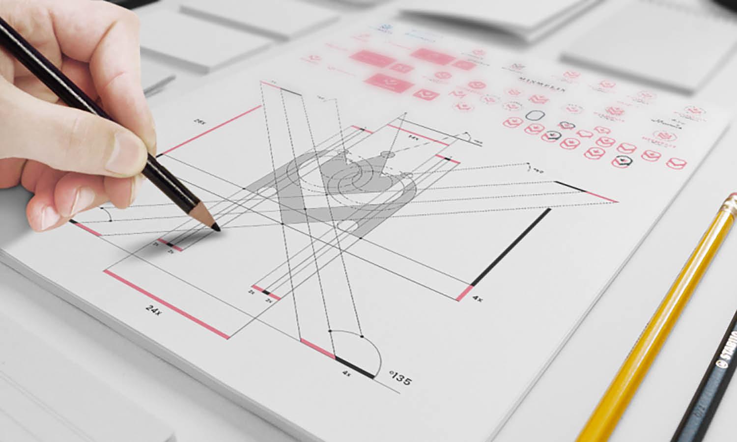
You can pair the deck with process assets: sketches, early layouts, grids, and failed ideas. These give art directors and clients a view into your decision-making, not just the final polish.
A printed run also opens doors: small online shops, gallery stores, or limited edition drops for your own community. Platforms like EZRA Card make it easier to bridge the gap between digital files and decks that people can actually hold and use.
If you already create logos, illustrations, or typography, consider offering a deck as part of a branding package. This physical artefact carries the brand into homes, cafes, and game nights. It feels less like “merch” and more like a designed experience.
A Call to the Table
Design can become abstract when it never leaves the screen. A deck of cards brings it back to the table—literally. People argue over it, spill drinks near it, bend it, bridge shuffle it, and pass it to friends.
If you are looking for a new canvas, choose this small one. Fifty-two chances to get better at composition. Fifty-two chances to refine your style. Fifty-two tiny posters that must all agree with each other.
Sit down. Draw the first card. Please keep it simple. Make it honest. Let the work speak every time someone deals a hand.


