Form vs. Function: Five Architectural Lessons for Designers of All Kinds

Designers in all kinds of businesses tend to balance between beauty and utility. They need to, because those two go hand in hand, and their job is to deliver both to the customers. If you think that isn’t the case in every design branch, think again.
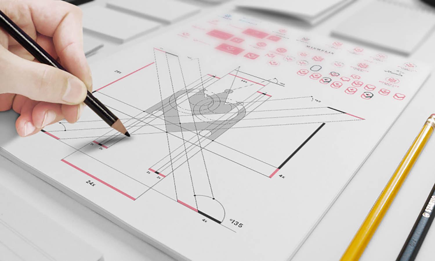
Working on a logo requires aesthetics, but also needs to be clear, practical, easy to pronounce, etc. Working on a building, well, that one’s easy. It needs to be pretty because that is the main design point, and it needs to have all the required things for living, right?
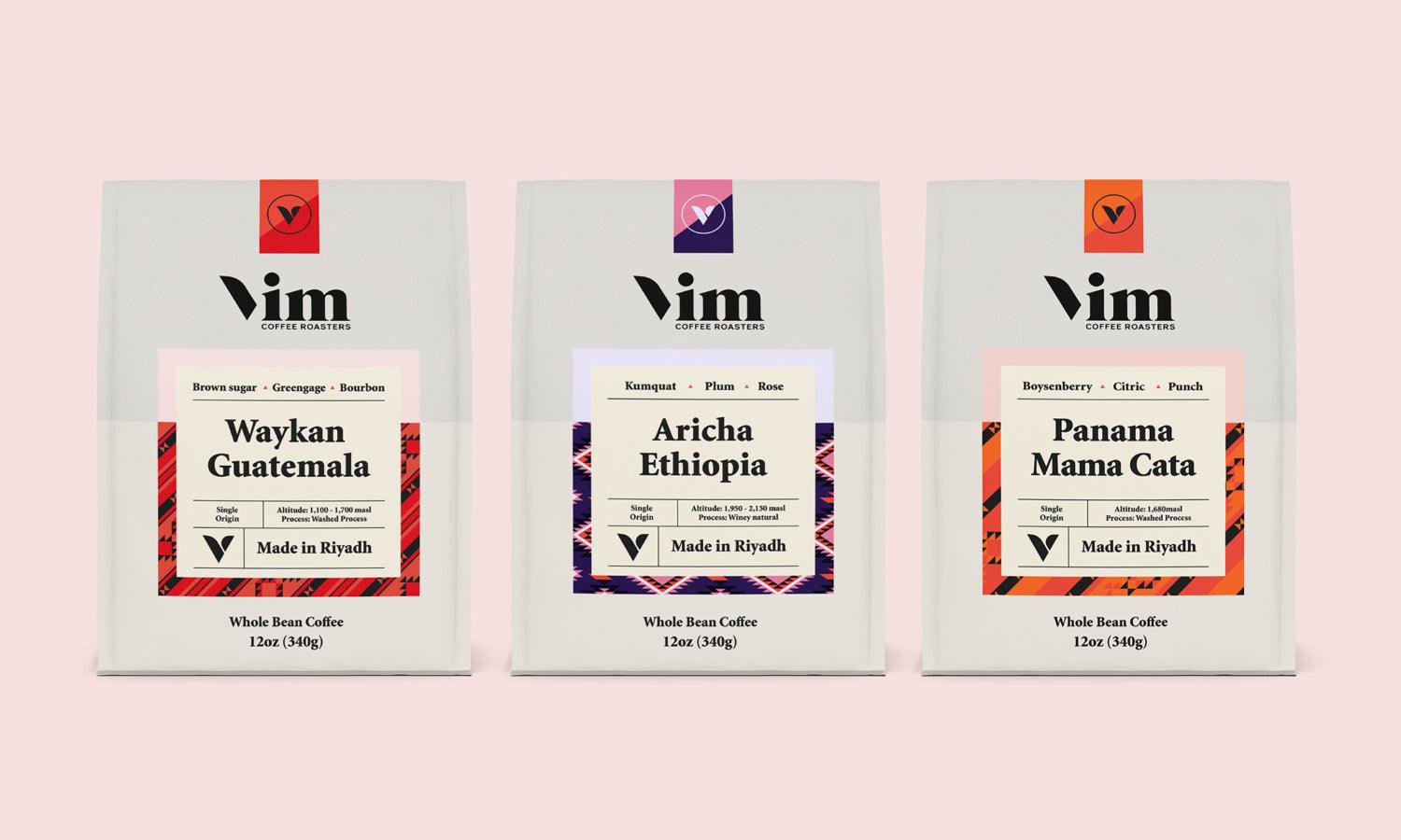
Then, there’s product packaging, like cosmetics. It needs to be packed in a certain space, but it also needs to look pretty. There are countless examples, but the point is that balancing form and function isn’t just a goal; it is an absolute necessity.
These five key lessons about balancing form and function you don’t want to miss if you have anything to do with design.
Purpose Comes First, But Don’t Forget Beauty
It is a need that is the starting point for every design. Buildings have to be load-bearing, climate-controlling, and sheltering kinds of constructions. Similarly, a poster must inform, a package must protect the product inside, and a logo must represent a brand image.
Usually, architects start from functions. When it's evident what the building will be up to, for example, long span and wind architecture, or if they will allow movement, the form will inevitably start shaping itself.
This sequence matters. By solving the function first, the form evolves around it naturally.
Use Constraints to Fuel Creativity
Architects are bound by materials, codes, climates, and budgets. Limitations, however, do not hinder innovation but guide it. For instance, industrial agriculture buildings. They are designed for maximum efficiency and minimum floor area.
For example, if you are going to build roof protection for an old machine or swaths of hay, then you will have to span large, open interiors, which means that you will have to construct a very strong framing system. Therefore, structural components like 40 ft pole barn trusses come into place as they are used to make wide roof spans with fewer interior supports, thereby maximizing usable space, but are technically very strong.
Here are a few simple ways to develop constraint-led creativity in design:
- Set boundaries (early) – Budget, space, or branding rules give you your sandbox.
- Investigate unfamiliar alternatives – Limitation begets inventive layouts or visual styles.
- Test multiple iterations – Don't warp your first workaround; take the idea further, build upon it, and then make a decision.
Don’t forget that true creativity happens only under constraint.
Every Material Tells a Story
When it comes to architectural materials, anything you use, from exposed concrete to reclaimed wood, defines the tone and character of that space. Choosing steel beams for a structure's integrity sends a message of strength and durability. If you use rammed earth or glass, that will send an entirely different message.
The situation is different in graphic or product design, because choices of material may be metaphorical. Anyway, the principle holds: materials shape the experience.
Balance Isn’t Always Symmetry
Balance, in this sense, does not mean to design mirrors on either side. Architects mostly achieve balance by creating heaviness on one side to counterbalance open voids, and vertical lines are made to anchor heavier horizontal planes. It is visual stability, and not just a duplicate.
This idea can be worked into the design:
- Distributing the balance of visual weight – For example, balancing the dark areas with light and larger elements with smaller ones.
- Use space wisely – Some hush is needed in the vicinity to anchor louder elements.
- Create a process of movement – Lead the eye along a particular path in space for intentional flow.
Let Structure Guide Aesthetics
Architectural design tends to express the very logic of what has been constructed. Instead of hiding away beams or trusses, certain designs could even flaunt them as part of the aesthetics.
This is a very strong form of honesty in the design, which is: what you see is what holds the thing up.
You can apply this principle straight into the layout and design; Do not hide the grid – use it. Let the navigation be as intuitive as possible. Let form and function be related to one another.
Conclusion
The main message for any designer is: form and function do not compete but collaborate. Structure supports beauty, and beauty elevates utility. Such a consideration pertains not only to buildings but also to logos, packaging, illustrations, and interfaces.
All designers, from illustrators to branding experts, may use architectural reasoning to think about how they might consider their work. Let your designs serve a specific function, and refine their form in the light of that function.
Well-functioning, attractive design not only captures attention but also proves enduring, effective in the long-run relationship with people.


