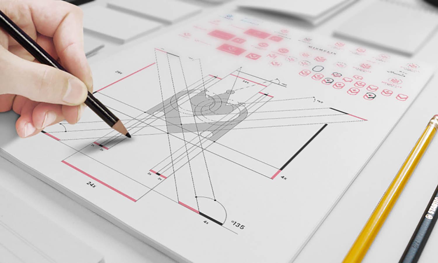
Designing Presentations Like a Pro: A Creative Guide for Graphic Designers

In the world of visual communication, presentations are more than just slides—they're stories, pitches, strategies, and sometimes even entire brands condensed into a few well-designed visuals. As a graphic designer, you already have a strong eye for aesthetics, balance, and composition. But when it comes to presentation design, the rules shift slightly—and mastering this medium can significantly boost your creative toolkit.
Whether you're designing for clients, corporate teams, or your own portfolio, here’s a practical guide to creating stunning presentations like a pro.
1. Understand the Purpose First, Design Second
Every presentation has a goal—whether it’s to persuade, inform, or inspire. Before you begin designing, ask:
- Who is the audience?
- What action should they take after the presentation?
- What’s the core message on each slide?
This clarity will shape your visual hierarchy, slide flow, and content decisions. Great designers solve problems—presentation design is no different.
2. Embrace Minimalism Without Losing Impact
Less is more, especially in slides. A cluttered design distracts; a focused slide communicates. Use white space effectively, limit text to key phrases, and let visuals do the heavy lifting.
As a designer, your challenge is to communicate clearly and beautifully—with fewer elements and more purpose.
3. Use Design Principles Thoughtfully
Bring your design skills into play with:
- Visual hierarchy: Guide the viewer’s eyes from headline to body to visuals.
- Consistency: Fonts, colors, and spacing should be uniform throughout.
- Contrast: Make key elements pop using size, color, or placement.
And remember: alignment isn't just aesthetic—it’s psychological. Clean alignment increases trust in the content.
4. Incorporate High-Quality Visuals and Icons
Replace text-heavy slides with charts, infographics, mockups, or icon-based layouts. Designers have the advantage of crafting or curating unique visuals. For efficiency, you can also use pre-made templates or editable design elements.
Platforms like SlideUplift offers a range of professional presentation templates that can serve as a foundation for your designs—saving time while still allowing customization and creative control.
5. Think Like a Storyteller
Presentations aren't just about looks—they're about narrative. Use your slides to guide the audience through a journey. Start with a hook, build the core argument or message, and finish with a strong conclusion or call to action.
As a designer, consider how color progression, slide transitions, and layout flow can support the emotional arc of the presentation.
6. Use Templates Strategically (Not Lazily)
Templates aren’t the enemy of creativity—they're tools for productivity. When you're under a tight deadline or juggling multiple client needs, customizable templates can speed up your process while maintaining polish.
Smart designers use quality templates as a base and build upon them with brand-specific visuals and customized layouts. This is where platforms like SlideUplift shine—offering visually engaging, editable, powerpoint presentation templates that can elevate any presentation.
7. Export and Deliver Professionally
Lastly, don’t underestimate the importance of how your presentation is delivered. Test on the actual screen it’ll be presented on, check font compatibility, and optimize file size for sharing or uploading.
Presentation design doesn’t end when the slides are done—it ends when the audience applauds.
Final Thoughts
As a graphic designer, you already speak the language of visual communication. By learning how to apply your skills to presentations, you open new opportunities—from client pitches to internal decks to branded storytelling.
Designing presentations like a pro isn't just about beauty—it’s about clarity, persuasion, and experience. Combine your creative instincts with strategic tools, and you’ll not only impress—you’ll inspire.


