Cultural Motifs in Tobacco Branding: Blending Tradition with Modern Design

When browsing niche tobacco brands online, many consumers pause to consider not only legitimacy but also the design language at play. What symbols or motifs nod to heritage? How do packaging choices reflect deeper cultural stories? One example is Native Smokes4less, a retailer that highlights how branding can carry both tradition and modern appeal. In that subtle overlap between commerce and culture lies a fascinating story of how visual identity carries weight.
In this article, we’ll explore how tobacco brands adopt cultural motifs, how designers navigate respect versus appropriation, and how modern design practices reinterpret tradition in packaging, identity, and consumer perception.
Why Cultural Design Matters in Tobacco Branding
In heavily regulated industries such as tobacco, brand messaging via traditional ad channels is often limited or prohibited. That makes packaging one of the few remaining canvases to communicate identity, values, and emotional resonance. For many Indigenous or heritage tobacco brands, cultural motifs become a visual assertion of authenticity, lineage, and respect.
But the use of cultural symbolism carries responsibility. Misappropriation or superficial borrowing can provoke backlash, while thoughtful, collaborative design can strengthen brand trust and deepen meaning. As noted in industry and public health commentary, some pack designs tap into cultural identity or national pride to maintain consumer connection in the face of marketing restrictions.
Furthermore, internal research by tobacco firms has long shown that packaging elements, shape, opening style, texture, influence consumer perception. For instance, alternative pack shapes (slim, rounded, slide-open) are used to evoke elegance or reduced harm. Designers working with cultural motifs must therefore integrate not only symbolism but also functional branding and perceptual cues.
Patterns, Motifs & Symbology: What Designers Borrow (and beware)
Here are several common strategies (and pitfalls) when integrating cultural elements into tobacco branding:
|
Strategy |
What It Looks Like |
Risks / Challenges |
|
Heritage patterns / weaving motifs |
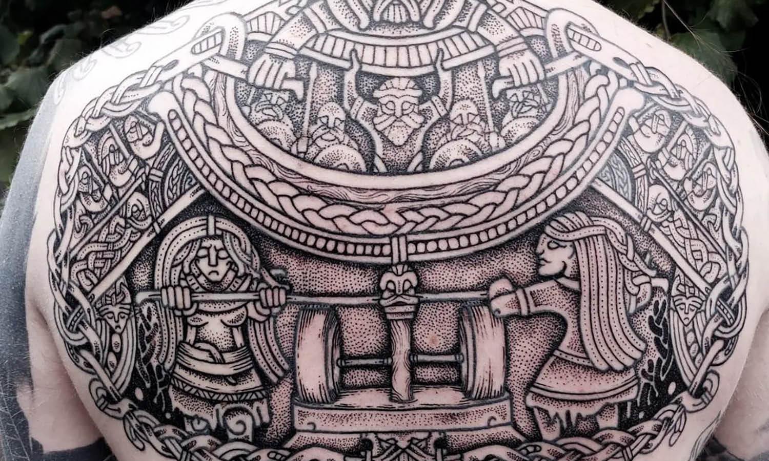
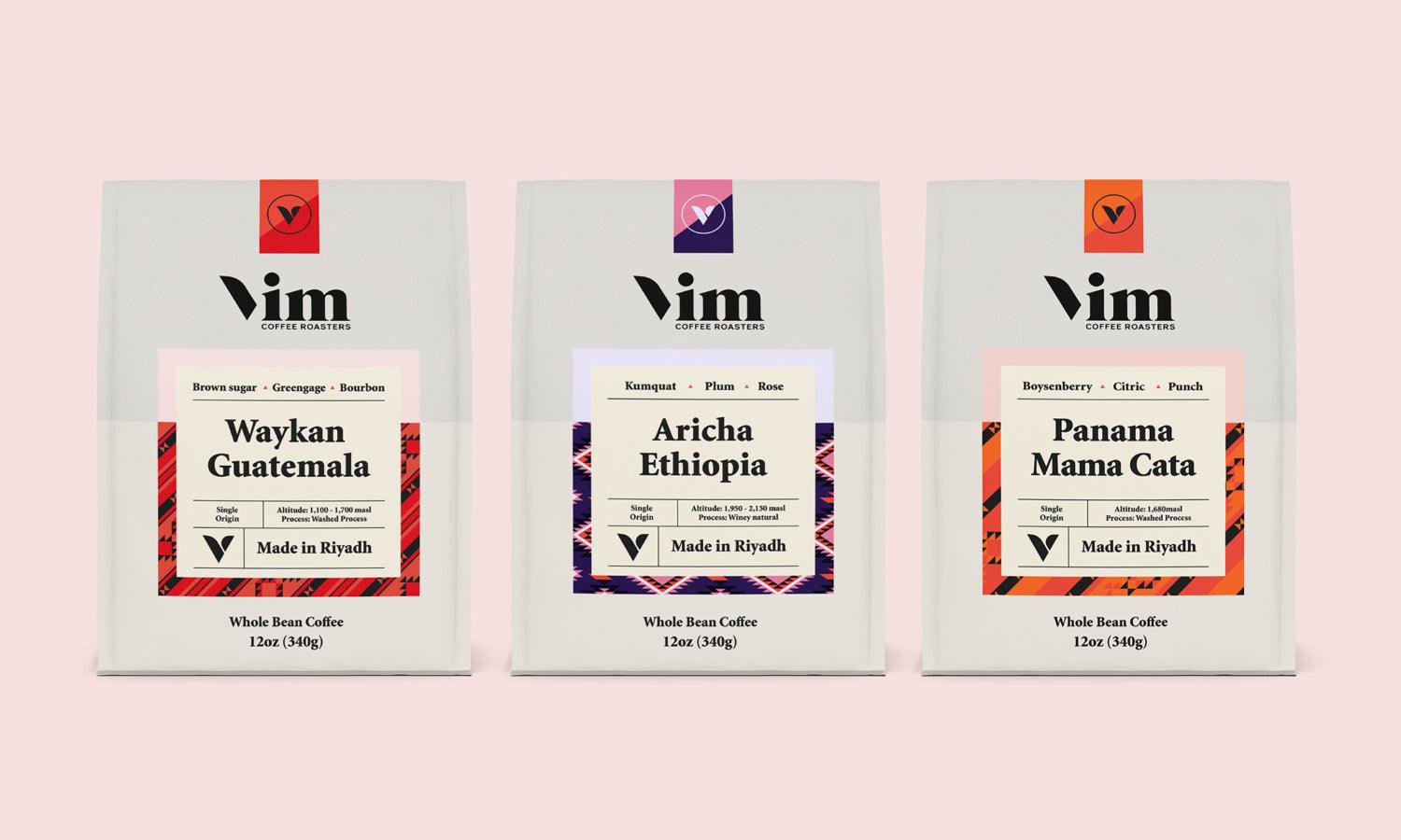
Using traditional textile patterns, beadwork geometry, or nature symbolism (feathers, water, plants) as background textures or accents |
Could be generic or misrepresented if divorced from context or meaning |
|
Cultural iconography |
Incorporating animals, totems, symbols meaningful to a tribe/community (e.g. eagle, turtle, sacred plants) |
Risk of appropriation or misuse if not permissioned or culturally accurate |
|
Color palettes with meaning |
Earth tones, cultural palette (for instance colors used in ceremonies) |
Running into legal design restrictions (in some jurisdictions, “plain packaging” laws reduce design use) |
|
Legend & storytelling |
Embedding small narrative elements, maps, or historic references in pack liners, inner flaps, or inserts |
Space is limited, legibility matters, and overcomplication can obscure brand clarity |
When done well, cultural motifs do more than decorate: they tell a brand’s origin story, honor lineage, and anchor design in context. But designers must engage with community voices or cultural advisors to avoid flattening symbols into “tribal aesthetic” tropes.

Case Studies & Lessons From Tobacco Packaging Research
Some existing studies shed light on how motifs and design choices affect perception:
- In a study titled “The Packaging Is Very Inviting …”, researchers found that for certain tobacco brands, design features like bright colors and the use of “American Indian” imagery were strong visual cues that influenced brand desirability.
- Research on standardizing tobacco packaging indicates that when branding elements are removed (plain packaging), the attractiveness of the product declines and attention to health warnings improves. This is key context: the more design is regulated out, the more critical each visual motif becomes for brands.
These findings underscore that every design element, motif, color, shape, texture, is a signal. For a cultural motif to succeed in tobacco branding, it must carry meaning without overpowering legal or regulatory clarity.
How to Design with Respect & Authenticity: a Creative Guide
For designers approached to craft tobacco branding with cultural motifs, here’s a suggested workflow and ethical guardrails:
- Community collaboration / consultation
Engage culture bearers, elders, or community artists early. Ensure symbols used are appropriate, correctly represented, and meaningful.
- Layer meaning, don’t overlay
Instead of pasting cultural imagery over generic design, weave motifs subtly into structure: embossing, watermarking, interior flaps, or secondary surfaces.
- Balance symbolism with clarity
Make sure the brand name, legal text, health warnings, and identifiers remain legible and prominent. Visual storytelling should support, not override.
- Prototype and test
Use focus groups or user testing to see how motifs read to intended audiences. Does the symbolism resonate or confuse?
- Stay aware of regulation
In markets with plain pack laws, branding leeway is limited. Designers must plan for variability or fallback versions.
- Document origin & meaning
Provide a design rationale or legend in marketing/press kits so the visual intent isn’t lost in brand rollout.
These steps help avoid tokenism and foster design that is rooted in respect.
How Consumers “Read” Cultural Branding
From a user perspective, cultural motifs on tobacco packaging influence expectations, trust, and perception:
- Authenticity cues
A well-integrated cultural design signals to consumers: “This is Indigenous-owned or heritage-born, not a mass generic brand.”
- Emotional resonance
Symbols tied to identity or tradition can create deeper attachment and brand loyalty.
- Skepticism mitigation
In a category where many brands are questioned for authenticity or counterfeits, cultural motifs coupled with transparency (e.g. sourcing info, certifications) can help build credibility.
Designers and marketers must remember: if a cultural motif is introduced carelessly, it can feel exploitative rather than honoring.
Challenges & Tensions to Navigate
Designing with cultural motifs in tobacco branding is not without hurdles:
- Regulatory pushback
In jurisdictions with strict packaging rules, much of the decorative space is off-limits. Designers must know local laws.
- Cultural misinterpretation
Symbols can carry multiple meanings; what’s celebratory in one context could be spiritual or private in another.
- Balancing readability vs. ornament
Overly intricate visuals may distract from essential brand elements, warnings, or user legibility.
- Graphic constraints
Printing on tobacco packs must survive handling, lighting, finishes, some delicate motifs degrade or lose detail.
Every design decision must respect usability, regulation, and cultural integrity equally.
Looking ahead: Cultural Design in Tobacco’s Evolving Identity
As the tobacco industry evolves (with pressures from health regulation, market shifts, alternatives), branding will increasingly rely on identity and narrative. Cultural motifs offer a bridge between heritage and market differentiation. But the brands and designers that succeed will be those who embed respect, clarity, and authenticity into every visual decision.
For a creative portal like Kreafolk, this intersection, where craftsmanship, identity, and commerce meet, is fertile ground. The story of how tradition and visual design coalesce in tobacco branding is still largely undocumented in design media, and crafting it with integrity opens room for visual scholarship, critique, and inspiration.
Would you like me to produce a version of this article optimized for Kreafolk’s layout (with suggestions for visuals, pull-quotes, sidebars), or create a list of “10 cultural motif ideas” that designers could experiment with?


