Can ‘Brutalism’ Be Soft?

As far as warm and fuzzy design goes, Brutalism isn’t it. In fact, it’s the opposite of that. Brutalism is bare concrete, sharp lines, and buildings that look more like bunkers than places humans were meant to live in. Some people call it cold and ugly, and it’s even been called oppressive. But despite that, it’s making a comeback although, this time, it’s different.
Blocky structures are still here and stripped-back layouts aren’t going anywhere any time soon, but now features like these are paired with soft neutrals, warm lighting, and the occasional houseplant. Instead of copying Brutalism, designers are tweaking it to make it not so harsh and more human. It’s showing up everywhere, and it’s starting to feel… Dare we say calm?
This change raises the question – can Brutalism be soft? Can something that was so severe ever be anything other than that?
Or is this just all a watered-down version of Brutalism and it just lost its edge?
The ‘New’ Brutalism
Brutalism has found its way back, but not in the way you’d expect. Now we have something called the ‘new’ Brutalism and it’s more about the feeling than anything else. There’s a kind of raw honesty that you can see in places like branding, web design, and product packaging. There’s a sense of nostalgia behind it, especially for mid-century design.
For some, tapping into this era feels authentic, perhaps even a little rebellious. In a world where people want sleek and flawless, the roughness of Brutalism stands out and brands are taking advantage of that. They’re using simple grids, big bold type, and muted monochrome palettes to show they’re not like the rest of the bunch. It’s bold, it’s stripped down and, most importantly, it’s catching attention.
How Brutalism Is Being Reimagined
Brutalism came, went away, and now it’s back, but not in its original form. Modern designers are taking the core principles and softening them so the concept feels more relatable. Here’s how they’re pulling it off.
Gentler Colors
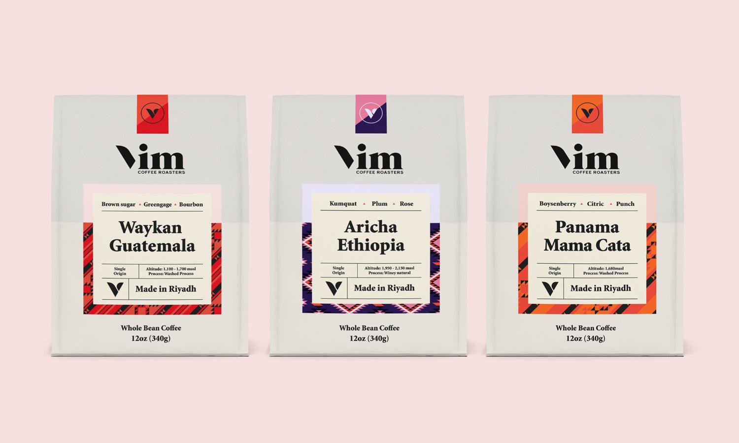
One of the easiest ways to change the tone of any style is to switch up the colors. Classic Brutalist design is all about black, white, and shades of gray, but the updated version swapped those out for pastels, earthy browns, soft creams, and even dusty blues and greens. These softer colors warm it up and make the layout feel calmer and more inclusive.
You’ll see this a lot with modern UI design, but even packaging and editorial layouts are doing the same.
Natural Materials and Textures
Old-school Brutalism was basically all concrete, glass, and steel. Now, that’s paired with natural elements like wood, stone, fabric, and clay. This mix creates a contrast that feels more grounded. Designers are also bringing this into digital projects with high-resolution surface scans and layered effects to mimic real materials.
The goal is to keep it minimalist but to also offset the harness with something more human and familiar.
Rounded Typography and Layouts
Bold, blocky fonts are still used in Brutalist design, but now they’re mixed with softer, rounder typefaces. Designers are also spacing things out more, so the layout is easier to read. The end result still looks strong, but it’s no longer overwhelming.
Integration of Greenery and Landscape
When it comes to actual spaces, one way to soften Brutalism is to add plants, flowers, and natural walkways. This helps balance out the hard concrete with something more relaxing. Gravel is often used for this purpose because it’s clean, keeps things simple, and adds texture without being too much.
If I were you, I’d look for gravel delivery near me to find a local supplier. This way, you’d be able to get a professional to pull off this kind of minimalist outdoor style for you.
Outdoor Brutalism Meets Landscape Design
Brutalism is making its way all over the place, including outdoor spaces. Architects and landscape designers are combining Brutalist elements with natural surroundings in ways that feel balanced and peaceful. You’ll still see heavy concrete walls and sharp lines because there would be no point without them, but now they’re softened. Grassy areas, plants, and water features break up that hardness that made Brutalism so cold and stark.
Aside from plants and water, ground material is also used to create contrast. Gravel, crushed limestone, river rock, and decomposed granite work really well with concrete and, at the same time, bring in a sense of calm.
This mix of hard and soft, rough and smooth, is what makes Brutalism feel fresh and new again.
Conclusion
Well, who knew that Brutalism could actually be soft and inviting? Up to a point, of course, nobody’s reinventing the wheel here. It just goes to show that everything can be tweaked if there’s someone creative behind it. And you can do this with any style – stick to the core basics and switch up the details with something you like. This way, you get the best of everything.
From https://kreafolk.com/blogs/articles/popular-architecture-style with anchor Brutalism


