30 Best Shield Illustration Design Ideas You Should Check

Source: Velinov, Desperate Measures, DeviantArt, https://www.deviantart.com/velinov/art/Desperate-Measures-278655059
Ready to defend your design territory with some epic shield illustrations? You're in the right place! Shield illustrations aren’t just for medieval knights or superhero emblems; they can add a robust and protective vibe to any project. From sleek, modern designs that scream sophistication to whimsical, detailed creations that tell a story, the versatility of shield illustrations is unmatched.
Whether you're looking to brand a sports team, create a memorable logo, or give your graphic project a touch of fortitude, exploring the world of shield illustrations can unlock new realms of creativity. So, buckle up and prepare to be inspired as we delve into some of the most striking and innovative shield illustration ideas out there! Get ready to shield yourself with creativity—let's discover designs that make you invincible in the art world!
Shield Illustration Ideas

Source: 1Oshuart, Soul Catcher, DeviantArt, https://www.deviantart.com/1oshuart/art/Soul-catcher-845702900

Source: Clayscence, Into Battle, DeviantArt, https://www.deviantart.com/clayscence/art/Into-battle-905495986

Source: 5Martist, Ahaneith, DeviantArt, https://www.deviantart.com/5martist/art/Ahaneith-914538370

Source: Austenmengler, Iron Knight, DeviantArt, https://www.deviantart.com/austenmengler/art/Iron-Knight-733161268

Source: Ashpwright, Shieldmaiden, DeviantArt, https://www.deviantart.com/ashpwright/art/Shieldmaiden-935455478

Source: Marie Bergeron, Zelda Series x Weapons, Behance, https://www.behance.net/gallery/23308965/Zelda-Series-x-Weapons

Source: Keerthi Priya, Captain America Shield, Behance, https://www.behance.net/gallery/92497323/Captain-America-Shield-Avengers-Illustration

Source: Svetlana Rudyk, Behance, https://www.behance.net/gallery/78923557/shield

Source: Andrewdefelice, Allosaurus Paladin, DeviantArt, https://www.deviantart.com/andrewdefelice/art/Allosaurus-Paladin-916590958

Source: Siqno, Badger Warrior, DeviantArt, https://www.deviantart.com/siqno/art/Badger-Warrior-958358443

Source: Rob-Joseph, Soldier, DeviantArt, https://www.deviantart.com/rob-joseph/art/Soldier-522348658

Source: Juan Felipe, Tree Sentinel, Dribbble, https://dribbble.com/shots/18886190-Tree-Sentinel

Source: Yamaorce, Grey Warden Com, DeviantArt, https://www.deviantart.com/yamaorce/art/Grey-Warden-Com-762299039

Source: 1Oshuart, Boromir Arrives To Rivendell, DeviantArt, https://www.deviantart.com/1oshuart/art/Boromir-arrives-to-Rivendell-606620115

Source: Cobwebmsnd, Shieldmaiden, DeviantArt, https://www.deviantart.com/cobwebmsnd/art/Shieldmaiden-790279872

Source: Mattspaceofficial, Relic Of The Shield, DeviantArt, https://www.deviantart.com/mattspaceofficial/art/Relic-of-the-Shield-944898588
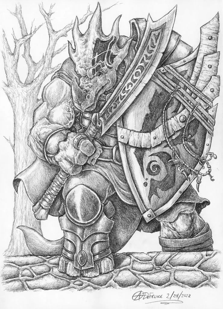
Source: Andrewdefelice, Dinosaur Barbarian, DeviantArt, https://www.deviantart.com/andrewdefelice/art/Dinosaur-Barbarian-910363027

Source: Dongjunlu, Lesson23: Viking Study, DeviantArt, https://www.deviantart.com/dongjunlu/art/Lesson23-Viking-Study-Viking-Weapon-691656381

Source: Enchantress-Lele, Warrior, DeviantArt, https://www.deviantart.com/enchantress-lele/art/Warrior-507250772

Source: Worldofartbooks, 12, DeviantArt, https://www.deviantart.com/worldofartbooks/art/12-992295000

Source: Chrishistoryartworks, The Last Praetorians, DeviantArt, https://www.deviantart.com/chrishistoryartworks/art/The-Last-Praetorians-883697728

Source: Muti, Knight, Dribbble, https://dribbble.com/shots/21256006-Knight

Source: Andreatm, Burst Of Thorns, DeviantArt, https://www.deviantart.com/andreatm/art/Burst-of-Thorns-565305928

Source: Sirielle, Scion Of Kings (Gil-Galad), DeviantArt, https://www.deviantart.com/sirielle/art/Scion-of-Kings-Gil-galad-as-son-of-Fingon-537418459

Source: 95Bee, Spider-Man Fan Art, DeviantArt, https://www.deviantart.com/95bee/art/spider-man-fan-art-848202086

Source: Lisa Champ, Hylian Shield, Dribbble, https://dribbble.com/shots/22034796-Hylian-Shield

Source: Ayrin Davis, Demonic Shield, Behance, https://www.behance.net/gallery/123839867/Illustration-Demonic-shield

Source: Teamzoth, Shields, DeviantArt, https://www.deviantart.com/teamzoth/art/Shields-291850639

Source: Quantzz, Barbarian From Chult, DeviantArt, https://www.deviantart.com/quantzz/art/Barbarian-from-Chult-855592987

Source: Velinov, Desperate Measures, DeviantArt, https://www.deviantart.com/velinov/art/Desperate-Measures-278655059
What Colors Work Best for a Shield Illustration?
Choosing the right colors for a shield illustration is like selecting the perfect spices for a dish—it can make or break the visual impact. Whether you’re designing a coat of arms, a logo, or simply a decorative piece, the color scheme you choose will significantly influence the viewer's perception and emotional response. Here’s a vibrant guide to picking the best colors for your shield illustrations, ensuring they stand out and convey the right message:
Classic Metallics: Gold, Silver, and Bronze
When you think of shields, metallic colors are often the first to come to mind. Gold, silver, and bronze not only reflect the traditional materials used in historical shields but also impart a sense of durability and value. Gold evokes wealth and power, silver suggests sleekness and modernity, while bronze can bring a touch of antiquity or resilience. Using these colors can give your shield a timeless look that resonates with strength and tradition.
Bold and Battle-Ready: Rich Reds and Deep Blues
Red and blue are not just popular choices because they’re visually striking—they also carry deep symbolic meanings that can enhance the narrative of your shield. Red, often associated with courage, passion, and danger, is perfect for a shield intended to convey strength and bravery. Blue, on the other hand, denotes loyalty, wisdom, and trustworthiness, ideal for a shield that represents protection and dependability. These colors make your shield pop and can be tempered with neutrals to balance their intensity.
Earthy and Reliable: Greens and Browns
If your shield illustration is meant to symbolize stability, nature, or growth, then greens and browns are your go-to palette. Green, the color of life and renewal, can make your shield feel more organic and connected to nature. Brown, on the other hand, grounds the design with its earthy, robust qualities, suggesting resilience and reliability. These colors work exceptionally well for designs that aim to represent organic brands, environmental missions, or historical contexts linked to the land.
Majestic and Mystical: Purples and Blacks
To infuse a sense of mystery or royalty into your shield, purple and black are excellent choices. Purple is traditionally associated with nobility, luxury, and ambition, making it a perfect pick for a shield with a regal or sophisticated backdrop. Black adds a layer of mystery and elegance, making it powerful for conveying authority and control. Together or alone, these colors can create a shield that stands out for its depth and dramatic flair.
Energizing and Eye-Catching: Bright Yellows and Oranges
For a shield that catches the eye and evokes energy and optimism, bright yellows and oranges are fantastic options. Yellow radiates positivity, clarity, and intellect, which can make your design feel inviting and inspiring. Orange combines the energy of red and the happiness of yellow, representing enthusiasm and creativity. These colors are great for more modern or youthful shield designs, especially those intended to stand out in digital mediums or contemporary contexts.
Color can dramatically affect the perception of your shield illustration, so choosing the right palette is crucial. Consider the message you want to convey, the context in which the shield will be used, and how the colors will interact with other elements in your design. With the right colors, your shield can become a powerful symbol that not only protects but also tells a compelling story.
What Are the Best Styles for a Shield Illustration?
When it comes to shield illustrations, the style you choose can transport your design to different eras, realms, and moods. From the ornate to the minimalistic, each style carries its own flair and purpose, making your shield not just a protective emblem but also a piece of art. Here are five popular styles to consider for your shield illustrations, each with its own unique charm and appeal:
Heraldic and Historical
Heraldic style is the classic choice for shield illustrations, steeped in the traditions of medieval coat of arms and nobility. This style features intricate linework, vibrant colors, and often includes lions, eagles, or other beasts as part of the design. Heraldic shields are not just beautiful; they're also rich in symbolism and history. They’re ideal for projects that aim to evoke a sense of ancestry, tradition, or authority, making them perfect for educational institutions, governmental bodies, or luxury brands.
Modern and Minimalistic
If your goal is to communicate in a clean, contemporary way, a modern minimalistic style might be your best pick. This style uses simple shapes, limited color palettes, and a lot of negative space to create a sleek, understated look. Modern shields often forego traditional ornamentation for a more abstract interpretation, making them adaptable to various applications, especially in corporate or tech-oriented fields where simplicity and clarity are prized.
Fantasy and Ornate
For those looking to dive into a world of imagination and detail, the fantasy style offers limitless possibilities. This style incorporates magical elements, mythical creatures, and elaborate motifs that can turn any shield into a gateway to a fantastical world. Rich textures, layered elements, and vibrant colors make these shields pop, ideal for gaming, literature, or entertainment industries where you want to capture the viewer’s imagination and whisk them away to another world.
Rustic and Artisanal
Embrace the beauty of imperfection with a rustic style that harks back to simpler times. This style features natural textures like wood grain, stone, or metal, often with a hand-crafted look that gives the shield a warm, approachable feel. Rustic style shields are great for brands or projects that value artisanal qualities, sustainability, or a connection to nature and tradition. They resonate well in markets focused on organic products, hand-made goods, or historical recreations.
Futuristic and Tech-Inspired
When looking forward, the futuristic style incorporates elements like metallic surfaces, neon outlines, and holographic effects. This style is sleek, dynamic, and often incorporates a sense of motion and technology, making it perfect for innovations in science, digital products, or any field that leans heavily into the future. Futuristic shields can serve not just as protection but as a symbol of progress and forward-thinking.
Choosing the right style for your shield illustration depends largely on the message you want to convey and the audience you intend to engage. Whether rooted in tradition or soaring into fantasy, each style offers a unique set of elements that can enhance your design’s impact.
What Are Some Creative Ideas for Shield Illustrations?
When it comes to shield illustrations, stepping outside the conventional realm can transform a basic shield into a standout piece of art. These versatile emblems serve as more than just medieval armor; they can be a dynamic part of your design arsenal. Here are five creative ideas to elevate your shield illustration game, infusing each design with uniqueness and flair:
Blend Modern with Medieval
Why stick to one era? Mix elements from futuristic themes with traditional medieval shield shapes for a visually intriguing design. Imagine a sleek, carbon-fiber texture paired with ornate, Gothic metalwork details. This contrast not only grabs attention but also makes the shield illustration a conversation piece. Whether it's for a game, a company logo, or personal art, this blend of old and new can set your work apart from the mundane.
Incorporate Natural Elements
Shields don't have to be all about steel and combat. Introducing elements from nature, like leaves, waves, or fire, can add a whole new dimension to the design. For instance, a shield illustration that uses wood textures and is intertwined with vine and floral motifs not only softens its appearance but also connects it to nature-inspired themes. This approach is perfect for brands or projects that focus on sustainability, nature conservation, or organic products.
Use Negative Space Creatively
Negative space is a powerful tool in design, and using it creatively within shield illustrations can produce stunning visual effects. Design a shield that incorporates its background in a meaningful way, such as creating the outline of a mountain or skyline within the shield itself. This technique is not only visually appealing but also adds a layer of depth to the artwork, making the shield symbolic of a larger idea or identity.
Add Cultural or Historical Significance
Each culture has its own symbols and styles that can be woven into shield designs to give them deeper meaning. Whether it’s incorporating Nordic runes, African tribal patterns, or Japanese crest elements, these designs can pay homage to various heritages and traditions. Such shields are perfect for projects that aim to reflect cultural identity or historical significance, giving a sense of pride and continuity.
Play with Typography
Shields and typography? Absolutely! Embedding a motto, name, or significant date within the shield design not only personalizes it but also makes it multifunctional. Choose fonts that complement the style and shape of the shield. For a sleek, modern look, opt for clean, sans-serif fonts; for a more traditional or vintage feel, go with serif or handwritten styles. This integration of text and imagery makes the shield illustrative and communicative.
Exploring these creative avenues can transform a simple shield illustration into a masterpiece of design. Whether you’re aiming for something that resonates with historical depth or stands out with modern boldness, the key is to push the boundaries and create something uniquely yours. Dive into these ideas and watch your shield illustrations shield you from the ordinary!
What Are Some Fantasy-Themed Shield Illustration Ideas?
Diving into the realm of fantasy, shield illustrations can transport viewers to worlds of wonder and magic. Whether you're crafting a graphic for a fantasy novel cover, designing elements for a role-playing game, or adding a mystical touch to personal projects, these fantasy-themed shield ideas will spark your creativity and enchant your audience. Here are five fantastical shield illustration ideas that blend myth and mystery:
Elemental Magic Shields
Why settle for mere metal when you can have a shield made of fire, water, earth, or air? Imagine a shield that ripples like water, with a shimmering surface reflecting a mysterious underwater realm. Or a shield that crackles with raw electrical energy, containing a storm within its bounds. These elemental designs can be dynamic, adding motion and life to the illustration, making them perfect for fantasy settings where magic rules.
Mythical Creature Motifs
Incorporate mythical beasts into your shield designs to add a touch of awe and fear. Dragons, phoenixes, unicorns, or griffins not only make the shield look majestic but also symbolize various strengths and powers. A dragon might represent strength and ferocity, while a unicorn could symbolize purity and grace. These creatures can be stylized or detailed, depending on the aesthetic you're aiming for, and they make any shield look like a relic straight out of a legend.
Enchanted Forest Theme
Take inspiration from the dense, mysterious vibes of an enchanted forest. Design a shield that features intricate foliage, mystical flowers, and hidden fae creatures peeking through leaves. The color palette could be rich greens and earthy browns, with pops of vibrant colors from magical flora or fauna. This idea is perfect for stories or brands that involve nature's magic and mystery, providing a protective emblem that looks like it was forged by the forest itself.
Celestial and Astrological Symbols
Celestial bodies and astrological symbols offer a cosmic take on shield designs. A shield adorned with constellations, moons, suns, or planetary symbols can feel both ancient and timeless. These designs can represent guardianship not just on earth, but across the universe, ideal for characters or brands that act as protectors or guides. The celestial theme also allows for a stunning visual style, using dark backgrounds with glowing symbols to create a stark, eye-catching contrast.
Runes and Ancient Scripts
Incorporate ancient runes or mysterious scripts into your shield illustrations to add an element of mystery and ancient wisdom. These symbols could be purely decorative or hold hidden meanings that add depth to the narrative of the graphic. For instance, a shield with runes that spell out a protective charm or a secret message can intrigue and engage viewers, inviting them to delve deeper into the story or the lore behind the illustration.
Each of these fantasy-themed shield illustration ideas offers a gateway into a world where the usual rules don't apply, and where imagination reigns supreme. By exploring these themes, you can create shields that not only protect but also tell a story of their own.
What Are the Most Popular Symbols in a Shield Illustration?
A shield illustration is more than just a decorative element—it’s a storytelling device packed with meaning. Throughout history and even in modern designs, shields have been adorned with powerful symbols that represent strength, honor, legacy, and identity. Whether you’re creating a medieval-inspired crest, a fantasy emblem, or a sleek modern logo, the right symbols can elevate your shield illustration and give it deeper significance. Here are five of the most popular symbols commonly used in shield illustrations and what they represent:
The Mighty Lion – Courage and Royalty
If there’s one animal that dominates the world of shield illustrations, it’s the lion. Known as the "King of Beasts," the lion symbolizes bravery, leadership, and strength. Often depicted standing on its hind legs in a fierce pose (a stance known as "rampant"), the lion has long been a favorite symbol in heraldry. Whether roaring in defiance or standing proud, a lion in your shield illustration adds an unmistakable sense of dominance and authority. It’s an ideal choice for family crests, sports team logos, and fantasy-inspired shields.
The Soaring Eagle – Freedom and Vision
Eagles are another staple in shield illustrations, representing freedom, power, and sharp vision. Often shown with wings spread wide, an eagle conveys dominance and the ability to see the bigger picture. This symbol is widely used in governmental, military, and corporate shields to project confidence and intelligence. If you want your shield to have an aura of wisdom and might, an eagle is a perfect addition. Bonus points if it’s clutching a lightning bolt or scroll for extra flair!
The Cross – Honor and Faith
The cross is one of the most recognizable symbols in shield illustrations, often associated with knights, chivalry, and religious devotion. Historically used in the shields of the Crusaders, the cross represents protection, divine guidance, and moral integrity. Today, it’s still a powerful emblem in military and religious-themed shields. Whether used in a bold, geometric style or in a more ornate and decorative manner, the cross instantly adds a sense of purpose and tradition to a shield illustration.
The Tower or Castle – Strength and Defense
A shield isn’t just about attack—it’s also about defense. That’s why symbols of fortresses, towers, or castles are often incorporated into shield illustrations. These icons represent stability, protection, and resilience. If you want to create a shield that embodies security and unwavering strength, adding a tower or castle motif is a smart choice. This works well for organizations that want to communicate trustworthiness, such as security firms, military units, or even fantasy-themed factions.
The Swords – Battle and Honor
Nothing screams warrior spirit more than a pair of crossed swords on a shield illustration. Swords symbolize strength, readiness for battle, and a commitment to justice. They can be sleek and modern or decorated and medieval, depending on the style of your shield. Whether used alone or combined with other elements like crowns or banners, swords make any shield look formidable and action-ready.
From fierce animals to powerful emblems of faith and war, these symbols give a shield illustration personality and meaning. Whether you’re designing something historical, fantasy-inspired, or contemporary, the right symbols will make your shield stand out and tell a compelling story. Choose wisely, and may your shield always stand strong!
Conclusion
A shield illustration is more than just a visual element—it’s a powerful symbol of identity, strength, and protection. Whether incorporating fierce animals, legendary weapons, or timeless emblems, the right symbols can transform a simple design into a meaningful statement. From historical heraldry to modern branding, each element within a shield illustration plays a role in telling a story. By carefully selecting colors, shapes, and motifs, designers can create shields that resonate with purpose and impact. Whether for a logo, a game, or a decorative piece, a well-crafted shield illustration ensures a bold and lasting impression.
Let Us Know What You Think!
Every information you read here are written and curated by Kreafolk's team, carefully pieced together with our creative community in mind. Did you enjoy our contents? Leave a comment below and share your thoughts. Cheers to more creative articles and inspirations!






Leave a Comment