30 Best Shark Logo Design Ideas You Should Check

Source: Yoga Perdana, Shark, Dribbble, https://dribbble.com/shots/6471661-Shark
If you're ready to dive into a world where fierceness meets finesse, then you're in for a treat with the best shark logo design ideas to check. Whether you're branding a sports team, seafood restaurant, tech startup, or ocean conservation group, the logo design, shark-inspired, offers unmatched power, agility, and visual impact.
Sharks are nature’s ultimate symbols of strength, speed, and stealth—making them a natural pick for logos that need to stand out and command attention. The sharp angles of dorsal fins, the swirl of ocean waves, and the sleek silhouette of a hammerhead can all inspire creative and dynamic design solutions. From minimalist shark icons that suggest danger with a single curve to full-color illustrations bursting with attitude, there’s no shortage of jaw-dropping ideas waiting beneath the surface.
This article showcases some of the most creative, clever, and downright bold ways to use shark imagery in logo design. Whether you're looking to inspire trust, convey dominance, or simply ride the waves of marine-themed branding, these ideas will keep your logo swimming ahead of the competition. Let’s sink our teeth into the deep blue of inspiration and check out the coolest shark logos the design world has to offer.
Shark Logo Design Ideas

Source: Nirjhar Khan, Shark Logo Visiting Card, Behance, https://www.behance.net/gallery/151042713/Shark-Logo-Visiting-Card

Source: Stevan Rodic, Hammerhead Shark 6-24, Dribbble, https://dribbble.com/shots/12299185-Hammerhead-Shark-6-24

Source: Andrew Korepan, sharks, Dribbble, https://dribbble.com/shots/10176854-sharks

Source: Second Eight, S for Shark, Dribbble, https://dribbble.com/shots/10641115-S-for-Shark

Source: Karrissa Armstrong, Shark Attack Logo Design, Behance, https://www.behance.net/gallery/131333461/Shark-Attack-Logo-Design

Source: Pongkoz Ray, Shark, Behance, https://www.behance.net/gallery/163540091/Shark

Source: Adam Anderson, Hungry Eddie, Dribbble, https://dribbble.com/shots/17275104-Hungry-Eddie

Source: Tanmoy Sen, Shark Creative Logo Design, Behance, https://www.behance.net/gallery/188847949/SHARK-CREATIVE-LOGO-DESIGN

Source: Eren Yalçın, Shark caravan logo, Behance, https://www.behance.net/gallery/153945179/Shark-shark-logo-caravan-caravan-logo

Source: Gregory Grigoriou, Shark King, Dribbble, https://dribbble.com/shots/7160295-Shark-King

Source: Antidote Inc, Shark Logo (Multiversion), Behance, https://www.behance.net/gallery/101123853/Shark-Logo-(Multiversion)

Source: Nagual, Shark sail, Dribbble, https://dribbble.com/shots/11014645-Shark-sail

Source: Four Hands, Shark, Dribbble, https://dribbble.com/shots/6258582-Shark

Source: Karim Mostafa, Shark Logo, Behance, https://www.behance.net/gallery/123907401/Shark-Logo

Source: Heavy, Shark Bar, Behance, https://www.behance.net/gallery/122784995/Shark-Bar

Source: Imad Oualla, SHARK LOGO DESIGN, Behance, https://www.behance.net/gallery/156403183/SHARK-LOGO-DESIGN

Source: Creative Star, Pixel Shark, Behance, https://www.behance.net/gallery/164248031/Pixel-Shark

Source: Dainogo, OCNHost Logo and Golden Ratio, Dribbble, https://dribbble.com/shots/4362957-OCNHost-Logo-and-Golden-Ratio

Source: BCABASSA, Simmons Sharks Athletics Logo, Dribbble, https://dribbble.com/shots/11106334-Simmons-Sharks-Athletics-Logo

Source: Liubov Lunyova, SHARK BAR & FOOD Logo & Branding, Behance, https://www.behance.net/gallery/234831831/SHARK-BAR-FOOD-LOGO-BRANDING

Source: Paul Hally, Captain Quint’s, Dribbble, https://dribbble.com/shots/6893562-Captain-Quint-s

Source: Creative Star, Pixel Shark, Behance, https://www.behance.net/gallery/164248031/Pixel-Shark

Source: Design_artgo, Pasific Surfing (P lettermark shark fin), Dribbble, https://dribbble.com/shots/15656662-P-lettermark-shark-fin-shape
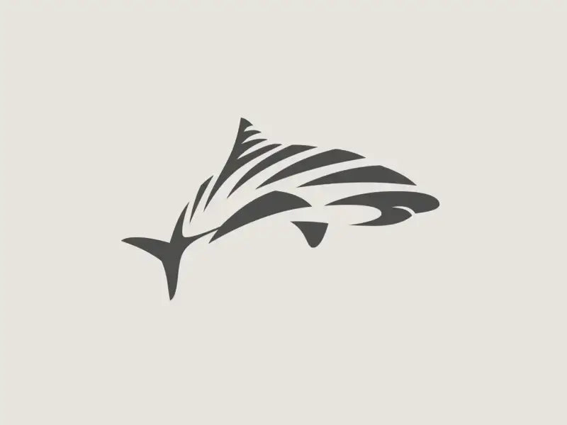
Source: Artvin, tigershark, Dribbble, https://dribbble.com/shots/10469054-tigershark

Source: Awoga Ranger, Shark Ambigram Line Art Logo, Dribbble, https://dribbble.com/shots/19688051-Shark-Ambigram-Line-Art-Logo

Source: Gymshark, Gymshark Rebrand 11.11.20, Dribbble, https://dribbble.com/shots/14559321-Gymshark-Rebrand-111120

Source: Tom Anders Watkins, Shark Logo, Dribbble, https://dribbble.com/shots/5256670-Shark-Logo

Source: Yoga Perdana, S Shark, Dribbble, https://dribbble.com/shots/6480036-S-Shark

Source: Ikhwan Hakim, Shark Logo, Dribbble, https://dribbble.com/shots/3580825-Shark-Logo

Source: Yoga Perdana, Shark, Dribbble, https://dribbble.com/shots/6471661-Shark
What Are The Key Elements Of A Successful Shark Logo Design?
Designing a shark logo design that truly stands out requires a blend of creativity, strategy, and attention to detail. Sharks symbolize strength, agility, and precision, so capturing these qualities is essential to crafting a logo that resonates with your audience. Here are five key elements to keep in mind when creating a successful shark logo design:
Striking Silhouette
The silhouette is the heart of any shark logo design. Sharks have an instantly recognizable shape, with their streamlined body, dorsal fin, and fierce tail. Using a clean and bold silhouette ensures that the design is easily identifiable, even at smaller sizes. Whether you choose a full-body profile or a minimalist dorsal fin cutting through waves, the shape should capture the essence of a shark’s power and motion.
Dynamic Movement
A successful shark logo design often incorporates a sense of movement. Sharks are known for their speed and fluidity, so your logo should reflect that energy. Curved lines, swirling waves, or a dramatic swoop of the shark’s body can bring the design to life. This dynamic quality not only adds visual interest but also communicates vitality and determination.
Purposeful Color Choices
Colors play a significant role in shaping the mood and message of your shark logo design. Blues and teals are popular choices, evoking the ocean and a sense of trustworthiness. However, don’t shy away from bold colors like black, red, or metallic tones for a more aggressive or luxurious feel. The right color palette should align with your brand’s personality while enhancing the shark imagery.
Versatility And Scalability
A successful shark logo design should be versatile enough to work across various applications. Whether it’s on a business card, a billboard, or a social media icon, the design should maintain its clarity and impact. Simplicity is key—avoid overly intricate details that might get lost when the logo is scaled down. A versatile design ensures your shark logo remains powerful in any setting.
Integration Of Brand Identity
While the shark is the focal point, it’s important to ensure the logo aligns with your overall brand identity. Think about how the shark can represent your business values. For instance, a tech company might emphasize sleek and modern elements, while a seafood brand might incorporate water-themed accents. Balancing the shark imagery with typography, complementary elements, and your brand’s unique flair is crucial for a cohesive design.
A successful shark logo design is much more than just an image of a shark—it’s a representation of your brand’s strength, confidence, and vision. By focusing on elements like striking silhouettes, dynamic movement, purposeful colors, versatility, and brand integration, you’ll create a design that’s not only visually stunning but also deeply meaningful.
What Are Some Creative Ideas For Shark Logo Designs?
Designing a shark logo is like diving into a world of endless possibilities. Sharks are powerful, sleek, and iconic, which makes them a fantastic subject for creative logo designs. If you’re looking to make your brand stand out, here are five innovative ideas to inspire your shark logo design:
Combine Sharks With Other Symbols
One of the most creative approaches to shark logo design is combining the shark with another symbol that represents your brand. For instance, a shark with a lightning bolt for a tail conveys speed and energy, while a shark fused with a mountain silhouette can signify adventure and resilience. By merging the shark’s image with relevant elements, you create a logo that’s unique and memorable.
Play With Negative Space
Negative space is a designer’s best friend, and it works beautifully in shark logo designs. Use the negative space within the shark’s body or surroundings to include hidden images, letters, or shapes. For example, the curve of a shark’s dorsal fin could subtly form a wave, or the space between its jaws could reveal a brand’s initials. This technique adds an extra layer of intrigue and sophistication to your logo.
Create Abstract Shark Shapes
Abstract designs allow you to represent a shark without being overly literal. Think of sleek, angular shapes or fluid lines that hint at a shark’s form. For example, a bold, swooping line could represent the shark’s movement through water. Abstract shark logo designs are perfect for tech companies or modern brands looking for a contemporary edge.
Incorporate Ocean Elements
Since sharks are closely tied to the ocean, integrating water-themed elements into your shark logo design can enhance its appeal. Consider blending the shark with waves, bubbles, or even coral reefs. A shark swimming through a spiral wave or leaping out of a splash adds depth and energy to the design. This approach is especially effective for brands related to water sports, marine conservation, or coastal living.
Add A Human Touch
To make your shark logo design stand out, consider adding a human element. For example, a shark wearing a captain’s hat or holding a fishing rod introduces a playful and approachable vibe. You could even go for a superhero-themed shark with a cape and emblem. These whimsical touches work well for brands targeting younger audiences or those looking for a fun and quirky image.
A shark logo design is more than just an image of a shark—it’s an opportunity to create something truly unique and meaningful for your brand. By combining sharks with symbols, using negative space, experimenting with abstract forms, adding oceanic touches, or giving your shark a human twist, you can craft a logo that’s as dynamic and bold as the shark itself.
What Shapes Work Best for Logo Design, Shark Motifs?
When it comes to logo design, shark motifs are all about power, precision, and sleekness. Choosing the right shapes can either turn your shark into a bold brand icon or a fishy flop. The goal? Make your shark feel fast, fearless, and unforgettable. Here are five shape ideas that work brilliantly for shark-themed logos:
Streamlined Curves That Mimic Speed
Sharks are built for speed, and using elongated curves can capture that movement perfectly. Think of the arc of a dorsal fin or the bend of a shark’s body mid-swim. These sleek, aerodynamic shapes help evoke motion and grace without making the logo feel static. If your brand wants to communicate agility or stealth, this is the shape language to use.
Triangles and Angular Fins for Edge
Triangles are sharp, just like shark teeth—and that makes them a great visual metaphor. Triangular dorsal fins, jagged tails, or even teeth silhouettes instantly give a logo a sense of aggression and strength. These shapes work especially well for brands that want a strong, daring image—think extreme sports, security companies, or energy drinks.
Circular Layouts for a Polished Feel
Even the fiercest sharks can look refined when enclosed in a circular or oval logo. This shape balances the intensity of shark elements with a harmonious, contained composition. It’s perfect for modern, clean branding—especially if you want the shark to feel approachable yet powerful. Try using a shark fin breaking a circular frame or a side profile swimming inside an emblem.
Negative Space Tricks
Some of the smartest shark logos use negative space to hint at the creature. The shape of a bite taken out of a letter, a fin implied by a simple slash, or the silhouette of a shark hidden inside another object—these tricks make your logo both memorable and clever. Negative space works best with minimalistic styles but adds a big impact in brand recognition.
Asymmetrical Compositions for Dynamic Energy
Symmetry can feel a bit too tame when you’re dealing with a creature as intense as a shark. Asymmetrical shapes—like an off-center shark tail or a sweeping body curve that breaks the frame—add excitement and forward momentum. This technique works well when you want your logo to feel bold, original, and full of movement.
Using the right shapes in logo design, shark motifs can go from simply cool to totally iconic. Whether you're emphasizing stealth with curves, attitude with triangles, or creativity with negative space, these shapes help your shark logo rise above the rest—without needing a splashy entrance.
What Fonts Pair Nicely With Logo Design, Shark Symbols?
Shark-themed logos already come with serious bite—so choosing the right font can take them from fierce to unforgettable. Whether you're swimming in minimalist waters or cruising toward a bold branding statement, the typeface you choose should match the energy of the shark symbol. From sharp serifs to stealthy sans-serifs, here are five font styles that pair brilliantly with logo design, shark symbols.
Bold Sans-Serif Fonts for a Strong Statement
Clean, heavy sans-serif fonts like Impact, Anton, or Bebas Neue are powerhouses when paired with shark visuals. These fonts offer a modern, aggressive vibe that mirrors the intensity of the shark. Their blocky, commanding presence makes sure your brand name doesn't get overshadowed by the artwork. Perfect for sports teams, energy drinks, or tech brands that want to assert dominance.
Angular Display Fonts With Bite
Nothing screams “shark” more than angles. Fonts with jagged or slanted features like Ethnocentric, Exo Black, or Blade Runner create a visual echo of sharp fins or razor teeth. These fonts pair beautifully with shark icons because they amplify the edge and danger associated with the creature. Great for branding that leans toward adrenaline, speed, or deep-sea mystery.
Sleek Modern Fonts for Futuristic Fins
Sharks are sleek predators, and some brands want their logo to reflect that sense of stealth and sophistication. Fonts like Orbitron, Rajdhani, or Eurostile convey high-tech precision while still maintaining a readable, elegant look. These pair well with minimalist shark silhouettes or abstract fin icons—especially for innovation-driven companies or underwater tech ventures.
Distressed or Grunge Fonts for Rugged Appeal
Want your shark logo to feel a little more raw and wild? Try pairing it with fonts like TrashHand, Capture It, or Rogue Sans. These distressed typefaces bring a textured, weathered feel—like they’ve survived the ocean's roughest storms. Ideal for ocean conservation groups, apparel brands, or any design that leans into survival, adventure, or rebellion.
Rounded Fonts for a Friendly Twist
Not all sharks need to terrify! For brands aimed at kids or family-friendly audiences, rounded fonts like Fredoka One, Baloo, or Comic Neue soften the shark’s reputation. These fonts pair best with cartoon-style shark illustrations and help balance toothy visuals with an approachable tone. Think aquariums, surf shops, or children’s swim gear brands.
Choosing the right font is like choosing the right waters to swim in—it defines the whole experience. With logo design, shark symbols offer a bold starting point, and the font you choose either amplifies their power, tempers their bite, or adds unexpected charm. Match the mood, mirror the motion, and you’ll have a logo that swims circles around the competition.
What Are the Best Backgrounds for Logo Design, Shark Concepts?
Designing a shark-themed logo is already thrilling, but the background can make or break the whole vibe. The right setting turns your logo from just another underwater cliché into a showstopper with depth and bite. Whether you're aiming for fierce and wild or modern and sleek, the backdrop helps sell the entire story. Here are five jaw-some background ideas to make your logo design, shark-focused, truly stand out:
Deep Blue Gradients for Depth and Drama
Few things scream “shark” louder than the deep ocean. A background that fades from navy to teal mimics the mysterious vastness of open water, instantly creating atmosphere. These gradients suggest depth, stealth, and that signature lurking feeling—perfect for when your logo needs to feel bold and a bit dangerous. It’s a no-fail canvas for dark shark silhouettes or glowing accent colors like white or electric blue.
Wave Patterns and Fluid Motion
Want to capture the shark’s motion and energy? Abstract wave patterns or rippling lines can simulate the dynamic movement of the sea. These backgrounds add visual texture without overpowering your logo. Choose soft curves for a sleek, modern design, or sharp, choppy lines to add intensity. It’s an especially great fit if your shark represents speed, precision, or dominance in motion—think racing, performance, or aquatic sports.
Minimalist Monochrome for High Impact
Sometimes, the strongest bite comes with the cleanest look. A solid black, white, or grayscale background can spotlight your shark without distractions. This works wonders when the logo has detailed line work, geometric patterns, or clever negative space. Monochrome settings add sophistication and let the shape and identity of the shark do all the talking. Plus, it keeps the design ultra-adaptable across print, digital, or apparel.
Textured Ocean Surfaces or Foamy Water
A rough ocean texture or splashy surface design can bring a tactile, visceral feel to shark logos. Imagine background visuals that feel like saltwater mist or the foamy chaos of waves crashing—these designs scream action. They're perfect for more aggressive branding styles or themes tied to adventure, marine survival, or rough-and-tumble athleticism. Add some texture and suddenly your logo isn’t just seen—it’s felt.
Coral Reefs and Marine Elements for Depth
For brands leaning toward education, conservation, or environmental messaging, incorporating coral reefs, seaweed, or fish silhouettes in the background helps establish a sense of place. These softer, more detailed scenes give context to your shark while allowing for storytelling. They work especially well when the shark isn’t the villain, but a respected force of nature—ideal for wildlife groups, aquariums, or eco-tourism brands.
In logo design, shark imagery is already powerful—but the background? That’s the secret sauce. It sets the stage, defines the mood, and amplifies your message. Whether you’re after stealth, strength, motion, or meaning, choosing the right background ensures your shark doesn’t just swim—it dominates the design waters.
Conclusion
In logo design, shark motifs demand more than just a fierce icon—they thrive with the right visual context. The background you choose plays a crucial role in shaping the mood and reinforcing the message. Whether it's deep ocean gradients, bold monochrome, or energetic waves, each backdrop adds meaning to the shark's presence. From powerful branding to sleek professionalism, your design's success hinges on how well all elements—especially the background—work together. Thoughtful choices lead to logos that are not only visually striking but also memorable. With the right background, your shark logo will leave a lasting impression and swim ahead of the competition.
Let Us Know What You Think!
Every information you read here are written and curated by Kreafolk's team, carefully pieced together with our creative community in mind. Did you enjoy our contents? Leave a comment below and share your thoughts. Cheers to more creative articles and inspirations!





Leave a Comment