30 Best Retro Poster Design Ideas You Should Check

Source: Bezerkartwerk, You Know I'm No Good, Instagram, https://www.instagram.com/p/CuphwURsEIR/
Step into the vibrant time machine of retro poster design and let’s bring the groovy past back to life with a modern twist! Whether you’re looking to spice up your workspace or add a pop of vintage flair to your home decor, embracing retro poster design is like flipping through a visually stunning history book. In this article, we’re diving deep into a collection of the most eye-catching and creative retro poster ideas that not only pay homage to bygone eras but also infuse them with a fresh, contemporary vibe.
From the psychedelic swirls of the ‘70s to the bold geometric patterns of the ‘80s, prepare to be inspired by designs that make you want to pull out your vinyl collection and throw on some bell-bottoms. So, let’s crank up the nostalgia and explore how these timeless aesthetics can be repurposed to enchant the modern viewer and make any space a little more rad!
Retro Poster Design Ideas

Source: Bezerkartwerk, The Smiths, Instagram, https://www.instagram.com/p/CeSxmeiuQgO/

Source: Bezerkartwerk, Hellfire Club, Instagram, https://www.instagram.com/p/CfjnKt1D8em/

Source: Thecarapalida, Instagram, https://www.instagram.com/p/CHdn2KJgncw/

Source: Rygalski_studio, Instagram, https://www.instagram.com/p/CuhTi0vsPM8/

Source: Midcentury_belgrade, Instagram, https://www.instagram.com/p/CuWZWVOMe-c/

Source: Bezerkartwerk, Instagram, https://www.instagram.com/p/CuUNZn8szwA/

Source: Poulettodesign, Instagram, https://www.instagram.com/p/CtLp9w0I4_Q

Source: Jptriedtobecreative, Be the Crispiest, Instagram, https://www.instagram.com/p/CvoT6X6S5MJ/

Source: Karinlevinkonstnar, Instagram, https://www.instagram.com/p/Cqi-DfArQ50/

Source: 50s_vintage_dame, Instagram, https://www.instagram.com/p/CdF4CPEBh6Q/

Source: Replico_patterns, Papaya, Instagram, https://www.instagram.com/p/Cvz5waZqh22/
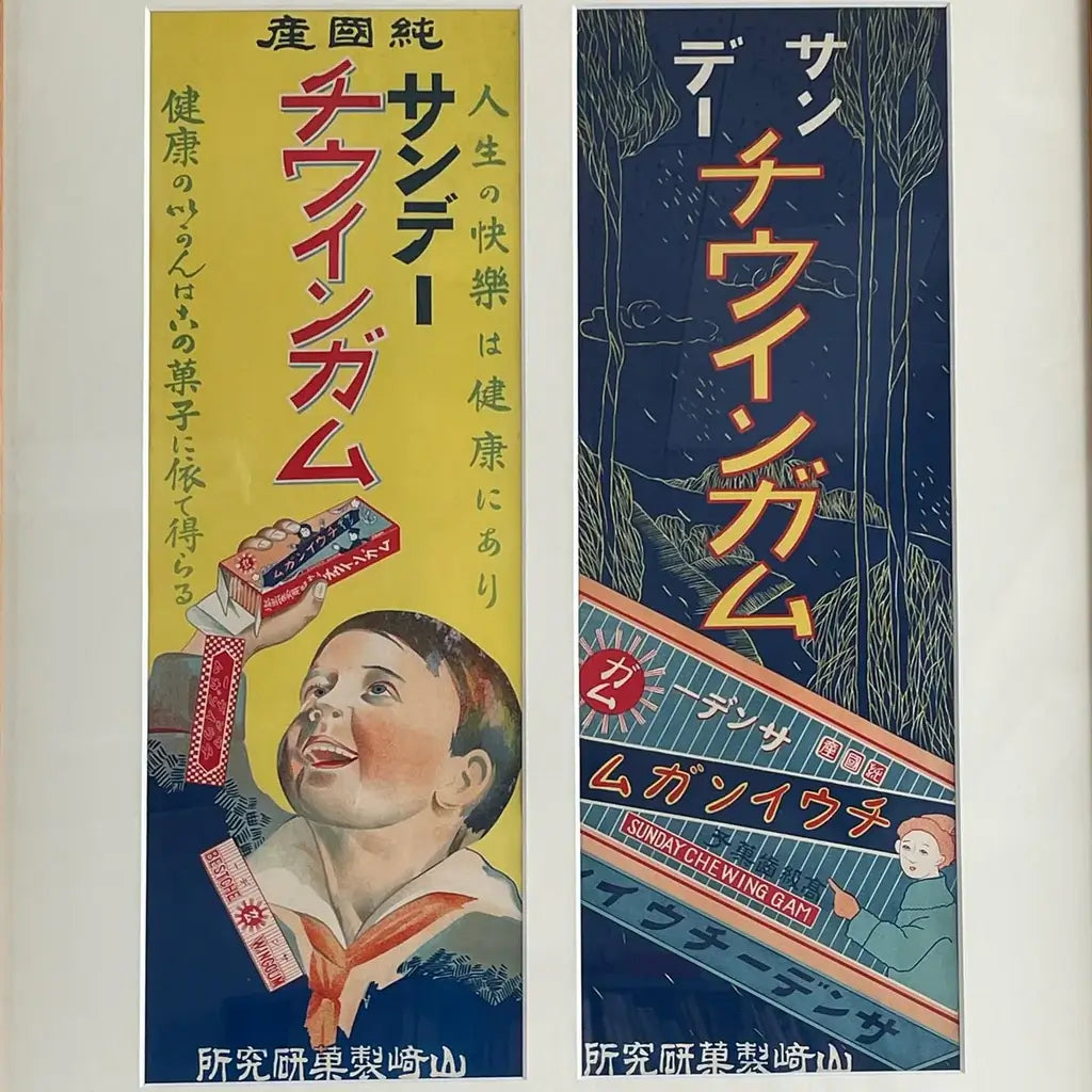
Source: Hourou_taro, Instagram, https://www.instagram.com/p/CrYIeaaJmQI/

Source: By_aimgee, Instagram, https://www.instagram.com/p/CwZ-IHCs9FP/

Source: Kartikgfx11, Instagram, https://www.instagram.com/p/Ct8rDwhvjJo/

Source: Bezerkartwerk, Now I am become Death, Instagram, https://www.instagram.com/p/CvhYeghsRAT/

Source: _da_hong, Instagram, https://www.instagram.com/p/Ct-6ZasvT5O/

Source: Stultsified, Instagram, https://www.instagram.com/p/CieRZawsFsP/

Source: Steve Turner, The Supremes: Where Did Our Love Go, Instagram, https://www.instagram.com/p/C_zz5EDsVCa/

Source: Pedro_demetriou, Instagram, https://www.instagram.com/p/CIgvKwmBVld/

Source: Canadianarmy, Passwords and Passphrases, Instagram, https://www.instagram.com/p/CGiFPVylRzx/

Source: Wildfeverstudio, Instagram, https://www.instagram.com/p/Cv9Jo18tnmp/

Source: Bezerkartwerk, Tony Bennett, Instagram, https://www.instagram.com/p/Cu_7ve7M0RD/

Source: Bezerkartwerk, Together in Electric Dreams, Instagram, https://www.instagram.com/p/Cvu9qr8Mjuh/

Source: Bezerkartwerk, Red Hulk, Instagram, https://www.instagram.com/p/CujfbgIsAbt/

Source: Pat Johnson, Hyunda Chroma, Dribbble, https://dribbble.com/shots/23872100-Hyunda-Chroma-Poster

Source: Lilstupizstudio, Instagram, https://www.instagram.com/p/DCLQM3TztDn/

Source: Flaviu Pop, Deadpool 3, Instagram, https://www.instagram.com/p/CuiGkowMAeH/

Source: Osheyi.A, Instagram, https://www.instagram.com/p/C6g0I5_irZ6/

Source: Davi Alves, Cuphead Season 2, Instagram, https://www.instagram.com/p/CaqI6jTPCmY/

Source: Bezerkartwerk, You Know I'm No Good, Instagram, https://www.instagram.com/p/CuphwURsEIR/
What Are the Key Characteristics of Retro Poster Design?
Retro poster design isn't just a nod to the past; it's a full-blown revival that brings old-school charm into the present with flair and fun. When you dive into the world of retro poster design, you're stepping into a vibrant kaleidoscope of colors, fonts, and styles that encapsulate decades gone by. Here are five key characteristics that define the essence of retro poster design, ensuring your creations resonate with a touch of nostalgia while captivating today's audience.
Bold and Nostalgic Color Palettes
One of the most distinctive features of retro poster design is its use of color. Vibrant, bold, and often contrasting hues create a visual pop that's hard to ignore. Think of the mustard yellows, avocado greens, and bright oranges that scream the '60s and '70s. These colors aren’t just chosen at random; they evoke a sense of nostalgia and bring back the essence of the eras they represent, making the design instantly recognizable and emotionally resonant with those who have a fondness for those times.
Distinctive Typography
The fonts used in retro poster designs often have a strong personality. Whether it's the curvy, cursive scripts of the 1950s, the chunky and bold lettering of the '70s, or the pixelated typefaces of the early '90s, typography in retro designs does more than convey information—it sets the mood. These fonts are usually big, bold, and in your face, sometimes with a shadow or an outline, to make them pop even more against the background.
Iconic Imagery and Symbols
Retro poster designs frequently incorporate imagery that is symbolic of the era they represent. Whether it’s a vinyl record, a classic car silhouette, or a peace sign, these symbols serve as quick visual shorthand that transports the viewer back in time. The imagery is not only about celebrating the aesthetic of the era but also about encapsulating the cultural and societal norms of the time, giving the poster a deeper contextual meaning.
Simplified and Stylized Layouts
Unlike modern design which can thrive on minimalism, retro poster design often features simplified, yet highly stylized layouts. These compositions are typically more straightforward and less cluttered than contemporary designs, focusing on one central piece of artwork or a dominant headline. The stylization comes from how the elements are handled—with exaggerated proportions, stylized illustrations, and sometimes even a cartoonish flair that adds a whimsical quality to the visuals.
A Touch of Kitsch
There’s often an element of kitsch in retro designs, which plays on ironic humor and nostalgia. This can be seen in the exaggerated emotions of the characters, the overtly dramatic copy, or the inclusion of elements that might seem outdated or cheesy by today’s standards but were all the rage back in the day. This playful nod to the past often brings a smile and a sense of warmth, making the poster engaging and memorable.
By mastering these key characteristics, your retro poster design won't just be a throwback—it will be a celebration of an era, reimagined for today's audience. So, let your creative juices flow, and let's bring some retro magic back to life in your design project!
Which Color Palettes Are Most Popular in Retro Poster Design?
The right palette can whisk you away to a different era, evoking the emotions and aesthetics of days long gone. Whether you're channeling the psychedelic '60s or the neon-lit '80s, choosing the right color palette is crucial for capturing the spirit of the past. Here’s a look at five color palettes that dominate the world of retro poster design, each offering its own unique brand of nostalgia.
Psychedelic Saturations
Dive into the '60s and '70s with colors that are as bold and radical as the times they represent. Think of saturated oranges, vibrant yellows, deep purples, and electric blues. This palette is all about high energy and visual impact, mirroring the revolutionary spirit of the counterculture movements. These colors weren't just popular; they were statements of freedom and rebellion, often swirling together in patterns that seemed to pulse and move before your eyes.
Earthy '70s Tones
As we roll into the '70s, the color palette shifts to more grounded, natural tones. Earthy browns, warm oranges, muted greens, and mustard yellows create a cozy, laid-back vibe that reflects the decade’s turn towards nature and simplicity. This palette is perfect for designs that aim to evoke a sense of calm nostalgia and a return to basics, mirroring the rustic aesthetics popular in interior design and fashion during this time.
Pastel Pop of the ‘80s
Fast forward to the '80s, where pastels took center stage. Soft pinks, baby blues, light lavenders, and minty greens offer a softer take on the boldness of previous decades. These hues are often associated with the optimistic, pop-culture-driven atmosphere of the '80s, found in everything from blockbuster movie posters to fashion trends. Utilizing these colors in retro poster designs can evoke a playful, youthful vibe that’s both charming and chic.
Neon Nights
No exploration of retro color palettes would be complete without the iconic neons of the late '80s and early '90s. Bright pinks, glowing greens, electric blues, and radical reds capture the vibrant nightlife and the burgeoning digital age. These colors work exceptionally well for designs that aim to reflect the high-energy, party vibes of the era—perfect for posters of dance clubs, music events, or any subject matter that aims to be loud and lively.
Monochrome and Sepia
Stepping further back in time, the early 20th century offers a monochrome and sepia-toned palette that speaks to the age of black and white photography and early cinema. These shades range from deep blacks to soft whites, with varying tones of sepia adding warmth and a sense of antiquity. This palette is ideal for retro designs that aim to evoke a sense of history and nostalgia, giving a poster a timeless, classic look that harks back to a simpler era.
Each of these color palettes offers a unique way to channel the past through your retro poster design, providing not just a visual feast but a visceral connection to the eras they represent. So pick your palette, and let's paint the town retro!
What Fonts Are Best for Retro Poster Design?
Choosing the right font for a retro poster design can be like picking the perfect outfit for a themed party: it sets the tone, invites the right kind of attention, and makes everything more fun! In the world of retro poster design, fonts play a pivotal role in conveying the era and mood you’re aiming to evoke. Here are five types of fonts that are not only popular but practically scream retro, ensuring your posters look authentically old-school while still appealing to modern tastes.
Groovy 70s Style Fonts
When you think of the '70s, images of bell bottoms, disco balls, and funky music posters come to mind. Fonts that capture this vibe are often curvy, bold, and have a fluid, groovy feel to them. Think of typefaces like 'Cooper Black,' which exudes a soft, rounded feel that’s unmistakable for anything but the '70s funk and soul scenes. Or 'Fat Frank,' a heavyweight champion of fonts that is both playful and impactful, perfect for headlines that need to grab attention.
Art Deco Elegance
Jump back to the 1920s and '30s, and the Art Deco style dominates with its elegance and sophistication. Fonts in this category, like 'Metropolis' or 'Cinzel,' feature sharp, clean lines and geometric forms that reflect the glamour and forward-thinking optimism of the era. These fonts are perfect for designs that aim to evoke luxury, class, and a high-energy cosmopolitan vibe, ideal for event posters or movie titles from the roaring '20s.
Psychedelic Typefaces
Psychedelic fonts mirror the art and culture of the late '60s and early '70s, characterized by swirling contours and shapes that seem to move before your eyes. Fonts like 'Bell Bottom' and 'Hippie Movement' offer exaggerated letterforms with irregular baselines and odd shapes, making them perfect for music or event posters intended to express freedom, rebellion, and the psychedelic rock era.
Chunky Block Letters
Moving into the bolder, more assertive era of the '80s, chunky block fonts come into play. These are characterized by their heavy, compact letterforms and often a somewhat squarish appearance, such as 'Impact' or 'Haettenschweiler.' These typefaces are perfect for posters that need to make a strong impact with just a glance, fitting for anything from concert announcements to film titles.
Retro Script Fonts
For a touch of nostalgia that harks back to the 1950s and '60s, retro script fonts like 'Lobster' and 'Pacifico' offer beautiful cursive details that mimic hand-painted lettering. These fonts are imbued with a sense of warmth and personal touch, ideal for designs that require a more intimate, homemade feel, such as café menus, wedding posters, or vintage clothing sales.
Incorporating these fonts into your retro poster designs can transport viewers back in time, offering them not just a visual but an emotional experience. So, go ahead and choose a font that not only matches the era you’re celebrating but also communicates the vibe you want to convey. Let your type speak volumes, and the rest of your design will dance right along with it!
What Are Some Common Themes in Retro Poster Design?
Retro poster design is like a time capsule, each piece a splash of the past, bringing with it all the flair, sentiment, and style of bygone eras. These designs serve not just as decorative art but as cultural snapshots that tell the story of different decades. Here, we explore five common themes that frequently pop up in retro poster design, each packed with nostalgia and styled with the unmistakable charm of its time.
Music and Concerts
Music is a powerful nostalgic force, and retro posters often celebrate this by showcasing iconic bands, legendary concerts, and music festivals of the past. These posters can range from the psychedelic rock concerts of the 1960s, featuring swirling, vibrant colors and trippy fonts, to the punk rock scenes of the 1970s and '80s, characterized by stark, bold imagery and gritty text. This theme captures the spirit of the music era it represents, making it a perennial favorite in retro design.
Travel and Tourism
Vintage travel posters are a window to the world, as seen through the lens of past decades. They often feature exotic destinations, with vibrant illustrations of landscapes and landmarks, styled in the optimistic tones of the mid-20th century. The use of bright, inviting colors and simple yet striking graphics invites the viewer to a bygone era of travel—luxurious ocean liners, glamorous air travel, and the classic family road trip.
Film and Entertainment
Retro film posters are a celebration of cinema's golden ages, from the silent films of the 1920s to the colorful blockbusters of the '80s. These posters often utilize dramatic imagery and bold typography to capture the essence of the movie and its era. Whether it’s a noir-style illustration or a flashy, neon-lit action movie poster, the theme is always about drawing the viewer into the cinematic world.
Advertising and Product Promotion
Commercial art in retro poster design showcases the advertising styles of different periods. This includes everything from the minimalist, elegant perfume advertisements of the early 20th century to the bold, catchy slogans of the '50s and '60s consumer boom. These posters not only promote products but also reflect the aesthetic tastes and economic climate of their times, making them fascinating cultural artifacts.
Political and Social Movements
Posters have been powerful tools for political and social movements throughout the 20th century. Retro designs in this theme often carry strong messages and use compelling visuals to advocate for change. From wartime propaganda posters to the civil rights and peace movements, these works are charged with emotion and are designed to inspire, motivate, and sometimes confront the viewer.
These common themes in retro poster design not only provide a feast for the eyes but also tell stories of their times, making them timeless pieces that resonate with audiences across generations. Whether you're creating a poster for a modern event with a retro twist or simply celebrating the aesthetic of a past decade, these themes offer endless inspiration and a rich palette to draw from.
What Are The Best Layouts For Retro Poster Design?
When it comes to retro poster design, the layout is your stage and the elements you choose to feature are your cast. Crafting the perfect retro poster means selecting a layout that not only captures the essence of the era but also highlights your message in a fun, eye-catching way. Let’s groove through five dynamic layouts that have proven to be stars in the retro design scene, ensuring your posters look anything but outdated.
The Central Figure Layout
Often seen in mid-century advertising and movie posters, this layout focuses on a single, central figure—be it a person, product, or an illustration—that dominates the design. The central figure is usually surrounded by minimal text or complementary graphic elements that frame and draw attention to the main subject. This layout works great for designs aiming to highlight a particular character, product, or event, as it directs all eyes to the star of your show.
The Asymmetrical Balance
Breaking away from the predictable, asymmetrical layouts use contrast and unexpected placement of elements to create visual interest and movement. This style was particularly popular in the psychedelic posters of the 1960s and 1970s, where text and images intermingle to form an engaging, fluid composition that appears to move before your eyes. This layout is perfect for creative, artsy themes that aim to captivate and mesmerize the audience.
The Grid System
Harking back to the Swiss and Bauhaus movements, the grid system offers a clean, organized way to structure your retro poster. This layout is characterized by its use of clean lines and geometric shapes, often used in the 1920s-1940s, providing a sense of order and clarity. It’s particularly effective for educational or informational posters where hierarchy and ease of information are key.
The Split Design Layout
This layout divides the poster into distinct segments, often with contrasting colors or images, to represent dual themes or highlight multiple aspects of a single subject. It was a common sight in the groovy '70s and '80s, perfect for showcasing before-and-after stories, comparative advertisements, or just a stylish way to incorporate multiple messages in one visually cohesive poster.
The Panoramic Scene
Capturing the expansive, often idyllic landscapes seen in vintage travel posters, the panoramic scene layout stretches across the poster, offering a wide, immersive view. This layout uses depth and perspective to draw the viewer into the scene, making it ideal for posters aimed at transporting the audience to another time or place—be it a sunny beach in the '60s or a bustling city street in the '50s.
Each of these retro poster layouts offers a unique way to tell your story, engage your audience, and keep the spirit of the past alive in your designs. By choosing the right layout for your message and style, you can ensure that your retro poster is not only a nod to the past but a standout piece in the present. So, let’s get designing and make those old-school vibes shine with modern brilliance!
Conclusion
Mastering retro poster design is about more than just aesthetics; it’s about capturing a moment in time and communicating it effectively to today's audience. Whether you opt for bold central figures, engaging asymmetrical compositions, structured grids, contrasting split designs, or expansive panoramic scenes, each layout offers unique opportunities to infuse nostalgia into your creations. By embracing these classic design principles, you can create retro posters that are both a tribute to the past and a vibrant, relevant piece of current visual culture. Dive into the colorful world of retro poster design and let the old inspirations fuel new innovations.
Let Us Know What You Think!
Every information you read here are written and curated by Kreafolk's team, carefully pieced together with our creative community in mind. Did you enjoy our contents? Leave a comment below and share your thoughts. Cheers to more creative articles and inspirations!





Leave a Comment