
30 Best Raspberry Illustration Ideas You Should Check

Source: Molly Benson, Dribbble, https://dribbble.com/shots/15714330-Raspberries
A splash of color and a hint of whimsy can turn an ordinary sketch into something unforgettable, and raspberry illustration is the perfect proof of that. From playful doodles bursting with bright reds to elegant botanical renderings, the world of raspberry illustration offers endless inspiration for artists and designers alike. Whether you are crafting a vibrant food poster, designing a charming kitchen pattern, or building a fresh concept for packaging, raspberries bring a cheerful vibe that feels both lively and natural.
This article gathers some of the best raspberry illustration ideas to check, each brimming with personality and clever details. You will find bold modern graphics, soft watercolor blends, and even quirky character concepts where raspberries seem ready to leap off the page. It is a delightful blend of art styles that highlight how versatile this tiny fruit can be in creative design. With their iconic shape and rich texture, raspberries are more than just a tasty treat; they are a design element packed with energy and charm. Get ready to let these raspberry-inspired visuals spark your imagination and brighten your next project in ways you never expected.
Raspberry Illustration Ideas
Source: JessieSchutter, DeviantArt, https://www.deviantart.com/jessieschutter/art/Berries-1000876993

Source: Silvia Cornea, Dribbble, https://dribbble.com/shots/19582249-Raspberry

Source: Bojana Rank, Hotel Indigo, Behance, https://www.behance.net/gallery/192060675/Hotel-Indigo-Music-Program-Posters

Source: 산 구구, The Harvest of Wild Raspberries, Behance, https://www.behance.net/gallery/222300515/The-Harvest-of-Wild-Raspberries

Source: Yuliya Miasnikova, Dribbble, https://dribbble.com/shots/23596918-Raspberry

Source: Fiorella Silva, Behance, https://www.behance.net/gallery/113936359/Raspberries

Source: Яна Михалко, Behance, https://www.behance.net/gallery/34605003/Raspberries-illustration

Source: Gaudibuendia, DeviantArt, https://www.deviantart.com/gaudibuendia/art/Raspberry-dragon-583946195

Source: Preih, DeviantArt, https://www.deviantart.com/preih/art/raspberry-920863827

Source: Trixiefox, DeviantArt, https://www.deviantart.com/trixiefox/art/Raspberries-776426826

Source: Peachylight, Raw Raspberry Cheesecake, DeviantArt, https://www.deviantart.com/peachylight/art/Raw-Raspberry-Cheesecakes-903218273

Source: Martahutchenko, DeviantArt, https://www.deviantart.com/martahutchenko/art/Raspberry-938951303

Source: Elenacomtestudio, Instagram, https://www.instagram.com/p/Csm4vOmON9I

Source: Ami.illustrations, Instagram, https://www.instagram.com/p/CxGX5HRKVie/

Source: Elena Garusova, Behance, https://www.behance.net/gallery/153793157/Raspberry

Source: Anna Suprunenko, Cakes & Berries, Behance, https://www.behance.net/gallery/23998089/Cakes-Berries

Source: Anastasia Goncharova, Behance, https://www.behance.net/gallery/111342089/Raspberry-watercolor

Source: Conniegg316, Instagram, https://www.instagram.com/p/B3DRxR4JPmo/

Source: Hwillustrator, Instagram, https://www.instagram.com/p/CDOVH4fndbp

Source: Channarong Pheangjanda, Behance, https://www.behance.net/gallery/67304033/Berry-fruit-vintage-illustration

Source: Michael Mongravery, Behance, https://www.behance.net/gallery/182998743/Raspberry-illustration-in-engraving-style

Source: Kate_letters_lots, Instagram, https://www.instagram.com/p/CvfK-jJL-TS/

Source: Kelseypaintz, Instagram, https://www.instagram.com/p/ChDmS2JOi2a/

Source: Science_visuals, Instagram, https://www.instagram.com/p/CeUd0wwuJod/

Source: Lisazhou_art, Instagram, https://www.instagram.com/p/B_Bc1vvAeN6/

Source: Aurora Kilbey, The Raspberry Farm, Behance, https://www.behance.net/gallery/211438621/The-Raspberry-Farm

Source: Daria.rosso.art, Instagram, https://www.instagram.com/p/CnG9Dh7sUIU

Source: Bloemkolie, Instagram, https://www.instagram.com/p/C4GLmyMIDMg/

Source: Makobush, DeviantArt, https://www.deviantart.com/makobush/art/Mouse-with-raspberries-922342877

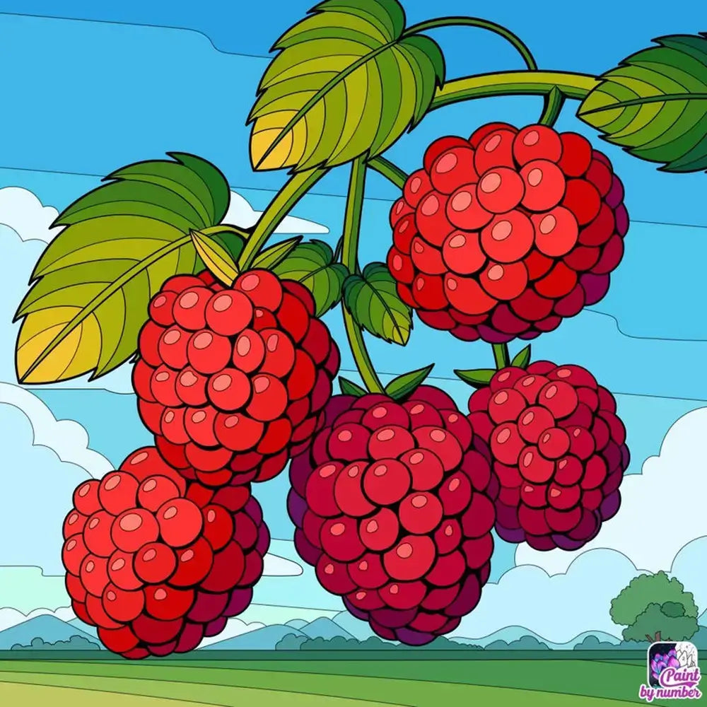
Source: Molly Benson, Dribbble, https://dribbble.com/shots/15714330-Raspberries
What Color Palettes Work Best For Raspberry Illustration?
When planning a raspberry illustration, color choices can make the entire piece pop with life or fall flat in an instant. The charm of raspberries lies in their juicy tones, playful highlights, and the way they interact with surrounding hues. Below are five exciting palette ideas that can make your raspberry illustration stand out in a fun and unique way.
Rich Berry Reds And Magentas
A raspberry illustration often thrives on deep berry reds and magentas that instantly feel luscious and ripe. These shades capture the fruit’s natural vibrancy and help each tiny drupelet appear three‑dimensional. Mixing in a few lighter pinks as highlights can add a delicious shine, making your berries appear fresh and full of flavor.
Soft Pastels For A Dreamy Look
For a whimsical or romantic vibe, try a palette of soft pastel pinks, muted lavenders, and powdery peach tones. This approach transforms a raspberry illustration into something almost ethereal. Pairing these light tones with delicate white accents can create a dreamy, airy composition perfect for stationery, wallpapers, or gentle kitchen art.
Bold Greens And Contrasting Reds
Nothing complements a raspberry illustration like the leaves and stems that frame it. Bold, earthy greens mixed with crisp reds create a striking contrast. This combination not only highlights the berries but also gives your piece a natural, garden‑fresh energy. Think of bright spring leaves and sunlit berries ready to pick.
Vintage Sepia And Warm Browns
For a nostalgic twist, use a palette inspired by old botanical prints. Warm browns, faded reds, and sepia undertones can give your raspberry illustration a timeless, hand‑drawn charm. Add subtle beige or parchment textures, and your artwork instantly feels like it belongs in an antique recipe book or vintage label collection.
Neon Highlights For A Modern Edge
If you want your raspberry illustration to break tradition, consider splashing in neon pinks, electric purples, and even touches of fluorescent yellow. These unexpected accents can turn a simple berry drawing into a bold art statement. The glow effect draws attention, making your raspberries feel playful, edgy, and contemporary.
Experimenting with these palettes allows you to give your raspberry illustration a personality that suits your project—whether that is classic elegance, soft fantasy, or modern flair. With each stroke and hue, you can transform a simple berry into a vibrant star of your artwork. Let your colors lead the way and watch your raspberries come to life in delightful, unexpected ways.
What Art Styles Suit Raspberry Illustration Best?
A raspberry illustration can burst with personality depending on the art style you choose. This tiny fruit, with its rich texture and cheerful color, adapts beautifully to a range of visual approaches. Whether you’re aiming for something elegant, quirky, or bold, the right style can transform your raspberry illustration into a show‑stopping piece. Here are five styles that work wonderfully.
Detailed Botanical Realism
For those who love capturing nature at its most intricate, botanical realism is a fantastic choice. This style focuses on lifelike textures, subtle shading, and delicate highlights. In a raspberry illustration, each tiny drupelet can be carefully drawn, giving the fruit a luscious and almost touchable look. Pairing this with detailed leaves and soft natural lighting creates an artwork that feels straight out of a botanical journal.
Playful Cartoon Charm
If you want your raspberry illustration to feel cheerful and approachable, a cartoon style can work magic. Exaggerated outlines, simplified shapes, and expressive faces or accessories make the berries come alive with character. Imagine a raspberry with sunglasses or a cheeky smile—suddenly, your illustration feels perfect for children’s books, greeting cards, or fun product designs.
Elegant Watercolor Whimsy
Watercolor adds a dreamy, artistic flow to a raspberry illustration. Soft edges and transparent washes blend to create a juicy appearance without rigid lines. Reds, pinks, and purples bleed gently into one another, giving your berries an organic and hand‑crafted feel. This style is ideal for art prints, invitations, or décor pieces that need a gentle touch.
Bold Pop Art Energy
For a striking modern vibe, pop art is a fantastic fit. Bright blocks of color, thick black outlines, and dramatic contrasts give your raspberry illustration a powerful visual punch. Imagine a cluster of raspberries in neon red with a vibrant yellow background—it feels alive, playful, and ready to grab attention on posters, packaging, or trendy merchandise.
Minimalist Line Art
Sometimes less is more, and minimalist line art proves that beautifully. A raspberry illustration in this style might use a single continuous line to capture the essence of the fruit. Add subtle hints of color or keep it monochrome for a chic, modern aesthetic. This approach works well for logos, branding, or clean decorative prints that need a touch of sophistication.
Each of these art styles opens up new possibilities for expressing the lively character of raspberries. Whether detailed or abstract, bold or soft, your raspberry illustration can reflect your unique creative voice and charm viewers with every glance.
What Are Trendy Patterns For Raspberry Illustration?
A raspberry illustration is already bursting with charm, but when you turn those juicy berries into patterns, the creativity level shoots through the roof. Patterns let your artwork dance across fabrics, packaging, wallpapers, and more. If you are ready to give your raspberry illustration a fashionable twist, here are five trendy pattern ideas that will make your designs feel fresh and unforgettable.
Scattered Berry Fields
One of the most popular approaches is the scattered pattern, where raspberries appear sprinkled like confetti across the surface. Imagine a raspberry illustration repeated in playful angles, with little green leaves peeking out here and there. This scattered look feels carefree and organic, perfect for wrapping paper, kitchen textiles, or stationery that needs a lively vibe.
Geometric Raspberry Grids
Mix structure with sweetness by placing your raspberry illustration inside neat geometric grids. Picture raspberries inside hexagons, circles, or diamond shapes, creating a rhythmic layout. This style adds a modern edge, balancing the natural form of the berry with clean lines, making it ideal for contemporary product packaging or sleek home décor accents.
Bold Oversized Motifs
Go big or go home! Oversized raspberry illustration patterns are trending on apparel, tote bags, and even wallpaper murals. Huge berries with dramatic highlights and deep red tones create a statement piece. When viewers see a pattern filled with large, expressive raspberries, it feels bold, artistic, and unapologetically fun.
Monochrome Silhouette Layers
For a chic and unexpected twist, try layering raspberry illustration silhouettes in a single bold color. Using only shades of red or even black and white creates a sophisticated pattern that feels like modern art. Overlapping silhouettes can add depth and movement, making your design look dynamic without relying on too many details.
Nature Mix And Match
Combine your raspberry illustration with other natural elements for a trendy mixed pattern. Think raspberries paired with delicate florals, buzzing bees, or leafy vines intertwined throughout the layout. This style feels lush and lively, turning your pattern into a tiny ecosystem bursting with visual interest and storytelling potential.
Each of these pattern ideas celebrates the unique textures and personality of raspberries while giving you endless room to play. Whether scattered, structured, oversized, or mixed with other elements, a well‑crafted raspberry illustration pattern can add a spark of joy to anything it touches. Let your imagination run wild, and soon you will have patterns that look as vibrant and flavorful as the fruit itself.
What Are Retro Styles For Raspberry Illustration?
A raspberry illustration can become a time machine when you infuse it with retro design styles. There’s something magical about mixing the lively shape of raspberries with nostalgic art trends that evoke earlier decades. Whether you want a vintage flair or a funky throwback, these styles will make your raspberry illustration feel playful, bold, and packed with character. Here are five retro approaches to try.
70s Psychedelic Vibes
Think swirling patterns, vibrant gradients, and exaggerated shapes. In this retro style, a raspberry illustration might feature oversized berries with groovy outlines, surrounded by rainbow waves or floral bursts. The 70s were all about bold expression, so don’t be afraid to use neon pinks, fiery oranges, and electric purples. This style feels perfect for posters, T‑shirts, or packaging that needs a splash of fun energy.
Mid‑Century Modern Minimalism
For a cleaner retro look, channel mid‑century modern design. Simplify your raspberry illustration into flat shapes with solid blocks of muted red, teal, mustard, and olive green. Pair the berries with geometric leaves or abstract circles. This approach gives your artwork a chic, timeless feel that works beautifully for kitchen décor, wallpaper, or stationery.
80s Pop And Memphis Influence
The 80s were loud, playful, and unapologetically colorful. Imagine your raspberry illustration surrounded by zigzags, squiggles, and checkerboard elements. Add bold outlines and contrasting tones like hot pink with bright cyan. This style makes your raspberries feel like they’ve stepped out of a funky magazine ad, giving your design a punchy personality that grabs attention.
Vintage Botanical Engraving
If you want a retro style that feels classic, consider an old‑world botanical engraving. Use fine cross‑hatching, detailed linework, and sepia tones to make your raspberry illustration resemble antique seed catalogs or 19th‑century field guides. This style has a delicate charm and looks stunning on product labels, recipe cards, or art prints with a nostalgic twist.
Retro Comic Book Flair
For a fun and action‑packed vibe, transform your raspberry illustration with a comic book style. Use halftone dots, bold black outlines, and speech bubbles like “Juicy!” or “Fresh!” Your berries can even have dynamic motion lines, giving them a sense of movement. This retro approach injects humor and excitement, making your artwork ideal for posters, café menus, or playful branding.
Each of these retro styles offers a unique way to reimagine raspberries beyond their natural look. By tapping into different eras, your raspberry illustration becomes more than a fruit drawing—it becomes a nostalgic piece of art that sparks curiosity and joy. Let the past inspire your next design and watch those berries shine with vintage charm.
What Are Fun Character Ideas For Raspberry Illustration?
A raspberry illustration doesn’t have to stay as a simple fruit on a page—it can turn into a lively character brimming with charm. By giving raspberries faces, outfits, and personalities, you can create designs that feel delightful and unexpected. Here are five fun character ideas that will make your raspberry illustration unforgettable.
The Adventurer Raspberry
Imagine a raspberry illustration with a little explorer hat, a tiny satchel, and a wooden walking stick. This character could be trekking through leafy vines, ready to discover hidden berry treasures. Adding boots and maybe even a map rolled up under its arm gives your adventurer raspberry a sense of purpose and movement, perfect for storybooks or playful posters.
The Rock Star Raspberry
Turn your raspberry illustration into the star of a lively concert. Picture a raspberry holding a sparkling guitar, wearing oversized sunglasses, and standing under bright stage lights. Give it a confident grin and spiky green leaves styled like wild hair. A backdrop of cheering berry fans and musical notes floating around can make this character burst with rhythm and energy.
The Chef Raspberry
For a culinary twist, draw a raspberry illustration with a chef’s hat, a tiny apron, and maybe a wooden spoon in hand. This berry could be stirring a pot of jam or proudly presenting a plate of pancakes topped with syrup and other berries. Adding steam curls and kitchen props makes your chef raspberry warm, friendly, and perfect for food‑themed artwork or café menus.
The Athlete Raspberry
Bring action into your raspberry illustration by turning the berry into a sporty character. Give it a sweatband, sneakers, and a determined expression as it runs on a tiny track or dribbles a basketball. You can even create a raspberry soccer team with green‑leaf jerseys. This energetic character adds movement and excitement, making it ideal for playful branding or sports‑themed products.
The Magical Raspberry
A sprinkle of fantasy can make your raspberry illustration truly unique. Picture a raspberry with fairy wings, holding a glowing wand, and leaving behind sparkles shaped like tiny seeds. Maybe it floats among giant flowers, casting cheerful spells that bring color to the scene. This magical character blends whimsy and wonder, making your artwork feel like a page from an enchanted storybook.
Each of these character ideas adds personality and depth to a simple raspberry illustration. By dressing up your berries and imagining them in new roles, you can transform ordinary fruit into delightful little characters that capture attention and spark smiles. Let your imagination run wild, and you might just discover a whole world of berry friends ready to jump into your next design.
Conclusion
A raspberry illustration offers endless opportunities to express creativity while highlighting the fruit’s vibrant texture and charm. Whether you choose bold pop art styles, soft watercolor effects, or detailed botanical renderings, each approach brings a unique mood to your work. Adding imaginative elements like character traits, patterned backgrounds, or vintage palettes can further enrich your design. A well‑crafted raspberry illustration can be used across various projects, from product packaging and textile prints to art prints and branding materials. By experimenting with styles and details, you can create artwork that feels fresh, engaging, and full of personality every time.
Let Us Know What You Think!
Every information you read here are written and curated by Kreafolk's team, carefully pieced together with our creative community in mind. Did you enjoy our contents? Leave a comment below and share your thoughts. Cheers to more creative articles and inspirations!
Related Articles


Leave a Comment