30 Best ProCreate Illustration Ideas You Should Check

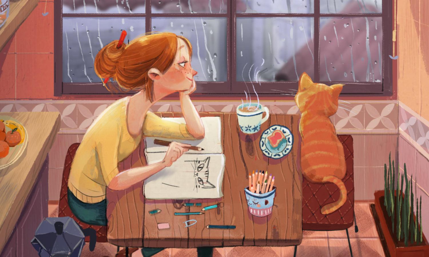
Source: Megbuddart, Instagram, https://www.instagram.com/p/Ctwes8Pr6u9/
Looking for fresh ProCreate illustration inspiration to liven up your digital canvas? You’ve just tapped into the right palette of ideas. Whether you're sketching on the train or layering textures on your tablet at midnight, ProCreate makes it ridiculously fun to bring your creativity to life. From dreamy character portraits to bold abstract shapes, the app offers endless room for experimentation. This article is your go-to guide for some of the best ProCreate illustration ideas worth trying right now.
We’re diving into a vibrant collection of themes—from whimsical animals and magical landscapes to pop culture mashups and retro vibes. Perfect for beginners and seasoned artists alike, these ideas are designed to spark your creativity and push your skills to new heights. So grab your Apple Pencil, charge up that iPad, and let’s get swiping, shading, and blending. Whether you're creating for fun, for a portfolio, or for social media flair, these ProCreate illustration ideas are sure to add some serious color to your creative journey.
ProCreate Illustration Ideas

Source: Tkachenkohanna_, Instagram, https://www.instagram.com/p/CvscTvxLbv5/

Source: Flaming.garden, Instagram, https://www.instagram.com/p/DL2VFKXi7yK/

Source: Samdrawson, Instagram, https://www.instagram.com/p/DLXYiUwiAkL/?

Source: Laura_dumitriu, Instagram, https://www.instagram.com/p/DKPo9IXscrH/

Source: Gretlusky, Instagram, https://www.instagram.com/p/Cyv7cOGMof4/

Source: Colors_by_jen, Instagram, https://www.instagram.com/p/DL2cNBVsEV4

Source: Samdrawson, Instagram, https://www.instagram.com/p/DMIWDamqJQx/

Source: Thestudio.g, Instagram, https://www.instagram.com/p/CywoDp6xmfN/

Source: Velliniki, Instagram, https://www.instagram.com/p/DGxpwS3sItE/

Source: Thecolinhoodshow, Instagram, https://www.instagram.com/p/CyqkB1NK6mm/

Source: Leannehatch_illustration, Instagram, https://www.instagram.com/p/CzEIMhdqGzl/

Source: Aranchaperpinan, Instagram, https://www.instagram.com/p/Cp90hEFIdyG/

Source: Emma_rose.illustrates, Instagram, https://www.instagram.com/p/CwvQXTStGxO/

Source: Vanya_illustrations, Instagram, https://www.instagram.com/p/CzTmRZJMce5/

Source: Domi.illustration, Instagram, https://www.instagram.com/p/CyVfv3CspgJ/

Source: Karinartspace, Instagram, https://www.instagram.com/p/DJJ5O2uKRjY/

Source: Sheincar, Instagram, https://www.instagram.com/p/DK_4jT-sy-Z/

Source: Cbabi, Instagram, https://www.instagram.com/p/CytN2eXAfpA/

Source: _Minitory, Instagram, https://www.instagram.com/p/Cy0dHFbItGq/

Source: Aebidraw, Instagram, https://www.instagram.com/p/DLfFCPYyQ89

Source: Migamigami, Instagram, https://www.instagram.com/p/DLRvwLxM-S0/

Source: Itsallinsideus, Instagram, https://www.instagram.com/p/CqSssRPMykI/

Source: Olyabad, Instagram, https://www.instagram.com/p/CyxOUKSI9Gy/

Source: Yaelhofri, Instagram, https://www.instagram.com/p/DHTDydpo41t/

Source: Ananaisdesign, Instagram, https://www.instagram.com/p/DIuC8bpMuZZ/

Source: Moonsketchh, Instagram, https://www.instagram.com/p/DLNwLtWogg4

Source: Kaylee_palette, Instagram, https://www.instagram.com/p/CxwwW55LBzt/

Source: Ta_ya_art, Instagram, https://www.instagram.com/p/DLzmGHPshlx/

Source: Studio.zosara, Instagram, https://www.instagram.com/p/CxvkbB8sana/

Source: Megbuddart, Instagram, https://www.instagram.com/p/Ctwes8Pr6u9/
What Are the Best ProCreate Illustration Tutorials for Beginners?
Jumping into the world of ProCreate illustration can feel like stepping into a colorful candy store—so many tools, so many brushes, and oh-so-many things to try! But if you're just starting out, the trick is to find tutorials that don’t just show off skills but actually teach them in bite-sized, beginner-friendly ways. Luckily, there’s a buffet of great tutorials to help you get the hang of ProCreate without getting overwhelmed. Here are five of the best tutorials to get you sketching, swiping, and shading like a digital champ.
“Intro to ProCreate” by Bardot Brush
This tutorial is the holy grail for first-timers. Lisa Bardot walks you through the basics—from creating a new canvas and understanding brushes to using layers and exporting your work. Her calm energy and cheerful tone make you feel like you’ve got a friend guiding you through the world of ProCreate illustration. By the end, you’ll know your way around the app and be itching to start your own mini masterpiece.
“How to Draw a Cute Character in ProCreate” by Art with Flo
Art with Flo is practically a ProCreate celebrity, and this tutorial is a perfect entry point into the adorable world of character illustration. You’ll learn to build a cartoon character step-by-step, with a focus on shapes, color, and fun proportions. Flo’s instructions are super easy to follow, and the end result is something you’ll be proud to share—even if it has googly eyes.
“10 Easy Brush Lettering Tips for ProCreate” by Karin Newport (iPad Lettering)
If you're into hand lettering and want to make your quotes sparkle with flair, Karin’s tutorial is a dream. She covers basic strokes, pressure sensitivity, and even shows how to add decorative swashes and shadows. It’s a great way to explore the lettering side of ProCreate illustration without needing calligraphy experience. Plus, watching the brush glide smoothly across the screen is seriously satisfying.
“Landscape Illustration for Beginners” by James Julier
Feeling the call of the great outdoors? James Julier breaks down how to create dreamy landscapes with a focus on atmosphere, depth, and lighting. He uses accessible language and shares helpful shortcuts and layering techniques that are perfect for new artists. If you want your ProCreate illustration skills to branch out (pun intended), this is the path to take.
“Draw Your First Animal in ProCreate” by CatCoq
Animals are always a fun subject, and CatCoq knows how to make the process playful and stress-free. This tutorial is great for learning about using references, simplifying forms, and picking the right brushes for fur, feathers, or scales. Her vibrant style makes your illustration look polished even if you’re still getting used to your Apple Pencil.
With the right tutorials, diving into ProCreate illustration becomes less intimidating and a lot more exciting. These beginner-friendly guides are perfect for helping you build confidence, practice techniques, and, most importantly, have fun while you draw. So open that app, hit play on a tutorial, and let your creativity fly!
What Are Some Popular ProCreate Illustration Styles?
ProCreate illustration has opened the digital floodgates for artists to create without limits—and with style. Whether you're sketching dreamy galaxies or doodling cats in suits, the app lets your imagination go wild with endless artistic approaches. Here are five popular ProCreate illustration styles that artists everywhere are falling in love with:
Line Art With a Twist
Clean, crisp, and oh-so-satisfying—line art is a forever favorite. But in ProCreate illustration, it’s not just about black lines on white backgrounds. Artists are giving line art a new spin by combining intricate linework with bold, unexpected color fills or animated textures. Think neon outlines, layered shadows, and minimalist storytelling. This style thrives on precision and simplicity, and it’s a great playground for experimenting with different brushes and pressure sensitivity.
Painterly Digital Realism
For those who love to push ProCreate’s brush engine to its limits, digital realism is the way to go. This style mimics traditional oil or acrylic painting and works beautifully for portraits, still life, and landscapes. Smudgy brush strokes, blended colors, and attention to light and shadow are key players here. The goal? To make viewers say, “Wait, is this really digital?” Spoiler: Yes. And it’s gorgeous.
Cute and Kawaii Aesthetic
Who can resist big eyes, pastel palettes, and adorably oversized heads? The kawaii style in ProCreate illustration is booming, especially on social media. This sweet and bubbly art style is perfect for stickers, characters, emojis, and playful merch designs. It's often defined by soft color schemes, simple shapes, and a whole lot of charm. Bonus points for sparkles, hearts, and floating cupcakes!
Bold Flat Design
Minimalist doesn’t mean boring. In fact, flat design in ProCreate illustration can be incredibly bold and expressive. This style uses solid colors, strong shapes, and minimal shading to tell a visual story. It's especially popular for editorial art, brand illustrations, and infographics. With the right palette and smart use of negative space, flat design becomes an art form all its own.
Retro and Vintage Vibes
Whether you're channeling ‘80s synthwave or mid-century modern charm, retro styles have made a massive comeback in digital art. Grainy textures, muted tones, funky typography, and nostalgic patterns all define this look. ProCreate illustration makes it easy to recreate the feel of old posters, magazine ads, or vinyl album covers using brush sets and texture overlays. Add a little noise, play with halftones, and let those retro vibes roll.
ProCreate illustration styles are as diverse as the artists who create them. Whether you’re all about elegance, cuteness, nostalgia, or bold simplicity, there’s a style (or ten) waiting for you to explore. The best part? You don’t have to stick to just one. Try blending styles, creating hybrids, and developing your own unique visual voice—because with ProCreate, your imagination is the only limit.
What Are Some Tips for Layering in ProCreate Illustration?
Layering in ProCreate illustration is like stacking slices on your favorite sandwich—every ingredient adds flavor, and how you stack it makes all the difference. Mastering the art of layers doesn’t just help you stay organized; it gives your artwork depth, flexibility, and that sweet ability to undo mistakes without panic. Here are five fun and effective tips for layering like a pro in your ProCreate illustration journey.
Name Your Layers Like a Legend
Let’s be honest—“Layer 1,” “Layer 27,” and “Layer 86” don’t tell you much. Instead of playing layer roulette, name each layer based on its content. Is it the background? The character's hair? The glowing eyeballs of your space hamster? Label it. Your future self (especially during edits or revisions) will thank you. Bonus tip: use color tags to group similar layers for quick recognition.
Use Clipping Masks Like Magic Cloaks
Want to shade only inside a specific area without messing up the base? Say hello to clipping masks. In ProCreate illustration, a clipping mask attaches itself to the layer below and only affects that shape. It’s perfect for adding texture, shadows, or highlights to a defined section without risking any overpainting. It’s like coloring inside the lines—with cheat codes.
Keep Elements on Separate Layers
It may seem easier to do everything on one or two layers, but separating your elements saves you from headaches later. Each major component—background, character, props, lighting—should live on its own layer. This allows you to adjust positions, edit colors, or delete elements without impacting the rest of your artwork. Think of it as giving each part its own comfy bed in the layer hotel.
Don’t Be Afraid of Layer Groups
Once your canvas starts looking like a digital layer jungle, it’s time to group up. Layer groups let you organize related layers under one collapsible folder. Whether you're building a complex scene or working on character turnarounds, grouping helps you tidy up and focus. Group your background layers, effects, or different pose versions so you're not endlessly scrolling.
Lock Alpha for Clean Edits
Sometimes you just want to shade or add detail to a layer without the risk of coloring outside the lines. Locking the alpha on a layer (a.k.a. locking transparency) lets you paint only on areas that already have pixels. It’s ideal for refining textures, tweaking tones, or adding extra flair without spilling over into unwanted territory.
Layering in ProCreate illustration is more than a technical step—it’s a creative superpower. From naming and grouping to using masks and alpha locks, these tips can seriously elevate your workflow and make your process smoother than a buttery brushstroke. So go ahead and layer like a digital wizard—because once you master these tricks, you’ll wonder how you ever illustrated without them.
What Is the Best Canvas Size for ProCreate Illustration?
When it comes to ProCreate illustration, choosing the right canvas size is like picking the perfect mug for your coffee—too small and it feels cramped, too big and you’re swimming in pixels. The truth is, there’s no one-size-fits-all canvas, but there are smart options depending on what you’re drawing, where it’s going, and how many layers you want to play with. Let’s break down five popular canvas size choices that keep your ProCreate workflow smooth and satisfying.
3000 x 3000 Pixels for Social Media Posts
If you're creating square art to post on Instagram or other social platforms, 3000 x 3000 pixels is a fantastic starting point. It’s big enough for crisp quality and gives you room to zoom in and add fun little details. Plus, it fits nicely into Instagram’s grid and still allows a fair number of layers, even on older iPads. This is the go-to for character portraits, stickers, or any ProCreate illustration made to share.
8.5 x 11 Inches at 300 DPI for Printable Art
Creating something you plan to print out and hang on your wall (or sell on Etsy)? Then you’ll want to think in inches and dots per inch. A canvas that’s 8.5 x 11 inches at 300 DPI gives you a standard letter-size print with professional-quality resolution. It’s perfect for posters, greeting cards, and zines. Just remember, the higher the DPI, the more memory your canvas will use—so layer management is key!
1920 x 1080 Pixels for Digital Screens
Designing wallpaper, desktop art, or YouTube thumbnails? Stick to a canvas size of 1920 x 1080 pixels. This is full HD and matches most screens perfectly. It’s lightweight, exports easily, and looks great on digital devices. Whether you’re crafting a ProCreate illustration to set as your lock screen or uploading it for your followers, this size keeps things sleek and screen-ready.
2048 x 2732 Pixels for iPad Screen Match
Want your art to fill your iPad screen edge-to-edge while working? Set your canvas to 2048 x 2732 pixels (that’s the iPad Pro 12.9” screen resolution). This is awesome for live drawing demos or content that stays digital. You get a beautiful fullscreen experience while illustrating, plus your art will always look its best on your own device. It’s the gold standard for personal pieces and digital showcases.
Custom Sizes Based on the Project
Every now and then, your project will scream for something unique—like a vertical comic strip, a wide landscape, or a tall infographic. Don’t be afraid to create custom canvas sizes! Just be mindful of your layer limit. The bigger your dimensions and the higher the DPI, the fewer layers you’ll have available. Plan ahead: what matters more—super high resolution or having 20+ layers to play with?
Picking the best canvas size in ProCreate illustration really comes down to what you’re making and where it’s going. Whether you’re posting online, printing at home, or just doodling for fun, a well-chosen canvas helps your creative process flow without hiccups. So open up that new canvas menu—and make it the perfect fit for your next masterpiece!
What Are Good Composition Tips for ProCreate Illustration?
Creating a stunning ProCreate illustration isn’t just about great brushwork or snazzy textures—it’s also about composition. That’s the secret sauce that turns a simple sketch into a scroll-stopper. Composition is how you arrange the elements in your artwork to guide the viewer’s eye, balance the visual weight, and tell a story (even if that story involves a dancing banana on Mars). Ready to bring structure to your creativity? Here are five fun and practical tips for mastering composition in your ProCreate illustration.
Start With the Rule of Thirds
Let’s kick things off with a classic. The rule of thirds divides your canvas into nine equal sections using two vertical and two horizontal lines. Placing your subject along these lines—or where they intersect—makes your artwork feel more dynamic and visually interesting. In ProCreate, you can activate the drawing guide and snap your layout right into this helpful grid. It’s like having invisible compositional training wheels that make your layout instantly stronger.
Think About Focal Points
Every great ProCreate illustration has a focal point—the visual “main event” that draws the viewer in. Maybe it’s a character’s glowing eyes, a swirling galaxy, or a slice of pizza levitating in space. Whatever it is, use contrast, color, and detail to highlight it. Try softening the surrounding elements or using darker tones elsewhere so that your focal point pops like confetti. If your viewer doesn't know where to look, they'll bounce quicker than a rubber ball.
Use Leading Lines
Leading lines are sneaky little tools that direct your viewer’s gaze around your illustration. They can be literal—like a road, river, or beam of light—or more abstract, like the way a character’s arm or a swirl of smoke curves. Use these lines to guide attention toward your focal point or move the eye across key parts of your composition. Think of them like arrows made of art.
Play With Negative Space
Don’t underestimate the power of empty space. Negative space—the areas between and around objects—is a powerful compositional tool. It creates breathing room, emphasizes your subject, and prevents your canvas from becoming a visual traffic jam. In ProCreate illustration, zoom out regularly to make sure your piece isn’t overcrowded. A well-placed patch of space can make your subject feel even more epic.
Balance Your Elements Like a Juggler
Balance isn’t about symmetry—it’s about harmony. Visual weight comes from size, color, texture, and complexity. So if you’ve got something bold on one side of your canvas, balance it with something of equal interest on the other. You can go symmetrical, asymmetrical, radial, or even intentionally off-balance for a dramatic effect. But whatever you choose, aim for a layout that feels intentional, not accidental.
Good composition gives your ProCreate illustration that polished, professional feel—and it’s also a fun way to shape your storytelling. Whether you’re using classic grids or experimenting with visual flow, these tips will help your work connect, impress, and stand out. So next time you fire up ProCreate, think beyond the brushes and let composition work its magic!
Conclusion
Mastering composition is a key step in elevating your ProCreate illustration from good to unforgettable. By applying techniques like the rule of thirds, focal points, and thoughtful use of space, you create artwork that feels intentional and engaging. Whether you're drawing whimsical characters, detailed environments, or stylized portraits, strong composition ensures your visual story shines. Don’t be afraid to experiment and trust your artistic instincts. With each new ProCreate illustration, you’ll sharpen your eye for layout and design, making your creative process smoother and your results more impactful. Remember—great art isn’t just what you draw, but how you arrange it.
Let Us Know What You Think!
Every information you read here are written and curated by Kreafolk's team, carefully pieced together with our creative community in mind. Did you enjoy our contents? Leave a comment below and share your thoughts. Cheers to more creative articles and inspirations!




Leave a Comment