
30 Best Lettering Poster Design Ideas You Should Check

Source: Geo.graphicdesigner, 36 Days Of Type, Instagram, https://www.instagram.com/p/CsnAG94IeE-/
Ready to elevate your creativity? Let's dive into the world of lettering poster design! From bold typography to playful scripts, lettering posters aren’t just visuals—they’re a vibe. They turn words into art and ideas into statements, making them perfect for creating eye-catching designs. This article will walk you through the best lettering poster design ideas that are trending right now.
Whether you’re seeking inspiration for personal projects, brand promotions, or even home decor, you’re sure to find designs that speak your language. So, buckle up and let your imagination run wild as we explore these creative picks. Each design showcases different lettering styles, so get ready to be inspired!
Lettering Poster Design Ideas

Source: Louis_louis, Tonk, Instagram, https://www.instagram.com/p/CsmDP5droD-/

Source: Another_poster, Rolling in a Grid Fashion, Instagram, https://www.instagram.com/p/CfgyfuBsmC2/

Source: Linuslohoff, Instagram, https://www.instagram.com/p/B-jPloHiRsk/

Source: Parasite____dsgn, Spazio Digitale, Instagram, https://www.instagram.com/p/CrSsyd8Nl9R/

Source: Tuongkhuyenle, Take a Break, Instagram, https://www.instagram.com/p/Ce59bQ-Fm8W/

Source: Geo.graphicdesigner, It's Easy to Say It Than Do It, Instagram, https://www.instagram.com/p/CusaUf2xvhb/

Source: Fatemeh.jpg, Don't Look Back into the Sun, Instagram, https://www.instagram.com/p/CteR-axruNQ/

Source: 62pontos, Sangue Latino, Instagram, https://www.instagram.com/p/Cjln2Kbu0f8/

Source: Marsmygb, Make it More Messy, Instagram, https://www.instagram.com/p/CwK7332taBH/

Source: Another_poster, Outline Borders, Instagram, https://www.instagram.com/p/CjF_6Hcs05v/

Source: Yassinmyh, Movie Star, Instagram, https://www.instagram.com/p/CjVfwHNMVQC

Source: Exquisiteparadox, Bagels & Coffee, Instagram, https://www.instagram.com/p/ChKgDVlsnpw/

Source: Jbgraphicdesign, Bauhaus 4, Instagram, https://www.instagram.com/p/CHdkyO_B61r/

Source: Tuongkhuyenle, Instagram, https://www.instagram.com/p/CfWPpeRl0lQ/

Source: Paulwetz, Stop Wasting Time, Instagram, https://www.instagram.com/p/CtPVARcNUO8/

Source: Tuongkhuyenle, Yet to Come, Instagram, https://www.instagram.com/p/CeqcqZXlU7q/

Source: Sheldonsiegar, Comic Sans, Instagram, https://www.instagram.com/p/CsHtnMhplfh/

Source: Markmontem, Home, Instagram, https://www.instagram.com/p/CwKZbbONoUq/

Source: Tuongkhuyenle, We Don't Talk Anymore, Instagram, https://www.instagram.com/p/CoZk74wvoP9/

Source: Another_poster, Bad Copy, Instagram, https://www.instagram.com/p/Ce3mPKcL4o3/

Source: Day.stay.hay_info, Round Table-Digitalization of Emotion, Instagram, https://www.instagram.com/p/CvA-6iayQfm/

Source: Tuongkhuyenle, Wish, Instagram, https://www.instagram.com/p/Cj7vWS7BKsh/

Source: Ben Didier, Sriracha Revolver, Dribbble, https://dribbble.com/shots/23622103-Sriracha-Revolver-poster
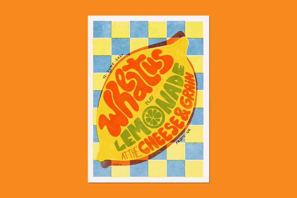
Source: Amparo Zeballos, Wheatus at the Cheese & Grain, Behance, https://www.behance.net/gallery/203457649/Wheatus-at-the-Cheese-Grain-Gig-Poster

Source: Brunoverart, Behance, https://www.behance.net/gallery/167799833/Typographic-poster-design

Source: Mel Cerri, Brazuca, Behance, https://www.behance.net/gallery/146685509/Brazuca
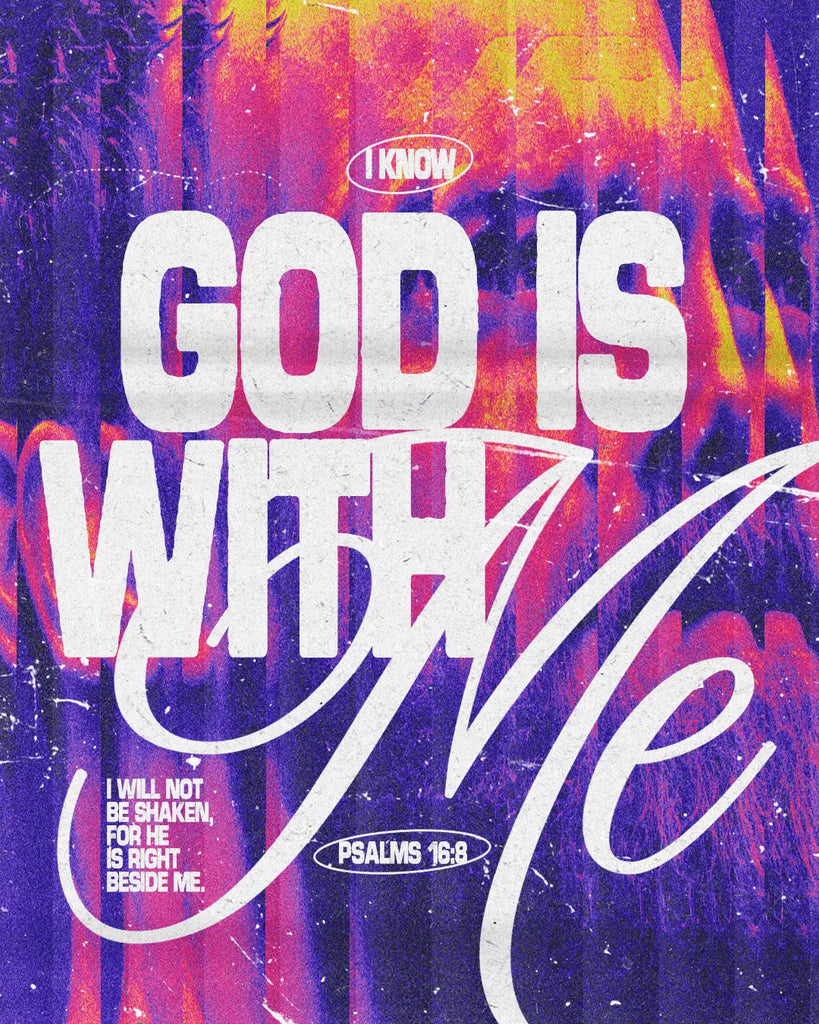
Source: Adrián Pérez, I Know God is With Me, Behance, https://www.behance.net/gallery/209600047/I-know-God-is-with-me-Christian-Poster

Source: 云雀 风流, 保持童趣, Behance, https://www.behance.net/gallery/166885073/_

Source: Thom Niessink, Wakker Dier 'Sloopmelk’, Dribbble, https://dribbble.com/shots/22973920-Wakker-Dier-Sloopmelk-Advertisement

Source: Geo.graphicdesigner, 36 Days Of Type, Instagram, https://www.instagram.com/p/CsnAG94IeE-/
What Are Some Popular Styles in Lettering Poster Design?
When it comes to lettering poster design, there’s no shortage of creative styles to explore. Each style has its own vibe and personality, making it a fantastic way to express different messages and themes. Whether you’re creating a poster for a brand, an event, or just for fun, the right style can make all the difference. Let’s dive into some of the most popular styles that are taking the design world by storm!
Retro/Vintage Lettering
Retro or vintage lettering poster design is all about taking inspiration from the past. These designs typically feature bold, chunky letters, often with a distressed or grainy texture to give them that aged look. Fonts reminiscent of the '70s, '80s, or even earlier eras are commonly used, making them perfect for posters that aim to evoke nostalgia. Colors like burnt orange, mustard yellow, and faded blues add to the retro vibe, while adding effects like drop shadows or layered text can enhance the old-school appeal. If you’re looking to create a poster that transports viewers back in time, the retro style is a go-to choice.
Minimalist Lettering
Sometimes, less really is more. Minimalist lettering poster design is all about simplicity and clarity. This style often features clean, sans-serif fonts or thin script fonts with ample white space around the text. The idea is to focus on the message itself, without any distractions. Minimalist designs usually use a limited color palette—often just black and white, or a single bold color with neutral tones. This style is great for modern and sophisticated posters that need to make an impact with fewer elements. It’s a popular choice for event announcements, gallery openings, or any setting that benefits from a clean and contemporary look.
Hand-Drawn Lettering
Hand-drawn lettering poster design brings a personal, authentic touch to posters. This style mimics the look of hand-crafted letters, making each design feel one-of-a-kind. It can range from playful doodles to elegant calligraphy, depending on the mood you want to convey. Brush strokes, sketch lines, and slight imperfections are embraced, giving the design a charming, organic feel. This style works well for event posters, artsy flyers, or any campaign that wants to feel more personal and heartfelt. The versatility of hand-drawn lettering makes it a favorite among artists who want to inject their unique flair into their work.
Graffiti/Street Art Lettering
Graffiti-inspired lettering poster design is bold, vibrant, and full of character. This style draws from the world of street art, where letters often have exaggerated shapes, dramatic angles, and bright, contrasting colors. Graffiti lettering is about breaking rules and boundaries, which makes it a fantastic choice for posters that aim to be edgy and attention-grabbing. It’s common to see bold outlines, splatter effects, and spray paint textures in this style. Graffiti lettering works particularly well for music events, youth-focused campaigns, or any setting that thrives on a rebellious spirit.
3D/Shadow Lettering
3D or shadow lettering poster design adds depth and dimension to your posters, making them stand out—literally! This style gives letters a three-dimensional look, often with the use of shadows, gradients, or perspective techniques. The result is a bold, eye-popping design that seems to jump off the page. 3D lettering can be playful or dramatic, depending on the color scheme and the design’s overall tone. It’s perfect for posters that need to make a strong visual impact, such as product launches, theater advertisements, or motivational messages. Adding textures or metallic effects can further enhance the 3D illusion, making the design even more dynamic.
These popular styles in *lettering poster design* offer a variety of options to make your message pop. Whether you’re going for a retro vibe, a minimalist aesthetic, or a street-art edge, each style brings something unique to the table. Don’t be afraid to experiment—mixing styles can also yield fresh, unexpected results.
What Are the Best Layouts for Lettering Poster Design?
Creating a visually striking lettering poster design is all about nailing the right layout. The layout determines how the words are positioned, which ultimately influences how your audience interprets the message. From bold arrangements to subtle spacing, each layout has its own flair. So, let’s break down the best layouts that will make your lettering stand out and deliver your message with style!
Centered Layout
The centered layout is a classic choice for lettering poster design, offering a clean and balanced look. In this layout, the main text is placed right in the middle of the poster, creating a focal point that draws the viewer’s attention directly to the message. It’s ideal for short, impactful phrases or quotes that need emphasis. To add a little twist, play with different font sizes, add subtle drop shadows, or use a gradient background to enhance the centered text. This layout works great for motivational posters, event announcements, or any design where the message needs to be front and center—literally!
Diagonal Layout
For a more dynamic and energetic vibe, the diagonal layout is a fantastic choice in lettering poster design. In this layout, text is positioned at an angle across the poster, creating a sense of movement and urgency. It’s perfect for edgy designs, music events, or posters that aim to grab attention with a bold, unconventional look. To make the most of this layout, use thick, bold fonts and bright colors that enhance the diagonal flow. Adding elements like lines, arrows, or splatter effects can further amplify the movement, making the design feel even more alive.
Grid-Based Layout
If you’re looking for a layout that’s both organized and versatile, the grid-based layout in lettering poster design is a top contender. This layout involves dividing the poster into equal sections or blocks, with each segment holding a piece of the text. It’s excellent for posters with multiple phrases, taglines, or event details that need to be separated but still feel cohesive. The grid-based layout allows for endless creativity—you can experiment with different fonts in each grid, play with colors, or even alternate the text’s orientation. It’s the perfect layout for complex messages, infographics, or creative event schedules.
Overlapping Text Layout
The overlapping text layout is bold, daring, and perfect for a modern lettering poster design. In this layout, words or letters are layered over each other, creating a visually rich composition. The overlapping effect adds depth and intrigue to the design, making it ideal for short words or impactful phrases. To ensure readability, it’s important to use contrasting colors or add outlines to the letters. This layout is especially popular for art exhibitions, avant-garde events, or any setting that benefits from a more abstract, artistic touch. It’s a great way to challenge traditional design rules while creating something truly unique.
Asymmetrical Layout
The asymmetrical layout is all about breaking free from conventional balance. This layout in lettering poster design positions text in an off-centered or staggered arrangement, creating an intentionally uneven look. The beauty of asymmetry lies in its unpredictability—it’s captivating, unconventional, and keeps the viewer’s eyes moving across the poster. Use bold fonts, unexpected angles, or varying sizes to enhance the asymmetrical feel. This layout works well for promotional posters, artistic events, or any project that aims to stand out with a sense of rebellion and creativity.
These layouts offer a diverse range of options to make your lettering poster design pop. Whether you prefer the clean and centered approach or the bold and asymmetrical route, each layout has the potential to elevate your design. So, get creative, try different layouts, and let your words shine!
How to Mix Fonts in Lettering Poster Design?
Mixing fonts in lettering poster design is an art form in itself! The right combination can make your poster eye-catching, dynamic, and full of personality. But get it wrong, and it can lead to a chaotic design that’s hard to read. Luckily, there are some creative techniques to help you master the mix. Let’s explore how to blend fonts in a way that enhances your poster’s appeal and keeps the message clear.
Pair Contrasting Fonts
The magic of lettering poster design often lies in contrasts. Pairing fonts that are different in style, weight, or shape creates a strong visual impact. For instance, you might combine a bold, blocky font with a delicate script or a sleek sans-serif with a classic serif. This contrast not only makes the design more visually interesting but also establishes a clear hierarchy, guiding the viewer’s eye to the most important parts of the message. Use the bolder font for key phrases or headlines, while the softer, more intricate font can add a decorative touch.
Establish a Clear Hierarchy
In lettering poster design, it’s essential to create a clear hierarchy when mixing fonts. Think of your poster as a conversation: there’s a main point (the loudest voice) and supporting details (the softer voices). Choose a dominant font for the headline and a contrasting yet complementary font for the subtext or details. For example, if you’re designing an event poster, use a bold, all-caps font for the event name and pair it with a clean, readable font for the date and location. The mix should feel intentional, with the fonts guiding the viewer’s eye from the most important information to the finer details.
Limit the Number of Fonts
While it’s tempting to use every cool font you find, restraint is key in lettering poster design. Using too many fonts can create a cluttered, overwhelming design. Stick to a maximum of two or three fonts to keep the design cohesive. For instance, you might use one font for the main heading, another for subheadings, and perhaps a third for accents or call-to-action phrases. Each font should serve a purpose, enhancing the design rather than adding noise. The right mix will add depth to your poster without compromising readability or visual flow.
Use Color to Unite Fonts
Color plays a powerful role in lettering poster design and can be used to tie different fonts together. If you’re mixing fonts, try using a consistent color palette to create harmony in the design. For example, use the same color for both fonts or apply a complementary color scheme that links the fonts visually. Color can also help emphasize certain words, guiding the viewer’s attention where you want it. Experimenting with gradient fills, shadows, or outlines can further enhance the blend of fonts while keeping the overall design cohesive.
Match the Mood of Your Design
When mixing fonts in lettering poster design, the overall vibe of the design matters. Fonts have personalities—some are playful, others are elegant, and some are bold and aggressive. Make sure the fonts you mix align with the poster’s theme or mood. For a whimsical design, combine a funky display font with a rounded script. For a formal or sophisticated look, pair a classic serif with a minimalist sans-serif. Matching the fonts to the design’s tone ensures a cohesive and effective message, making the poster feel intentional and well-crafted.
Mixing fonts in lettering poster design can transform a simple message into an engaging visual story. By pairing contrasting fonts, establishing hierarchy, limiting the number of fonts, using color effectively, and matching the design’s mood, you can create a dynamic and impactful design.
How to Create Unique Themes in Lettering Poster Design?
When it comes to lettering poster design, developing a unique theme can set your work apart and captivate your audience. Whether you’re promoting an event, showcasing a brand, or just expressing your creativity, a distinct theme can make your poster memorable and impactful. Here are five creative strategies to help you forge unique themes in your lettering poster designs.
Dive Deep into the Concept
Every great design starts with a solid concept. Before you even pick up your tools, spend some time brainstorming the purpose of your poster. What message do you want to convey? Who is your audience? What emotions do you want to evoke? Answering these questions can help you form a cohesive theme. For instance, if you’re designing a poster for a music festival, think about the genre of music and the culture surrounding it. This could lead to a vibrant, energetic theme with bold, rhythmic typography that mimics the dynamism of the music.
Play with Visual Metaphors
Visual metaphors are a fantastic way to add depth and intrigue to your lettering poster design. A visual metaphor involves using one thing to represent another, helping to convey your message in a clever and visually engaging way. For example, if you’re creating a poster for a book fair, you might design letters that look like books on shelves, or words that form the shape of a book. This not only catches the eye but also instantly communicates the theme of the poster in a fun and unique way.
Incorporate Cultural Elements
Drawing inspiration from different cultures can introduce a unique flavor to your *lettering poster design*. Whether it’s integrating traditional patterns, colors, or type styles, cultural elements can make your design stand out. Be respectful and do thorough research to ensure cultural accuracy and sensitivity. For instance, using Arabic calligraphy styles in a poster for a Middle Eastern film festival can add authenticity and appeal, creating a strong visual link to the culture.
Experiment with Color Psychology
Colors can dramatically affect the mood and theme of your lettering poster design. Each color has psychological implications and can evoke specific feelings. Selecting the right color palette can reinforce the theme of your poster. For a poster promoting sustainability and nature, for instance, choosing greens and earth tones can invoke feelings of growth and harmony. Think about what emotions you want to evoke, and choose your colors strategically to help convey your message.
Blend Typography with Imagery
Combining typography with imagery is a powerful technique in lettering poster design. This involves integrating text with relevant images to create a unified theme. For example, if you’re designing a poster for a beach party, you could shape the letters with images of sand and waves, or overlay the text on a sunny beach background. This method not only enhances the visual impact of the poster but also ensures that the theme is immediately clear to the viewer.
Creating unique themes in lettering poster design requires creativity, insight, and a willingness to experiment. By diving deep into the concept, playing with visual metaphors, incorporating cultural elements, using color psychology, and blending typography with imagery, you can develop themes that resonate with your audience and make your designs stand out. So unleash your creativity and let your designs tell a story that’s as unique as your message!
What Are the Best Software Options for Lettering Poster Design?
Creating stunning lettering poster designs requires not only creativity but also the right tools. With the myriad of software options available today, choosing the right one can boost your creative prowess and streamline your design process. Here's a rundown of the top software picks that can help you bring those catchy, bold, and artistic lettering ideas to life. Let’s dive into the digital toolbox and discover the best software for lettering poster design!
Adobe Illustrator
Adobe Illustrator reigns supreme when it comes to vector graphics, making it a top choice for lettering poster design. Its powerful tools allow you to manipulate text in countless ways, from simple adjustments to complex typographic designs. Illustrator's precision in handling curves and edges makes it ideal for crafting high-resolution lettering that looks crisp both on screen and in print. Plus, with its extensive library of fonts and the ability to create custom typefaces, Illustrator offers limitless possibilities for creative expression.
Procreate
Tailored for iPad users, Procreate has gained a massive following among designers for its intuitive interface and robust capabilities. While primarily known for digital painting, Procreate is also a fantastic tool for lettering. Its wide array of brushes allows you to simulate various lettering styles, from watercolor brushes to calligraphy pens. The app supports layers, blending modes, and an extensive color palette, which makes it perfect for designing dynamic and textured *lettering posters*. It’s an excellent option for designers who prefer a more hands-on, artistic approach.
CorelDRAW
CorelDRAW is another vector graphic stalwart that excels in creating precise and detailed lettering designs. Its user-friendly interface might be more approachable for newcomers than Illustrator. CorelDRAW offers a broad set of typography tools that make it easy to experiment with text styles and apply effects. Additionally, its built-in vector and bitmap resources are a boon for creating complex, multi-layered designs. If you’re looking for software that balances powerful functionality with ease of use, CorelDRAW could be your go-to.
Adobe Photoshop
While primarily a photo editing tool, Adobe Photoshop holds its ground in the lettering poster design arena thanks to its sophisticated text manipulation capabilities. Photoshop allows you to layer images and text seamlessly, offering effects like shadows, glow, and texture that can bring depth and flair to your lettering. It’s particularly good for posters where the lettering needs to blend organically with photographic elements or detailed backgrounds. For designers looking to combine text and imagery in creative ways, Photoshop is a match made in heaven.
Affinity Designer
As a cost-effective alternative to Adobe’s offerings, Affinity Designer is a potent vector graphics editor that shines in versatility and performance. It’s particularly well-suited for lettering, with a straightforward interface and powerful text tools that simplify the design process. Affinity Designer supports multiple layers and offers extensive vector and raster capabilities in a single package, meaning you can create complex lettering effects without switching between different programs. It’s a fantastic choice for designers who need professional features at a more accessible price point.
Each of these software options offers unique features and benefits, so the best choice depends on your specific needs, budget, and design style. Whether you’re a professional designer looking to craft detailed vector illustrations or an enthusiast dabbling in digital art, these tools will help you create lettering poster designs that are not only beautiful but also impactful. So, choose your software, unleash your creativity, and start making designs that truly stand out!
Conclusion
Mastering the art of lettering poster design can transform simple messages into compelling visual experiences. By thoughtfully combining typography, color, and thematic elements, designers can create posters that not only grab attention but also resonate deeply with their audiences. Whether you're promoting an event, launching a new product, or simply sharing a message, the right design strategies can elevate your poster from ordinary to extraordinary. Remember, every element of your design should contribute to a cohesive theme that enhances the overall impact of your message, ensuring that your lettering poster design stands out in a crowded visual landscape.
Let Us Know What You Think!
Every information you read here are written and curated by Kreafolk's team, carefully pieced together with our creative community in mind. Did you enjoy our contents? Leave a comment below and share your thoughts. Cheers to more creative articles and inspirations!
Related Articles


Leave a Comment