30 Best Illustrated Poster Design Ideas You Should Check

Source: Raviamarzupa, Instagram, https://www.instagram.com/p/DCDa4XzRZsP
Ready to dive into a world where color splashes and bold lines tell compelling stories on paper? Welcome to our vibrant showcase of the best illustrated poster design ideas, where creativity knows no bounds! Whether you're a designer hunting for inspiration, a business looking to jazz up your marketing, or just a lover of good art, these poster designs are sure to capture your imagination.
Illustrated posters are not just art; they are a powerful tool for communication, blending aesthetics with messages in a way that sticks with the viewer. From whimsical to profound, minimalist to complex, the range of styles and themes is endless. In this article, we’ll explore how these designs can convey emotion, build identity, and create impact, all while keeping your eyes feasting on stunning visuals.
Get ready to be dazzled by illustrations that not only stand out but also speak out! Let’s unleash the power of visual storytelling and discover how these imaginative posters make every wall they adorn come alive.
Illustrated Poster Design Ideas

Source: Youbringfire, Electrical Fire, Instagram, https://www.instagram.com/p/B_In0uVJoMZ/

Source: Claire.prouvost, Les Merveilles, Instagram, https://www.instagram.com/p/CAVQw34Bw_r/

Source: Miroschnee, Neubau, Instagram, https://www.instagram.com/p/CHpWAy3hAQt/

Source: Bogna.brewczyk, Mloda Kultura, Instagram, https://www.instagram.com/p/CtYaRlRIMHs/

Source: Pistacho_studio, Nou Curs Escolar, Instagram, https://www.instagram.com/p/Cve4teAI4pC/

Source: X_ofarrell, The Last Dance, Instagram, https://www.instagram.com/p/CwxjV-3t8Kt/

Source: Pigeonxperson, Swindons Zine Fest!, Instagram, https://www.instagram.com/p/CrQVwYCol3f/

Source: Joel.roth, Museums Nacht, Instagram, https://www.instagram.com/p/CiF3pSoDDis/

Source: Hodguez, Tun-Up, Instagram, https://www.instagram.com/p/Ccp_wAyqJpp/

Source: Nevindoart, Everything Come to You at the Right Time!, Instagram, https://www.instagram.com/p/CwdK4Vbhdja/

Source: Cool_lookin_bug, How to Cry on Command, Instagram, https://www.instagram.com/p/Cw0p5KOv_Az/

Source: Val_tmh, Zine Happening, Instagram, https://www.instagram.com/p/Cq0C8EfNLjb/

Source: Una_ancizar_collagera, Los Libros a Ciegas, Instagram, https://www.instagram.com/p/Cw1C6pqPfNL/

Source: Dan.rhys.design, Knives Out: Glass Onion, Instagram, https://www.instagram.com/p/CnFV9d7I5PR/

Source: Frenchman Georges, Libraires d’un Jour, Instagram, https://www.instagram.com/p/Curi9o4ttzk/

Source: Cbc_music, Alvvays, Instagram, https://www.instagram.com/p/CwnWMr8L_G1/

Source: Joshakazzam, Source, Instagram, https://www.instagram.com/p/Cq9iLMRrknI/

Source: Jamersdesigner, October Village, Instagram, https://www.instagram.com/p/Cw1ViDmJiWu/

Source: Lydia Ortiz, Prissy, Instagram, https://www.instagram.com/p/CwyN2LKSEIe/

Source: Notveryvibes, Don't Grow Up, Instagram, https://www.instagram.com/p/Cw0BJlYMGeT/

Source: Mercedes Bazan, Behance, https://www.behance.net/gallery/94020201/Illustrated-posters-V1

Source: Anna Fraiese, the Flora Festival, Behance, https://www.behance.net/gallery/189279991/theFlora-Festival-Poster

Source: Ruwangi Amarasinghe, The Soul, Behance, https://www.behance.net/gallery/78465797/The-Soul-Illustrated-poster

Source: Valentin Pujadas, Family, Instagram, https://www.instagram.com/p/C-UjvYmib38/

Source: Gaetan Sahsah, Instagram, https://www.instagram.com/p/C4wCrX6LK90/

Source: Justynafrackiewicz, The Bear 2022, Instagram, https://www.instagram.com/p/C5nOeyuourT/

Source: Cameronjlwest, We at the 100 Club, Instagram, https://www.instagram.com/p/Cz3ZkAQNwuL

Source: Madpaule, Joker, Instagram, https://www.instagram.com/p/B-4UMb5Bwnz/

Source: Brogan_o_, Norwich Film Festival, Instagram, https://www.instagram.com/p/Cx7Vhl3MAkB/

Source: Raviamarzupa, Instagram, https://www.instagram.com/p/DCDa4xXzRZsP
What Are The Key Elements Of Illustrated Poster Design?
Diving into the world of illustrated poster design is like stepping into a vibrant festival of visuals, where every element plays a critical role in captivating and communicating. Whether you’re jazzing up a local event or creating a show-stopper for a big brand, mastering these five key elements will turn your illustrated posters into eye-catching masterpieces.
Bold Imagery
The heart of every illustrated poster is its imagery. This isn't just about choosing a pretty picture; it's about selecting visuals that pack a punch. Bold, vivid illustrations that tell a story at a glance are what stop people in their tracks. Whether you're going for a hyper-realistic sketch or a whimsical cartoon, the imagery should be powerful enough to convey the essence of your message without words.
Striking Color Palette
Color isn't just decoration; it's communication. Choosing the right color palette can set the mood, evoke emotions, and even influence decisions. Think about what emotions you want to evoke—excitement, nostalgia, peace? Colors can do that! A well-chosen palette enhances the impact of your illustrations and creates a cohesive visual experience that’s both enjoyable and effective.
Engaging Typography
If your poster could talk, how would it sound? That's where typography comes in. The right typeface can sing, shout, or whisper your message to the audience. It's not just about readability; it’s about personality. From bold, impactful fonts for a concert poster to elegant, subtle serifs for a gallery opening, typography should both complement your illustrations and convey the right tone for your content.
Compelling Composition
Good composition is like a good party host—it quietly guides guests (viewers) where to go and what to focus on without them even realizing it. A well-composed poster has a flow that draws the eye from the main point of interest to secondary elements, creating a journey that’s both intuitive and enjoyable. It’s about balancing elements so that everything feels harmoniously placed yet dynamically engaging.
Purposeful Negative Space
In the world of illustrated poster design, sometimes what you don’t include is as impactful as what you do. Negative space (the area around and between the elements) isn’t just empty; it’s a powerful design tool. It can emphasize the parts you want to stand out, improve readability, and even form hidden images or messages. Smart use of negative space can transform a cluttered layout into an elegant and focused message.
By weaving together these elements, your illustrated poster design not only grabs attention but holds it, delivering a message that’s both beautiful and memorable. Whether your poster is aimed at promoting a rock concert or an art exhibition, these core components are your building blocks to creating something that not only looks stunning but resonates deeply with your audience. Let the fun begin!
How to Use Negative Space in Illustrated Posters?
Unlocking the magic of negative space in illustrated poster design is like discovering a secret room in your favorite video game—it opens up a whole new world of possibilities! When wielded with flair and imagination, negative space isn’t just empty space; it’s a dynamic component of your design arsenal. Here are five electrifying ways to harness its power in your illustrated posters:
Create Intriguing Visual Puzzles
Dive into the playful side of design by using negative space to form visual puzzles. Imagine designing a music festival poster where the space between guitar strings forms the city skyline, or a coffee cup whose steam outlines a morning sunrise. This clever use of space invites the viewer to look a little closer, turning a simple glance into a lingering gaze.
Emphasize Key Elements
Let’s say you want to highlight the main subject of your poster. You can amplify its importance by isolating it with swathes of negative space. This technique not only focuses your audience's attention where you want it but also gives your central imagery a breath of fresh air, standing out starkly against the blank canvas around it.
Balance Composition and Add Elegance
Negative space can be your best friend when it comes to balancing your composition. By strategically placing it around your more densely illustrated areas, you create a visual harmony that feels both intentional and elegant. Think of it as the pause in a piece of music, giving rhythm and cadence to the visual melody of your poster.
Evoke Emotion with Minimalism
Sometimes, what you don’t show is as powerful as what you do. Use negative space to evoke a mood or emotion subtly. A sparse design with ample negative space can convey feelings of loneliness, serenity, or mystery, depending on how you style the rest of your elements. It’s perfect for projects that call for a touch of introspection or calm.
Construct Hidden Messages
Who doesn’t love discovering a hidden message? With negative space, you can embed secondary images or text that only become apparent after a closer look. This not only adds a layer of depth to your design but also engages your audience more interactively. For instance, the silhouette of a dancer might also outline the shape of a musical note, adding a layer of meaning that supports your poster’s theme.
By mastering the use of negative space, your illustrated posters can go from good to great, transforming them into pieces that capture the imagination and refuse to let go. Whether you’re creating a promotional piece, an art exhibit, or just adding to your portfolio, consider negative space your canvas of opportunity—it's there to frame, enhance, and transform your visual storytelling!
What Are The Most Popular Styles Of Illustrated Poster Design?
Illustrated poster design is like the fashion world of the graphic design industry—it's diverse, expressive, and ever-evolving. From the whimsically hand-drawn to the sleekly digital, each style has its own charm and audience. If you’re looking to dive into the world of illustrated posters or just spice up your portfolio, here are five of the most popular styles that are turning heads and captivating viewers!
Minimalist Modernism
Stripping things down to the basics, minimalist modernism is all about less being more. This style focuses on flat colors, basic shapes, and a restricted color palette to convey the message. It’s not just clean and contemporary, but also highly effective in making bold statements with simple visuals. Think of it as the poster child of the design mantra: “Keep it simple, smarty!”
Retro Revival
Everything old is new again with the retro revival style. This nostalgic approach takes cues from past decades, like the groovy ‘70s or the neon-lit ‘80s, bringing classic elements into a modern context. Using vintage color schemes, typewriter fonts, and grainy textures, these posters not only celebrate history but also appeal to those who yearn for a taste of the good old days.
Hand-Drawn Whimsy
There’s something inherently personal and enchanting about hand-drawn illustrations. This style features unique sketches that can range from hyper-detailed to charmingly simplistic. Whether it’s a whimsical doodle or a sophisticated ink drawing, the hand-drawn approach adds a human touch that’s instantly engaging and warmly inviting.
Gritty Grunge
Perfect for the edgier audience, gritty grunge makes a splash with its raw, unfinished look. Think textured backgrounds, splattered paint effects, and distressed fonts that look like they’ve survived a few battles. This style is particularly popular in music and event posters, where a touch of rebellion makes the design stand out.
Eclectic Collage
The eclectic collage style is a visual feast, mixing various elements like photographs, textures, and typefaces to create a cohesive chaos. It’s like a scrapbook on your wall, each component telling a part of the story. This style is fantastic for layered messaging and offers endless creativity, allowing designers to blend reality with imagination for eye-catching results.
Exploring these popular styles in illustrated poster design not only broadens your creative horizons but also increases your versatility as a designer. Each style offers a different way to tell a story, evoke an emotion, or catch an eye, proving that in the world of illustration, the possibilities are as limitless as your imagination.
What Are Some Innovative Uses of Texture in Illustrated Posters?
When it comes to illustrated poster design, texture is like the secret spice blend in your favorite dish—it enhances everything it touches, adding depth and emotion to your visual feast. Texture can transform a flat image into a tactile experience that pulls viewers into your poster’s world. Here are five innovative ways to sprinkle some textural magic into your illustrated posters:
Layering for Depth
Texture can be a game-changer when it comes to adding depth to your designs. Think about layering different textures to create a sense of dimension and complexity. For example, a background with a gritty, sandpaper-like texture contrasted with a smooth, glossy illustration of a classic car can make the image pop off the page, creating a dynamic and engaging visual experience. This technique not only enhances the overall impact but also guides the viewer’s eye through the design.
Incorporating Real-World Materials
Get creative by integrating real-world materials into your digital designs. This could mean using scanned images of fabrics, papers, or even natural elements like leaves or wood grains. For a concert poster, bits of torn concert tickets or faded denim textures could add an authentic, grungy feel that resonates with the theme. These textures bring an unexpected, tactile quality to your posters, making them stand out in a sea of smooth and sleek designs.
Emulating Traditional Art Techniques
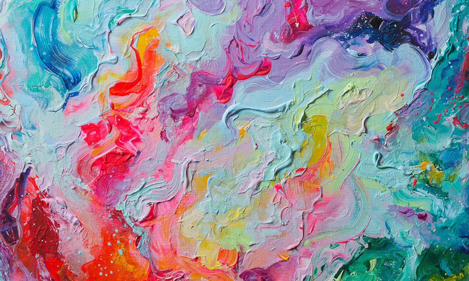
Borrow the charm of traditional art by emulating its textures in your illustrations. Use digital brushes that mimic watercolor, oil paint, or charcoal to give your posters an artistic flair that feels both classic and fresh. For instance, a poster for a jazz festival might feature a saxophone painted in bold, expressive oil strokes, blending modern design with the timeless texture of oil paint to evoke the soulful feel of jazz music.
Creating Visual Rhythms
Textures can create visual rhythms that enhance the dynamic feel of a poster. By repeating a textured pattern across the design, you can create movement and flow. This could be subtle, like a soft wave texture across a poster for a beach festival, or more pronounced, like a geometric pattern with a fabric-like texture for a fashion event. These rhythms can make your design not only more lively but also more cohesive.
Enhancing Emotional Resonance
Different textures can evoke different emotions. A velvet texture might convey luxury and sophistication, while a rusty, metallic texture could suggest ruggedness or decay. Choose textures that align with the emotional tone of your poster’s message. For a film festival featuring classic films, a grainy, filmic texture could evoke nostalgia, making the poster feel as timeless as the movies it promotes.
By exploring these innovative uses of texture, your illustrated posters can achieve a richness and depth that goes beyond color and composition. Textures not only add visual interest but also emotional resonance, making your work not just seen but felt. Dive into the textural playground, and watch your illustrated posters come to life with every grain, thread, and brushstroke!
What Are The Best Fonts For Illustrated Poster Design?
When it comes to illustrated poster design, choosing the right font is like selecting the perfect accessory—it can make your design pop, convey the right mood, and ensure your message isn't just seen, but felt. Here’s a rundown of five fantastic fonts that not only enhance the beauty of your illustrations but also make sure your text speaks as loudly as your images.
Futura Bold
Let’s start with a classic! Futura Bold is a geometric sans-serif typeface that brings a touch of modernism to any poster. Its clean, crisp lines and shapes mesh well with minimalist and futuristic illustrations, making it a go-to for designs that need to convey strength and forward-thinking. Whether it's a tech event or a modern art exhibit, Futura Bold delivers clarity and style.
Garamond
If your poster design leans towards the elegant or vintage, Garamond is your font. With its timeless appeal and refined appearance, this serif font adds a touch of sophistication to any poster. It’s particularly effective in designs that incorporate classical illustrations or require a high level of legibility. Use Garamond to lend an air of literary elegance and historical depth to your design.
Helvetica Neue
Versatility is the name of the game with Helvetica Neue. This sans-serif superstar is known for its clean, no-fuss appearance that goes well with just about any design style. Whether your illustrations are bold and colorful or subtle and detailed, Helvetica Neue supports the visuals without overpowering them, making it a safe yet stylish choice for a wide range of poster designs.
Playfair Display
When your design demands a touch of drama, Playfair Display answers the call. This serif font, with its high contrast and distinctive style, pairs beautifully with bold and dramatic illustrated artworks. It’s particularly suited for fashion, luxury, and high-end event posters where a hint of opulence is essential. Let Playfair Display transform your poster into a statement piece that’s both regal and riveting.
Montserrat
For designs that need to convey a contemporary and approachable vibe, Montserrat is the perfect pick. Its geometric yet humanistic design works well with casual, fun, and modern illustrations. Available in a variety of weights, Montserrat is incredibly flexible, making it ideal for everything from catchy headlines to small body text, all while keeping the design fresh and engaging.
Selecting the right font for your illustrated poster isn't just about aesthetics; it's about creating harmony between text and image, ensuring your message is communicated effectively and memorably. These fonts are not just tools of the trade; they’re partners in design, each bringing its own flavor and flair to the visual feast of your poster. So, go ahead, choose your font wisely, and watch your illustrated poster design come to life with clarity and style!
Conclusion
In the realm of visual communication, illustrated poster design stands out as a compelling blend of artistry and messaging. The right combination of fonts, color schemes, and layout choices can transform a simple idea into a striking visual narrative that captures attention and evokes emotion. As designers, it’s our task to harness these elements skillfully to create posters that not only look exceptional but also convey messages effectively. By continually exploring innovative styles and techniques in illustrated poster design, we can ensure that each piece is not just seen but remembered, making a lasting impact on its intended audience.
Let Us Know What You Think!
Every information you read here are written and curated by Kreafolk's team, carefully pieced together with our creative community in mind. Did you enjoy our contents? Leave a comment below and share your thoughts. Cheers to more creative articles and inspirations!




Leave a Comment