30 Best Hotel Illustration Ideas You Should Check

Source: Soulcin, Queen's Bedroom, DeviantArt, https://www.deviantart.com/soulcin/art/Queen-s-Bedroom-992006309
Looking for inspiration to bring your hospitality brand to life? You’re in the right place! In this article, we’re diving into the world of hotel illustration to showcase some of the most creative and captivating ideas that are sure to leave a lasting impression. From whimsical sketches that capture the charm of cozy bed-and-breakfasts to sleek, modern designs that resonate with high-end clientele, hotel illustration is all about storytelling through art.
Imagine vibrant lobby scenes, inviting room layouts, or picturesque landscapes that transport guests before they even arrive. With the right illustrations, your brand can create an emotional connection, making your hotel unforgettable.This article isn’t just about pretty pictures—it’s about exploring strategic ideas that enhance guest experiences and elevate your brand identity. So, get ready to check out some of the best hotel illustration ideas that will inspire your next design project.
Hotel Illustration Ideas

Source: Destinationmarketing_, Instagram, https://www.instagram.com/p/CEl9lhoDi3z/

Source: Yesterdays-Paper, Vintage Hotels The Royal Orleans, DeviantArt, https://www.deviantart.com/yesterdays-paper/art/Vintage-Hotels-The-Royal-Orleans-682713193

Source: Ianlawillustration, Instagram, https://www.instagram.com/p/CUXA404MBkl/

Source: Fran Labuschagne, Hotel Paradiso, Behance, https://www.behance.net/gallery/148908483/Hotel-Paradiso

Source: Jatindercreates, Instagram, https://www.instagram.com/p/CSJRtL1MA_T/

Source: Camille Jousset, The Law of Rhythm, Behance, https://www.behance.net/gallery/218803423/The-Law-of-Rhythm-Hotel

Source: Daria Malikova, Watercolor Interiors for a London Hotel, Behance, https://www.behance.net/gallery/154446519/Watercolor-interiors-for-a-London-hotel

Source: Feline Zegers, Instagram, https://www.instagram.com/p/CYZKN2lqODx/

Source: Sophie De La Rochefordiere, Instagram, https://www.instagram.com/p/C2mKFoaMAt5/

Source: Rachelsiegelart, Instagram, https://www.instagram.com/p/C1KREFprYp9/

Source: Abhinanth V A, Behance, https://www.behance.net/gallery/224209651/Resort-illustration

Source: Jafor-Ahmad, A Tropical Island, DeviantArt, https://www.deviantart.com/jafor-ahmad/art/A-tropical-island-980656729

Source: Imogen.Partridge, Instagram, https://www.instagram.com/p/Ctx-IbGs5QF/

Source: Illustratorius, Instagram, https://www.instagram.com/p/Cs_fnmLt5zI/

Source: Nativetonothing, Instagram, https://www.instagram.com/p/CqvOLEnuSQB/

Source: Downtownstudioo, Instagram, https://www.instagram.com/p/ButRqpfliPJ/

Source: Annescholl, Instagram, https://www.instagram.com/p/CbU6LYSMZEk

Source: Sarahsmartdraws, Instagram, https://www.instagram.com/p/Co6ti_1oalL/

Source: Krestovskaya Anna, Swiss Hotel Postcard, Dribbble, https://dribbble.com/shots/25513600-Swiss-Hotel-Postcard

Source: Arrivehotels, Instagram, https://www.instagram.com/p/Cj3G2bNuh4e/

Source: Serendigity-Art, Hotel Qa'Alle Entrance, DeviantArt, https://www.deviantart.com/serendigity-art/art/Hotel-Qa-Alle-Entrance-954076733

Source: Arsenixc, Hotel Room In Japan 1987, DeviantArt, https://www.deviantart.com/arsenixc/art/Hotel-room-in-Japan-1987-937196403

Source: Itsendy, Seaside Motel, DeviantArt, https://www.deviantart.com/itsendy/art/Seaside-Motel-855714607

Source: Yesterdays-Paper, Vintage Motels - Downtowner, Greenville MS, DeviantArt, https://www.deviantart.com/yesterdays-paper/art/Vintage-Motels-Downtowner-Greenville-MS-691789529

Source: Zhaoenzhe, Venetian Hotel, DeviantArt, https://www.deviantart.com/zhaoenzhe/art/Macau-sketch-Venetian-Hotel-440662057

Source: Lyraina, Grand Hotel Abaddon, DeviantArt, https://www.deviantart.com/lyraina/art/Grand-Hotel-Abaddon-Bar-at-Night-882062807

Source: Thenativeliondesigns, Instagram, https://www.instagram.com/p/B9_6z4fBwb_/

Source: Chateaugrief, Belvedere Island, DeviantArt, https://www.deviantart.com/chateaugrief/art/Belvedere-Island-669171594

Source: Ceemkoart, New Orleans' Vintage Soul, DeviantArt, https://www.deviantart.com/ceemkoart/art/New-Orleans-Vintage-Soul-Retro-Poster-Collection-990457947

Source: Soulcin, Queen's Bedroom, DeviantArt, https://www.deviantart.com/soulcin/art/Queen-s-Bedroom-992006309
What Elements Should Be Included in Hotel Illustration?
Creating a captivating hotel illustration is all about capturing the essence of the hotel’s ambiance while making guests feel like they’re already on vacation. But what elements should you include to make sure your illustration stands out? Here are five must-have components to craft the perfect hotel illustration that speaks volumes.
Architectural Details
Every hotel has its unique architectural charm, whether it's a modern skyscraper or a cozy countryside inn. Highlighting these architectural details gives your illustration character and makes it instantly recognizable. Think about grand entrances, elegant balconies, or even quirky window shapes. These elements not only add authenticity but also help tell the story of the hotel’s history and style. Don’t forget to play with perspective to create a dynamic and inviting scene.
Surrounding Landscape and Environment
A hotel isn’t just a building; it’s a part of its environment. Including the surrounding landscape—like lush gardens, palm-fringed beaches, or bustling cityscapes—helps set the scene. This contextual backdrop makes your hotel illustration more immersive and realistic. It gives potential guests a sense of place and adventure. Plus, it adds a layer of storytelling, showing how the hotel fits seamlessly into its environment.
Guests and Activities
Bringing your hotel illustration to life means showing it in action. Adding guests enjoying their stay creates an emotional connection and paints a vivid picture of the experience. Whether it's a family splashing in the pool, couples dining al fresco, or business travelers networking in the lobby, illustrating activities makes the scene relatable and lively. It also showcases the hotel’s vibe—fun and playful, romantic and serene, or professional and sophisticated.
Iconic Interior Features
The charm of a hotel often lies in its interior. Including iconic interior features such as grand chandeliers, stylish furniture, or even quirky art pieces gives the illustration a touch of elegance and luxury. Think about lobby designs, room layouts, or signature restaurants. These elements help guests imagine themselves lounging in comfort or dining in style. A detailed depiction of interiors can also showcase the hotel’s unique design aesthetic, making it a memorable and aspirational destination.
Branding Elements
Last but not least, don’t forget the branding! Integrating the hotel’s logo, color scheme, and even signature motifs reinforces brand identity. This subtle yet powerful touch makes the illustration cohesive and instantly recognizable. Whether it’s the logo on a doormat, branded umbrellas by the pool, or custom patterns on cushions, branding elements tie the whole illustration together. It enhances brand recall and gives a polished, professional finish.
Creating a hotel illustration isn’t just about drawing a building; it’s about crafting an experience. By thoughtfully including architectural details, the surrounding landscape, lively guest activities, iconic interiors, and cohesive branding elements, your illustration will not only capture attention but also inspire wanderlust.
What Color Palettes Best Suit Hotel Illustrations?
Diving into the world of hotel illustration, one of the most exhilarating parts is playing with colors. The right palette can turn a simple drawing into a story, evoking emotions and setting the atmosphere. Whether you're an aspiring artist or a seasoned illustrator, choosing the perfect color palette for your hotel illustration can be a delightful puzzle. Here’s a guide to help you navigate this colorful journey :
Reflecting the Hotel's Personality
Just like people, every hotel has its own personality. Is it a cozy, rustic lodge or a sleek, modern urban retreat? For the former, think warm, earthy tones - browns, deep greens, and oranges. For the latter, cool blues, grays, and crisp whites. The color palette should be a reflection of the hotel's character, giving a viewer an instant ‘feel’ of the place.
Accentuating Architectural Elements
Pay attention to the architectural style of the hotel. A grand Victorian hotel might call for rich, royal colors like purples and golds to accentuate its elegance. In contrast, a minimalist, contemporary hotel would benefit from a more subdued palette, emphasizing clean lines and simplicity. Use colors to highlight these architectural features in your hotel illustration.
Setting the Mood with Color Psychology
Colors have the power to evoke emotions. Blues and greens are calming, perfect for a spa retreat illustration. Vibrant reds and oranges can reflect the energy of a bustling city hotel. Soft pastels might suit a quaint bed-and-breakfast. Think about the mood you want to convey in your hotel illustration and choose your palette accordingly.
Complementing the Surroundings
Consider the hotel’s setting. A beachfront property could be illustrated with a palette of sandy beiges, ocean blues, and sunny yellows. A mountain lodge might call for a palette of forest greens, earthy browns, and deep blues. Let the environment inspire your color choices, creating a harmonious blend between the hotel and its surroundings.
Experimenting with Trendy Palettes
While it’s important to stay true to the hotel’s essence, don’t shy away from experimenting with trendy color palettes. Maybe a pop of neon in a retro-themed hotel illustration or some muted pastels in a chic boutique hotel drawing. Keeping an eye on current color trends can add a fresh, contemporary twist to your artwork.
Creating hotel illustrations is not just about drawing structures; it’s about capturing the essence of a place. The right color palette breathes life into your artwork, inviting viewers to step into the world you’ve created. It’s a blend of art and psychology, a dance of hues and shades that tells a story.
What Are Popular Styles in Hotel Illustration?
Hotel illustration is a powerful way to capture the ambiance, charm, and personality of a hotel. Whether you’re designing for a luxury resort, a cozy boutique inn, or a vibrant urban hotel, the style you choose can make all the difference. But with so many artistic directions to explore, which styles are the most popular? Let’s dive into five captivating styles that are making waves in the world of hotel illustration.
Minimalist Line Art
Less is more! Minimalist line art is all about simplicity and elegance. Using clean lines and monochromatic palettes, this style captures the architectural essence of a hotel without overwhelming details. It’s perfect for modern, high-end hotels that want to convey sophistication and exclusivity. Think sleek city hotels or luxurious spa resorts. The beauty of minimalist line art lies in its ability to communicate sophistication while maintaining a contemporary and chic look. Plus, it adapts beautifully to various branding materials, from business cards to social media graphics.
Whimsical Hand-Drawn Sketches
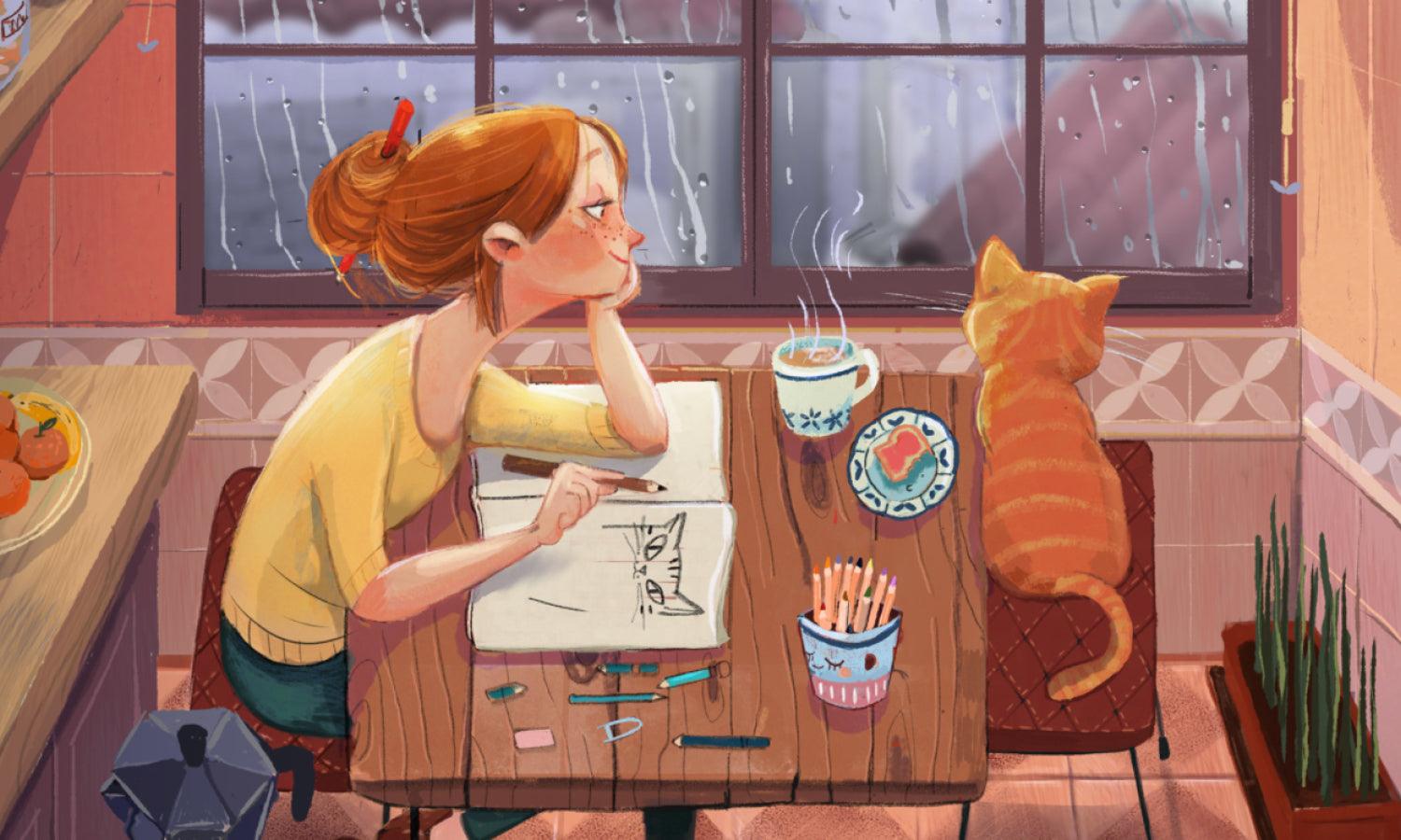
For hotels that want to evoke charm and warmth, whimsical hand-drawn sketches are the way to go. This style brings out a playful, storybook-like quality, perfect for boutique hotels, bed-and-breakfasts, or family-friendly resorts. With soft lines, delicate shading, and a dash of nostalgia, these illustrations make guests feel right at home before they even arrive. It’s all about capturing the little details, like ivy-covered balconies, cozy reading nooks, or a cat lounging by the window. These sketches are personal, inviting, and packed with character.
Vintage Travel Poster Aesthetics
Retro never goes out of style! Inspired by vintage travel posters of the early 20th century, this style brings a sense of wanderlust and adventure. With bold colors, striking typography, and dramatic compositions, vintage-inspired hotel illustrations are perfect for resorts or historical hotels that want to celebrate their legacy. It’s all about creating a sense of nostalgia and romance, making guests feel like they’re stepping into a glamorous bygone era. Imagine sun-kissed beaches, majestic mountain resorts, or elegant city hotels painted in vivid retro hues. It’s vintage with a modern twist!
Watercolor Illustration
Soft, dreamy, and effortlessly elegant—watercolor illustrations bring a touch of artistic sophistication to hotel branding. This style is perfect for romantic getaways, luxury villas, and destination resorts. With delicate brush strokes and fluid color transitions, watercolor illustrations beautifully capture the ambiance and natural beauty surrounding the hotel. Whether it’s lush gardens, serene beach views, or picturesque cityscapes, watercolor brings a sense of calm and tranquility. It’s ideal for evoking emotion and inviting guests to escape and relax.
Bold Digital Vector Art
For those looking for a vibrant and modern touch, bold digital vector art is the go-to style. This style features clean shapes, bright colors, and dynamic compositions, making it perfect for urban hotels, lifestyle brands, or quirky boutique stays. Vector art is incredibly versatile, easily scaling for everything from billboards to mobile apps. Its vibrant and energetic vibe appeals to younger audiences and those seeking a fun, memorable stay. It’s bold, it’s loud, and it’s undeniably eye-catching.
Choosing the right style for your "hotel illustration" isn’t just about what looks good—it’s about storytelling. Each of these popular styles brings a unique narrative and emotion to the table. Whether you’re aiming for chic minimalism, playful nostalgia, romantic elegance, retro adventure, or bold modernism, there’s a style to perfectly capture the spirit of your hotel. So, which style will you check into?
Which Techniques Work Best for Hotel Illustrations?
The world of hotel illustration, where creativity meets structure, and every stroke tells a story. Whether you’re a budding artist or a professional looking to spice up your portfolio, mastering certain techniques can elevate your hotel illustrations from good to absolutely breathtaking. Let’s dive into five techniques that work like magic for hotel illustration :
Perspective Perfection
When it comes to hotel illustration, getting the perspective right is crucial. It's like the backbone of your drawing, providing a realistic and three-dimensional look. Whether you’re sketching a grand, sprawling resort or a cozy, tucked-away inn, mastering linear perspective techniques will help your hotel pop off the page. Play around with one-point, two-point, or even three-point perspectives to create depth and dimension, making your viewers feel like they could step right into the scene.
Lighting and Shadow Play
Lighting can make or break an illustration. It sets the mood, creates atmosphere, and gives depth to your artwork. Experiment with different lighting scenarios – the soft glow of dawn, the harsh midday sun, or the romantic hues of dusk. Use shadows to add volume and a sense of realism. Think about how light interacts with the hotel’s architecture and surroundings, and let this guide your shading techniques.
Textural Wonderland
Hotels aren’t just made of walls and windows; they’re a tapestry of textures. From the rough stonework of an old castle to the sleek glass of a modern skyscraper, textures bring a tactile dimension to your illustrations. Use a mix of techniques like cross-hatching, stippling, or scumbling to mimic these textures. It’s about making your viewers ‘feel’ the illustration, adding layers of richness and detail.
Color Dynamics
Color is a powerful tool in your artistic arsenal. It can convey emotion, set the tone, and create harmony or contrast. When working on hotel illustrations, consider the color theory – warm colors for a welcoming vibe, cool colors for a calm and serene atmosphere. Use harmonious color palettes to create a cohesive look or contrasting colors for a bold statement. Remember, color is not just about beauty; it’s about storytelling.
Detailed Delights
It’s often the little details that turn a good illustration into a great one. Adding intricate details like the patterns on the carpets, the design on the curtains, or the flowers in the garden can bring your hotel illustration to life. These details not only add visual interest but also help convey the hotel's unique character and style. Be careful not to overcrowd your illustration; it’s about striking the right balance between simplicity and intricacy.
Hotel illustration is an art form where technique and creativity come together to create something truly special. By mastering these techniques, you can bring a sense of realism, depth, and emotion to your hotel drawings, captivating your audience’s imagination.
What Are the Best Examples of Hotel Illustration?
Looking for some jaw-dropping "hotel illustration" inspiration? You’re in the right place! Whether you're a designer seeking fresh ideas or a hotelier looking to revamp your brand’s visual identity, exploring the best examples of hotel illustration can spark creativity and help you stand out. From chic minimalism to vibrant storytelling, these illustrations are more than just pretty pictures—they’re experiences on paper (or screen). Let’s take a tour of five outstanding examples that perfectly capture the essence of hotel life.
The Grand Budapest Hotel Posters
Wes Anderson’s film "The Grand Budapest Hotel" didn’t just captivate audiences with its quirky humor and charming storyline—it made waves in the design world with its iconic illustrations. The posters for this fictional hotel are masterpieces of vintage-inspired art. Using pastel palettes, symmetrical designs, and intricate architectural details, the illustrations transport viewers into a whimsical, nostalgic world. This example showcases how illustration can build an entire universe around a hotel, making it feel like a character in itself. It’s a brilliant inspiration for boutique hotels or those wanting to capture a cinematic, storybook feel.
Airbnb City Guides
Airbnb isn’t technically a hotel chain, but their city guide illustrations are worth mentioning. These digital illustrations capture the spirit of each city with playful, vibrant designs that highlight local landmarks and cultural quirks. The attention to detail and clever use of color create a sense of adventure and curiosity. For hotels aiming to emphasize local experiences or urban exploration, this example shows how to blend branding with destination marketing through illustration. It’s about more than just rooms—it’s about the journey.
Ritz-Carlton’s Elegant Architectural Sketches
If you’re looking for sophistication and elegance, Ritz-Carlton’s architectural sketches are a masterclass in luxury illustration. These hand-drawn sketches focus on the grandiose facades and intricate architectural details of their iconic properties worldwide. Using minimalist line art with subtle shading, these illustrations exude class and exclusivity. This example is perfect for luxury hotels wanting to showcase their architectural beauty and heritage. It’s proof that sometimes less is more—elegance lies in the details.
The Ace Hotel’s Whimsical Room Illustrations
The Ace Hotel chain is known for its quirky, eclectic style, and their room illustrations perfectly capture this vibe. Using playful, hand-drawn sketches with quirky details (like a guitar casually leaning against a chair or vintage lampshades), these illustrations reflect the laid-back, artistic spirit of the brand. This example shows how hotel illustration can break away from traditional conventions to create a fun, relatable brand identity. If you’re designing for boutique hotels or lifestyle brands, this playful, narrative-driven style is a winner.
Marriott’s Digital Vector Maps
Marriott uses vibrant, digital vector maps to showcase their hotel locations and nearby attractions. These illustrations are clean, colorful, and easy to navigate, adding a touch of fun to trip planning. By including landmarks, dining spots, and recreational areas, these maps enhance the guest experience even before they arrive. This example highlights the functional yet artistic potential of hotel illustration. It’s not just about looking pretty—it’s about adding value and creating anticipation.
The best examples of hotel illustration are those that do more than decorate—they communicate a story, evoke emotion, and elevate brand identity. So, which style resonates with your brand? Whichever you choose, remember that illustration isn’t just art—it’s an experience.
Conclusion
Hotel illustration is a powerful tool for bringing a hotel’s story to life. From minimalist architectural sketches to vibrant digital maps, each style offers a unique way to connect with guests and showcase a hotel’s personality. By exploring different styles and drawing inspiration from the best examples, designers can create captivating visuals that leave a lasting impression. Whether you’re designing for luxury resorts, boutique inns, or urban escapes, the right illustration style can enhance branding and guest experiences. Ready to elevate your hotel’s identity? Start experimenting with hotel illustration and make your property unforgettable.
Let Us Know What You Think!
Every information you read here are written and curated by Kreafolk's team, carefully pieced together with our creative community in mind. Did you enjoy our contents? Leave a comment below and share your thoughts. Cheers to more creative articles and inspirations!





Leave a Comment