30 Best Flat Illustration Ideas You Should Check

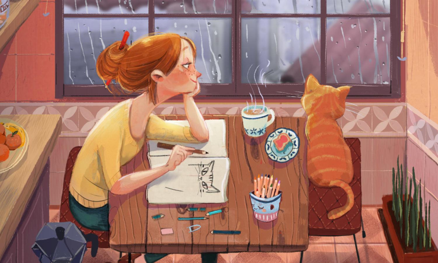
Source: Zove.ahhh, Instagram, https://www.instagram.com/p/CjnbkbQheNd/
Flat illustration is more than just a trend—it’s a powerful visual language that brings simplicity and charm to any creative project. Whether you're designing a brand identity, app interface, or editorial spread, the clean lines and bold colors of flat illustration offer a refreshing visual experience. Unlike complex, hyper-detailed styles, flat illustration relies on minimalism, geometric forms, and color-blocked aesthetics to tell stories in a clear, modern way.
This article dives into some of the best flat illustration ideas worth exploring—from playful character scenes to crisp business infographics. You'll find clever compositions, versatile themes, and concepts that make flat illustration a standout choice for designers looking to grab attention without overwhelming the viewer. Whether you're a seasoned illustrator or a creative just starting to dabble, these ideas can spark your next masterpiece. From abstract environments to expressive avatars, we’re spotlighting styles that pop and formats that function beautifully across digital and print media.
Ready to flatten the curve in the most artistic way possible? Let’s unpack these brilliant flat illustration ideas that are easy to adapt and impossible to ignore. Your design toolkit is about to get a whole lot bolder.
Flat Illustrations Ideas

Source: Anastasiya Pruss, Evensoul, Behance, https://www.behance.net/gallery/220891997/Evensoul-Service-psychotherapy-Brand-illustration

Source: Thedhimangupta, Instagram, https://www.instagram.com/p/CuMjBJpPC48/

Source: Lingcoolart, Instagram, https://www.instagram.com/p/Cy6JyBZvblJ/

Source: Nina.clausonet, Instagram, https://www.instagram.com/p/Cu9Z_uXsjKN/

Source: Rozkazaz, Instagram, https://www.instagram.com/p/Ck1eQ6vOglM/

Source: D15_17, Instagram, https://www.instagram.com/p/CrlDwE4vPBm/

Source: Noragazzar, Instagram, https://www.instagram.com/p/Cj4xNLrrYya/

Source: Leenakisonen, Instagram, https://www.instagram.com/p/CzGtyp_Mk9z/

Source: Itsannahurley, Instagram, https://www.instagram.com/p/CnMtvolMkuA/

Source: Azzurroscuro, Instagram, https://www.instagram.com/p/CnfEaGMDeQj/

Source: Anya Evdokimova, Behance, https://www.behance.net/gallery/161639717/Various-illustration-2

Source: Nina.clausonet, Instagram, https://www.instagram.com/p/Cnj806KNDKi/

Source: Noragazzar, Instagram, https://www.instagram.com/p/Cjr8nulhj1d/

Source: Bonehaus, Instagram, https://www.instagram.com/p/Co9skDfOtUj/

Source: Ughsketches, Instagram, https://www.instagram.com/p/ChcVpufIfXF/

Source: Asyleart, Instagram, https://www.instagram.com/p/CiXL7TGq5cL/

Source: Diarlle Carvalho, GoDaddy, Behance, https://www.behance.net/gallery/223068149/GoDaddy-Illustration-Set

Source: Whistleburg, Instagram, https://www.instagram.com/p/CvhZJy1S-Vl/

Source: Laura Normand, Fleurs, Behance, https://www.behance.net/gallery/118378053/FLEURS-Pop-art-flowers

Source: Kittyo.illustration, Instagram, https://www.instagram.com/p/CphZEy5sIAN/

Source: Noragazzar, Instagram, https://www.instagram.com/p/CqXjvgNIaLE/

Source: Felic Art, Zeelo, Behance, https://www.behance.net/gallery/222331861/Zeelo-Explainer-Video

Source: Parapaboom, Instagram, https://www.instagram.com/p/Cfs70MaLA-z/

Source: Zove.ahhh, Instagram, https://www.instagram.com/p/CjiQy3bhzuj/

Source: Judit Zengővári, Behance, https://www.behance.net/gallery/222599315/Tennis-Characters

Source: Monika Gregulska, Embrace the Nature, Behance, https://www.behance.net/gallery/204133095/Embrace-the-nature

Source: Yasmin Ayumi, Mental Health, Behance, https://www.behance.net/gallery/217484359/Saude-sem-segredo-Mental-Health

Source: Janeenmade, Instagram, https://www.instagram.com/p/CtOthymNz8J/

Source: Uran.duo, Instagram, https://www.instagram.com/p/CtbjhcrPmla/

Source: Zove.ahhh, Instagram, https://www.instagram.com/p/CjnbkbQheNd/
What Are the Core Elements of Flat Illustration?
Flat illustration is all about cutting the fluff and keeping things clean, colorful, and clever. It’s the kind of style that doesn’t need flashy gradients or fancy textures to make an impact. Instead, it relies on essential visual ingredients that work together in harmony to tell a story, convey a message, or simply look fantastic. Whether you're just starting out or refining your flat illustration game, here are five core elements that make this style so distinct and lovable.
Bold, Solid Colors
One of the first things you'll notice in any flat illustration is the use of bold, solid color palettes. There are no gradient blends or airbrushed shadows—just pure color blocks that define shape, contrast, and mood. These colors aren’t just bright for the sake of being loud—they’re intentionally chosen to bring clarity and attention to the artwork. Whether you're using muted pastels for a soft feel or vivid primaries for high energy, color does the heavy lifting in flat illustration. Keep it intentional, keep it limited, and let the hues do the talking.
Simple Shapes and Geometry
Flat illustration wouldn’t be flat without its geometric roots. At the heart of every object, character, or icon lies a basic shape—circles, rectangles, triangles, and lines all come together to form everything from smiling suns to soaring rockets. This simplicity isn’t a limitation; it’s a creative challenge. How do you turn a few basic shapes into something meaningful and expressive? That’s where the fun begins. Flat illustration embraces this minimalism and turns it into a strength by focusing on visual clarity and stylized abstraction.
Minimal Detail, Maximum Expression
Despite its simplicity, flat illustration has a way of packing in personality. The trick? Knowing what to leave out. Instead of overloading a design with intricate textures or fussy embellishments, flat illustration zooms in on the essentials. Eyes are dots. Smiles are curves. Leaves are solid green shapes. Yet somehow, they still feel alive. It’s this minimal-detail approach that allows artists to focus on expression, composition, and concept without visual noise. Think of it as visual haiku—short, structured, but full of meaning.
Clean Lines and Clear Contours
Clean, intentional outlines give flat illustration its unmistakable crispness. Some illustrations ditch the outlines entirely and rely on contrast between color blocks to separate forms. Others embrace smooth, even strokes to define characters and objects. Either way, the line work in flat illustration is never chaotic or overcomplicated. It’s designed to guide the eye, define boundaries, and give structure to the scene. The clarity of these lines helps make the style so versatile—perfect for icons, infographics, web design, and more.
Balanced Composition and Space
A strong flat illustration isn’t just about what you put on the canvas—it’s also about how you arrange it. Balance is a key element here. Whether it's a centered layout with a single focal point or a dynamic scene filled with action, every element should feel like it belongs. Negative space is your secret weapon. It gives breathing room, draws attention, and helps maintain visual hierarchy. In flat illustration, less is more—but where you put that “less” really matters.
These five elements are the foundation of a strong flat illustration. They’re simple, sure—but with the right eye and creativity, they can speak volumes.
What Are the Most Common Themes in Flat Illustration?
Flat illustration is like the chameleon of the design world—it fits just about anywhere, adapts to almost any message, and still manages to look stylishly minimal. Whether you're scrolling through a brand’s landing page, reading an infographic, or thumbing through a modern children’s book, chances are a flat illustration is brightening your view. So, what kinds of stories does this versatile art style love to tell? Here are five of the most common (and beloved) themes in flat illustration that keep popping up in creative corners everywhere.
Daily Life and Human Interaction
Scenes of everyday activities are the bread and butter of flat illustration. From folks walking dogs and sipping coffee to coworkers gathered around laptops, these visuals make the mundane feel magical. Flat illustration excels at capturing human behavior with charm and clarity. Characters are stylized, often diverse, and always expressive—without needing complex features. Whether it’s a digital workplace, a cozy home setting, or a bustling street scene, flat illustration makes daily life feel cheerful and relatable.
Technology and Innovation
Tech themes and flat illustration go hand in hand—literally. You'll often see flat hands holding smartphones, abstract representations of cloud storage, and flowy lines connecting gadgets. This style is perfect for simplifying complex ideas like software tools, cybersecurity, or artificial intelligence. The minimal detail and icon-like precision make it ideal for communicating innovation in a way that feels approachable. Add a few gears, circuit lines, and chat bubbles, and you’ve got a futuristic concept wrapped in a playful visual.
Nature and the Environment
From blooming trees and rolling hills to oceans full of stylized fish, flat illustration often explores nature in its most geometric form. These visuals are especially popular in eco-conscious branding, editorial content, and outdoor lifestyle products. Designers use clean leaves, flat mountains, and cheerful suns to evoke calm, sustainability, and adventure. It’s a way to celebrate the environment while keeping the design uncluttered and modern. Bonus points for pairing natural themes with bold, unconventional color palettes.
Business and Finance
Flat illustration has found its place in the serious world of numbers and strategy—by making it fun. It’s common to see cheerful business characters shaking hands, climbing ladders, or tossing around dollar signs. Graphs, charts, and icons are stylized to look user-friendly, taking the edge off traditionally dry subjects. Flat illustration is widely used in pitch decks, startup websites, and fintech apps to make complex concepts feel digestible and lively.
Travel and Exploration
What better way to inspire wanderlust than through colorful planes, backpacks, cityscapes, and winding maps? Travel-themed flat illustrations often include elements like iconic landmarks, passports, luggage, and dreamy destinations. This theme allows for creative mashups—stylized landscapes mixed with symbolic transport, or characters mid-journey with a sense of movement and curiosity. It’s storytelling on a global scale, all drawn with flat lines and bold imagination.
Whether you're illustrating a corporate pitch or a camping adventure, these common themes prove that flat illustration is as versatile as it is vibrant. It’s all about finding the right story and giving it the clean, colorful treatment it deserves.
What Are Some Creative Layout Ideas for Flat Illustration?
Flat illustration thrives on simplicity, but that doesn’t mean your layouts have to be dull or repetitive. In fact, the charm of flat illustration lies in its flexibility—it can adapt to nearly any composition style without losing its clarity. If you're looking to elevate your artwork or branding with clever layouts, here are five creative ideas that will make your flat illustration pop off the screen (or page) while staying bold, clean, and unmistakably stylish.
Grid-Based Symmetry
One of the most reliable ways to achieve harmony in flat illustration is by embracing grid-based layouts. This structure works especially well for editorial spreads, UI dashboards, and posters. By aligning characters, icons, and elements along a grid, you can ensure balance without sacrificing visual interest. Flat illustration looks especially crisp when paired with consistent spacing, sharp lines, and symmetrical arrangements. Try combining bold typography and minimalist color schemes within the grid to keep the design visually cohesive.
Overlapping Elements with Purpose
Although flat illustration avoids complex depth, you can still introduce dimension through smart layering. Overlapping objects—such as plants behind characters, speech bubbles over heads, or text interwoven between shapes—adds rhythm and intrigue. Just be sure each overlap serves a purpose. This technique works beautifully in storytelling scenes where you want to guide the viewer’s eye or emphasize focal points without relying on shadows or gradients.
Isometric Illusions
Who says flat illustration has to be completely flat? Isometric layouts are a great middle ground. By designing scenes with a tilted perspective, you can build cityscapes, rooms, or workflow diagrams that feel structured yet imaginative. Think floating office desks, stacked software windows, or miniature neighborhoods. The key is to maintain that trademark flat style—solid fills, minimal details—while tricking the eye into perceiving depth through angle and arrangement.
Modular Story Panels
Taking inspiration from comics or storyboards, modular panels give flat illustration a cinematic flair. This layout is perfect for presenting processes, tutorials, or narrative sequences. Use clearly separated blocks to divide actions or moments, and add arrows or visual cues to lead the eye from one to the next. You’ll turn a static flat illustration into a mini visual journey, all while maintaining that crisp, uncluttered style that defines the genre.
Bold Negative Space
Don’t underestimate the power of what you don’t draw. Flat illustration pairs beautifully with bold, intentional negative space. Think of floating figures in a sea of color, or a single central object surrounded by breathing room. This minimalist approach adds emphasis and sophistication, letting each element stand out. It’s a layout choice that’s especially effective in modern branding, posters, and social media visuals.
Whether you're designing a marketing graphic, a website section, or a quirky character scene, these layout ideas give flat illustration new energy. When used thoughtfully, composition becomes more than a container—it becomes part of the message.
What Are the Best Fonts to Pair with Flat Illustration?
Pairing the right font with a flat illustration is like choosing the perfect topping for your favorite dish—it enhances everything and brings the whole composition to life. Flat illustration, with its clean lines and bold shapes, craves typography that complements its minimal yet expressive personality. Whether you're creating a quirky landing page, a sleek infographic, or playful packaging, the type you choose should echo the illustration's tone and simplicity. Let’s look at five font styles that play particularly well with flat illustration and give your design that polished, professional edge.
Rounded Sans-Serifs
Flat illustration often feels friendly, and nothing says “approachable” like a rounded sans-serif font. Think of typefaces like Quicksand, Nunito, or Poppins. These fonts are soft, bubbly, and easy to read—making them a perfect match for colorful, character-driven illustrations. Rounded sans-serifs work wonders in educational materials, children’s designs, and startup branding. They amplify the cheerful vibe of flat illustration without stealing the spotlight.
Geometric Sans-Serifs
If your flat illustration leans modern and sleek, geometric sans-serifs are your best friend. Fonts like Futura, Montserrat, or Avenir offer clean, structured letterforms that mirror the geometric nature of flat illustration itself. This combo works especially well in tech interfaces, infographics, and editorial layouts. The balance of form and function gives your design a crisp, contemporary edge—perfect for illustrations that highlight data, workflows, or digital tools.
Bold Display Fonts
Want your flat illustration to make a statement? Pair it with a bold display font. Think Bebas Neue, Anton, or League Spartan. These typefaces are assertive, eye-catching, and great for headlines or calls-to-action. Because flat illustration typically avoids intricate detail, these strong fonts balance beautifully against simple shapes and solid colors. Just be sure to use bold fonts sparingly—they’re great for impact but need breathing room to shine.
Playful Handwritten Fonts
Sometimes your flat illustration calls for a little whimsy—and that’s where handwritten or script-style fonts come in. Options like Pacifico, Amatic SC, or Fredericka the Great can add a dash of character and personality to your work. These fonts are ideal for themes like food, travel, hobbies, or lifestyle brands. When used tastefully, they make the illustration feel warm, personal, and handcrafted—even when it’s created entirely in vector!
Minimalist Serif Fonts
While flat illustration typically favors sans-serifs, there’s room for contrast. A minimalist serif font like Merriweather, Playfair Display, or Lora can introduce elegance without breaking the aesthetic. These fonts work especially well for editorial designs, websites with flat illustrations, or brand identities that want to mix creativity with credibility. The key is choosing a serif that’s clean and modern—avoid overly ornate letterforms that clash with the simplicity of the illustration.
In the world of flat illustration, your typography isn’t just an accessory—it’s a partner in design. Choose fonts that reflect the tone, support the visuals, and keep your overall layout looking cohesive and sharp.
What Software Is Best for Creating Flat Illustration?
Flat illustration may look simple on the surface, but behind every smooth line and blocky color lies powerful software that makes it all happen. Whether you're crafting vibrant characters or sleek digital icons, choosing the right tool is key to bringing your flat illustration ideas to life. Each program comes with its own flair, features, and creative possibilities. From vector pros to beginner-friendly gems, here are five of the best software options for designing in this clean, bold style.
Adobe Illustrator
Let’s start with the heavyweight champ. Adobe Illustrator is the industry standard when it comes to vector graphics, and it's a dream for flat illustration. With its precision pen tools, scalable vector shapes, and endless libraries of brushes, gradients, and icons, Illustrator offers unmatched flexibility. The layering system is intuitive, and the color management tools are perfect for building bold, cohesive palettes. Whether you're designing logos, infographics, or playful character scenes, Illustrator gives you the control and clarity you need to keep things flat and fabulous.
Affinity Designer
Affinity Designer is like Illustrator’s sleeker, more budget-friendly cousin—and it packs a serious punch. Designed for speed and smooth workflow, this program is ideal for artists who love working with both vector and raster elements. Flat illustration thrives in its vector persona mode, where you can easily snap shapes, tweak nodes, and manage layers like a pro. The best part? No subscription fees. It’s a one-time purchase that delivers professional results without draining your wallet.
Figma
You might know Figma as a UI/UX design tool, but it’s surprisingly powerful for flat illustration as well. With its vector tools, smart alignment features, and collaborative interface, Figma is perfect for fast-paced, design-on-the-go situations. It’s web-based, which means you can illustrate from anywhere and work in real time with teammates. Flat illustration shines in Figma when you're creating icon sets, landing page visuals, or simplified scenes for web and app interfaces.
Procreate
If you're an iPad user and prefer to draw with a stylus, Procreate is a creative powerhouse. While it's primarily a raster-based app, Procreate makes flat illustration feel natural with its smooth drawing tools, layering system, and responsive brushes. You can easily block out solid colors, use symmetry guides, and export high-resolution art. It’s perfect for artists who like to sketch freehand but still want the clean aesthetic of flat illustration. Add in pressure sensitivity and gesture shortcuts, and you’ve got a hands-on experience that feels both fun and pro-level.
Inkscape
Looking for a free, open-source alternative? Inkscape delivers. While it may not have the polished UI of its paid counterparts, it’s fully capable of professional-grade vector illustration. You get all the core tools you need—paths, shapes, fills, nodes, and more. Inkscape is great for flat illustration projects like posters, editorial art, and icon design, especially if you're just starting and want to learn without financial commitment. Plus, the global community provides a wealth of tutorials and plug-ins to expand your skills.
No matter your style or budget, there’s a perfect piece of software out there to support your flat illustration journey. Choose one that fits your workflow, inspires your creativity, and lets your ideas take center stage—bold, bright, and beautifully flat.
Conclusion
Choosing the right software can make a world of difference in how efficiently and creatively you work with flat illustration. From industry giants like Adobe Illustrator to accessible tools like Inkscape and Procreate, each program offers unique strengths tailored to different workflows and skill levels. Whether you prefer precise vector paths or intuitive drawing interfaces, flat illustration thrives when paired with the right digital tools. The key is to find software that complements your creative process while allowing you to focus on bold colors, simple shapes, and clean compositions that define this popular and impactful illustration style.
Let Us Know What You Think!
Every information you read here are written and curated by Kreafolk's team, carefully pieced together with our creative community in mind. Did you enjoy our contents? Leave a comment below and share your thoughts. Cheers to more creative articles and inspirations!




Leave a Comment