30 Best Fig Illustration Ideas You Should Check

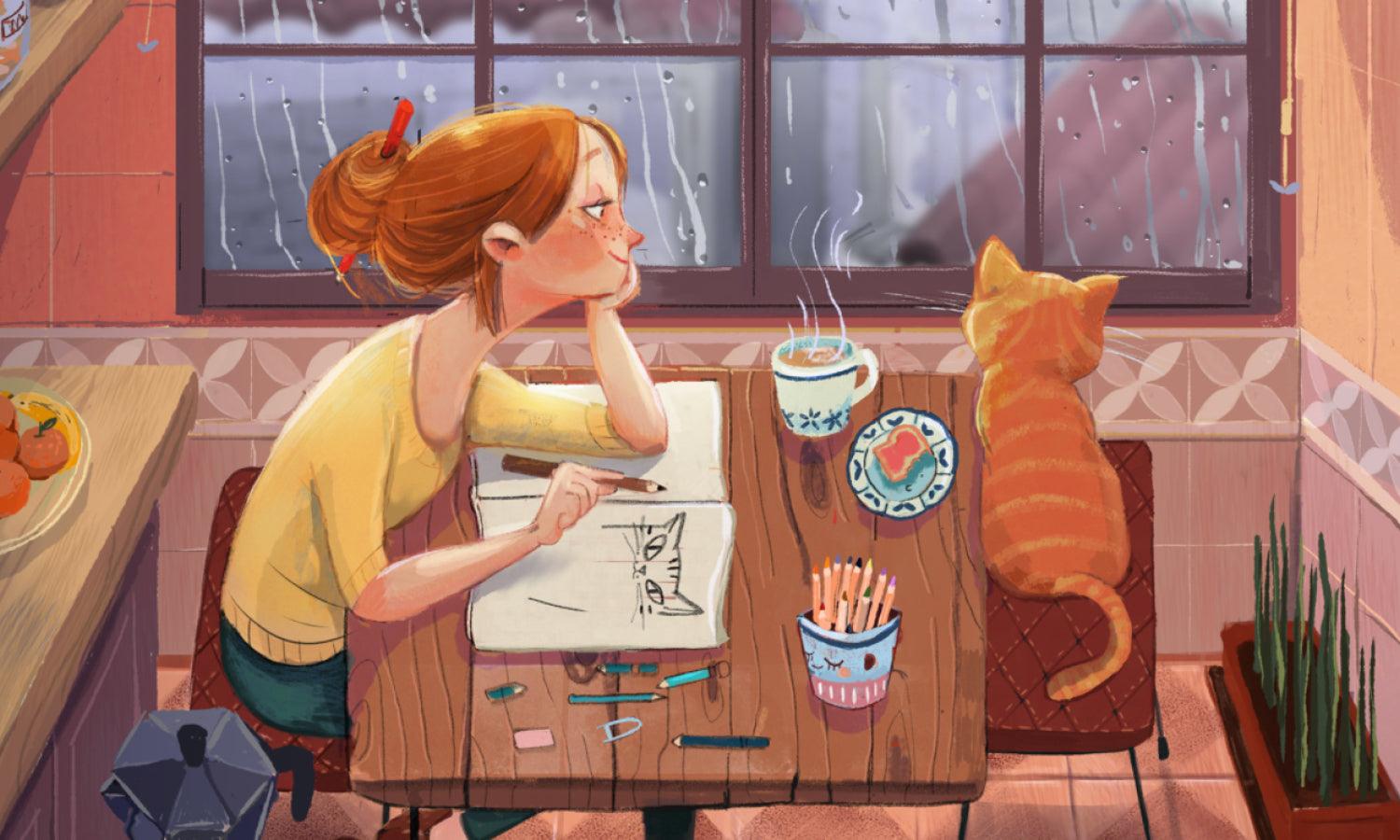
Source: Jiyun Kim, Fig (2019), Behance, https://www.behance.net/gallery/78491771/Fig-(2019)
Looking for juicy inspiration for your next creative project? Fig illustration is a deliciously versatile theme that offers a world of artistic possibilities. From realistic botanical renderings to whimsical cartoon styles, figs can be shaped, sliced, stylized, or even personified in all kinds of imaginative ways. Whether you're aiming for a fresh market vibe or something more abstract and dreamy, there's a fig illustration idea that can perfectly match your visual goals.
This article serves up a curated menu of the best fig illustration ideas to check—ripe with textures, tones, and twists. You’ll find everything from lush watercolor interpretations to flat modern designs ideal for packaging, branding, or editorial work. Figs are more than just fruits—they’re symbols of abundance, fertility, and creativity, making them an ideal subject for bold experimentation and soft, sensual artistry alike. Get ready to peel back the layers of creativity and explore what makes fig-focused artwork both timeless and trend-forward.
Fig Illustration Ideas

Source: Kailenefalls, Instagram, https://www.instagram.com/p/CzqrlJ0pAXL/

Source: Kazuyoshi Terashima, Behance, https://www.behance.net/gallery/151366619/fig

Source: Art_side_of_life, Instagram, https://www.instagram.com/p/DGeeqkIyEYV/

Source: Eleonora Surano, Fig Toast, Behance, https://www.behance.net/gallery/176401715/Fig-Toast

Source: Fiona_avocado, Instagram, https://www.instagram.com/p/DI31UQeRa2E/

Source: Lucia Calfapietra, Behance, https://www.behance.net/gallery/105572259/FIG

Source: Elizabethwheatleyart, Instagram, https://www.instagram.com/p/C34csxsCUhm/

Source: Katariinapurru, Instagram, https://www.instagram.com/p/C3hVoXNIQ7g/

Source: Olexandra М, Fig & Thyme Gin, Behance, https://www.behance.net/gallery/164259601/Fig-Thyme-Gin-Watercolor-Cocktail

Source: 13rapports, Instagram, https://www.instagram.com/p/C8L9mtzqUgA/

Source: Irina Shishkova, Behance, https://www.behance.net/gallery/88066315/Collection-of-fig-fruits-watercolor-illustration

Source: Dee.beale, Instagram, https://www.instagram.com/p/CpKvmpMsWS3/

Source: Vankhuynhart, Instagram, https://www.instagram.com/p/CaSCG3cOj8T/

Source: Sophiaoconnorillustration, Instagram, https://www.instagram.com/p/ClyS3R2oaiG/

Source: Pipandlo, Instagram, https://www.instagram.com/p/CU-Ak6KgOuq/

Source: Nashwa Mahmoud, Dribbble, https://dribbble.com/shots/15879167-Figs-all-the-day

Source: Santa Dovydaitytė, Dribbble, https://dribbble.com/shots/17140019-Fig-Illustration

Source: Theydrawandcook, Instagram, https://www.instagram.com/p/CPp-6uHn6Ay/

Source: Tugba Kaya, Dribbble, https://dribbble.com/shots/20588177-Fig-Illustrations-pt3

Source: Romanceofbooks, Instagram, https://www.instagram.com/p/CT-ZeTRl5Ij/

Source: Viola.artstudio, Instagram, https://www.instagram.com/p/C3Sbs7yK2LG/

Source: Erikabeeswax, Instagram, https://www.instagram.com/p/ChxEa4GrvYq/

Source: Design.sumitgill, Instagram, https://www.instagram.com/p/Cpeu86QBqky/

Source: Frauhellen.jpg, Instagram, https://www.instagram.com/p/CqkHbtcv456/

Source: Sarahmaxwellart, Instagram, https://www.instagram.com/p/B4M2n5JAqx8/

Source: Flaming.garden, Instagram, https://www.instagram.com/p/B4SskrPnmFk/

Source: Pelc.olka, Instagram, https://www.instagram.com/p/Cvb8fvYozb9/

Source: Edimcatstuff, Instagram, https://www.instagram.com/p/CDu2HOaJoZM/

Source: Lauramckendry_art, Instagram, https://www.instagram.com/p/CHckn9PHS3p/

Source: Jiyun Kim, Fig (2019), Behance, https://www.behance.net/gallery/78491771/Fig-(2019)
What Colors Work Best in Fig Illustration?
When it comes to fig illustration, color is everything. The beauty of a fig lies not only in its luscious shape but also in its captivating palette. Whether you’re designing a juicy, realistic fig or a stylized version for packaging or patterns, choosing the right colors can make your artwork pop and feel deliciously fresh. Below are five standout color considerations that work exceptionally well in fig illustration.
Deep Purples and Plums
Nothing screams fig quite like a rich, deep purple. This color mirrors the exterior skin of many fig varieties and instantly sets a lush, ripe tone. Purples can range from almost black to red-violet hues, making them perfect for creating depth and texture. For digital work, try using gradients or soft transitions to mimic the fig’s natural variation. Whether matte or glossy, purple gives your fig illustration an unmistakable, luxurious feel.
Rosy Pinks and Soft Reds
Slice open a fig and what do you see? A delightful blend of rosy pinks and muted reds that resemble crushed berries. These shades add warmth, juiciness, and a sense of ripeness to the inner flesh of your fig illustration. Use them to create intricate seed textures or the soft gradients of the fig’s interior. When balanced properly with purple skins, pink and red tones create that mouthwatering, realistic vibe.
Warm Earthy Greens
Figs aren’t all about purples and pinks—their stems and leaves bring in earthy greens that complement the fruity palette. Sage green, olive, and pistachio tones provide grounding elements that are great for adding natural contrast. These greens also help if you’re designing botanical-style fig illustration or want to include fig branches and foliage in your scene. The warm undertones of these greens pair beautifully with both the vibrant and muted sides of a fig.
Golden Yellows and Ochres
Golden yellows might not be the first color that comes to mind, but they can play a crucial supporting role. Use ochre tones to highlight areas where light hits the fig or to depict dried fig varieties, which often lean more golden-brown. These hues also bring a sense of richness and vintage charm to your illustration, especially if you're going for a rustic or textured look.
Creams and Neutral Tones
To balance out the bold colors of figs, consider using creamy neutrals for backgrounds, highlights, or minimalistic fig illustrations. Ivory, beige, and light taupe can help your vibrant fruit tones stand out while still maintaining a natural, soft aesthetic. These neutrals are especially useful in modern and minimalist fig illustration compositions where less is more and clarity reigns.
Fig illustration thrives on the harmony between rich, saturated tones and their softer, earthy companions. Don’t be afraid to experiment—figs are expressive, layered, and full of character. The right palette can turn a simple drawing into a flavor-packed visual treat!
What Are Some Popular Styles for Fig Illustration?
Fig illustration is more than just drawing a sweet fruit—it’s a playground of textures, colors, and personalities. From elegant botanical renderings to quirky cartoon figs with facial expressions, this theme is juicy with possibilities. Artists across the globe bring their own flavor to fig illustration, creating visual styles that are bold, soft, intricate, or just plain fun. Below are five popular styles that showcase how creatively diverse fig illustration can be.
Botanical Realism
For artists who love detail and precision, botanical realism is a top-tier style. This approach focuses on scientifically accurate depictions of figs, often rendered with fine linework and subtle, layered watercolor or colored pencil shading. Every vein, seed, and skin texture is carefully observed, making this style perfect for educational materials, botanical prints, and high-end art prints. It’s like putting nature under a magnifying glass and admiring every curve and color shift.
Minimalist Line Art
If you're more into sleek and modern visuals, minimalist line art offers a stylish alternative. This style uses simple, clean lines—sometimes even just a single stroke—to convey the fig’s shape and essence. Often paired with soft background washes or no color at all, minimalist fig illustration is great for branding, textile design, or editorial layouts. It captures the spirit of a fig without over-explaining it, creating visual poetry in just a few strokes.
Flat Vector Style
Flat vector fig illustrations are bold, colorful, and digitally friendly. Often created using software like Adobe Illustrator, this style strips away realism and instead focuses on geometric shapes, bold color blocking, and simplified forms. It’s a favorite for packaging, icons, stickers, and playful branding projects. With the right palette, a vector fig can be just as mouthwatering as a photorealistic one—only with a lot more punch and flexibility.
Whimsical Cartoon Figs
Who says figs can’t have personality? Cartoon fig illustrations turn the fruit into characters with eyes, hands, emotions, and stories. These illustrations are perfect for children’s books, social media content, or branding that wants to be fun and approachable. Whether the fig is dancing, meditating, or sipping tea, whimsical styles bring humor and relatability into the mix. Think rounder shapes, exaggerated features, and pastel or candy-colored palettes.
Vintage Print Style
Channeling the charm of old botanical books or retro food labels, the vintage print style gives fig illustration a timeless and nostalgic touch. This style uses halftone textures, earthy tones, and sometimes distressed effects to evoke a sense of history. Whether digital or hand-drawn, it pairs wonderfully with rustic themes and artisan product packaging. A fig done in this style feels like a nod to tradition—rich, mature, and full of soul.
In short, fig illustration is a buffet of artistic expression. Whether you lean toward clean modernity, expressive whimsy, or antique elegance, there’s a fig style out there that will fit your creative appetite. All it takes is a little imagination—and maybe a slice of the real thing for inspiration.
What Background Settings Are Suitable for Fig Illustrations?
Choosing the right background is like selecting the perfect wine to complement a delicious meal—it enhances the overall experience and brings out the best in the main subject. The background sets the stage, adding depth, context, and emotion to your artwork. Here are five enchanting background settings that can truly make your fig illustrations pop!
Natural Habitat
Transport your audience right into the heart of a fig tree’s natural environment. Imagine illustrating a fig with a backdrop of lush foliage, twisted branches, and dappled sunlight filtering through leaves. This setting not only grounds your fig in its organic context but also adds a layer of storytelling to the piece. Use soft, muted greens and browns to keep the focus on the fig while providing a rich, textured canvas that whispers tales of nature.
Rustic Kitchen Scenes
Picture a fig on a rustic wooden table, perhaps accompanied by a knife and a few cheese crumbs, ready to be enjoyed. This setting evokes a sense of warmth and homeliness, making it perfect for illustrations aimed at culinary themes. The textures of wood and the play of kitchen light can provide a comforting background that complements the delicate details of the fig, inviting viewers to imagine tasting its sweetness.
Abstract Geometric Forms
For a more modern twist, set your fig against a backdrop of bold geometric shapes and vibrant colors. This approach is fantastic for creating dynamic, contemporary artwork that stands out. Think of soft circular forms that mimic the shape of the fig or sharp triangles that contrast it, all in colors that either harmonize with or boldly contrast the fig’s hues. This style can turn a simple fig illustration into a striking piece of modern art.
Minimalist Shades and Gradients
Sometimes, less is indeed more. A minimalist background with subtle gradients can beautifully highlight the fig without stealing its thunder. Choose a light-to-dark gradient, perhaps in a color that echoes one of the fig’s own shades, to create a soothing backdrop that allows the fruit to be the star of your illustration. This setting is particularly effective in digital art, where you can play with light and shadow to create depth effortlessly.
Vintage Botanical Illustrations
Channel the charm of old-world botanical art by using a vintage-inspired background. Think of faded paper textures, soft script handwriting, or even botanical elements like old leaves and flowers. This background works beautifully for fig illustrations that aim to capture a nostalgic or educational vibe, reminiscent of classic botanical prints. It’s a style that speaks to history and craftsmanship, providing a rich narrative backdrop that enhances the detailed work of your fig illustration.
Choosing the right background for your fig illustrations can dramatically affect how your artwork is perceived and enjoyed. So let your creativity flow and experiment with backgrounds that bring out the best in your fruity subjects!
What Are Some Cute Fig Illustration Concepts?
Fig illustration doesn’t always have to be sophisticated or serious—sometimes it shines best when it’s sweet, quirky, and downright adorable. Whether you’re designing for children’s products, playful packaging, or just want to add a bit of charm to your portfolio, cute fig illustration concepts can deliver smiles in the most unexpected ways. Here are five fun and lovable ideas to turn a simple fig into a character worth falling for.
Figs with Faces
Give your figs a little personality by adding cheerful faces! A smiling fig with big round eyes, blushing cheeks, and tiny hands can easily win hearts. You can pose these fruity characters waving hello, hugging each other, or lounging on a picnic blanket. Add accessories like glasses, bows, or even hats to turn each fig into a unique character. This concept works great for stickers, children’s books, and social media graphics that aim for instant charm.
Fig Friends and Fig Families
Why stop at just one fig when you can create a whole fig family? Picture a big fig parent holding hands with two little figlets, each with their own quirky expressions or accessories. You could even go seasonal—baby figs in scarves for winter, sun hats in summer. Fig families are perfect for greeting cards, branding for organic baby food, or any context where you want warmth and connection wrapped in fruity fun.
Fig Tea Party Scenes
What’s cuter than figs having a tea party? Think miniature scenes with figs sitting on mushroom stools, pouring tea from acorn teapots, surrounded by whimsical leaves and floral accents. You can add tiny table settings, butterflies, or bees joining in as guests. This concept works beautifully in soft watercolor or pastel palettes and suits stationery, prints, and fairytale-themed illustrations. It turns an everyday fruit into a full-blown storybook moment.
Fig Costumes and Characters
Turn your figs into little fashionistas by dressing them up! Imagine a fig in a superhero cape, a ballerina tutu, a chef’s hat, or even a tiny detective outfit complete with magnifying glass. This idea turns simple fig illustration into a character-based design system. Each fig can represent a different personality or profession, making them ideal for themed collections, educational materials, or collectible merchandise like enamel pins and keychains.
Figs Doing Everyday Things
One of the most endearing concepts in fig illustration is to humanize the figs by showing them in relatable, everyday scenarios. A fig brushing its teeth, doing yoga, reading a book, or taking a nap under a leaf instantly becomes adorable and relatable. These kinds of illustrations work well for calendars, planners, or motivational content—especially when paired with pun-based captions like “Fig-uring It Out” or “Feeling Fig-tastic Today!”
In the world of cute design, figs are surprisingly flexible and full of character. With a few expressive details and a dash of imagination, fig illustration can evolve from simple fruit art to endearing, story-filled visuals that connect with people of all ages.
What Emotions Can Be Expressed Through Fig Illustration?
Fig illustration may seem like just a fruity endeavor, but don’t be fooled—these sweet little fruits can be surprisingly expressive. With their curvy shapes, rich colors, and squishy textures, figs make a perfect canvas for emotional storytelling. Whether you're designing for children, branding with personality, or simply exploring your artistic range, fig illustration can help convey a delightful spectrum of feelings. Here are five emotions you can bring to life using figs as your muse.
Joy and Playfulness
There’s something inherently cheerful about a fig. Maybe it’s the plump roundness or the burst of rosy color on the inside. Give your fig a smiling face, raise its little arms in a wave, or let it bounce midair—and suddenly, you’ve got a character brimming with joy. Joyful fig illustrations are perfect for greeting cards, kids’ products, and food branding that aims to feel approachable and friendly. Add some sparkles, hearts, or dancing shoes, and you’ve got instant fig happiness.
Shyness and Timidity
Not all figs want to be the life of the party. Some figs prefer to sit in the corner with a soft blush and eyes peeking bashfully behind a leaf. A slightly turned posture, droopy eyelids, and pastel tones can help convey quiet emotions like shyness or timidity. These subtle fig personalities are great for slower-paced narratives or introspective scenes in illustrated stories. You can even depict them clutching a book or hiding behind a teacup for extra cuteness.
Surprise and Delight
Imagine a fig suddenly sliced open, revealing its vibrant pink interior—ta-da! That alone is enough to convey surprise. But with a fig character, a wide-eyed look, raised eyebrows, and open arms can drive that emotion home. You can also show surprise through visual storytelling: maybe the fig opens a letter, finds a butterfly, or drops its ice cream. These small moments create charm and connect with viewers who love unexpected fig-tastic fun.
Love and Affection
Figs are soft, sweet, and often associated with sensuality and warmth—making them ideal for expressing love. You can draw figs holding hands (or stems!), hugging, or even forming a heart shape together. Add a soft glow, delicate lines, or romantic patterns in the background, and you have an image bursting with affection. These kinds of fig illustrations are great for Valentine’s Day cards, wedding designs, or personalized gifts meant to warm hearts.
Tiredness and Relaxation
A lounging fig with droopy eyes, a cozy blanket, and maybe a cup of tea? That’s a mood. Fig illustration can effectively capture emotions like fatigue, calmness, or full-on nap mode. Soft colors, slow curves, and a relaxed posture will do the trick. This vibe works wonders for wellness-themed designs, bedtime stories, or any project looking to radiate peace and comfort.
Figs may be small, but they carry big emotions when illustrated with intention. With the right expressions, poses, and creative context, fig illustration can become an emotional playground full of relatable charm.
Conclusion
Fig illustration offers far more than just visual appeal—it’s a powerful medium to express mood, character, and charm in any creative project. Whether you’re showcasing joy, love, surprise, or even calmness, figs provide a flexible and engaging subject that can speak volumes through thoughtful design. From vibrant colors to expressive poses, the artistic possibilities are rich and rewarding. As you explore different fig illustration styles and emotions, you’ll find endless opportunities to bring personality to your artwork. Let the humble fig inspire your next creation with its unique blend of sweetness, softness, and storytelling potential.
Let Us Know What You Think!
Every information you read here are written and curated by Kreafolk's team, carefully pieced together with our creative community in mind. Did you enjoy our contents? Leave a comment below and share your thoughts. Cheers to more creative articles and inspirations!










Leave a Comment