30 Best Corporate Identity Design Ideas You Should Check

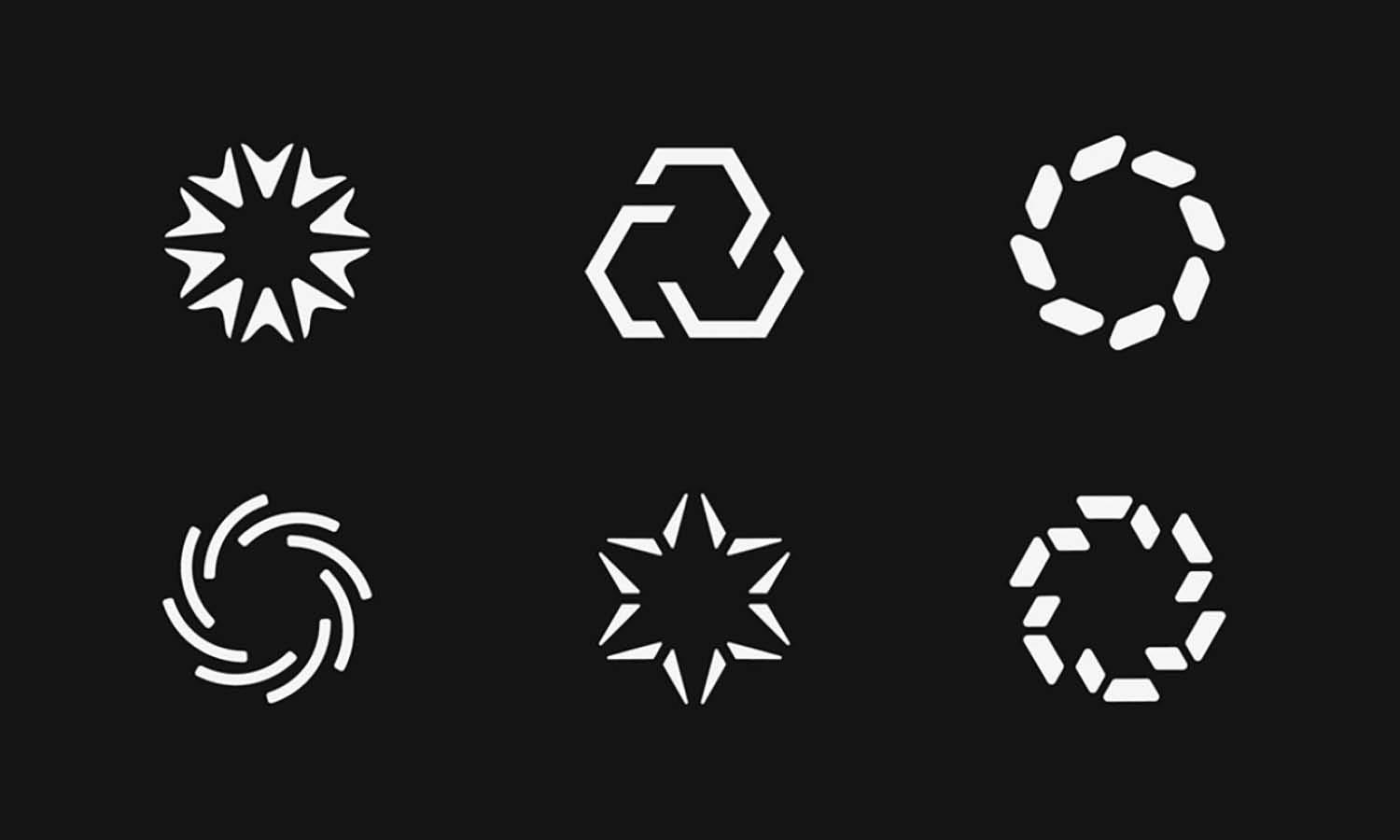
Source: Stacy Saturday, Tagset, Behance, https://www.behance.net/gallery/179734909/Tagset-Brand-Identity-Naming
Welcome to the vibrant world of corporate identity design, where creativity meets branding to forge unforgettable business personas! As companies vie for attention in a bustling market, crafting a distinctive corporate identity isn’t just advisable—it’s essential. This lively guide dives into the most imaginative and effective design ideas that are reshaping how brands present themselves. From sleek logos that communicate brand values at a glance to comprehensive visual strategies that encompass color schemes, typography, and marketing materials, we’re covering it all.
Prepare to be inspired by a collection of standout ideas that promise to elevate your brand's identity from ordinary to extraordinary. Whether you're looking to revamp your existing identity or starting from scratch, these curated design marvels will provide the spark you need to ignite your creative journey. So, let’s unleash your brand's potential and make it resonate deeply with your audience, ensuring your corporate identity isn’t just seen, but remembered. Stay tuned as we explore the frontier of corporate identity design—where your brand’s best self awaits!
Corporate Identity Design Ideas

Source: Hoet & Hoet, Sambrinvest, Behance, https://www.behance.net/gallery/83166283/Sambrinvest

Source: Gabriel M. Ramos, Eletromidia, Behance, https://www.behance.net/gallery/108565927/Eletromidia

Source: Svetoslav Stankov, W.kids, Behance, https://www.behance.net/gallery/58354413/Wkids-Language-School-Branding

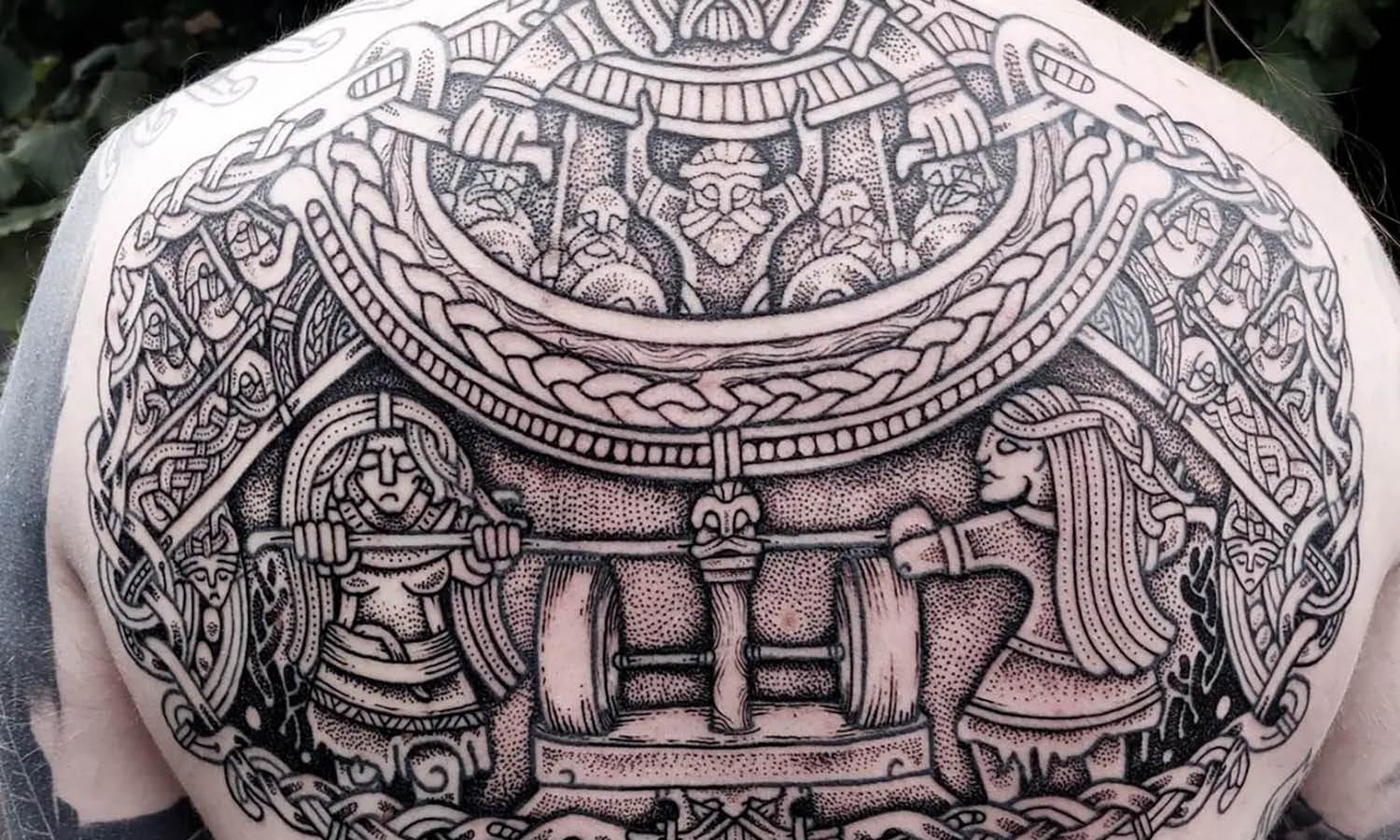
Source: Simon Lukas Mers, The Tattoo Museum, Behance, https://www.behance.net/gallery/108540905/the-tattoo-museum-Bachelor

Source: Agata Kosturek, DBU, Behance, https://www.behance.net/gallery/62592673/done-by-us-Corporate-Identity-Interior-Design-Brand

Source: Hyek Kim, Meta, Behance, https://www.behance.net/gallery/65910817/Meta-Rebranding

Source: Ramotion, Atopa, Behance, https://www.behance.net/gallery/108086735/Atopa-Brand-Identity-Design-and-Website

Source: Bepolar Lab, Smith & Hobbs, Behance, https://www.behance.net/gallery/97254889/Smith-Hobbs-Law-Firm

Source: Kate Anto, Itsumo, Behance, https://www.behance.net/gallery/65128121/ITSUMO-fashion-branding

Source: Bill Pappas, Zelios Gardens, Behance, https://www.behance.net/gallery/80395405/Zelios-Gardens-Branding

Source: Marco Stoermer, Oberhafen, Behance, https://www.behance.net/gallery/98286065/Oberhafen

Source: Renzo Design Studio, Agudelo Velásques, Behance, https://www.behance.net/gallery/96302633/Agudelo-Velasquez-Brand-Identity

Source: Omar Saraya, MoneyFellows, Behance, https://www.behance.net/gallery/110520565/Money-fellows

Source: Madeo, Brandmaster, Behance, https://www.behance.net/gallery/114161021/BrandMaster-Visual-Identity-Rebranding

Source: Pol Solsona Studio, Vadebike, Behance, https://www.behance.net/gallery/91150435/Vadebike

Source: Amr Bo Shanab, Voice Orbit, Behance, https://www.behance.net/gallery/87573603/Voice-Orbit-Brand-Identity

Source: Bratus Agency, Incentex, Behance, https://www.behance.net/gallery/78757487/Incentex-Visual-identity

Source: Antonio Calvino, Heba Shaik, Behance, https://www.behance.net/gallery/96046165/Heba-Shaikh-Brand-Identity

Source: Tanveer Khan, Ginnel, Behance, https://www.behance.net/gallery/209835187/Finance-Logo-Finance-Brand-Design-Ginnel

Source: Akinbinu Akintayo, Kabiru, Behance, https://www.behance.net/gallery/207076339/Kabiru-Brand-Identity-Guidelines

Source: Mustapha Elkasimi, 909, Behance, https://www.behance.net/gallery/176938831/909

Source: Tamim Islam, Invision, Behance, https://www.behance.net/gallery/201063259/Invision-Brand-Identity

Source: Butcher Studio, Brightr, Behance, https://www.behance.net/gallery/207562123/Brightr-Brand-Identity-for-Tech-Storytelling

Source: Amr Bo Shanab, StandUP, Behance, https://www.behance.net/gallery/192763471/StandUP

Source: Maksym Serdiuk, Unstudio, Behance, https://www.behance.net/gallery/207374925/Unstudio-Corporate-redesign-Architecture

Source: Evgeniya Mesh, Фирменный стиль, Behance, https://www.behance.net/gallery/196142535/firmennyj-stil-Corporate-identity

Source: Ahmed Alaldin, Handesly, Behance, https://www.behance.net/gallery/208311351/Handesly-Brand-Identity

Source: Hexagon Agency, Helix Investment Fund, Behance, https://www.behance.net/gallery/191656483/Helix-Investment-Fund-Brand-Identity

Source: Luis Vásquez, Tranche, Behance, https://www.behance.net/gallery/134898219/Tranche

Source: Stacy Saturday, Tagset, Behance, https://www.behance.net/gallery/179734909/Tagset-Brand-Identity-Naming
What Are the Key Elements of Corporate Identity Design?
Corporate identity design isn't just about slapping a logo on everything that moves within your business. It's a symphony of design elements that convey the essence, personality, and values of your brand. This artistic orchestration helps businesses stand out, connect with their audience, and build enduring relationships. So, what are the key ingredients that make corporate identity design so vital? Let’s explore the five pivotal elements that can turn a bland business into a memorable brand.
Logo: The Heartbeat of Your Brand
Think of your logo as the face of your brand—it’s often the first thing people will notice and the last thing they'll forget. A powerful logo is more than just an attractive graphic; it serves as the cornerstone of your corporate identity. It should encapsulate your brand’s ethos in a simple, yet profound, visual representation. From colors to typography, every detail of the logo contributes to making your brand recognizable across various platforms, from billboards to business cards.
Color Scheme: Painting Your Brand’s Personality
Color is a silent yet incredibly persuasive communicator. It can influence mood, communicate values, and even drive consumer behavior. When it comes to corporate identity design, selecting the right color palette can make your brand more relatable and appealing to your target audience. Whether it’s the trust-evoking blue seen in the logos of tech giants or the energetic red of popular fast-food chains, colors play a pivotal role in how your brand is perceived.
Typography: Speaking Style
If your brand was a person, typography would be its voice. The fonts you choose for your corporate identity design can speak volumes about your brand's character. Are you a serious, information-first tech company? A sleek, modern sans-serif might be your go-to. Or maybe a playful and approachable food brand? A whimsical script could do the trick. Consistent use of typography not only reinforces brand recognition but also ensures clarity and legibility across all media.
Brand Style Guide: The Rulebook of Your Brand’s Identity
A brand style guide is essentially your brand’s bible. It outlines how to use (and not use) the various elements of your corporate identity. This guide ensures consistency—a crucial element in building a coherent brand image. It covers everything from logo placement and usage, color palette applications, typography settings, to imagery and voice tone. Consistency led by a well-defined style guide builds a reliable and recognizable brand identity that resonates with audiences everywhere.
Consistent Imagery: Visual Storytelling
Your choice of imagery, from photographs to illustrations, should reflect your brand's core values and support its overall narrative. Consistent imagery creates a cohesive visual landscape that complements your brand’s identity elements and enhances brand recall. It’s about choosing images that not only look good but feel right and align perfectly with your brand’s message.
In a nutshell, stellar corporate identity design is a blend of creativity and strategy. It’s about crafting a visual and textual narrative that captures the essence of your brand and communicates it effectively to the world. By focusing on these five elements, you can ensure that your brand not only stands out but also stays true to its vision and values, no matter where it goes.
What Are the Latest Trends in Corporate Identity Design?
In the ever-evolving landscape of corporate identity design, staying ahead of the curve isn't just a bonus—it's essential. As brands jostle for a spot in the limelight, knowing the latest trends can help you create an identity that not only stands out but also resonates with today's audience. So, buckle up and let’s explore the freshest and most exciting trends that are shaping the world of corporate identity design!
Minimalism Goes Maximal
The age-old adage of "less is more" continues to reign, but with a twist—minimalism is now about bold simplicity. Think clean lines, uncluttered spaces, and limited color palettes that make logos and branding elements pop. This trend focuses on distilling a brand's essence down to its most fundamental aspects, which helps in creating a clear and strong presence in a crowded market. Brands are not just stripping down to basics; they are using stark contrasts and typographic cleverness to make a minimal yet unforgettable impact.
Vibrant Color Schemes
Move over, subdued shades—vivid colors are here to take the throne! Corporate identity designs are now embracing bright, bold colors that stand out and convey emotions powerfully. These vibrant color schemes are not just eye-catching but are also strategic, as they are often used to evoke specific psychological responses from the target audience. This trend is particularly effective in digital platforms where attention spans are short, and a splash of color can make all the difference.
Responsive and Adaptive Logos
As digital spaces evolve, so does the need for versatile corporate identities. Responsive and adaptive logos are now a must-have in any designer's toolkit. These logos adapt to different formats and environments, maintaining their integrity and impact across various media. Whether it’s a mobile app icon or a digital billboard, having a logo that scales and changes without losing its essence is key in maintaining brand consistency in today’s multi-platform world.
Authentic and Handcrafted Designs
In a digital world, there’s a growing appreciation for the tactile and the artisanal. Handcrafted designs bring a touch of authenticity and uniqueness to corporate identities, setting brands apart from their more polished and often indistinguishable competitors. This trend includes hand-drawn illustrations or typography that adds a personal touch, resonating deeply with audiences looking for genuineness and sincerity in branding.
Sustainability in Branding
As global awareness of environmental issues increases, brands are aligning their identities with the values of sustainability and responsibility. This trend is manifesting in eco-friendly packaging, green logos, and materials, as well as in corporate narratives that highlight commitment to the planet. A sustainable corporate identity not only appeals to environmentally conscious consumers but also sets a brand as a forward-thinking, ethical player in its industry.
These trends showcase how dynamic and responsive corporate identity design needs to be in order to connect with modern audiences. By embracing these developments, brands can ensure they not only keep pace but also lead the way in the hearts and minds of their customers.
What Is the Difference Between Corporate Identity and Brand Identity?
Diving into the world of business visuals can sometimes feel like deciphering a secret code. Terms like "corporate identity" and "brand identity" often get tossed around interchangeably, but they hold distinct meanings and purposes. Understanding these differences can empower businesses to harness their full branding potential. Let's decode these terms with a twist of fun and unravel how they contribute uniquely to the success of a business.
Scope and Scale: The Playground of Identity
Corporate identity is like the architectural blueprint of a company—it's all about the structural design that publically showcases the business. It includes tangible elements like logos, uniforms, and business cards. Essentially, corporate identity design is the visual and physical manifestation of a company in the corporate arena.
On the other hand, brand identity is the emotional landscape—it's broader and encompasses perceptions, experiences, and interactions that people associate with the brand. Brand identity is not just seen; it's felt. It's the story and personality that resonate with consumers, influencing loyalty and brand preference.
Consistency vs. Emotion: The Ingredients of Impact
Corporate identity focuses heavily on consistency. Like a strict diet plan, it ensures that every visual aspect conforms to specific standards, creating a cohesive and instantly recognizable appearance across all touchpoints. This is crucial for maintaining professionalism and reliability in the eyes of stakeholders and customers.
Brand identity, however, thrives on emotional connection. It’s the secret sauce that flavors your brand's interactions with its audience. Brand identity designs how your brand makes people feel through its tone of voice, customer service style, and even the content it shares. This emotional quotient builds a community of loyal followers.
Formality vs. Fluidity: The Dance of Design
Corporate identity is formal. It’s like a well-tailored suit—it must fit perfectly and look impeccable in professional settings. This identity is crafted to convey authority and corporate ethos effectively and uniformly.
Brand identity is more fluid and adaptable. It’s like your favorite pair of jeans—comfortable, versatile, and reflects your style no matter where you go. It adapts to cultural shifts and evolving market dynamics, ensuring that the brand remains relevant and relatable over time.
Internal vs. External: The Focus Areas**
Corporate identity design often emphasizes internal consistency. It's geared towards ensuring that employees, partners, and shareholders see a unified symbol of what the company stands for. It’s about aligning the corporate look and feel inside out.
Brand identity extends beyond the internal workings to embrace external perceptions. It’s what the outside world thinks and feels about your brand. Brand identity cares deeply about consumer sentiments and public reputation, striving to bridge the gap between business offerings and consumer expectations.
Strategic vs. Creative: The Mindsets Behind the Masks
Corporate identity is strategic. It’s developed with a focus on long-term business goals and aligns with the company’s mission and vision. It serves as a critical pillar in strategic business decisions, supporting operational consistency and corporate discipline.
Brand identity is inherently creative. It’s where businesses get to show off their creative chops—from innovative marketing campaigns to storytelling elements that capture the audience’s imagination. It’s all about crafting a unique narrative that distinguishes the brand from its competitors.
Understanding the nuanced differences between corporate and brand identity allows businesses to leverage both strategic precision and creative flair.
What Tools Are Best for Creating Corporate Identity Designs?
Creating a corporate identity is like setting the stage for a grand performance where every visual element plays a pivotal role. But to craft such a masterpiece, you need the right tools in your toolkit. Let's dive into the best tools available today for designers looking to sculpt their next iconic corporate identity, making the process as smooth and sprightly as a Picasso sketch!
Adobe Illustrator: The Vector Virtuoso
When it comes to creating logos and branding materials that need to scale seamlessly from a tiny business card to a gigantic billboard, Adobe Illustrator is your go-to pal. Known for its powerful vector editing capabilities, Illustrator allows designers to craft precise, scalable graphics that maintain their crispness at any size. Its extensive toolkit, including gradient meshes, complex path manipulations, and an immense library of brushes, makes it a favorite among designers aiming to forge an enduring corporate identity.
Sketch: The Digital Design Dynamo
Sketch has become a darling in the design world, especially for those immersed in the digital dimensions of corporate identity creation. With its vector-based system, intuitive interface, and focus on user interface design, Sketch is perfect for crafting the digital aspects of brand identities such as website layouts, app interfaces, and interactive media. Its collaborative features and extensive plugin ecosystem enable a seamless design process that's as collaborative as a jazz band jam session.
CorelDRAW: The Graphic Guru
For those who like to mix a bit of old-school charm with modern capabilities, CorelDRAW offers a robust suite of graphic design tools that are ideal for logo creation, marketing materials, and branding projects. Its strong layout capabilities, photo-editing features, and extensive font management help designers create a cohesive look that’s both attractive and functional. Whether you’re etching out a newsletter or designing a corporate brochure, CorelDRAW handles it with grace and style.
InVision Studio: The Interactive Innovator
In today’s digital-first world, corporate identities often need to live and breathe online. InVision Studio steps up as a powerful tool for designing interactive interfaces that can bring a brand’s identity to life digitally. From detailed animations to complex user interfaces, InVision helps designers prototype and test designs that not only look good but also provide a seamless user experience. Think of it as your digital test lab for all things brand identity!
Canva: The Convenient Creator
Not everyone is a wizard with complex design software, and that’s where Canva comes in. With its user-friendly interface and a plethora of ready-to-use templates, Canva is a fantastic tool for startups and small businesses looking to create a corporate identity without diving too deep into the design weeds. From logo creation to social media posts, Canva makes design accessible to non-designers, ensuring that even the smallest businesses can look great.
Whether you're a seasoned designer or a budding entrepreneur, picking the right tool can make the difference between a good corporate identity and a great one. Each of these tools offers unique features that cater to different aspects of the corporate identity design process, so choose the one that best fits your project’s needs and let your creative flags fly high!
What Are Some Iconic Corporate Identity Designs?
When we talk about iconic corporate identity designs, we're diving into a treasure trove of creativity and strategic brilliance that has not only captured the essence of each brand but also left a permanent mark on our cultural landscape. These are the designs that make you think, "Wow, I wish I'd thought of that!" Let’s unwrap five legendary corporate identities that have stood the test of time and continue to inspire designers around the globe.
Apple’s Minimalist Mastery
Talk about striking the bullseye! Apple’s corporate identity, with its clean, minimalist design, is as iconic as it gets. The simple apple silhouette with a bite taken out is instantly recognizable worldwide. This logo, combined with Apple’s sleek product design and user-friendly interface, speaks volumes about the brand's commitment to simplicity and innovation. The use of a neutral color palette and a focus on space adds to its modern feel, making Apple’s corporate identity a frontrunner in the tech industry.
Nike’s Swoosh of Energy
Just do it? More like just designed it! Nike’s swoosh symbolizes movement and speed and encapsulates the essence of what the brand stands for—performance and endurance. This logo is a masterclass in using a single image to convey a brand’s identity, encouraging empowerment through sports. The dynamic curve, resembling a checkmark, represents positivity and achievement, making it an enduring symbol in sports apparel.
Coca-Cola’s Curvy Confidence
The flowing script of the Coca-Cola logo is as sweet and timeless as the drink itself. Its red and white color scheme is bold and inviting, reflecting warmth and youthful zest. This branding goes beyond the logo, influencing bottle designs and advertising themes that emphasize togetherness and enjoyment. Coca-Cola’s corporate identity is a prime example of how consistent visual elements can create a strong emotional connection with consumers across generations.
Google’s Playful Palette
Google’s logo might just be the friendliest one out there! With a simple, clean typeface and a playful mix of primary colors (plus that cheeky green ‘l’), Google’s corporate identity reflects its mission to organize the world's information in an accessible and useful way. The use of vibrant colors makes the brand approachable and relatable, which is a smart move for a tech giant that affects daily life on a global scale.
McDonald’s Golden Arches
Who can drive past those golden arches without recognizing them? McDonald’s has utilized this simple yet bold symbol to signify more than just fast food; it’s a beacon for consistent, reliable meals no matter where you are in the world. The golden arches, originally designed as part of the architecture of their first restaurants, have become synonymous with quick service and youthful joy. Paired with the red background, it creates a vibrant and energetic corporate identity that’s hard to miss.
These brands have mastered the art of corporate identity design, creating visual identities that resonate deeply with consumers and endure through changes in market trends and consumer preferences. Their logos aren’t just logos; they are a gateway to the brand's world, promising a consistent experience and building formidable brand loyalty.
Conclusion
Mastering corporate identity design is pivotal for any business aiming to carve out a distinct presence in a crowded marketplace. By effectively leveraging the latest design trends and tools, brands can craft an identity that not only resonates with their target audience but also strengthens their market position. As we look forward, it’s clear that innovative, adaptive, and sustainable design strategies will dominate the landscape. Businesses that embrace these principles in their corporate identity design are set to not only attract but also retain a loyal customer base, ensuring long-term success and brand relevance.
Let Us Know What You Think!
Every information you read here are written and curated by Kreafolk's team, carefully pieced together with our creative community in mind. Did you enjoy our contents? Leave a comment below and share your thoughts. Cheers to more creative articles and inspirations!







Leave a Comment