Top 5 Logo Design Trends in the Gambling Industry

The gambling industry is dynamic and competitive, and businesses should constantly innovate to stay on top. A vital aspect of this innovation pertains to branding, mainly logo design, which is crucial in attracting and retaining customers.
Consider the five trends listed below if you’re looking for a logo design to help you with your online casino branding. They’ll help you choose the logo to suit your company’s vision.
Minimalism and Simplicity
From the California to New Jersey gaming industry, minimalism and simplicity are a priority in their logo designs. Recent trends indicate a shift towards minimalistic logo designs in the gambling industry. Brands opt for more straightforward, cleaner logos that are easily recognizable across various media platforms. This trend emphasizes removing unnecessary elements and focusing on essential features that effectively convey the brand's message.
A minimalistic approach makes logos timeless and adaptable, an essential characteristic in the fast-paced gambling sector. Minimalism and simplicity in logo design are not just aesthetic choices but powerful tools that enhance brand recognition, adaptability, and memorability.
This design ethos helps reduce a logo to its essential elements, making it easy for consumers to identify and remember. A minimalist logo effortlessly communicates the brand's message without clutter, allowing it to be versatile across various applications.
Bold and Vibrant Colors
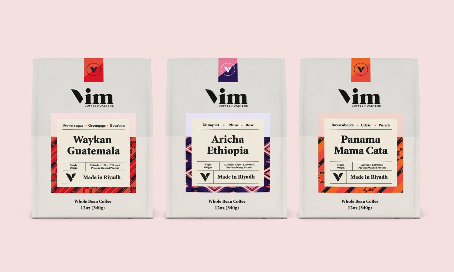
Using bold and vibrant colors in gambling logos has gained popularity. This trend deviates from traditional color schemes and aims to quickly grab potential customers' attention and make a memorable impression.
Bright reds, deep purples, and electric blues are standard, reflecting the excitement and energy associated with gambling. These colors are often used strategically to invoke feelings of luck, success, and thrill.
Adeptly utilizing bold and vivid colors can significantly enhance the identity and ethos of a brand or offering, rendering them more enticing and unforgettable to consumers.
Besides their capacity to captivate and evoke emotions, these vibrant hues boast adaptability and flexibility. They find applications across various design scenarios, including branding, advertising, web design, and packaging.
Retro Revival
The retro revival trend incorporates vintage and classic design elements into modern logos, a nod to the past. This approach evokes nostalgia and a sense of trust and reliability, appealing to new and long-time gamblers.
Retro-themed logos often feature old-style typography, art-deco style, and 80's inspired neon, refreshing from overly sleek and modern designs.
Furthermore, the digital saturation of the market has led to a craving for simplicity and the tangible. Retro designs, reminiscent of a time before the digital explosion, offer a refreshing break from the complexity of modern designs, appealing to the emotional side of consumers who yearn for the simplicity and authenticity of bygone eras.
The charm of retro design lies in its ability to evoke warmth and familiarity, creating a solid emotional connection with the audience. In 2024, brands seek to harness this genuine engagement, steering away from the impersonal and often sterile digital designs that have dominated the landscape in recent years.
Creative Typography
In an industry where the thrill of the game and the allure of chance reign supreme, casinos have long understood the power of first impressions. Creative typography is a potent tool in the arsenal of strategies to captivate and intrigue.
The magic of typography in casino logo design lies in its ability to convey emotion and theme without saying a word.
Fonts that mimic the flowing curves of a roulette wheel, the sharp edges of a deck of cards, or the luxurious elegance of a night out at the casino speak volumes about what the gamer can expect. The choice of color, size, and form of typography can evoke feelings of excitement, sophistication, or even nostalgia for the golden age of casino gaming.
Symbolic Imagery
Recent trends in casino logo design have leaned heavily towards using symbolic imagery, a tactic that captures the essence of the casino experience and embeds a more profound meaning into the brand's fabric.
This use of symbols, ranging from classic card suits and dice to more abstract and modern elements, is a strategic move to evoke specific emotions and associations in patrons' minds.
Symbolic imagery serves a dual purpose in casino logo design. Firstly, it acts as an instant communicator, visually conveying the thrilling and dynamic nature of casino gaming.
Secondly, it taps into the rich tapestry of cultural and historical associations that many of these symbols carry. For instance, using a lion might suggest royalty and power and evoke the thrill of the chase and the potential for triumph, mirroring the gambler's journey.
Furthermore, this trend toward symbolic imagery in logos reflects a broader shift in the industry toward sophistication and the desire to offer a holistic and upscale entertainment experience. Casinos are not just places to gamble; they are entertainment hubs, resorts, and sometimes even architectural wonders.
The logo, therefore, must encapsulate all these elements, making symbolic imagery a fitting choice.
Conclusion
The gambling industry's evolving nature demands that businesses keep up with the latest trends, especially in branding and logo design. The casino logo design trends above reflect a broader movement toward innovative and memorable logo designs. These trends help businesses stand out in a competitive market and foster a deeper connection with their target audience.


Leave a Comment