
10 Common Yet Crucial Typography Mistakes To Avoid

Typography is not just an art; it's a pivotal element of user experience design. Whether it's in web design, advertising, or print media, the choice of fonts and their arrangement can significantly influence how information is perceived and received. However, designers often encounter a variety of common typography mistakes that can detract from the clarity and effectiveness of their message. These errors, while seemingly minor, can have major repercussions on the readability and aesthetic appeal of your design project. In this article, we explore the top ten typography mistakes to avoid.
Understanding these pitfalls will not only improve your designs but also enhance communication with your audience, ensuring that your message is not only seen but also appreciated. Avoiding these mistakes is crucial for maintaining professionalism and achieving effective visual communication. As we delve into these common errors, keep in mind that typography is a powerful tool that, when used wisely, can greatly enhance the impact of your design.
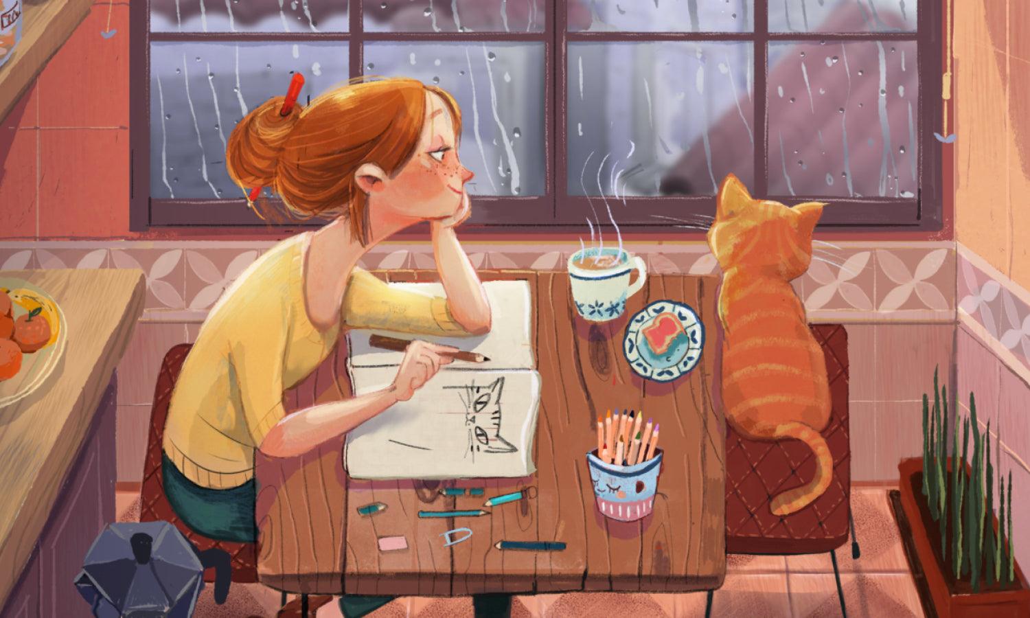
Overusing Decorative Fonts
Decorative fonts, while eye-catching and unique, are a double-edged sword in the realm of typography. They offer stylistic flair and personality to a design but can lead to significant readability issues when overused. One of the key typography mistakes to avoid is the excessive use of these elaborate typefaces in large blocks of text or in core interface elements where clarity is paramount.
Decorative fonts should be used sparingly, primarily for headlines or special highlights where they can add visual interest without compromising the overall legibility of the text. When texts such as body copy or crucial informational content are rendered in a decorative font, it can make the text difficult to read, especially for longer durations. This can alienate readers or viewers, leading to a decrease in engagement and effectiveness of the communication.
Furthermore, mixing multiple decorative fonts can create a cluttered, inconsistent look that distracts from the main message. A good rule of thumb is to pair a more understated, legible font with a decorative one to balance out the aesthetics and functionality. Always prioritize your audience's ability to easily absorb the information presented, ensuring that style does not overshadow substance in your design.
Choosing Wrong Font Size
Choosing the correct font size is crucial in typography to ensure optimal readability and effective communication. A common typography mistake is selecting a font size that is either too small to be easily readable or so large that it overwhelms the layout. This can affect user engagement, readability, and the overall visual hierarchy of the design.
The right font size depends on various factors including the reading environment, the length of the text, and the target audience. For instance, text intended for senior citizens or small screens, like mobile devices, may require larger typefaces, while printed materials can often accommodate smaller sizes. The key is to strike a balance where the font size enhances readability without dominating the design.
It's also essential to consider the leading and kerning around the text. Adequate spacing between lines and letters can help make even smaller fonts clear and legible. Test different sizes in real-world scenarios to see how they perform under actual conditions. This means checking readability on different devices and print sizes before finalizing the design.
Adjusting font size appropriately for headers, subheaders, and body text creates a clear and structured flow of information, making it easier for users to follow and understand the content. Always aim for a font size that complements the design and enhances the user experience, making your textual content accessible and engaging to all viewers.
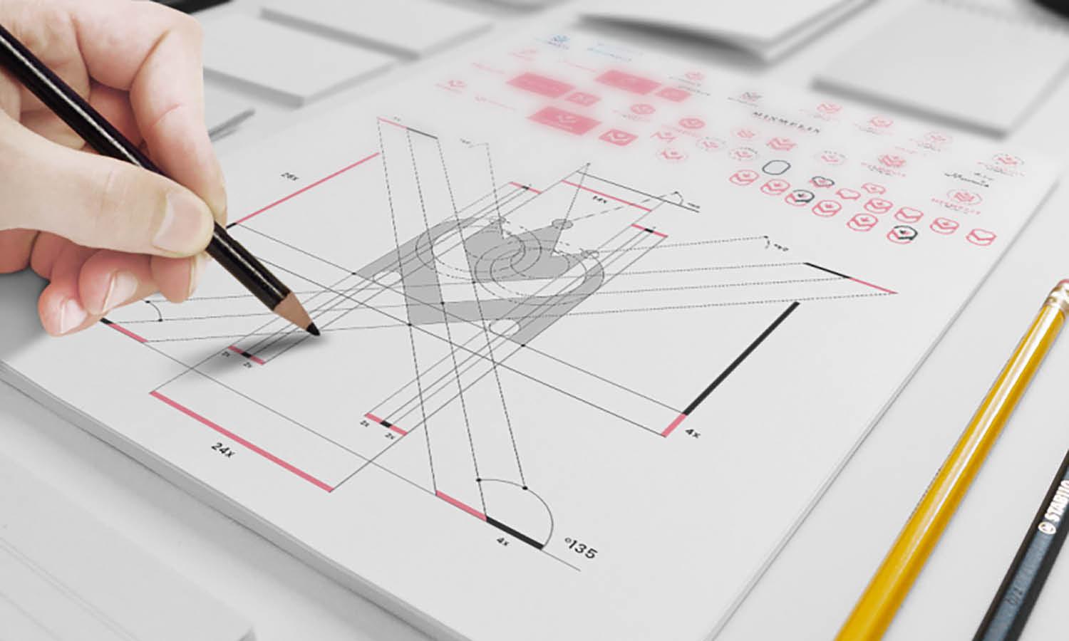
Ignoring Kerning and Tracking
Ignoring kerning and tracking is a prevalent typography mistake that can severely impact the readability and aesthetic quality of your text. Kerning refers to the adjustment of space between two characters, making the text look more uniform and aesthetically pleasing. Tracking involves adjusting the spacing uniformly over a large section of text. Both are crucial for creating visually appealing and easy-to-read content.
Without proper kerning, certain letter combinations can appear awkwardly spaced. For example, the space between "A" and "V" needs to be tighter than between "E" and "M" to appear visually balanced. Ignoring these subtle adjustments can make text look amateurish and can even lead to misinterpretation of information.
Tracking is equally important, especially in digital content, where readability must be maintained over different devices and resolutions. Poor tracking makes text either too cramped or too loose, making it difficult for the eyes to smoothly follow lines of text. This can deter readers, particularly in long passages, from engaging fully with the content.
To avoid these typography mistakes, always fine-tune kerning and tracking based on the font type, size, and the context of use. Using design software, adjust these settings to enhance text presentation and ensure that your messages are communicated clearly and effectively. Taking the time to refine these typography elements can drastically elevate the quality of your design and improve the overall user experience.

Source: Narrowtype, Instagram, https://www.instagram.com/p/CxsmKNZIdf9/
Overlooking Line Spacing (Leading)
One of the key typography mistakes often overlooked by designers is inappropriate line spacing, also known as leading. Line spacing is crucial because it directly influences readability and the overall aesthetic appeal of the text. Too tight line spacing can make paragraphs dense and overwhelming, while too loose spacing can disjoint the reading flow, making it challenging for the eye to track from one line to the next.
Ideal leading varies depending on the typeface, font size, and text layout but generally should be 120% to 145% of the font size. For instance, if the font size is 10 points, the line spacing should be between 12 and 14.5 points. This range helps maintain a visual balance that is neither cramped nor excessively spaced.
Effective line spacing enhances the legibility of text blocks, especially in long-form content where reader fatigue can set in. It also plays a role in setting the mood and tone of the written content. For example, more relaxed line spacing can convey a sense of openness and ease, suitable for informal texts, while tighter spacing might be used in more formal or dense informational documents.
Choosing Illegible Fonts
A common typography mistake is choosing fonts that prioritize style over clarity, resulting in illegible text. The primary goal of typography is to communicate a message, and if the text is hard to read, it fails its fundamental purpose. Decorative fonts might look appealing and add character to a design, but they often sacrifice readability for aesthetic flair.
When selecting a font, especially for body text, opt for those that are clear and easy to read at any size. Fonts with simple, clean lines and adequate character spacing are preferable. This is particularly important in digital media, where readability across different devices and screen sizes must be considered.
For headers and titles, while you can afford to be more adventurous with font choices, it is crucial to ensure that these too remain accessible. Even in more creative designs, readability should not be compromised. Test the legibility of your fonts by viewing them in different contexts and sizes to ensure they perform well across all intended uses.
Misusing Font Weights
Misusing font weights is one of the critical typography mistakes that can undermine the effectiveness of your design. Font weight refers to the thickness of the character strokes, ranging from thin to bold. Proper use of font weight can create a visual hierarchy, direct the reader’s attention, and enhance the overall readability of your text.
However, indiscriminate use of various font weights within a single design can lead to a cluttered and confusing layout. Over-reliance on bold fonts, for example, can make your design feel aggressive and heavy, while using too many light weights might render text illegible, especially in smaller sizes or on low-resolution screens.
To avoid this typography mistake, establish clear rules for using font weights. Typically, bold weights are perfect for headlines or important calls to action, where they need to stand out. Regular weights work well for body text, ensuring clarity and ease of reading. Lighter weights can be used for captions or less critical information.
By thoughtfully balancing font weights, you can create a structured and appealing design that effectively communicates your message and ensures that your content remains accessible and engaging to your audience.
Ignoring Color Contrast
One of the most prevalent typography mistakes is ignoring color contrast between text and its background. Proper contrast is not merely a design choice but a fundamental aspect of ensuring readability and accessibility in typography. Without sufficient contrast, text can blend into the background, making it difficult for users to read and causing strain on their eyes, which can deter engagement and comprehension.
The importance of color contrast extends beyond aesthetic appeal; it plays a critical role in accessibility. People with visual impairments, such as color blindness, rely heavily on contrast to perceive information. The Web Content Accessibility Guidelines (WCAG) suggest a contrast ratio of at least 4.5:1 for normal text and 3:1 for large text. This guideline ensures that texts are legible to a wider audience, including those with visual challenges.
Designers should use tools like contrast checkers to evaluate text-background color combinations before finalizing designs. These tools help verify that the contrast meets the required standards and that text visibility is optimized across various devices and lighting conditions.

Source: April Li, Typographic Narrative 2, Behance, https://www.behance.net/gallery/156215905/Typographic-Narrative-2
Ignoring Text Hierarchy
Ignoring text hierarchy is a critical typography mistake that can render even the most well-crafted content ineffective. Text hierarchy involves using various font sizes, weights, and styles to organize information, guide readers through content, and emphasize key points. Effective hierarchy makes content more scannable and improves user engagement by allowing readers to easily prioritize information.
Designers should establish a clear hierarchy that differentiates between the importance of text elements such as headings, subheadings, body text, and captions. Typically, the largest font sizes are reserved for main headings, which should grab attention and summarize information. Subheadings should be distinguishable yet subtler, guiding readers to sections of interest, while body text should be smaller yet legible, providing detailed information.
Failing to implement this structure often leads to a flat text presentation that challenges the reader to identify the order and relevance of information. This oversight can diminish the effectiveness of your design and leave readers lost or overwhelmed.
Overcrowding Text
Overcrowding text is a common typography mistake that can significantly compromise the effectiveness and aesthetics of a design. When too much text is squeezed into a limited space, it not only makes the content hard to read but also visually unappealing. Effective typography should breathe, allowing each word and line to be easily distinguished without straining the reader’s eyes.
To avoid this typography error, designers must judiciously use white space, which refers to the empty space around and between elements in a design. White space is not wasted space; rather, it's a powerful tool that helps create a clean, organized layout that enhances readability. By allowing adequate room between lines of text (leading) and around text blocks, you can significantly improve the legibility and overall visual impact of your design.
Incorporating ample margins and padding can also prevent text from feeling cramped. Be strategic about the amount of content you include and avoid the temptation to fill every inch of space. Instead, focus on delivering your message with clarity and precision.
Failing to Proofread
Failing to proofread is a typography mistake that can drastically undermine the professionalism of any design project. It is not just about catching typographical errors or misspelled words; proofreading encompasses the review of font consistency, alignment, kerning, and overall layout to ensure everything appears as intended. Typography errors can easily distract from the content's intended message and cause confusion or misinterpretation among readers.
Proofreading should be an integral part of the design process, performed multiple times throughout the development of any document. It is essential to check that the text aligns with the overall design elements and that there are no discrepancies in font sizes, styles, or weights. Even small errors can have a significant impact on the design's credibility and the audience's perception of the brand or message being conveyed.
Designers should employ various proofreading techniques such as reading the text aloud, reviewing the design from a physical printout, or using digital tools that highlight typographical errors. It is also beneficial to have another person review the work, as a fresh pair of eyes may catch errors that the designer has overlooked.
Disregarding Brand Consistency
Disregarding brand consistency is a significant typography mistake that can weaken a brand's identity and confuse its audience. Typography is a powerful tool in brand communication, as consistent use of specific fonts and styles helps to establish a recognizable and memorable visual identity. When typography is inconsistent, it dilutes the brand message and reduces the effectiveness of the marketing efforts.
Brand consistency in typography means using a coherent set of typefaces, sizes, and styles across all mediums and platforms. This includes everything from print materials like brochures and business cards to digital content such as websites and social media posts. Consistency helps build trust and familiarity, which are crucial for maintaining a strong relationship with the audience.
Designers must develop a comprehensive style guide that specifies the typefaces used for headings, body text, and accents, as well as guidelines for kerning, leading, and tracking. This guide should be adhered to rigorously to maintain uniformity across all brand materials.
Conclusion
Avoiding common typography mistakes is crucial for creating effective and visually appealing designs. By paying careful attention to kerning, font size, text hierarchy, and color contrast, designers can enhance readability and ensure their messages are communicated clearly and effectively. Remember, typography is a powerful tool in design that, when used properly, can significantly impact the user's experience and perception. Always strive for clarity and consistency in your typographic choices to maintain professionalism and achieve successful visual communication.
Let Us Know What You Think!
Every information you read here are written and curated by Kreafolk's team, carefully pieced together with our creative community in mind. Did you enjoy our contents? Leave a comment below and share your thoughts. Cheers to more creative articles and inspirations!
Related Articles


Leave a Comment