The Impact of Applying Symbolism in Graphic Design

Source: Silvia Amadei, Alchemical Illustrations, Behance, https://www.behance.net/gallery/93452037/Alchemical-Illustrations
Symbolism in graphic design plays a critical role in shaping how audiences perceive and connect with messages. Designers use symbols as visual shorthand, embedding deeper meanings within logos, layouts, and illustrations that resonate with viewers on both conscious and subconscious levels. These symbols can be drawn from culture, history, religion, or nature, allowing designers to communicate complex ideas with clarity and impact.
Symbolism enhances storytelling and builds emotional bridges between brands and their audiences. A simple image—like a heart for love or a flame for energy—can instantly evoke specific feelings or associations without relying on words. This visual language is especially powerful in logo design and branding, where minimalism meets maximum meaning.
By understanding how different shapes, colors, and icons are interpreted across various contexts, designers can craft compelling visuals that align with brand identity and audience expectations. In this article, we will explore how symbolism in graphic design is applied strategically, review its psychological effects, and examine examples that demonstrate its influence on modern visual storytelling. Whether you are a designer or a brand strategist, recognizing the power of symbolism can transform your creative approach and elevate your design work.
Enhancing Visual Communication
In graphic design, effective communication is essential, and symbolism plays a vital role in amplifying a design's message. By integrating symbolism into visual compositions, designers can simplify complex ideas, making them accessible and memorable. Symbols act as visual shorthand, conveying ideas that resonate universally, regardless of language or background. This power lies in the symbol’s ability to represent broader concepts through a single image, creating an immediate understanding for viewers.
For instance, a peace symbol instantly conveys messages of harmony and non-violence, while a heart symbolizes love and compassion. These symbols transcend language, making designs inclusive and widely interpretable. By using symbolism in graphic design, brands and designers can communicate more directly, reducing the need for lengthy text. This is particularly advantageous in digital spaces where concise, impactful visuals are essential for capturing and retaining attention.
This is where the expertise of a specialized graphic design agency becomes invaluable. Creato, a renowned graphic design agency based in Sydney, excels in transforming symbols into powerful communication tools. Their skilled designers adeptly navigate the subtleties of symbolism, ensuring that each design is not only visually compelling but also rich in meaning. Partnering with Creato can elevate your graphic design projects, ensuring that every element conveys the intended message with clarity and impact.
Creating Emotional Connections
Symbolism in graphic design serves as a powerful tool to create emotional connections with audiences. Symbols carry cultural and psychological significance, evoking feelings and associations that resonate deeply with viewers. When designers use symbolism effectively, they tap into these collective emotions, enhancing the design’s emotional impact and aligning it with the viewer’s personal experiences.
For example, the use of earthy colors and natural symbols like leaves or trees in branding can evoke feelings of environmental consciousness and harmony with nature. This symbolic association encourages an emotional bond, particularly for audiences that value sustainability. Similarly, heart symbols foster a sense of warmth and compassion, making them common in designs focused on caregiving or charity. Symbols can subtly guide viewers’ emotions, making them feel connected to the brand or message on a personal level.
Emotional connections through symbolism also contribute to brand loyalty. When viewers feel an emotional resonance with a design, they are more likely to remember and engage with it. Over time, these connections can build trust and affinity, as viewers come to associate the brand with positive feelings and values that align with their own.
Adding Depth and Layers of Meaning
In graphic design, symbolism has the unique capability to add depth and multiple layers of meaning to a visual composition. Symbols serve as powerful tools to convey messages that go beyond the surface, enabling designers to embed complex ideas within seemingly simple elements. This layered approach not only enriches the design but also invites viewers to explore it more deeply, finding new interpretations and meanings with each look.
For instance, in a brand logo, a simple tree symbol can represent more than just nature—it can signify growth, stability, and even a connection to heritage. This layered meaning resonates with audiences who value these qualities, allowing the brand to establish a multidimensional presence. Additionally, symbols with layered meanings can make a design feel more dynamic, as they encourage viewers to engage in active interpretation, making the experience more personal and memorable.

Source: Einav Vaisman, Vases From Greece, Behance, https://www.behance.net/gallery/94428629/Vases-From-Greece
Establishing Cultural Relevance
Symbolism in graphic design is a powerful method for establishing cultural relevance, as symbols often carry meanings rooted in specific cultural contexts. By incorporating culturally significant symbols, designers can create visuals that resonate with particular audiences, strengthening the design’s impact and fostering a sense of belonging and connection.
For example, in a design for a product aimed at an Asian market, using a lotus flower symbol can evoke notions of purity, enlightenment, and resilience, values that resonate strongly in various Asian cultures. Similarly, incorporating indigenous patterns or motifs in a design aimed at celebrating Native American heritage can convey respect for tradition and ancestry. These culturally relevant symbols make the design feel more authentic and relatable, as audiences recognize elements that reflect their own values and traditions.
Cultural relevance through symbolism also enhances the viewer’s emotional response, as familiar symbols can evoke a sense of pride or nostalgia. This emotional connection helps to build brand loyalty, as viewers feel acknowledged and represented by the design.
Facilitating Brand Recognition
Symbolism in graphic design plays a critical role in facilitating brand recognition, as symbols create memorable visuals that audiences can quickly associate with a brand. When a brand uses a distinctive symbol as part of its visual identity, it becomes an immediate point of reference for consumers, simplifying the recognition process. Iconic symbols like the Nike swoosh or Apple’s bitten apple serve as powerful examples, demonstrating how a well-chosen symbol can encapsulate a brand’s essence in one simple image.
A symbol’s ability to transcend language and cultural barriers further strengthens brand recognition. Unlike text-based logos that require reading and comprehension, symbols offer instant understanding, making it easier for global audiences to identify and connect with the brand. This efficiency is particularly valuable in a digital landscape where audiences scroll through information rapidly; symbols allow for immediate identification, capturing attention in seconds.
Reducing the Need for Text
In graphic design, symbolism reduces the need for extensive text by visually conveying messages that would otherwise require explanation. This approach not only makes designs more concise but also enhances the viewer's experience, as symbols provide immediate understanding without relying on lengthy descriptions. By replacing words with symbols, designers can streamline communication, making it more efficient and accessible, especially in a fast-paced digital environment.
For example, a hospital sign with a red cross symbol quickly communicates healthcare without additional text. Likewise, symbols like a heart for “favorites” or a shopping cart for “purchases” have become universally understood, allowing users to navigate with ease. These symbolic representations make the design intuitive and user-friendly, improving the overall functionality of digital and print layouts alike.
Reducing text through symbolism is particularly beneficial for brands targeting global audiences. Symbols transcend language barriers, enabling diverse audiences to engage with the content without needing translation. This universal appeal makes symbolism an effective tool for creating inclusive designs that reach a broader audience.
Communicating Values and Principles
In graphic design, symbolism serves as a powerful tool to communicate a brand's values and principles effectively. Symbols can encapsulate complex ideas, reflecting what a brand stands for and making its core message more relatable and accessible to audiences. Through strategic use of symbolic elements, designers can convey the brand’s essence in a way that words alone cannot achieve.
For instance, a company focused on sustainability might use symbols of nature, like leaves or trees, in its branding to represent environmental consciousness. Such symbols instantly communicate a commitment to ecological responsibility, aligning the brand’s image with the values that resonate with eco-conscious consumers. Similarly, brands centered on innovation often incorporate symbols like arrows or abstract, futuristic shapes, representing forward-thinking and progress.
This symbolic communication of values and principles also aids in building trust and loyalty. When audiences perceive that a brand’s visuals align with their own beliefs, it fosters a sense of connection and reliability. Over time, consistent use of meaningful symbols helps establish a brand identity that audiences can recognize and trust, making the values visually inherent in the design.

Source: Silvia Amadei, Alchemical Illustrations, Behance, https://www.behance.net/gallery/93452037/Alchemical-Illustrations
Encouraging Interpretation and Curiosity
Symbolism in graphic design is a powerful means of encouraging interpretation and sparking curiosity in viewers. Symbols often carry multiple meanings, creating layers that invite audiences to explore and engage more deeply with the design. This complexity transforms a design into an interactive experience, as viewers try to decipher the embedded meanings and connect them to the brand or message.
For instance, a logo featuring a stylized compass could evoke notions of exploration, guidance, or discovery, depending on how it is interpreted. This interpretive element draws viewers in, prompting them to consider the underlying story and purpose behind the symbol. The ambiguity in symbolic design encourages a personal connection, allowing each viewer to bring their unique perspective to the interpretation.
Encouraging curiosity through symbolism also builds a memorable experience, as people are more likely to remember and think about designs that intrigue them. This engagement creates a lasting impression, strengthening brand recall as viewers revisit the design in their minds to uncover its nuances.
Building a Unique Design Identity
Symbolism in graphic design plays a crucial role in building a unique design identity, setting brands apart in a competitive visual landscape. A distinct design identity, shaped through carefully chosen symbols, helps brands communicate their essence in a recognizable and memorable way. By selecting symbols that align with the brand’s personality and values, designers can create a visual language that resonates with audiences and fosters brand loyalty.
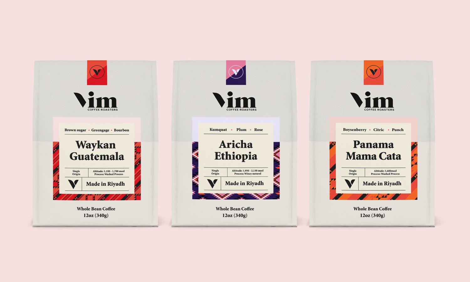
For example, a tech company might use sleek, geometric symbols to reflect modernity and innovation, while an artisanal coffee brand could incorporate hand-drawn icons of coffee beans or leaves to evoke warmth and craftsmanship. These symbols serve as shorthand for the brand’s core attributes, creating a visual identity that feels authentic and differentiated from competitors.
Unique symbolism also enhances brand recall. As audiences encounter these symbols consistently across different platforms, the visual identity becomes ingrained in their memory, reinforcing brand recognition. This consistency not only boosts visibility but also strengthens the brand’s presence in the market, making it easier for audiences to identify and relate to the brand at a glance.
Improving Visual Hierarchy and Focus
Symbolism in graphic design significantly enhances visual hierarchy and focus, guiding viewers’ attention toward essential elements in a design. Visual hierarchy is a design principle that arranges elements to lead the viewer’s eye, ensuring that the most important information is seen first. Through strategic symbolism, designers can create focal points that highlight key messages, improving both clarity and engagement.
For instance, a prominent symbol, like a star or arrow, can be used to emphasize a call-to-action button or headline, drawing the viewer’s attention immediately to the desired area. Similarly, symbols like icons or badges can be employed to segment information, making the layout more organized and intuitive. These symbolic cues direct viewers’ eyes naturally, enhancing the design’s flow and improving the user experience.
Symbolism also helps in creating balance within the design. Symbols with varying sizes, colors, and positions can be arranged to form a hierarchy, ensuring that viewers interpret the elements in a specific order. This structured approach prevents visual clutter, enabling viewers to focus on the essential parts of the design without feeling overwhelmed.
Conclusion
Symbolism in graphic design is far more than decorative—it is a foundational element that strengthens communication, evokes emotion, and reinforces brand identity. By intentionally choosing and applying symbols, designers can convey layered meanings that transcend language and cultural barriers. Whether through shapes, colors, or icons, these symbolic choices create memorable and meaningful visuals that leave a lasting impression. As the design landscape continues to evolve, understanding and leveraging symbolism remains a vital skill for any graphic designer seeking to create impactful, purpose-driven work that truly connects with its intended audience.
Let Us Know What You Think!
Every information you read here are written and curated by Kreafolk's team, carefully pieced together with our creative community in mind. Did you enjoy our contents? Leave a comment below and share your thoughts. Cheers to more creative articles and inspirations!









Leave a Comment